
XY chart
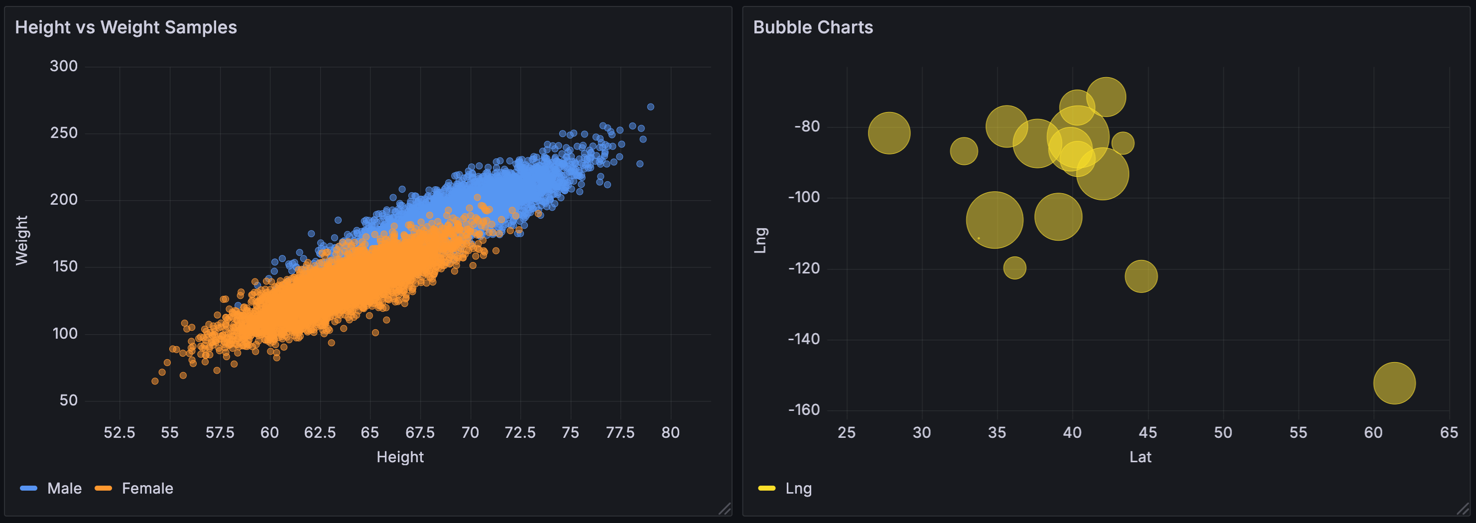
XY charts provide a way to visualize arbitrary x and y values in a graph so that you can easily show the relationship between two variables. XY charts are typically used to create scatter plots. You can also use them to create bubble charts where field values determine the size of each bubble:
Supported data formats
You can use any type of tabular data with at least two numeric fields in an xy chart. This type of visualization doesn’t require time data.
Configuration options
The following section describes the configuration options available in the panel editor pane for this visualization. These options are, as much as possible, ordered as they appear in Grafana.
Panel options
In the Panel options section of the panel editor pane, set basic options like panel title and description, as well as panel links. To learn more, refer to Configure panel options.
XY Chart options
The following options let you control how data is displayed in an xy chart:
| Option | Description |
|---|---|
| Series mapping | Set how series data is mapped in the chart. Choose from: Auto and Manual. Depending on your series mapping selection, the Frame, X-field, and Y-field options differ. For information on setting these specific fields, refer to the Series mapping section. |
| Size field | Set which field’s values control the size of the points in the chart. This value is relative to the min and max of all the values in the data frame. When you select this option, you can then set the Min point size and Max point size options. Required in Manual mode. |
| Color field | Set which field’s values control the color of the points in the chart. To use the color value options under the Standard options, you must set this field. Typically, this field is used when you only have one series displayed in the chart. Required in Manual mode. |
| Show | Set how values are represented in the visualization. Choose from: Points, Lines, or Both. |
| Point size | Set the size of all points in the chart, from one to one hundred pixels in diameter. The default size is five pixels. You can set an override to set the pixel size by series (y-field). |
| Min/Max point size | Use these options to control the minimum or maximum point size when you’ve set the Size field option. You can override these options for specific series. |
| Point shape | Set the shape of the points in the chart. Choose from:
|
| Point stroke width | The width of the point stroke in pixels. The default is one pixel. |
| Fill opacity | The opacity of the point fill. The default is 50. |
| Line style | Set the style of the lines that connect points. Choose from: Solid, Dash, or Dots. |
| Line width | The width of the lines that connect points, in pixels. |
Series mapping
Set how series data is mapped in the chart. Choose from:
- Auto - Automatically generates series from all available data frames (or datasets). You can filter to select only one frame.
- Manual - Explicitly define the series by selecting from available data frames.
Depending on your series mapping selection, the Frame, X-field, and Y-field options differ. These options are described in the tabs that follow:
When you select Auto as your series mapping mode, the following options are preconfigured, but you can also define them yourself:
| Option | Description |
|---|---|
| Frame | By default, an xy chart displays all data frames. You can filter to select only one frame. |
| X field | Select which field or fields x represents. By default, this is the first number field in each data frame. For an example of this in Auto mode, refer to the X field section. |
| Y field | After the x-field is set, by default, all the remaining number fields in the data frame are designated as the y-fields. You can use this option to explicitly choose which fields to use for y. For more information on how to use this in Auto mode, refer to the Y field section. |
When you select Manual as your series mode, you can add, edit, and delete series. To manage a series, click the Series field; to rename the series, click the series name.
In Manual mode, these fields are required:
| Option | Description |
|---|---|
| Frame | Select your data frame or dataset. You can add as many frames as you want. |
| X field | Select which field x represents. |
| Y field | Select which field y represents. |
X field
In Auto series mapping mode, select which field or fields x represents. By default, this is the first number field in each data frame. For example, you enter the following CSV content:
| a | b | c |
|---|---|---|
| 0 | 0 | 0 |
| 1 | 1 | 9 |
| 2 | 2 | 4 |
In the resulting chart, the x-field is generated from the values in column “a” unless you define it differently.
Y field
In Auto series mapping mode, after the x-field is set, by default, all the remaining number fields in the data frame are designated as the y-fields. You can use this option to explicitly choose which fields to use for y.
The series of the chart are generated from the y-fields. To make changes to a series in an xy chart, make overrides to the y-field.
Note
Any field you use in the Size field or Color field doesn’t generate a series.
You can also use overrides to exclude y-fields individually. To do so, add an override with the following properties for each y-field you want removed:
- Override type: Fields with name
- Override property: Series > Hide in area
- Area: Viz
Show
Set how values are represented in the visualization. Choose from:
- Points - Display values as points. When you select this option, the Point size option is also displayed.
- Lines - Add a line between values. When you select this option, the Line style and Line width options are also displayed.
- Both - Display both points and lines.
Line style
Set the style of the lines that connect points. To change the color, use the standard Color scheme field option.

- Solid - Display a solid line. This is the default setting.
- Dash - Display a dashed line. When you choose this option, a drop-down list is displayed where you can select the length and gap setting for the line dashes. By default, the length and gap are set to
10, 10. - Dots - Display dotted lines. When you choose this option, a drop-down list is displayed where you can select dot spacing. By default, the dot spacing is set to
0, 10(the first number represents dot length, which is always zero).
Tooltip options
Tooltip options control the information overlay that appears when you hover over data points in the visualization.
| Option | Description |
|---|---|
| Tooltip mode | When you hover your cursor over the visualization, Grafana can display tooltips. Choose how they behave:
|
| Max width | Set the maximum width of the tooltip box. |
Legend options
Legend options control the series names and statistics that appear under or to the right of the graph. For more information about the legend, refer to Configure a legend.
| Option | Description |
|---|---|
| Visibility | Toggle the switch to turn the legend on or off. |
| Mode | Use these settings to define how the legend appears in your visualization. List displays the legend as a list. This is a default display mode of the legend. Table displays the legend as a table. |
| Placement | Choose where to display the legend. Bottom places the legend below the graph. Right places the legend to the right of the graph. |
| Width | Control how wide the legend is when placed on the right side of the visualization. This option is only displayed if you set the legend placement to Right. |
| Values | Choose which of the standard calculations to show in the legend. You can have more than one. |
Axis options
Options under the Axis section control how the x- and y-axes are rendered. Some options don’t take effect until you click outside of the field option box you’re editing. You can also press Enter.
| Option | Description |
|---|---|
| Placement | Select the placement of the y-axis. Choose from: Auto, Left, Right, and Hidden. |
| Label | Set a y-axis text label. If you have more than one y-axis, then you can assign different labels using an override. |
| Width | Set a fixed width for the axis. By default, Grafana dynamically calculates the width of an axis. |
| Show grid lines | Set the axis grid line visibility. Choose from: Auto, On, and Off. |
| Color | Set the color of the axis. Choose from:
|
| Show border | Set the axis border visibility. |
| Scale | Set the y-axis values scale. Choose from: Linear, Logarithmic, and Symlog. |
| Centered zero | Set the y-axis so it’s centered on zero. Applies to the Linear or Symlog scale options. |
| Soft min | Set a soft min to better control the y-axis limits. |
| Soft max | Set a soft max to better control the y-axis limits. |
Placement
Select the placement of the y-axis. Choose from the following:
- Auto - Automatically assigns the y-axis to the series. When there are two or more series with different units, Grafana assigns the left axis to the first unit and the right axis to the units that follow.
- Left - Display all y-axes on the left side.
- Right - Display all y-axes on the right side.
- Hidden - Hide all axes. To selectively hide axes, Add a field override that targets specific fields.
Scale
Set the y-axis values scale. Choose from:
- Linear - Divides the scale into equal parts.
- Logarithmic - Use a logarithmic scale. If you select this option, in the Log base list, choose a binary (base 2) or common (base 10) logarithmic scale.
- Symlog - Use a symmetrical logarithmic scale. If you select this option, choose also:
- Log base - Select a binary (base 2) or common (base 10) logarithmic scale.
- Linear threshold - Set the threshold at which the scale changes from linear to logarithmic.
Soft min and soft max
Set a Soft min or soft max option for better control of y-axis limits. By default, Grafana sets the range for the y-axis automatically based on the dataset.
Soft min and soft max settings can prevent small variations in the data from being magnified when it’s mostly flat. In contrast, hard min and max values help prevent obscuring useful detail in the data by clipping intermittent spikes past a specific point.
To define hard limits of the y-axis, set standard min/max options. For more information, refer to Configure standard options. The following examples shows how this option works in a time series visualization:

Standard options
Standard options in the panel editor pane let you change how field data is displayed in your visualizations. When you set a standard option, the change is applied to all fields or series. For more granular control over the display of fields, refer to Configure field overrides.
You can customize the following standard options:
- Field min/max - Enable Field min/max to have Grafana calculate the min or max of each field individually, based on the minimum or maximum value of the field.
- Color scheme - Set single or multiple colors for your entire visualization. To learn more about color schemes, refer to Configure standard options.
Data links and actions
Data links allow you to link to other panels, dashboards, and external resources and actions let you trigger basic, unauthenticated, API calls. In both cases, you can carry out these tasks while maintaining the context of the source panel.
For each data link, set the following options:
- Title
- URL
- Open in new tab
- One click - Opens the data link with a single click. Only one data link can have One click enabled at a time.
For each action, define the following API call settings:
| Option | Description |
|---|---|
| Title | A human-readable label for the action that’s displayed in the UI. |
| Confirmation message | A descriptive prompt to confirm or cancel the action. |
| Method | Select from POST, PUT, or GET. |
| URL | The request URL. To add a variable, click in the URL field and enter |
| Query parameters | Key and Value pairs. Click the + icon to add as many key/value pairs as you need. |
| Headers | Comprised of Key and Value pairs and a Content-Type. Click the + icon to add as many key/value pairs as you need. |
| Content-Type | Select from the following: application/json, text/plain, application/XML, and application/x-www-form-urlencoded. |
| Body | The body of the request. |
To learn more, refer to Configure data links and actions.
Value mappings
Value mapping is a technique you can use to change how data appears in a visualization.
For each value mapping, set the following options:
- Condition - Choose what’s mapped to the display text and (optionally) color:
- Value - Specific values
- Range - Numerical ranges
- Regex - Regular expressions
- Special - Special values like
Null,NaN(not a number), or boolean values liketrueandfalse
- Display text
- Color (Optional)
- Icon (Canvas only)
To learn more, refer to Configure value mappings.
Thresholds
A threshold is a value or limit you set for a metric that’s reflected visually when it’s met or exceeded. Thresholds are one way you can conditionally style and color your visualizations based on query results.
For each threshold, set the following options:
| Option | Description |
|---|---|
| Value | Set the value for each threshold. |
| Thresholds mode | Choose from Absolute and Percentage. |
To learn more, refer to Configure thresholds.
Field overrides
Overrides allow you to customize visualization settings for specific fields or series. When you add an override rule, it targets a particular set of fields and lets you define multiple options for how that field is displayed.
Choose from the following override options:
| Option | Description |
|---|---|
| Fields with name | Select a field from the list of all available fields. |
| Field with name matching regex | Specify fields to override with a regular expression. |
| Fields with type | Select fields by type, such as string, numeric, or time. |
| Fields returned by query | Select all fields returned by a specific query, such as A, B, or C. |
| Fields with values | Select all fields returned by your defined reducer condition, such as Min, Max, Count, Total. |
To learn more, refer to Configure field overrides.
Was this page helpful?
Related resources from Grafana Labs


