
Trend
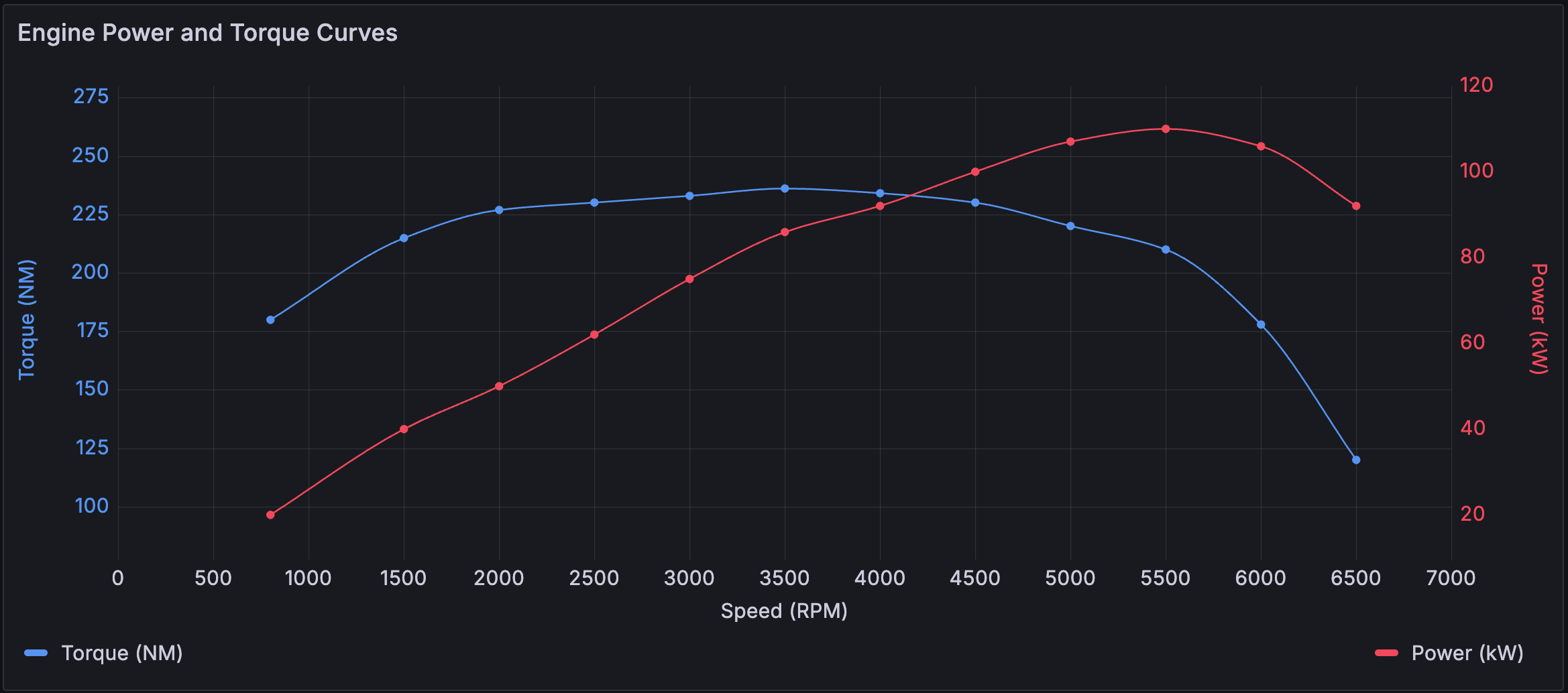
Trend visualizations should be used for datasets that have a sequential, numeric x-field that is not time. Some examples are function graphs, rpm/torque curves, supply/demand relationships, and elevation or heart rate plots along a race course (with x as distance or duration from start).
For example, you could represent engine power and torque versus speed where speed is plotted on the x-axis and power and torque are plotted on the y-axes:
Trend visualizations support all visual styles and options available in the time series visualization with these exceptions:
- No annotations or time regions
- No shared cursor/crosshair
- No multi-timezone x-axis
- No ability to change the dashboard time range using drag-selection
Configuration options
The following section describes the configuration options available in the panel editor pane for this visualization. These options are, as much as possible, ordered as they appear in Grafana.
Panel options
In the Panel options section of the panel editor pane, set basic options like panel title and description, as well as panel links. To learn more, refer to Configure panel options.
X axis options
In the X field option, select a field that contains increasing numeric values.
Tooltip options
Tooltip options control the information overlay that appears when you hover over data points in the visualization.
| Option | Description |
|---|---|
| Tooltip mode | When you hover your cursor over the visualization, Grafana can display tooltips. Choose how tooltips behave. |
| Values sort order | This option controls the order in which values are listed in a tooltip. |
| Hide zeros | When you set the Tooltip mode to All, the Hide zeros option is displayed. This option controls whether or not series with 0 values are shown in the list in the tooltip. |
| Hover proximity | Set the hover proximity (in pixels) to control how close the cursor must be to a data point to trigger the tooltip to display. |
| Max width | Set the maximum width of the tooltip box. |
| Max height | Set the maximum height of the tooltip box. The default is 600 pixels. |
Tooltip mode
When you hover your cursor over the visualization, Grafana can display tooltips. Choose how tooltips behave.
- Single - The hover tooltip shows only a single series, the one that you are hovering over on the visualization.
- All - The hover tooltip shows all series in the visualization. Grafana highlights the series that you are hovering over in bold in the series list in the tooltip.
- Hidden - Do not display the tooltip when you interact with the visualization.
Use an override to hide individual series from the tooltip.
Values sort order
When you set the Tooltip mode to All, the Values sort order option is displayed. This option controls the order in which values are listed in a tooltip. Choose from the following:
- None - Grafana automatically sorts the values displayed in a tooltip.
- Ascending - Values in the tooltip are listed from smallest to largest.
- Descending - Values in the tooltip are listed from largest to smallest.
Hover proximity
Set the hover proximity (in pixels) to control how close the cursor must be to a data point to trigger the tooltip to display. The following screen recording shows this option in a time series visualization:

Legend options
Legend options control the series names and statistics that appear under or to the right of the graph. For more information about the legend, refer to Configure a legend.
| Option | Description |
|---|---|
| Visibility | Toggle the switch to turn the legend on or off. |
| Mode | Use these settings to define how the legend appears in your visualization. List displays the legend as a list. This is a default display mode of the legend. Table displays the legend as a table. |
| Placement | Choose where to display the legend. Bottom places the legend below the graph. Right places the legend to the right of the graph. |
| Width | Control how wide the legend is when placed on the right side of the visualization. This option is only displayed if you set the legend placement to Right. |
| Values | Choose which of the standard calculations to show in the legend. You can have more than one. |
Graph styles options
The options under the Graph styles section let you control the general appearance of the graph, excluding color.
| Option | Description |
|---|---|
| Style | Choose whether to display your time-series data as Lines, Bars, or Points. |
| Line interpolation | Choose how the graph interpolates the series line. |
| Line width | Set the thickness of the series lines or the outline for bars using the Line width slider. |
| Fill opacity | Set the series area fill color using the Fill opacity slider. |
| Gradient mode | Choose a gradient mode to control the gradient fill, which is based on the series color. |
| Line style | Choose a solid, dashed, or dotted line style. |
| Connect null values | Choose how null values, which are gaps in the data, appear on the graph. |
| Disconnect values | Choose whether to set a threshold above which values in the data should be disconnected. |
| Show points | Set whether to show data points to lines or bars. |
| Point size | Set the size of the points, from 1 to 40 pixels in diameter. |
| Stack series | Set whether Grafana displays series on top of each other. |
| Bar alignment | Set the position of the bar relative to a data point. |
| Bar width factor | Set the width of the bar relative to minimum space between data points. A factor of 0.5 means that the bars take up half of the available space between data points. A factor of 1.0 means that the bars take up all available space. |
Style
Choose whether to display your time-series data as Lines, Bars, or Points. You can use overrides to combine multiple styles in the same graph. Choose from the following:

Line interpolation
Choose how the graph interpolates the series line:
- Linear - Points are joined by straight lines.
- Smooth - Points are joined by curved lines that smooths transitions between points.
- Step before - The line is displayed as steps between points. Points are rendered at the end of the step.
- Step after - The line is displayed as steps between points. Points are rendered at the beginning of the step.

Gradient mode
Choose a gradient mode to control the gradient fill, which is based on the series color. To change the color, use the standard color scheme field option. For more information, refer to Color scheme.
- None - No gradient fill. This is the default setting.
- Opacity - An opacity gradient where the opacity of the fill increases as y-axis values increase.
- Hue - A subtle gradient that’s based on the hue of the series color.
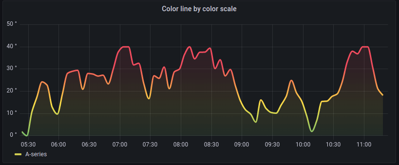
- Scheme - A color gradient defined by your Color scheme. This setting is used for the fill area and line. For more information about scheme, refer to Scheme gradient mode.
Gradient appearance is influenced by the Fill opacity setting. The following image shows the Fill opacity set to 50.

Scheme gradient mode
In Scheme gradient mode, the line or bar receives a gradient color defined from the selected Color scheme option in the visualization’s Standard options.
The following image shows a line chart with the Green-Yellow-Red (by value) color scheme option selected:
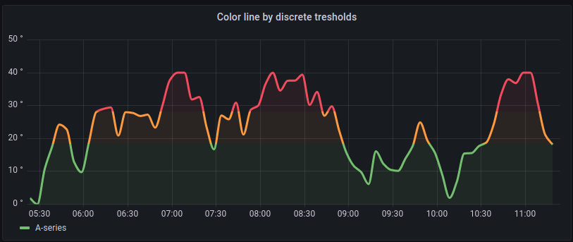
If the Color scheme is set to From thresholds (by value) and Gradient mode is set to Scheme, then the line or bar color changes as it crosses the defined thresholds:
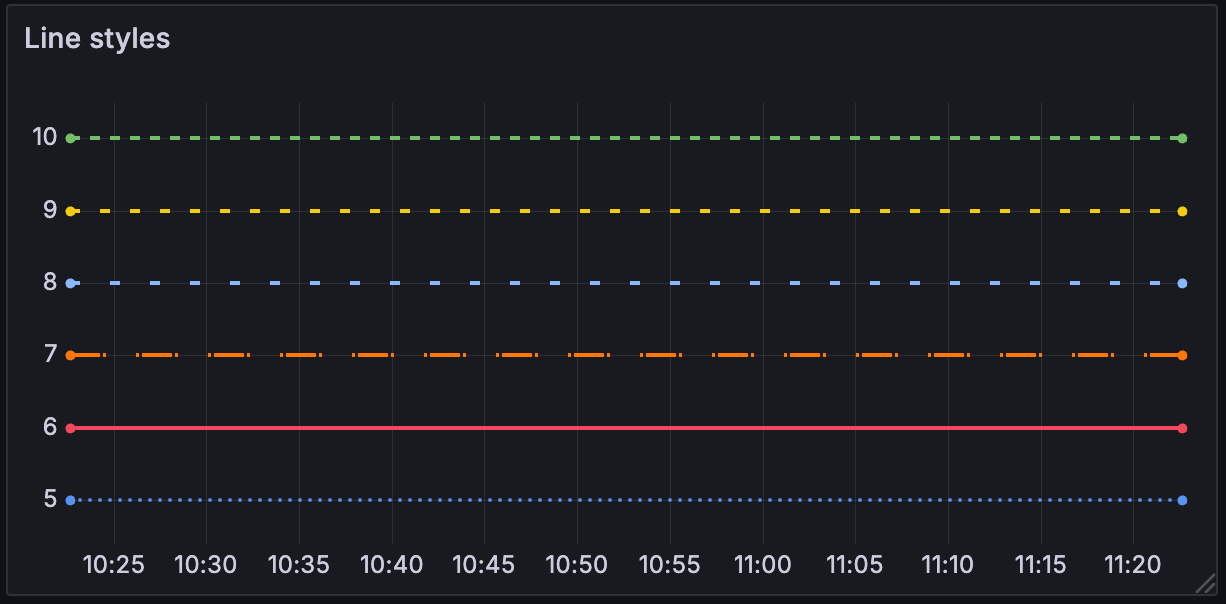
Line style
Choose a solid, dashed, or dotted line style:
- Solid - Display a solid line. This is the default setting.
- Dash - Display a dashed line. When you choose this option, a list appears for you to select the length and gap (length, gap) for the line dashes. Dash spacing is 10, 10 by default.
- Dots - Display dotted lines. When you choose this option, a list appears for you to select the gap (length = 0, gap) for the dot spacing. Dot spacing is 0, 10 by default.
Connect null values
Choose how null values, which are gaps in the data, appear on the graph. Null values can be connected to form a continuous line or set to a threshold above which gaps in the data are no longer connected.
- Never - Time series data points with gaps in the data are never connected.
- Always - Time series data points with gaps in the data are always connected.
- Threshold - Specify a threshold above which gaps in the data are no longer connected. This can be useful when the connected gaps in the data are of a known size and/or within a known range, and gaps outside this range should no longer be connected.
Disconnect values
Choose whether to set a threshold above which values in the data should be disconnected.
- Never - Time series data points in the data are never disconnected.
- Threshold - Specify a threshold above which values in the data are disconnected. This can be useful when desired values in the data are of a known size and/or within a known range, and values outside this range should no longer be connected.
To change the color, use the standard color scheme field option.
Show points
Set whether to show data points as lines or bars. Choose from the following:
- Auto - Grafana determines a point’s visibility based on the density of the data. If the density is low, then points appear.
- Always - Show the points regardless of how dense the dataset is.
- Never - Don’t show points.
Stack series
Set whether Grafana stacks or displays series on top of each other. Be cautious when using stacking because it can create misleading graphs. To read more about why stacking might not be the best approach, refer to The issue with stacking. Choose from the following:
- Off - Turns off series stacking. When Off, all series share the same space in the visualization.
- Normal - Stacks series on top of each other.
- 100% - Stack by percentage where all series add up to 100%.
Stack series in groups
The stacking group option is only available as an override. For more information about creating an override, refer to Configure field overrides.
Edit the panel and click Overrides.
Create a field override for the Stack series option.
In stacking mode, click Normal.
Name the stacking group in which you want the series to appear.
The stacking group name option is only available when you create an override.
Bar alignment
Set the position of the bar relative to a data point. In the examples below, Show points is set to Always which makes it easier to see the difference this setting makes. The points don’t change, but the bars change in relationship to the points. Choose from the following:
- Before
![Bar alignment before icon]() The bar is drawn before the point. The point is placed on the trailing corner of the bar.
The bar is drawn before the point. The point is placed on the trailing corner of the bar. - Center
![Bar alignment center icon]() The bar is drawn around the point. The point is placed in the center of the bar. This is the default.
The bar is drawn around the point. The point is placed in the center of the bar. This is the default. - After
![Bar alignment after icon]() The bar is drawn after the point. The point is placed on the leading corner of the bar.
The bar is drawn after the point. The point is placed on the leading corner of the bar.
 The bar is drawn before the point. The point is placed on the trailing corner of the bar.
 The bar is drawn around the point. The point is placed in the center of the bar. This is the default.
 The bar is drawn after the point. The point is placed on the leading corner of the bar.
Axis options
Options under the Axis section control how the x- and y-axes are rendered. Some options don’t take effect until you click outside of the field option box you’re editing. You can also press Enter.
| Option | Description |
|---|---|
| Placement | Select the placement of the y-axis. Choose from: Auto, Left, Right, and Hidden. |
| Label | Set a y-axis text label. If you have more than one y-axis, then you can assign different labels using an override. |
| Width | Set a fixed width for the axis. By default, Grafana dynamically calculates the width of an axis. |
| Show grid lines | Set the axis grid line visibility. Choose from: Auto, On, and Off. |
| Color | Set the color of the axis. Choose from:
|
| Show border | Set the axis border visibility. |
| Scale | Set the y-axis values scale. Choose from: Linear, Logarithmic, and Symlog. |
| Centered zero | Set the y-axis so it’s centered on zero. Applies to the Linear or Symlog scale options. |
| Soft min | Set a soft min to better control the y-axis limits. |
| Soft max | Set a soft max to better control the y-axis limits. |
Placement
Select the placement of the y-axis. Choose from the following:
- Auto - Automatically assigns the y-axis to the series. When there are two or more series with different units, Grafana assigns the left axis to the first unit and the right axis to the units that follow.
- Left - Display all y-axes on the left side.
- Right - Display all y-axes on the right side.
- Hidden - Hide all axes. To selectively hide axes, Add a field override that targets specific fields.
Scale
Set the y-axis values scale. Choose from:
- Linear - Divides the scale into equal parts.
- Logarithmic - Use a logarithmic scale. If you select this option, in the Log base list, choose a binary (base 2) or common (base 10) logarithmic scale.
- Symlog - Use a symmetrical logarithmic scale. If you select this option, choose also:
- Log base - Select a binary (base 2) or common (base 10) logarithmic scale.
- Linear threshold - Set the threshold at which the scale changes from linear to logarithmic.
Soft min and soft max
Set a Soft min or soft max option for better control of y-axis limits. By default, Grafana sets the range for the y-axis automatically based on the dataset.
Soft min and soft max settings can prevent small variations in the data from being magnified when it’s mostly flat. In contrast, hard min and max values help prevent obscuring useful detail in the data by clipping intermittent spikes past a specific point.
To define hard limits of the y-axis, set standard min/max options. For more information, refer to Configure standard options. The following examples shows how this option works in a time series visualization:

Standard options
Standard options in the panel editor pane let you change how field data is displayed in your visualizations. When you set a standard option, the change is applied to all fields or series. For more granular control over the display of fields, refer to Configure overrides.
| Option | Description |
|---|---|
| Unit | Choose which unit a field should use. |
| Min/Max | Set the minimum and maximum values used in percentage threshold calculations or leave these field empty for them to be calculated automatically. |
| Field min/max | Enable Field min/max to have Grafana calculate the min or max of each field individually, based on the minimum or maximum value of the field. |
| Decimals | Specify the number of decimals Grafana includes in the rendered value. |
| Display name | Set the display title of all fields. You can use variables in the field title. |
| Color scheme | Set single or multiple colors for your entire visualization. |
| No value | Enter what Grafana should display if the field value is empty or null. The default value is a hyphen (-). |
To learn more, refer to Configure standard options.
Data links and actions
Data links allow you to link to other panels, dashboards, and external resources and actions let you trigger basic, unauthenticated, API calls. In both cases, you can carry out these tasks while maintaining the context of the source panel.
For each data link, set the following options:
- Title
- URL
- Open in new tab
- One click - Opens the data link with a single click. Only one data link can have One click enabled at a time.
For each action, define the following API call settings:
| Option | Description |
|---|---|
| Title | A human-readable label for the action that’s displayed in the UI. |
| Confirmation message | A descriptive prompt to confirm or cancel the action. |
| Method | Select from POST, PUT, or GET. |
| URL | The request URL. To add a variable, click in the URL field and enter |
| Query parameters | Key and Value pairs. Click the + icon to add as many key/value pairs as you need. |
| Headers | Comprised of Key and Value pairs and a Content-Type. Click the + icon to add as many key/value pairs as you need. |
| Content-Type | Select from the following: application/json, text/plain, application/XML, and application/x-www-form-urlencoded. |
| Body | The body of the request. |
To learn more, refer to Configure data links and actions.
Value mappings
Value mapping is a technique you can use to change how data appears in a visualization.
For each value mapping, set the following options:
- Condition - Choose what’s mapped to the display text and (optionally) color:
- Value - Specific values
- Range - Numerical ranges
- Regex - Regular expressions
- Special - Special values like
Null,NaN(not a number), or boolean values liketrueandfalse
- Display text
- Color (Optional)
- Icon (Canvas only)
To learn more, refer to Configure value mappings.
Thresholds
A threshold is a value or limit you set for a metric that’s reflected visually when it’s met or exceeded. Thresholds are one way you can conditionally style and color your visualizations based on query results.
For each threshold, set the following options:
| Option | Description |
|---|---|
| Value | Set the value for each threshold. |
| Thresholds mode | Choose from Absolute and Percentage. |
| Show thresholds | Choose from a variety of display options including not displaying thresholds at all. |
To learn more, refer to Configure thresholds.
Field overrides
Overrides allow you to customize visualization settings for specific fields or series. When you add an override rule, it targets a particular set of fields and lets you define multiple options for how that field is displayed.
Choose from the following override options:
| Option | Description |
|---|---|
| Fields with name | Select a field from the list of all available fields. |
| Field with name matching regex | Specify fields to override with a regular expression. |
| Fields with type | Select fields by type, such as string, numeric, or time. |
| Fields returned by query | Select all fields returned by a specific query, such as A, B, or C. |
| Fields with values | Select all fields returned by your defined reducer condition, such as Min, Max, Count, Total. |
To learn more, refer to Configure field overrides.
Was this page helpful?
Related resources from Grafana Labs


