Plugins 〉Scatter

Scatter

Scatter Panel for Grafana
![]()
![]()

At last - a simple yet usable and flexible X/Y scatter plot panel for Grafana with a reasonable amount of configuration options.

The graph panel, built into Grafana is without doubt the deluxe, Rolls-Royce of all Grafana panels. Unfortunately, it comes with some severe restrictions, specifically, it insists of 'time series' formatted data queries, where date (in increasing left-to-right order etc.) MUST be displayed along the X axis. Using the time series data format, Graph insists that the time dimension be returned as a UNIX timestamp, in a column called 'time'. If you data fits this, then look no further - the Graph panel is what you need.
If, however, your data does not meet these requirements - say, for example, you have a table formatted data set - you need something else.
If you have the time and expertise, there is the plotly panel. Based on the well known plotly graph plotting library, I'm sure this can support many, many X/Y chart formats, though it does come with a number of assumptions regarding the data formats it can process. The learning curve or plotly itself is pretty steep, so I set out to create this panel - scatter - to handle things more intuitively.
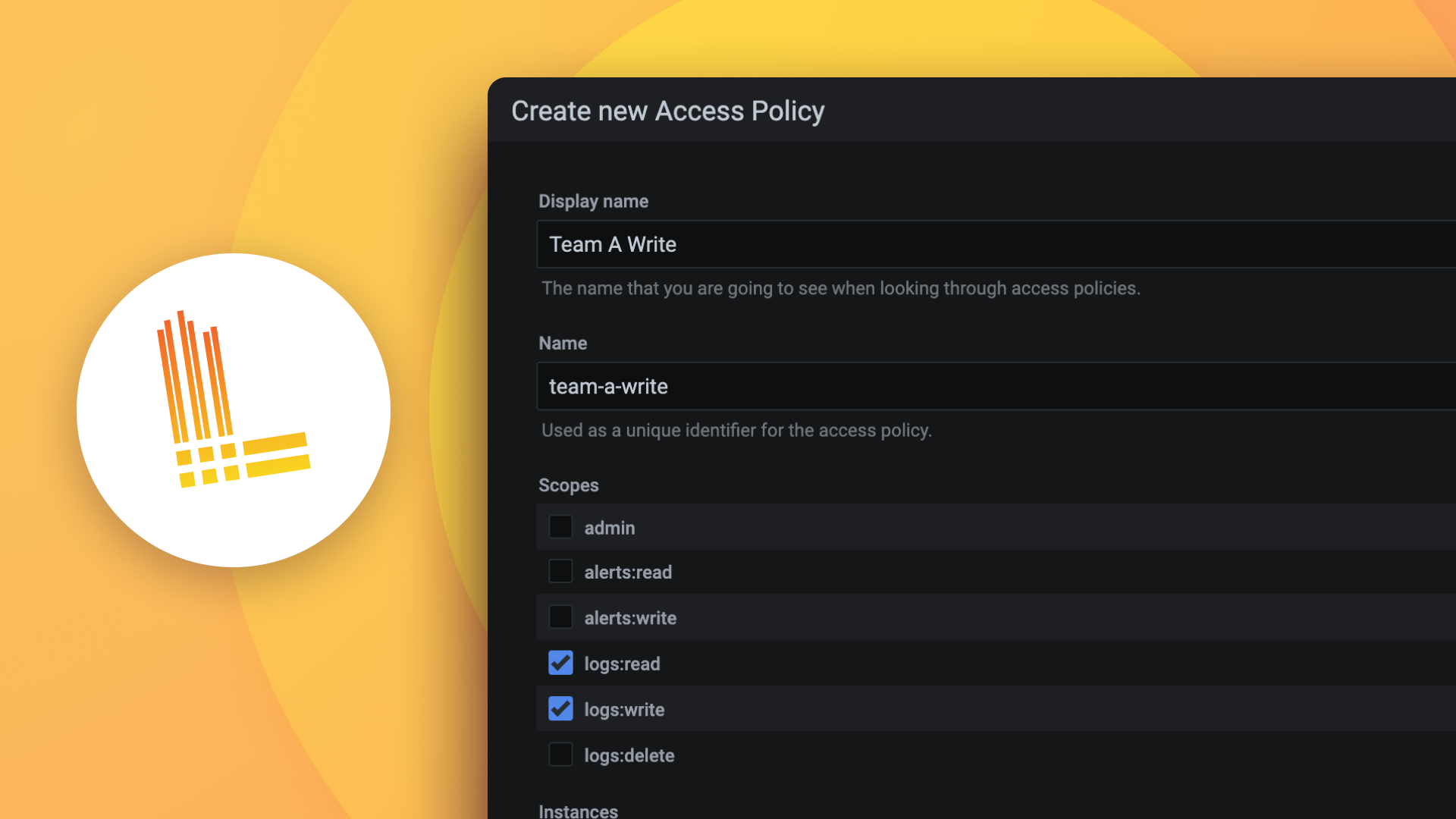
To start with, Scatter requires a table formatted data set with two or more numeric columns of data.
One of these can be assigned to the X axis, any other - or others - can be assigned to a series of Y axis values and the resulting data plotted as a series of dots. Each series can optionally also show a regression line using one of a number of statistical best fits. More on these lines later.
Getting started.
Everything starts with the data. In this case, a table-formatted Grafana data set with two or more columns of numerical values. Any values.
For this into, I'm using a simple SQL Server data source, querying a table of average child height vs age (the data appears to be real, but don't quote me on this). I have a table called HEIGHT with three fields, Age, Boys and Girls.
Like this:
| Age         Boys                   Girls            |
|-----------------------------------------------------|
| 5           109.696837335773       109.541676679828 |
| 6           115.627250312838       115.398119979595 |
| 7           121.114919518384       120.790683951776 |
| 8           126.285187093615       126.01172170753  |
| 9           131.262623167035       131.349152850971 |
| 10          136.187610423329       137.076855097059 |
| 11          141.221657358784       143.201525339874 |
| 12          146.950111196817       148.711637208893 |
| 13          153.627616043882       152.62642835968  |
| 14          159.89410578979        155.139181721546 |
| 15          164.419476461234       156.693073197084 |
| 16          167.282482716353       157.567921769527 |
| 17          169.036989740789       158.026194787039 |
| 18          170.077288053313       158.304537661364 |
| 19          170.835994392509       158.638268921939 |
The query itself couldn't be simpler - SELECT * FROM HEIGHT
Putting this in a dashboard, is pretty simple too.
First create a new (empty) dashboard, and press the Add Panel button.
By default, Grafana adds the built-in Graph panel with a timeseries records type selection.
Change the query to whatever you need (in my case, the 'SELECT * FROM HEIGHT' query), and switch over from timeseries to table format. The graph panel shows a message saying 'unable to graph data' and a button 'Switch to table view'.

If you're interested, click the button and review the table formatted data

Now switch the visualization over to the Scatter panel

That's all it takes. On first loading, the panel automatically configures itself, using the first column as the X axis and all the other columns as Y axis to display a basic X/Y scatter graph. Of course, any of these configuration options can be changed to suit your needs.
Configuration options
The scatter panel provides 4 custom configuration sections, in addition to the standard options that Grafana provides for all panels. XAxis, YAxis, Legend and Display. These should be pretty intuitive, nevertheless, I'll describe the highlights of each in turn.
X Axis configuration

The field selector dropdown allows the user to select the column that defines the X axis. In this case 'Age' is preselected by the autoconfiguration as this appears in the first (left most) column of the query.
The 'inverted' checkbox changes the X Axis display from the default left-to-right to right-to-left direction. I've found this useful when displaying data as 'days in the past '
By default, the graph panels auto range according to the data. Hence (in this case) the X axis ranges from 5 to 19. Values entered into the Min and/or Max extent fields override the automatic ranging.
The X Axis Title field - also pre-filled in by the automatic configuration routine can be changed, according to your wishes. The Size and colour-picker dot adjusts the size and colour of - duh - the X Axis title.
Y Axis configuration

This is very similar to the X Axis configuration setting, except that you can pick the number and order of each data set. The colour and dot size can be adjusted according to your preference. A line selector (defaulted to 'none') provides a number of best-fit regression lines, when needed. Note: The regression line feature is somewhat experimental - future versions of the panel are likely to change (enhance?) the way these lines work. (More on lines below)
The Min and Max extent and Title fields work just like the same fields in the X Axis configuration section. The Y Axis title has an additional switch for rotating the text, if needed.
Legend configuration
By default, legends are turned off.
Turning them on adds coloured labels to the top right of the panel like this:

When displayed, the user can click on these legend labels to select or deselect data sets, using the same logic as in the Grafana graph panel.
Display configuration
Finally, a catch-all section for the overall appearance. Specifically to adjust the underlying grid pattern colour (I like using the custom tab of the colour-picker to set opacity to 25% or so)

Also - if desired, the graph border colour and thickness can be changed with the border controls.
Regression lines
As hinted above, each of the Y Axis data sets can display a line in addition to the individual dots. A number of line types are available (this list subject to change in future version).

'Simple' regression line
This adds a simple join-the-dots line between each dot like so:

Note - the dots are joined in the order that they appear in the data query. This works best when the data has been pre-sorted by the query to match the X Axis values. If your lines appear as wild tangles, this means you need to pre-sort your data in your query (Currently, Grafana does not offer a sort-by query transformation, but future versions may add this)
'Linear' regression line
This adds a least-squares best-fit line, of the form 

'Exponential' regression line
This adds a statistical best-fit line, of the form 

Note - This particular data set - height vs age - does follow an exponential relationship, so the result, even if statistically the best fit, is not useful. your data might be different though.
'Power' regression line
This adds a statistical best-fit line, of the form 

Again, but particularly helpful with my test data set, but as they say - 'your mileage may vary'.
I'd like to add a regression for tending to an asymptote - something like  . This would be useful for cases like in my test data set as growth slows down after teenage years. This will have to wait for a future version of the panel. Watch this space.
Wish list
In future version, I plan to add a number of new features, such as these:
- Tool tips - showing regression coefficients, variants etc. (over lines), and non-numeric fields (over dots) etc.
- Error confidence areas - show best fit surrounded by shaded area of X standard errors (need to research this)
- Additional best-fit regression types
- anything else? - feel free to enter a feature request in the github issues page
Grafana Cloud Free
- Free tier: Limited to 3 users
- Paid plans: $55 / user / month above included usage
- Access to all Enterprise Plugins
- Fully managed service (not available to self-manage)
Self-hosted Grafana Enterprise
- Access to all Enterprise plugins
- All Grafana Enterprise features
- Self-manage on your own infrastructure
Install on Grafana Cloud
Plugins can be installed directly from within your Grafana instance or automated using the Cloud API or Terraform.
Learn more about plugin installationMarketplace plugins
This is a paid plugin developed by a marketplace partner. To purchase an entitlement, sign in first, then fill out the contact form.
Get this plugin
This is a paid for plugin developed by a marketplace partner. To purchase entitlement please fill out the contact us form.
What to expect:
- Grafana Labs will reach out to discuss your needs
- Payment will be taken by Grafana Labs
- Once purchased the plugin will be available for you to install (cloud) or a signed version will be provided (on-premise)
Thank you! We will be in touch.
For more information, visit the docs on plugin installation.
Installing on a local Grafana:
For local instances, plugins are installed and updated via a simple CLI command. Plugins are not updated automatically, however you will be notified when updates are available right within your Grafana.
1. Install the Panel
Use the grafana-cli tool to install Scatter from the commandline:
grafana-cli plugins install The plugin will be installed into your grafana plugins directory; the default is /var/lib/grafana/plugins. More information on the cli tool.
Alternatively, you can manually download the .zip file for your architecture below and unpack it into your grafana plugins directory.
Alternatively, you can manually download the .zip file and unpack it into your grafana plugins directory.
2. Add the Panel to a Dashboard
Installed panels are available immediately in the Dashboards section in your Grafana main menu, and can be added like any other core panel in Grafana.
To see a list of installed panels, click the Plugins item in the main menu. Both core panels and installed panels will appear.
Change Log
All notable changes to this project will be documented in this file.
v1.0.0
- Initial Release
v1.1.0
- Updates, bug fixes, and enhancements.
- Support for more regression types, log scales and optional label naming based on table data.
v1.2.0
- Add horizontal reference lines
- Support dot coloring override based on string field in data set.
