
SPC Chart


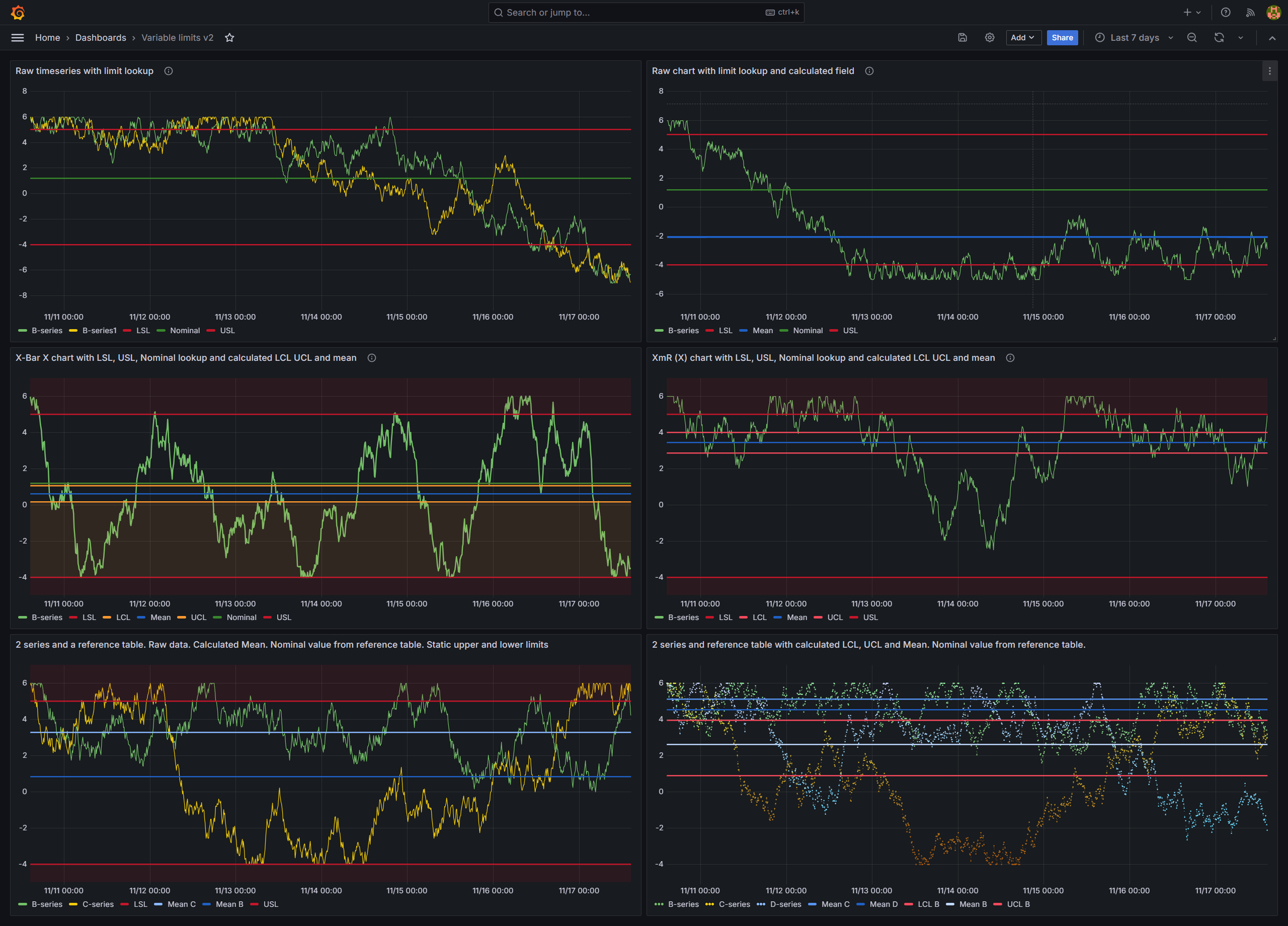
The SPC Chart panel automatically calculates and displays control limits for XmR, Xbar-R, and Xbar-S charts — so you can monitor process stability, detect special cause variation, and make data-driven decisions in real time.
Why SPC Chart?
Control charts are the foundation of statistical process control. They separate common cause variation (normal process behavior) from special cause variation (signals that something has changed). This plugin makes that analysis effortless:
- Automatic control limits — LCL, UCL, and Mean are calculated and displayed automatically based on the selected chart type
- Multiple chart types — XmR for individual measurements, Xbar-R for small subgroups, Xbar-S for larger subgroups
- Custom control lines — add Nominal, LSL, USL, or any custom reference line with static values or dynamic series lookup
- Fill regions — visually highlight zones between control lines to show acceptable process ranges
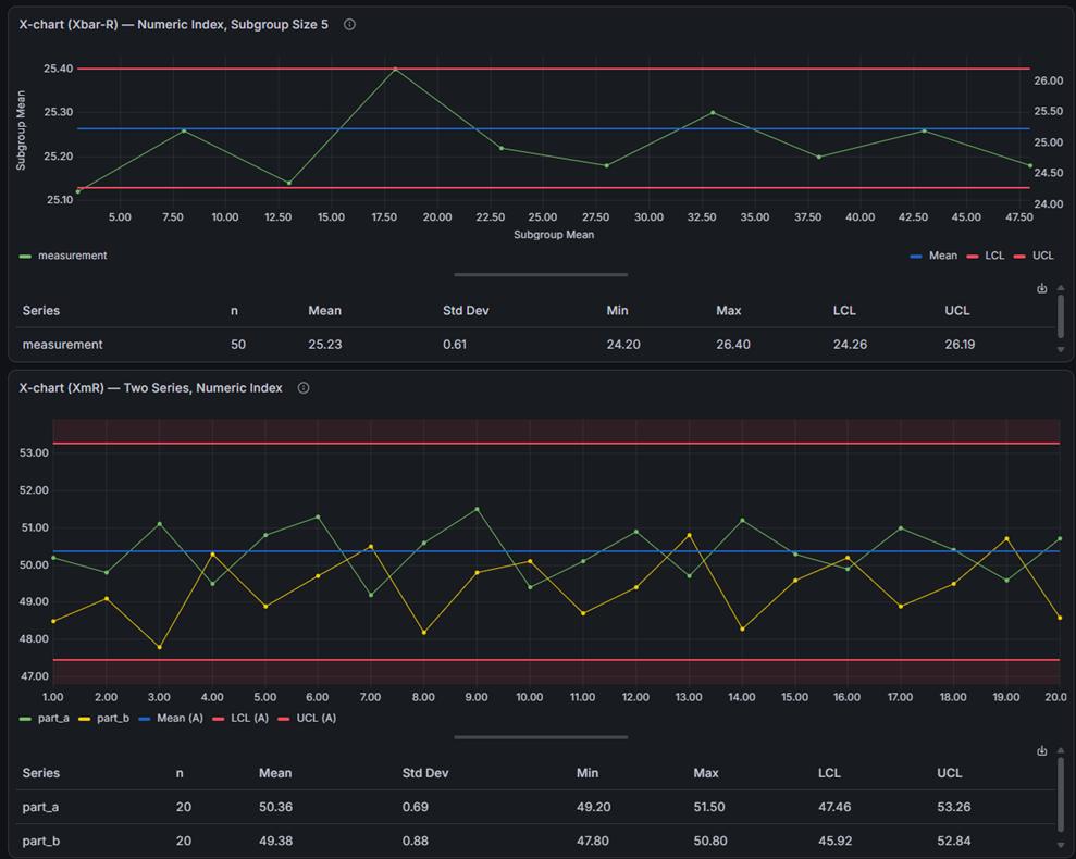
- Statistics table — an optional table below the chart summarizing each series: count, mean, standard deviation, min/max, control limits, and process capability (Cp, Cpk, Pp, Ppk)
Features
| Feature | Description |
|---|---|
| XmR charts | Individual (X) and Moving Range (mR) charts for single measurements |
| Xbar-R charts | Subgroup mean (X-bar) and Range (R) charts for small subgroups |
| Xbar-S charts | Subgroup mean (X-bar) and Standard Deviation (S) charts for larger subgroups |
| Automatic control limits | LCL, UCL, and Mean calculated from the data using standard SPC formulas |
| Custom control lines | Add Nominal, LSL, USL, or custom lines with static values or dynamic series lookup |
| Subgrouping | Group consecutive measurements into subgroups of size 2-25 |
| Aggregation | Aggregate raw data by moving range, range, mean, or standard deviation |
| Fill regions | Color-fill areas between control lines to highlight process zones |
| Alerting support | Grafana alerting integration with alert state annotations on the chart |
| Custom annotations | Create, edit, and delete annotations directly on the chart |
| Threshold visualization | Display alert thresholds alongside SPC control limits |
| Dashboard variables | Control subgroup size across multiple panels with a single subgroupSize variable |
| Feature queries | Mark queries as reference-only: consumed as control lines, excluded from SPC statistics |
| Variable limits | Draw a stepped specification limit from a reference query carrying one value per point |
| Statistics table | Optional summary table with per-series stats and process capability |
Statistics Table
Turn on Show statistics table in the panel options to display a summary table below the chart. For each series it shows the count, mean, standard deviation, min and max of your measurements, the control limits (LCL/UCL), and — when both a Lower and Upper Specification Limit are set — the process capability indices Cp, Cpk, Pp, and Ppk.
You choose which columns appear, and columns that don't apply are hidden automatically. To save the numbers, right-click the panel and choose "Download CSV". The table is off by default, so existing dashboards are unaffected until you enable it.
Use Cases
- Manufacturing quality — monitor process parameters and detect shifts before they produce defects
- IT operations — track response times, error rates, or throughput to distinguish real incidents from normal variation
- Laboratory analysis — control measurement systems and reagent performance over time
- Supply chain — monitor delivery times, fill rates, or inventory levels for process stability
- Healthcare — track clinical metrics and patient outcomes with statistical rigor
Requirements
- Grafana 11.6.10 or later
Getting Started
- Install the plugin from the Grafana Plugin Catalog
- Add a new panel and select SPC Chart as the visualization
- Configure a query that returns time series data (a time field and one or more numeric value fields)
- Select a Chart Type (XmR, Xbar-R, or Xbar-S) to automatically calculate control limits
The plugin comes with sample provisioned dashboards. Build and start the plugin to see them.
Documentation
For detailed documentation, configuration guides, and formula references, see the full documentation.
Part of the KensoBI SPC Suite
SPC Chart is part of a growing family of Statistical Process Control plugins for Grafana by Kenso Software:
SPC Histogram Panel — Distribution analysis with histograms, bell curves, and a built-in statistics table showing Cp, Cpk, Pp, and Ppk. Use it to understand process capability: is your process producing results within specification limits?
SPC Pareto Panel — Pareto analysis with automatic sorting, cumulative percentage lines, and 80/20 threshold highlighting. Use it to identify the vital few factors contributing to defects or issues.
SPC CAD Panel — Brings 3D geometry into the picture, letting you bind the data from control charts and histograms to physical features on your parts.
SPC Box Plot Panel — Box-and-whisker plots with built-in SPC. Automatically groups measurements into subgroups, computes quartiles and outliers, and overlays Xf-Rf control limits to detect shifts in both process location and spread.
SPC Bullet Panel — Compact bullet charts and progress bars with optional SPC metrics (Cpk, Cp, Ppk, Pp, Sigma Level) for dense KPI dashboards.
SPC Characteristic Datasource — The datasource that powers the SPC CAD panel. Connects to your measurement database (PostgreSQL or MSSQL), lets you select features and characteristics through a point-and-click interface, and returns SPC statistics, time series measurements, and forecast data — no SQL required.
Getting Help
If you have any questions or feedback, you can:
- Create an issue to report bugs, issues, and feature suggestions.
- Ask a question on the KensoBI Discord channel.
Your feedback is always welcome!
License
This software is distributed under the Apache License 2.0.
Plugin Insights
Quality scores for version 2.4.0
- Status: PassedSecurity
All checks passed
- Status: PassedMaintenance
All checks passed
- Status: PassedDocumentation
All checks passed
- Version
- 2.4.0
- Dependencies
- Grafana >=11.6.10
- Developer
- Kenso Software
- Last Updated
- September 10, 2026