
Grafana Gauge Panel





This panel plugin provides a D3-based gauge panel for Grafana 10.0+
Screenshots
Example gauges


Configuration Options
The React port has separated the configuration options into multiple searchable sections and added new features.
Standard Options

| Option | Description |
|---|---|
| Show Display Name on Gauge | Show the field or series name above the value on the gauge |
| Show Value on Gauge | Show the numeric value on the gauge |
| Show Tick Labels | Show numeric labels next to the major ticks |
| Stat | The statistic to be displayed on the gauge |
| Unit | A unit for the value displayed. This will be used to abbreviate as needed |
| Decimals | Maximum number of decimals to display if any are required |
Font Settings

| Option | Description |
|---|---|
| Display Name Font | Font used for the display name shown above the value |
| Display Name Font Size | Font size of the display name |
| Value Font | Font to be used on the value displayed |
| Value Font Size | Font size for the value displayed |
| Tick Label Font | Font to be used on the tick labels |
| Tick Label Font Size | Font size to be used for the tick labels |
Needle Options

| Option | Description |
|---|---|
| Animate Needle Transition | Enables needle animation between values |
| Transition Speed (MS) | When animation is enabled, set how fast the transition occurs |
| Allow Crossing Limits | Enable this to allow the needle to go below and above the limit |
| Needle Cross Limit Degrees | When crossing limits is enabled, this sets the degrees that can be exceeded |
| Needle Width | Specifies the width of the needle |
| Show End Marker | This will create a marker at the end of the needle of the specified shape |
| Show Start Marker | This will create a marker at the start of the needle of the specified shape |
When the option Allow Crossing Limits is enabled, the needle can exceed
the maximum or minimum limit by the specified degrees. The example below shows a gauge with a limit of 100,
and allows the needle to cross the limit (burying the needle).

Limits

| Option | Description |
|---|---|
| Minimum Value | Minimum Value allowed on the face |
| Maximum Value | Maximum Value allowed on the face |
| Wrap Values to Range | Wrap out-of-range values using modulo arithmetic (for compass) |
When you change the Minimum or Maximum Value, tick spacing is automatically recalculated if the new range would produce more than 100 ticks. If the current tick spacing is still within the limit, your settings are preserved. A warning icon appears on the gauge when the tick count is clamped, with a tooltip showing suggested spacing values.
Coloring

| Option | Description |
|---|---|
| Outer Edge | Color of the outer edge of the gauge |
| Inner (Face) | Color used on the face of the gauge (background of dial) |
| Pivot | Color of the pivot (center) |
| Needle | Color of the needle |
| Units Label | Color for label units when displayed |
| Tick Label | Color of values displayed near the tick major sections |
| Tick Major | Color of the major ticks (longer lines) |
| Tick Minor | Color of the minor ticks (shorter lines) |
Radial Customization
Note that many of these settings are very sensitive to the visualization since they are percentages of the radius. Adjust in small increments to see how they affect the gauge.

| Option | Description |
|---|---|
| Radius | Specifies size of gauge by radius. Value 0 will auto-scale to fit panel |
| Tickness Gauge Basis | Scaling for tick, a lower value will autoscale poorly |
| Pivot Radius | Size of the center pivot, as a percentage of radius |
| Value Y-Offset (Vertical) | Sets a vertical offset to better place the displayed metric |
| Display Name Y-Offset (Vertical) | Sets a vertical offset to better place the display name |
| Padding | Adds space between the ticks and outer edge |
| Edge Width | Thickness of the circle around the edge, as a percentage of radius |
| Tick Edge Gap | Spacing between ticks and the outer circle, as a percentage of radius |
| Tick Length Major | Length of the major ticks, as a percentage of the gauge radius |
| Tick Width Major | Width of the major ticks in pixels |
| Tick Length Minor | Length of the minor ticks, as a percentage of the gauge radius |
| Tick Width Minor | Width of the minor ticks in pixels |
| Needle Tick Gap | Spacing between ticks and needle end, as a percentage of gauge radius |
| Needle Length Stem | Length of the needle beyond the centre, as a percentage of gauge radius |
Gauge Degrees
This is the main section that is used to modify the displayed range on the gauge.

| Option | Description |
|---|---|
| Zero Tick Angle | Angle where the tick value (0) starts (default 60) |
| Max Tick Angle | Angle where the tick value ends (default 300) |
| Zero Needle Angle | Angle where needle is at minimum value (default 40) |
| Max Needle Angle | Angle where needle is at maximum value (default 320) |
Gauge Readings

| Option | Description |
|---|---|
| Tick Spacing Major | The numeric spacing of the major increment ticks (minimum 0.001) |
| Tick Spacing Minor | The numeric spacing of the minor increment ticks (minimum 0.001) |
| Format Tick Labels with Unit | Format tick labels using the configured unit and decimals |
When Format Tick Labels with Unit is enabled, tick labels are formatted using the unit configured in Standard options (e.g., "bytes/sec"). The unit suffix is shown on a second line below the value on the first tick, last tick, and any tick where the unit prefix changes (e.g., "KB/s" to "MB/s"). Middle ticks show only the number for clean alignment.
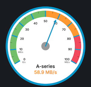
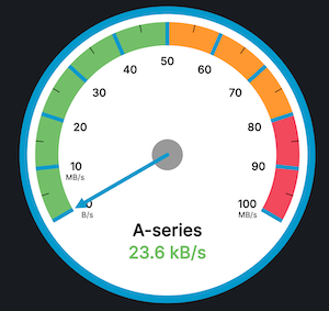
Fractional tick spacing is supported for both major and minor ticks. This is useful for gauges with narrow ranges where sub-integer precision is needed (e.g., a frequency gauge spanning 47-52 Hz with 0.1 Hz minor ticks). Minor ticks that overlap with major tick positions are automatically hidden.
Tick Maps

Use the Add Tick Map button to create a tick map.
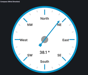
A tick map allows you to substitute text for a given value. Using this option a compass style gauge can be constructed.
| Option | Description |
|---|---|
| Label | Sets the name of the Tick Map |
| Value | Tick value where the text will be placed |
| Text | Text to be displayed |
Thresholds
Thresholds operate in the same manner as other Grafana plugins.
Dynamic thresholds are supported via Grafana's Config from query results transformation. When thresholds are set dynamically from query data, they take precedence over the static thresholds configured in the panel editor.
There are additional display options detailed below.

| Option | Description |
|---|---|
| Show Threshold Band On Gauge | Thresholds are displayed as a band on face of gauge along the needle arc |
| Show Lower Range | Lower threshold is displayed on band |
| Show Middle Range | Middle thresholds are displayed on band |
| Show Upper Range | Upper threshold is displayed on band |
| Show Threshold State on Background | Gauge face color changes to state of threshold |
| Show Threshold State on Value | Displayed value color changes to state of threshold |
| Show Threshold State on Title | Displayed title color changes to state of threshold |
When the middle and upper threshold option are selected, the gauge will look similar to this:

The state of the threshold can be displayed as the background color of the gauge.

The state of the threshold can be displayed on the value of the gauge.

Value Mappings
Value Mappings works the same as other Grafana plugins. This allows displaying alternative text instead of the value based on ranges or regular expressions.
Primarily this is used for N/A for null data, but can be used to indicate a state.
Ex: For a temperature gauge, a value below 0 could be harmful, or a value above 100 could be harmful to a device. A value mapping could be used to display this as an urgent message, or simply indicate a "nominal" reading.

Features
Data operator same as SingleStat panel (avg, sum, current, etc)
Unit formats same as SingleStat
Customizable Font size and type for value displayed and ticks
Animated needle transition (elastic or quadin)
Adjustable Limits
All possible color options for gauge components
Customizable gauge component sizes (needle length, width, tick length, etc)
Threshold colors displayed on gauge
Threshold can modify displayed value and background
Needle animation speed is configurable
Arbitrary degree gauges now supported (default is from 60 to 320)
Value text on gauge can now be moved up/down as needed
Contributing
All contributions are welcome! See the CONTRIBUTING.md doc for more information.
Acknowledgements
This panel is based on the "SingleStat" panel by Grafana, along with large portions of these excellent D3 examples:
- https://oliverbinns.com/articles/D3js-gauge/
- http://bl.ocks.org/tomerd/1499279
- http://bl.ocks.org/dustinlarimer/5888271 Markers!
Contributors
 Brian Gann 💻 📖 🚧 |
 Clinton Judy 💻 |
 Dan Cech 💻 |
 Jasper Hafkenscheid 💻 |
 Ole Martin Ruud 💻 |
Grafana Cloud
Connect any plugin in Grafana Cloud.
- 150+ data source integrations
- Grafana Assistant - AI that correlates your data, builds queries, and answers questions
- 10k Prometheus metrics + 50 GB logs, traces, and profiles on the free tier
- ...and more
Insights
- Adoption
Running on 45,236 active Grafana instances.
- Activity
Last updated 22 Apr 2026.
1 release in the past year.
- Version
- 2.2.0
- Dependencies
- Grafana >=10.0.0
- Developer
- Brian Gann
Grafana Cloud
Connect any plugin in Grafana Cloud.
- 150+ data source integrations
- Grafana Assistant - AI that correlates your data, builds queries, and answers questions
- 10k Prometheus metrics + 50 GB logs, traces, and profiles on the free tier
- ...and more