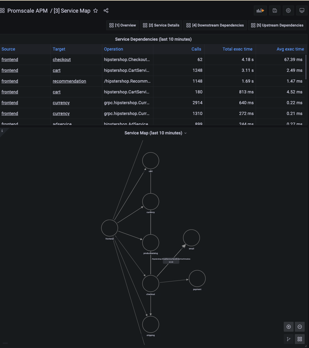
3 - APM Service Map
This map shows all services sending traces and the interactions between them. Each arrow represents a service calling a specific operation in another service. The legend in the arrows includes the requests per second for that interaction. If you are downsampling your traces before sending them to Promscale, then the number of requests per second will not be accurate but you'll be able to see how it compares to other operations.
APM Overview dashboard offered by Promscale on top of traces by leveraging SQL and TimescaleDB capabilities.
This dashboard contains service dependencies for the last 10 mins:
- Service Dependencies describing Source, Target services, Operation, Number of Calls, Total Execution time, and Average Execution time.
- Service Map represents the nodes and edges here nodes are services and edges are connections between the services and the total number of calls between services.
Data source config
Collector type:
Collector plugins:
Collector config:
Dashboard revisions
Upload an updated version of an exported dashboard.json file from Grafana
| Revision | Decscription | Created | |
|---|---|---|---|
| Download |
Sign up for Grafana Cloud

Get up and running in minutes with the Grafana Cloud free tier, which includes free forever 10k metrics, 50GB logs, 50GB traces, 500 VUh, and more.
Get this dashboard
Data source:
Dependencies: