
Important: This documentation is about an older version. It's relevant only to the release noted, many of the features and functions have been updated or replaced. Please view the current version.
Singlestat Panel
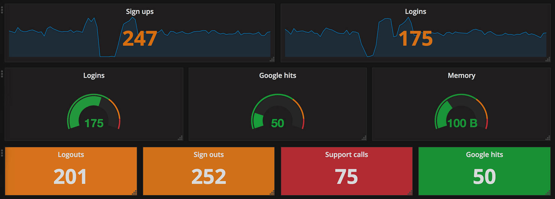
The Singlestat Panel allows you to show the one main summary stat of a SINGLE series. It reduces the series into a single number (by looking at the max, min, average, or sum of values in the series). Singlestat also provides thresholds to color the stat or the Panel background. It can also translate the single number into a text value, and show a sparkline summary of the series.
Singlestat Panel Configuration
The singlestat panel has a normal query editor to allow you define your exact metric queries like many other Panels. In the Options tab, you can access the Singlestat-specific functionality.
- Stats: The Stats field let you set the function (min, max, average, current, total, first, delta, range) that your entire query is reduced into a single value with. This reduces the entire query into a single summary value that is displayed.
- min - The smallest value in the series
- max - The largest value in the series
- avg - The average of all the non-null values in the series
- current - The last value in the series. If the series ends on null the previous value will be used.
- total - The sum of all the non-null values in the series
- first - The first value in the series
- delta - The total incremental increase (of a counter) in the series. An attempt is made to account for counter resets, but this will only be accurate for single instance metrics. Used to show total counter increase in time series.
- diff - The difference between ‘current’ (last value) and ‘first’.
- range - The difference between ‘min’ and ‘max’. Useful the show the range of change for a gauge.
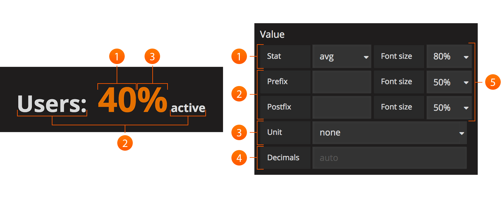
- Prefix/Postfix: The Prefix/Postfix fields let you define a custom label to appear before/after the value. The
$__namevariable can be used here to use the series name or alias from the metric query. - Units: Units are appended to the the Singlestat within the panel, and will respect the color and threshold settings for the value.
- Decimals: The Decimal field allows you to override the automatic decimal precision, and set it explicitly.
- Font Size: You can use this section to select the font size of the different texts in the Singlestat Panel, i.e. prefix, value and postfix.
Coloring
The coloring options of the Singlestat Panel config allow you to dynamically change the colors based on the Singlestat value.
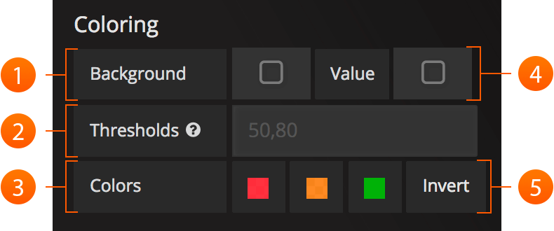
- Background: This checkbox applies the configured thresholds and colors to the entirety of the Singlestat Panel background.
- Thresholds: Change the background and value colors dynamically within the panel, depending on the Singlestat value. The threshold field accepts 2 comma-separated values which represent 3 ranges that correspond to the three colors directly to the right. For example: if the thresholds are 70, 90 then the first color represents < 70, the second color represents between 70 and 90 and the third color represents > 90.
- Colors: Select a color and opacity
- Value: This checkbox applies the configured thresholds and colors to the summary stat.
- Invert order: This link toggles the threshold color order.For example: Green, Orange, Red (
 ) will become Red, Orange, Green (
 ).
).
Spark Lines
Sparklines are a great way of seeing the historical data related to the summary stat, providing valuable context at a glance. Sparklines act differently than traditional Graph Panels and do not include x or y axis, coordinates, a legend, or ability to interact with the graph.
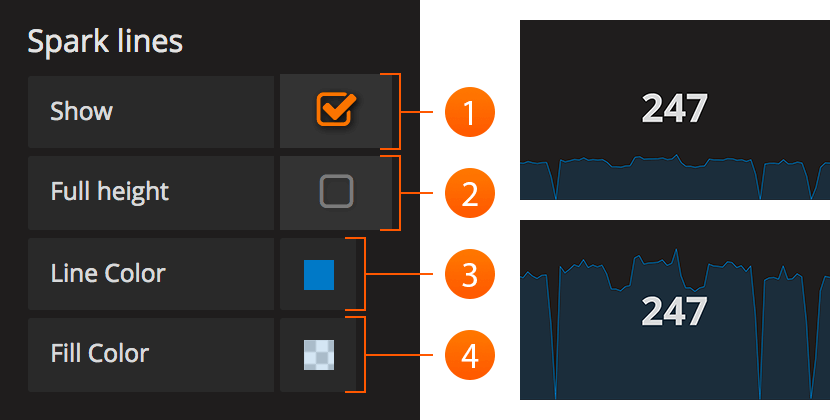
- Show: The show checkbox will toggle whether the spark line is shown in the Panel. When unselected, only the Singlestat value will appear.
- Full Height: Check if you want the sparklines to take up the full panel height, or uncheck if they should be below the main Singlestat value.
- Line Color: This color selection applies to the color of the sparkline itself.
- Fill Color: This color selection applies to the area below the sparkline.
Pro-tip: Reduce the opacity on fill colors for nice looking panels.
Gauge
Gauges gives a clear picture of how high a value is in it’s context. It’s a great way to see if a value is close to the thresholds. The gauge uses the colors set in the color options.
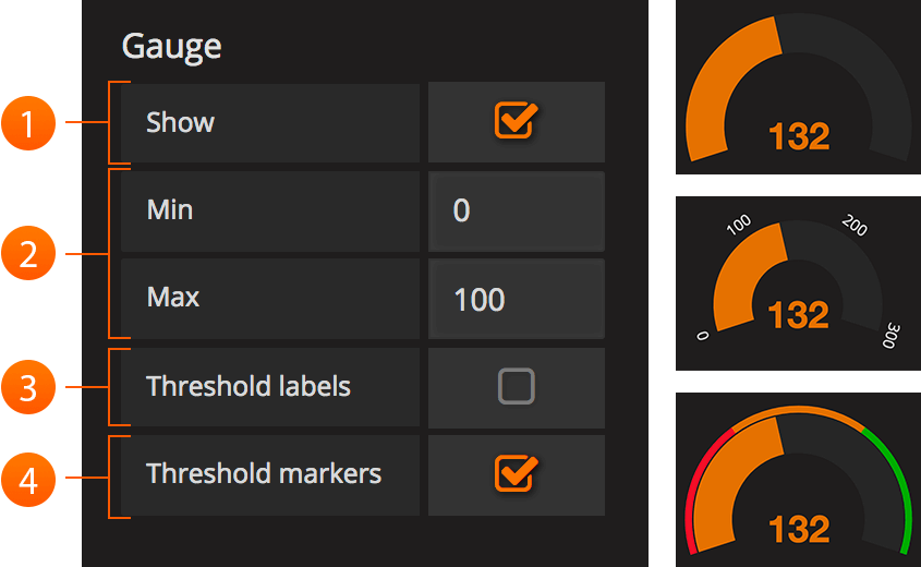
- Show: The show checkbox will toggle whether the gauge is shown in the panel. When unselected, only the Singlestat value will appear.
- Min/Max: This sets the start and end point for the gauge.
- Threshold Labels: Check if you want to show the threshold labels. Thresholds are set in the color options.
- Threshold Markers: Check if you want to have a second meter showing the thresholds.
Value/Range to text mapping
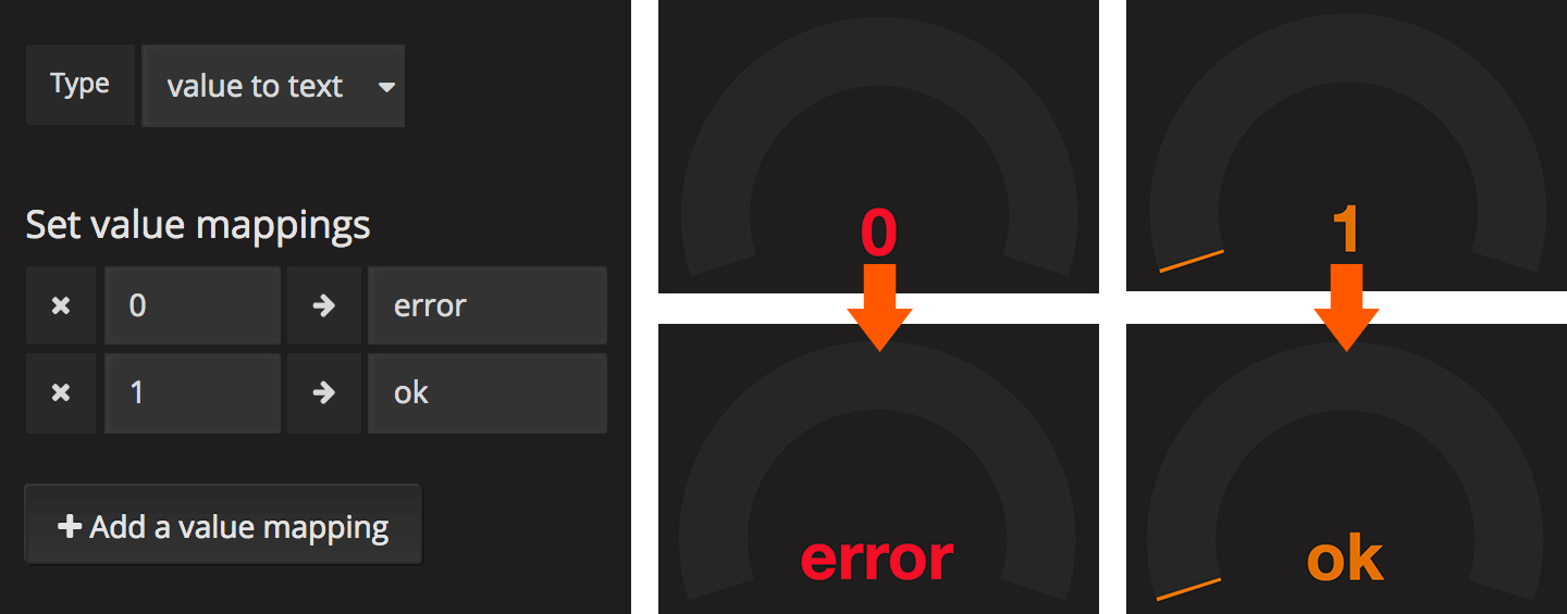
Value/Range to text mapping allows you to translate the value of the summary stat into explicit text. The text will respect all styling, thresholds and customization defined for the value. This can be useful to translate the number of the main Singlestat value into a context-specific human-readable word or message.
Troubleshooting
Multiple Series Error
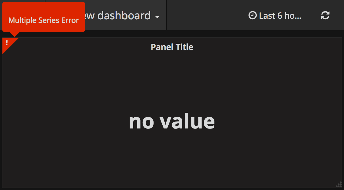
Grafana 2.5 introduced stricter checking for multiple-series on singlestat panels. In previous versions, the panel logic did not verify that only a single series was used, and instead, displayed the first series encountered. Depending on your data source, this could have lead to inconsistent data being shown and/or a general confusion about which metric was being displayed.
To fix your singlestat panel:
Edit your panel by clicking the Panel Title and selecting Edit.
Do you have multiple queries in the metrics tab?
- Solution: Select a single query to visualize. You can toggle whether a query is visualized by clicking the eye icon on each line. If the error persists, continue to the next solution.
Do you have one query?
- Solution: This likely means your query is returning multiple series. You will want to reduce this down to a single series. This can be accomplished in many ways, depending on your data source. Some common practices include summing the series, averaging or any number of other functions. Consult the documentation for your data source for additional information.
Was this page helpful?
Related resources from Grafana Labs


