Important: This documentation is about an older version. It's relevant only to the release noted, many of the features and functions have been updated or replaced. Please view the current version.
Flamegraphs: Visualizing performance data
A fundamental aspect of continuous profiling is the flamegraph, a convenient way to visualize performance data. These graphs provide a clear, intuitive understanding of resource allocation and bottlenecks within the application. Pyroscope extends this functionality with additional visualization formats like tree graphs and top lists.
How is a flamegraph created?
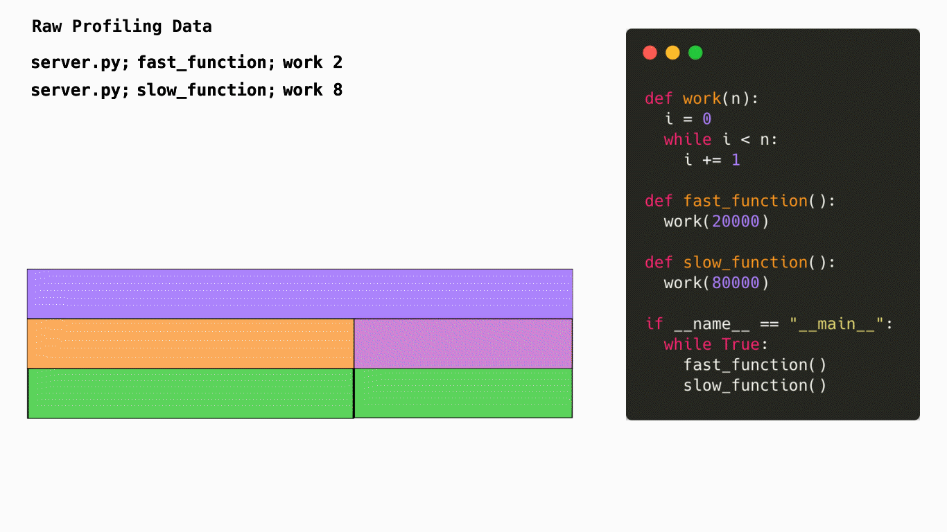
This diagram shows how code is turned into a flamegraph. In this case Pyroscope would sample the stacktrace of your application to understand how many CPU cycles are being spent in each function. It would then aggregate this data and turn it into a flamegraph. This is a very simplified example but it gives you an idea of how Pyroscope works.
What does a flamegraph represent?
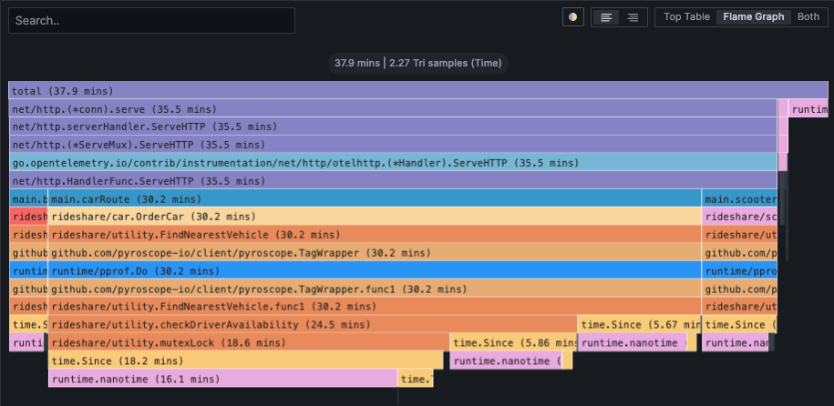
Horizontally, the flamegraph represents 100% of the time that this application was running. The width of each node represents the amount of time spent in that function. The wider the node, the more time spent in that function. The narrower the node, the less time spent in that function.
Vertically, the nodes in the flamegraph represent the heirarchy of which functions were called and how much time was spent in each function. The top node is the root node and represents the total amount of time spent in the application. The nodes below it represent the functions that were called and how much time was spent in each function. The nodes below those represent the functions that were called from those functions and how much time was spent in each function. This continues until you reach the bottom of the flamegraph.
This is a CPU profile, but profiles can represent many other types of resource such as memory, network, disk, etc.