Important: This documentation is about an older version. It's relevant only to the release noted, many of the features and functions have been updated or replaced. Please view the current version.
Use the Pyroscope UI to explore profiling data
Pyroscope’s UI is designed to make it easy to visualize and analyze profiling data. There are several different modes for viewing, analyzing, uploading, and comparing profiling data.
While code profiling has been a long-standing practice, continuous profiling represents a modern and more advanced approach to performance monitoring. This technique adds two critical dimensions to traditional profiles:
- Time
- Profiling data is collected continuously, providing a time-centric view that allows querying performance data from any point in the past.
- Metadata
- Profiles are enriched with metadata, adding contextual depth to the performance data.
These dimensions, coupled with the detailed nature of performance profiles, make continuous profiling a uniquely valuable tool. Pyroscope’s UI enhances this further by offering a convenient platform to analyze profiles and get insights that are impossible to get from using other traditional signals like logs, metrics, or tracing.
In this UI reference, you’ll learn how Pyroscope parallels these other modern observability tools by providing a Prometheus-like querying experience. More importantly, you’ll learn how to use Pyroscope’s extensive UI features for a deeper insight into your application’s performance.
Key features of the Pyroscope UI
The following sections describe Pyroscope UI capabilities.
Tag Explorer
The Tag Explorer page is a vital part of Pyroscope’s UI, allowing users to navigate and analyze performance data through tags/labels. This feature is crucial for identifying performance anomalies and understanding the behavior of different application segments under various conditions. We intentionally don’t include a query language on this page as we built this page to be as intuitive as possible for users to use the UI to navigate and drill down into which tags are most interesting to them.
To use the Tag Explorer:
- Select a tag to view the corresponding profiling data
- Analyze the pie chart and the table of descriptive statistics to determine which tags if any are behaving abnormally
- Select a tag to view the corresponding profiling data
- Make use of the shortcuts to the single, comparison, and diff pages to further identify the root cause of the performance issue
![tag-explorer-page]()
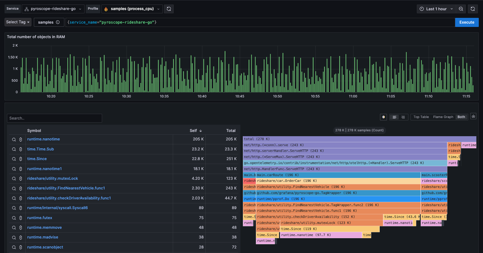
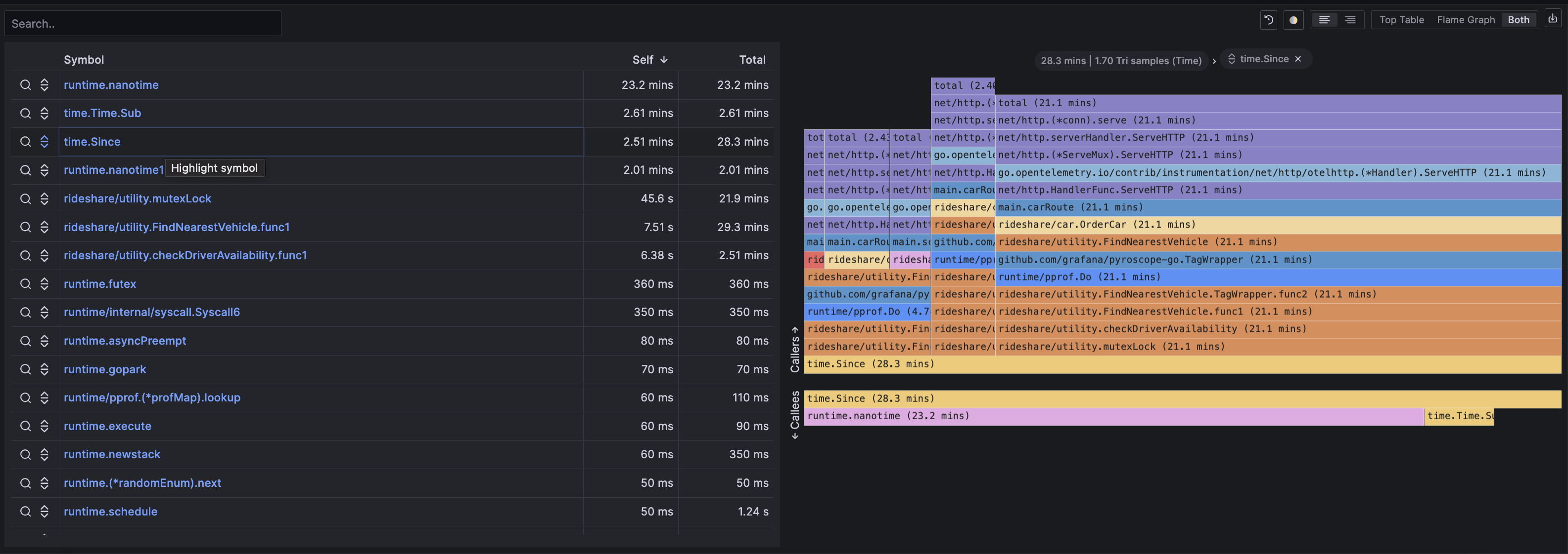
Single view
The Single View page in Pyroscope’s UI is built for in-depth profile analysis. Here, you can explore a single flamegraph with multiple viewing options and functionalities:
- Table view
- Breaks down the profiling data into a sortable table format.
- Sandwich view
- Displays both the callers and callees for a selected function, offering a comprehensive view of function interactions.
- Flamegraph view
- Visualizes profiling data in a flamegraph format, allowing easy identification of resource-intensive functions.
- Export & share
- Options to export the flamegraph for offline analysis or share it via a flamegraph.com link for collaborative review.
The screenshot above shows a spike in CPU usage. Without profiling, we would go from a memory spike to digging through code or guessing what the cause of it is. However, with profiling, you can use the flamegraph and table to see exactly which function is most responsible for the spike. Often this will show up as a single node taking up a noticeably disproportionate width in the flamegraph as seen below with the “checkDriverAvailability” function.
However, in some instances it may be a function that is called many times and is taking up a large amount of space in the flamegraph. In this case, you can use the sandwich view to see that a logging function called throughout many functions in the codebase is the culprit.
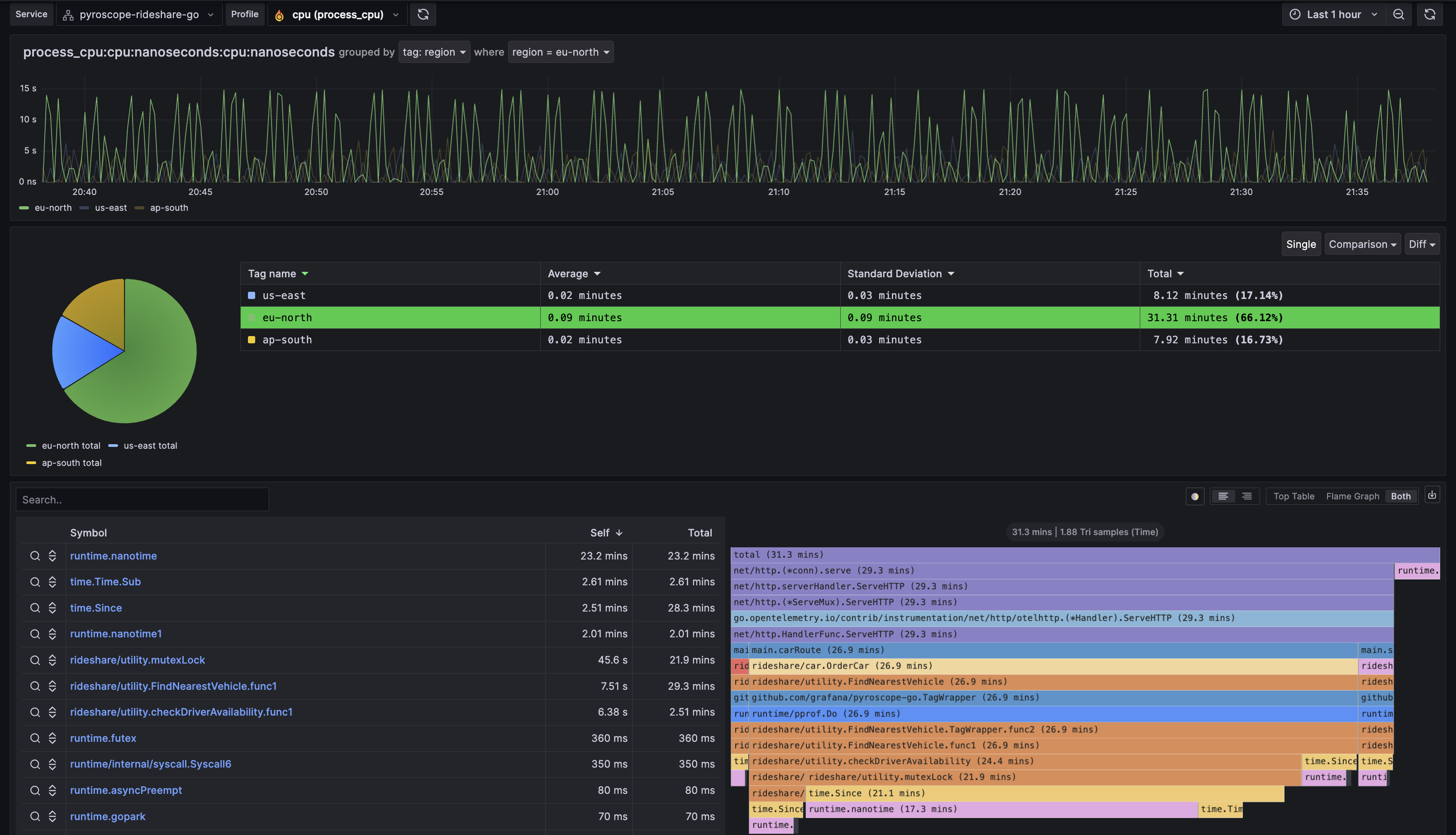
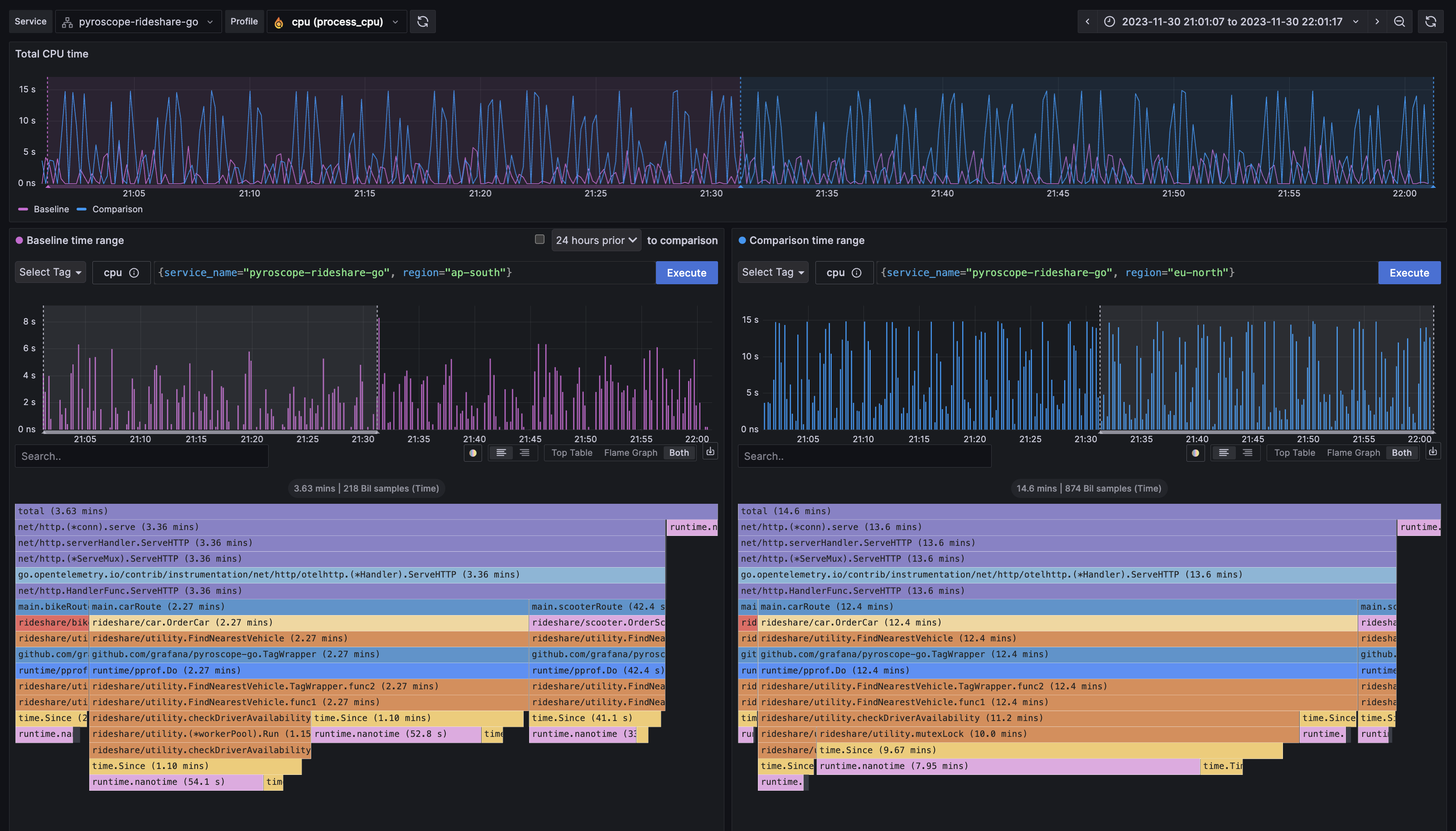
Comparison page
The Comparison page facilitates side-by-side comparison of profiles either based on different label sets, different time periods, or both. This feature is extremely valuable for understanding the impact of changes or differences between do distinct queries of your application.
To run a comparison:
- Select two different sets of labels (for exmaple,
env:productionvs.env:development) and or time periods, reflected by the sub-timelines above each flamegraph. - View the resulting flamegraphs side by side to identify disparities in performance.
There are many practical use cases for comparison for companies using Pyroscope.
Some examples of labels below expressed as label:value are:
- Feature flags
- Compare application performance with
feature_flag:avs.feature_flag:b - Deployment environments
- Contrast
env:productionvs.env:development - Release analysis
- Examine
commit:release-1vs.commit:release-2 - Region
- Compare
region:us-east-1vs.region:us-west-1
Another example where time is more important than labels is when you want to compare two different time periods. For example, in investigating the cause of a memory leak you would see something like the following where the timeline shows an steadily increasing amount of memory allocations over time. This is a clear indicator of a memory leak.
You can then use the comparison page to compare the memory allocations between two different time periods where allocations were low and where allocations were high which would allow you to identify the function that is causing the memory leak.
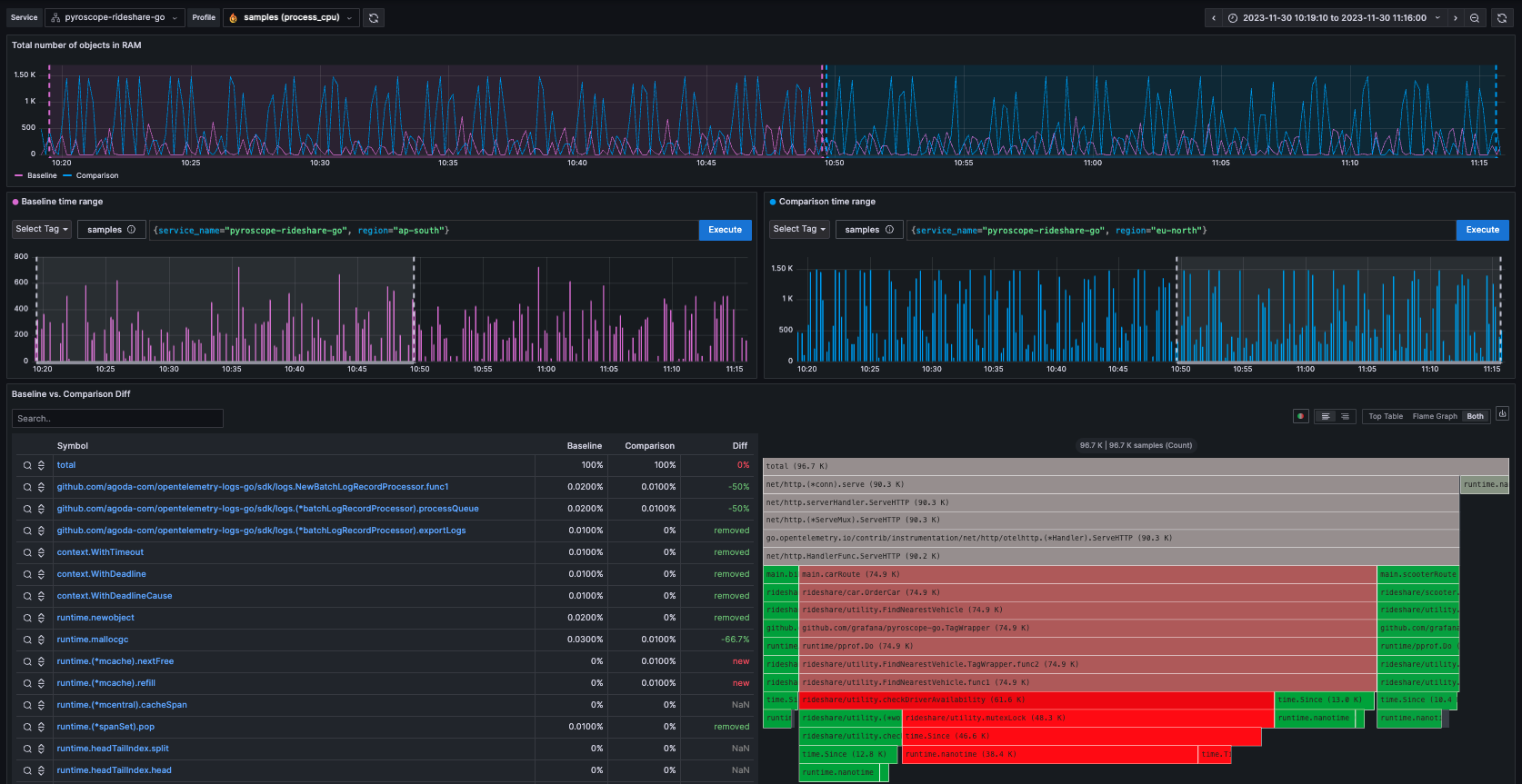
Diff page: Identify changes with differential analysis
The Diff page is an extension of the comparison page, crucial for more easily visually showing the differences between two profiling data sets. It normalizes the data by comparing the percentage of total time spent in each function so that the resulting flamegraph is comparing the share of time spent in each function rather than the absolute amount of time spent in each function. This is important because it allows you to compare two different queries that may have different total amounts of time spent in each function.
Similar to a git diff it takes the flamegraphs from the comparison page and highlights the differences between the two flamegraphs where red represents an increase in CPU usage from the baseline to the comparison and green represents a decrease.
Using the same examples from above, here is a diff between two label sets: