This is documentation for the next version of Grafana Pyroscope documentation. For the latest stable release, go to the latest version.

Use the Pyroscope UI to explore profiling data
The Grafana Pyroscope UI is a single-page interface for querying and visualizing profiling data. You select a service and profile type, refine the query with labels, then inspect a timeline and flame graph.
The Pyroscope UI is available with Pyroscope open source.
In Grafana and Grafana Cloud, use Profiles Drilldown to explore profiling data. Profiles Drilldown includes comparison and differential flame graph views that aren’t in the Pyroscope UI.
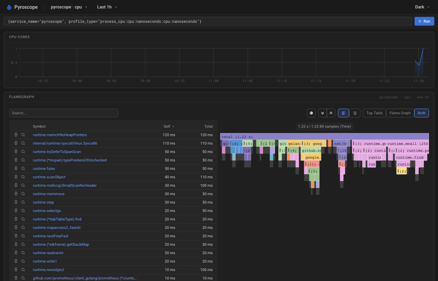
Select a service and time range
The navigation bar sets the service, profile type, and time range for the page.
- Select a Service, then a Profile Type.
- Select a time range preset, for example Last 1h or Last 24h.
- Optional: If Pyroscope is multi-tenant, enter a tenant ID when prompted, then use the tenant control to switch tenants later.
Use Dark or Light to change the theme. Dark is the default.
If you edit the query and want to return to the service you selected, click Reset query.
Query profile data
Use the query bar to refine which series the timeline and flame graph use. The query is a Prometheus-style label selector, for example {service_name="checkout", namespace="production"}.
After you change the query, click Run to apply it.
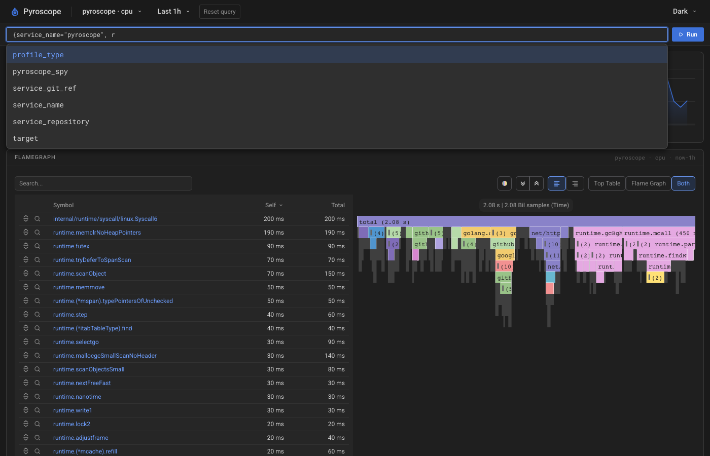
As you type, the query bar suggests matching label names and label values:
- When you type a label name, the query bar suggests available label names.
- When you type a label value after
=, the query bar suggests values for that label.
Suggestions are scoped to the selected time range and to the other label filters already in the query. Continue typing to filter the suggestions, then select one to add it to the query.
Inspect the timeline
The timeline shows how the selected profile type changes over the time range.
Drag across the timeline to zoom into a shorter window. The flame graph updates to match that window. To return to a relative range, select a time range preset in the navigation bar.
Explore the flame graph
The flame graph panel shows where the selected profile spends its value, for example CPU time or memory.
Choose a view:
- Top Table shows a sortable table of functions.
- Flame Graph shows the flame graph only.
- Both shows the table and the flame graph. This option is available when the panel is wide enough.
Use Search… to highlight matching frames. To change colors, select By package name or By value. Use the text alignment controls to align flame graph labels left or right.
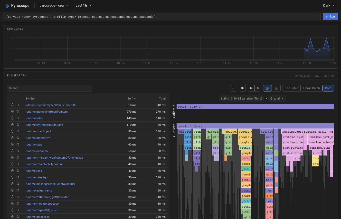
To inspect callers and callees for one function, click a frame and select Sandwich view. Click the sandwich pill or reset control to leave sandwich view.
Was this page helpful?
Related resources from Grafana Labs