Important: This documentation is about an older version. It's relevant only to the release noted, many of the features and functions have been updated or replaced. Please view the current version.
Bar chart
This panel visualization allows you to graph categorical data.

Supported data formats
Only one data frame is supported and it must have at least one string field that will be used as the category for an X or Y axis and one or more numerical fields.
Example:
| Browser | Market share |
|---|---|
| Chrome | 50 |
| IE | 17.5 |
If you have more than one numerical field the panel will show grouped bars.
Visualizing time series or multiple result sets
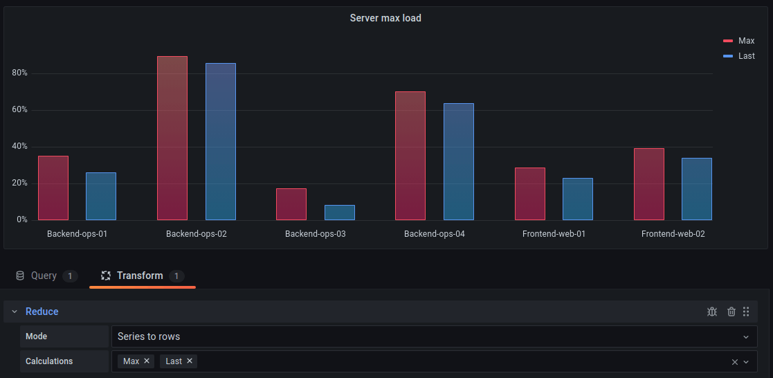
If you have multiple time series or tables you first need to join them using a join or reduce transform. For example if you have multiple time series and you want to compare their last and max value add the Reduce transform and specify Max and Last as options under Calculations.

Bar chart options
Use these options to refine your visualization.
Orientation
- Auto - Grafana decides the bar orientation based on what the panel dimensions.
- Horizontal - Will make the X axis the category axis.
- Vertical - Will make the Y axis the category axis.
Rotate bar labels
When the graph is in vertical orientation you can use this setting to rotate the labels under the bars. Useful if the labels are long and overlap.
Bar label max length
Sets the max length of the bar label. Labels longer than the max length will be truncated and ... will be appended to the end.
Show values
This controls whether values are shown on top or to the left of bars.
- Auto Values will be shown if there is space
- Always Always show values.
- Never Never show values.
Group width
Controls the width of groups. 1 = max with, 0 = min width.
Bar width
Controls the width of bars. 1 = Max width, 0 = Min width.
Line width
Controls line width of the bars.
Fill opacity
Controls the fill opacity bars.
Gradient mode
Set the mode of the gradient fill. Fill gradient is based on the line color. To change the color, use the standard color scheme field option.
Gradient appearance is influenced by the Fill opacity setting.
None
No gradient fill. This is the default setting.
Opacity
Transparency of the gradient is calculated based on the values on the y-axis. Opacity of the fill is increasing with the values on the Y-axis.
Hue
Gradient color is generated based on the hue of the line color.
Tooltip mode
When you hover your cursor over the visualization, Grafana can display tooltips. Choose how tooltips behave.
- Single - The hover tooltip shows only a single series, the one that you are hovering over on the visualization.
- All - The hover tooltip shows all series in the visualization. Grafana highlights the series that you are hovering over in bold in the series list in the tooltip.
- Hidden - Do not display the tooltip when you interact with the visualization.
Use an override to hide individual series from the tooltip.
Legend mode
Use these settings to define how the legend appears in your visualization. For more information about the legend, refer to Configure a legend.
- List - Displays the legend as a list. This is a default display mode of the legend.
- Table - Displays the legend as a table.
- Hidden - Hides the legend.
Legend placement
Choose where to display the legend.
- Bottom - Below the graph.
- Right - To the right of the graph.
Legend values
Choose which of the standard calculations to show in the legend. You can have more than one.
Legend calculations
Choose which of the standard calculations to show in the legend. You can have more than one.
For more information about the legend, refer to Configure a legend.
Text size
Enter a Value to change the size of the text on your bar chart.
Axis
Use the following field settings to refine how your axes display.
Some field options will not affect the visualization until you click outside of the field option box you are editing or press Enter.
Placement
Select the placement of the Y-axis.
Auto
Grafana automatically assigns Y-axis to the series. When there are two or more series with different units, then Grafana assigns the left axis to the first unit and right to the following units.
Left
Display all Y-axes on the left side.
Right
Display all Y-axes on the right side.
Hidden
Hide all axes.
To selectively hide axes, Add a field override that targets specific fields.
Label
Set a Y-axis text label.
If you have more than one Y-axis, then you can give assign different labels with an override.
Width
Set a fixed width of the axis. By default, Grafana dynamically calculates the width of an axis.
By setting the width of the axis, data whose axes types are different can share the same display proportions. This makes it easier to compare more than one graph’s worth of data because the axes are not shifted or stretched within visual proximity of each other.
Soft min and soft max
Set a Soft min or soft max option for better control of Y-axis limits. By default, Grafana sets the range for the Y-axis automatically based on the dataset.
Soft min and soft max settings can prevent blips from turning into mountains when the data is mostly flat, and hard min or max derived from standard min and max field options can prevent intermittent spikes from flattening useful detail by clipping the spikes past a defined point.
You can set standard min/max options to define hard limits of the Y-axis. For more information, refer to Standard options definitions.


