This is documentation for the next version of Grafana documentation. For the latest stable release, go to the latest version.
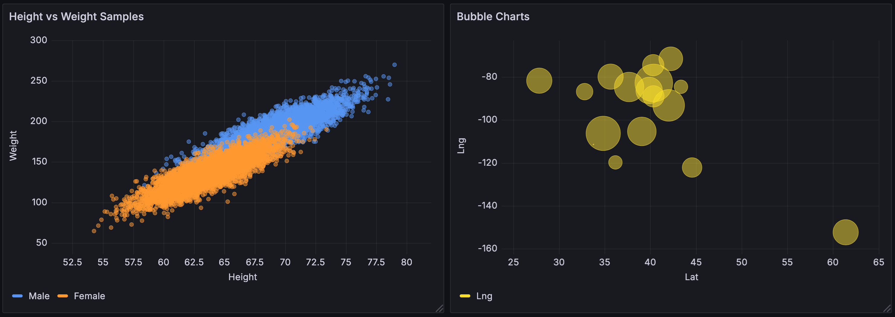
XY chart
XY charts provide a way to visualize arbitrary x and y values in a graph so that you can easily show the relationship between two variables. XY charts are typically used to create scatter plots. You can also use them to create bubble charts where field values determine the size of each bubble:
Supported data formats
You can use any type of tabular data with at least two numeric fields in an xy chart. The x field can be a time field. This type of visualization doesn’t require time data, but it can be used.
Configuration options
The following section describes the configuration options available in the panel editor pane for this visualization. These options are, as much as possible, ordered as they appear in Grafana.
Panel options
In the Panel options section of the panel editor pane, set basic options like panel title and description, as well as panel links. To learn more, refer to Configure panel options.
XY Chart options
The following options let you control how data is displayed in an xy chart:
Series mapping
Set how series data is mapped in the chart. Choose from:
- Auto - Automatically generates series from all available data frames (or datasets). You can filter to select only one frame.
- Manual - Explicitly define the series by selecting from available data frames.
Depending on your series mapping selection, the Frame, X-field, and Y-field options differ. These options are described in the tabs that follow:
When you select Auto as your series mapping mode, the following options are preconfigured, but you can also define them yourself:
When you select Manual as your series mode, you can add, edit, and delete series. To manage a series, click the Series field; to rename the series, click the series name.
In Manual mode, these fields are required:
X field
In Auto series mapping mode, select which field or fields x represents. By default, this is the first number or time field in each data frame. For example, you enter the following CSV content:
In the resulting chart, the x-field is generated from the values in column “a” unless you define it differently.
Y field
In Auto series mapping mode, after the x-field is set, by default, all the remaining number fields in the data frame are designated as the y-fields. You can use this option to explicitly choose which fields to use for y.
The series of the chart are generated from the y-fields. To make changes to a series in an xy chart, make overrides to the y-field.
Note
Any field you use in the Size field or Color field doesn’t generate a series.
You can also use overrides to exclude y-fields individually. To do so, add an override with the following properties for each y-field you want removed:
- Override type: Fields with name
- Override property: Series > Hide in area
- Area: Viz
Show
Set how values are represented in the visualization. Choose from:
- Points - Display values as points. When you select this option, the Point size option is also displayed.
- Lines - Add a line between values. When you select this option, the Line style and Line width options are also displayed.
- Both - Display both points and lines.
Line style
Set the style of the lines that connect points. To change the color, use the standard Color scheme field option.
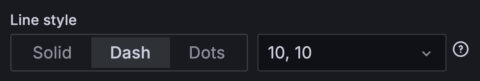
- Solid - Display a solid line. This is the default setting.
- Dash - Display a dashed line. When you choose this option, a drop-down list is displayed where you can select the length and gap setting for the line dashes. By default, the length and gap are set to
10, 10. - Dots - Display dotted lines. When you choose this option, a drop-down list is displayed where you can select dot spacing. By default, the dot spacing is set to
0, 10(the first number represents dot length, which is always zero).
Tooltip options
Tooltip options control the information overlay that appears when you hover over data points in the visualization.
Legend options
Legend options control the series names and statistics that appear under or to the right of the graph. For more information about the legend, refer to Configure a legend.
Axis options
Options under the Axis section control how the x- and y-axes are rendered. Some options don’t take effect until you click outside of the field option box you’re editing. You can also press Enter.
Placement
Select the placement of the y-axis. Choose from the following:
- Auto - Automatically assigns the y-axis to the series. When there are two or more series with different units, Grafana assigns the left axis to the first unit and the right axis to the units that follow.
- Left - Display all y-axes on the left side.
- Right - Display all y-axes on the right side.
- Hidden - Hide all axes. To selectively hide axes, Add a field override that targets specific fields.
Scale
Set the y-axis values scale. Choose from:
- Linear - Divides the scale into equal parts.
- Logarithmic - Use a logarithmic scale. If you select this option, in the Log base list, choose a binary (base 2) or common (base 10) logarithmic scale.
- Symlog - Use a symmetrical logarithmic scale. If you select this option, choose also:
- Log base - Select a binary (base 2) or common (base 10) logarithmic scale.
- Linear threshold - Set the threshold at which the scale changes from linear to logarithmic.
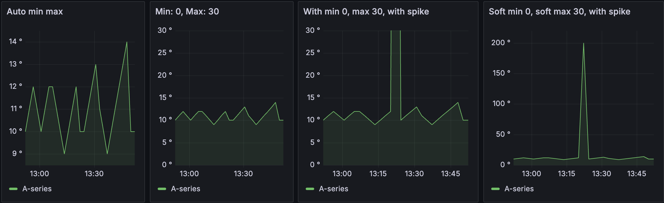
Soft min and soft max
Set a Soft min or soft max option for better control of y-axis limits. By default, Grafana sets the range for the y-axis automatically based on the dataset.
Soft min and soft max settings can prevent small variations in the data from being magnified when it’s mostly flat. In contrast, hard min and max values help prevent obscuring useful detail in the data by clipping intermittent spikes past a specific point.
To define hard limits of the y-axis, set standard min/max options. For more information, refer to Configure standard options. The following examples shows how this option works in a time series visualization:
Standard options
Standard options in the panel editor pane let you change how field data is displayed in your visualizations. When you set a standard option, the change is applied to all fields or series. For more granular control over the display of fields, refer to Configure field overrides.
You can customize the following standard options:
- Field min/max - Enable Field min/max to have Grafana calculate the min or max of each field individually, based on the minimum or maximum value of the field.
- Color scheme - Set single or multiple colors for your entire visualization. To learn more about color schemes, refer to Configure standard options.
Data links and actions
Data links allow you to link to other panels, dashboards, and external resources and actions let you trigger basic, unauthenticated, API calls. In both cases, you can carry out these tasks while maintaining the context of the source panel.
For each data link, set the following options:
- Title
- URL
- Open in new tab
- One click - Opens the data link with a single click. Only one data link can have One click enabled at a time.
For each action, define the following API call settings:
To learn more, refer to Configure data links and actions.
Value mappings
Value mapping is a technique you can use to change how data appears in a visualization.
For each value mapping, set the following options:
- Condition - Choose what’s mapped to the display text and (optionally) color:
- Value - Specific values
- Range - Numerical ranges
- Regex - Regular expressions
- Special - Special values like
Null,NaN(not a number), or boolean values liketrueandfalse
- Display text
- Color (Optional)
- Icon (Canvas only)
To learn more, refer to Configure value mappings.
Thresholds
A threshold is a value or limit you set for a metric that’s reflected visually when it’s met or exceeded. Thresholds are one way you can conditionally style and color your visualizations based on query results.
For each threshold, set the following options:
To learn more, refer to Configure thresholds.
Field overrides
Overrides allow you to customize visualization settings for specific fields or series. When you add an override rule, it targets a particular set of fields and lets you define multiple options for how that field is displayed.
Choose from the following override options:
To learn more, refer to Configure field overrides.


