This is documentation for the next version of Grafana documentation. For the latest stable release, go to the latest version.
Stat
Note
This visualization replaces the Singlestat visualization, which was deprecated in Grafana 7.0 and removed in Grafana 8.0.
A stat visualization displays your data in single values of interest—such as the latest or current value of a series—with an optional graph sparkline. A graph sparkline, which is only available in stat visualizations, is a small time-series graph shown in the background of each value in the visualization.
For example, if you’re monitoring the utilization of various services, you can use a stat visualization to show their latest usage:

Use a stat visualization when you need to:
- Monitor key metrics at a glance, such as the latest health of your application, number of high priority bugs in your application, or total number of sales.
- Display aggregated data, such as the average response time of your services.
- Highlight values above your normal thresholds to quickly identify if any metrics are outside your expected range.
With Grafana Play, you can explore and see how it works, learning from practical examples to accelerate your development. This feature can be seen on Stat Visualizations in Grafana.
Configure a stat visualization
Once you’ve created a dashboard, the following video shows you how to configure a stat visualization:
Alternatively, refer to this blog post on how to easily retrieve values from a range in Grafana using a stat visualization.
Supported data formats
The stat visualization supports a variety of formats for displaying data. Supported formats include:
- Single values - The most common format and can be numerical, strings, or boolean values.
- Time-series data - Calculation types can be applied to your time-series data to display single values over a specified time range.
Examples
The following tables are examples of the type of data you need for a stat visualization and how it should be formatted.
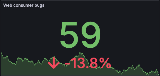
Single numerical values
The data is visualized as follows, with the last value displayed, along with a sparkline and percentage change:
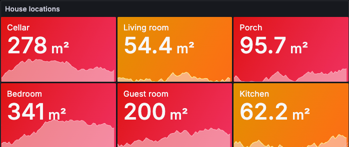
Time-series data
The data is visualized as follows, with the mean value displayed for each room, along with the room name, sparkline, and unit of measurement:
By default, a stat displays one of the following:
- Just the value for a single series or field.
- Both the value and name for multiple series or fields.
You can use the Text mode to control how the text is displayed.
Configuration options
The following section describes the configuration options available in the panel editor pane for this visualization. These options are, as much as possible, ordered as they appear in Grafana.
Panel options
In the Panel options section of the panel editor pane, set basic options like panel title and description, as well as panel links. To learn more, refer to Configure panel options.
Value options
Use the following options to refine how your visualization displays its values:
Stat styles
The stat visualization automatically adjusts the layout depending on available width and height in the dashboard, but you can also use the following options to further style the visualization.
Text mode
You can use the Text mode option to control what text the visualization renders. If the value is not important, only the name and color is, then change the Text mode to Name. The value will still be used to determine color and is displayed in a tooltip.
- Auto - If the data contains multiple series or fields, show both name and value. Grafana also shows both name and value when the panel has no title or the field has a display name.
- Value - Show only value, never name. Name is displayed in the hover tooltip instead.
- Value and name - Always show value and name.
- Name - Show name instead of value. Value is displayed in the hover tooltip.
- None - Show nothing (empty). Name and value are displayed in the hover tooltip.
Wide layout
Set whether wide layout is enabled or not. Wide layout is enabled by default.
- On - Wide layout is enabled.
- Off - Wide layout is disabled.
This option is only applicable when Text mode is set to Value and name. When wide layout is enabled, the value and name are displayed side-by-side with the value on the right, if the panel is wide enough. When wide layout is disabled, the value is always rendered underneath the name.
Text size
Adjust the sizes of the stat text.
- Title - Enter a numeric value for the stat title size.
- Value - Enter a numeric value for the stat value size.
- Percent change - Enter a numeric value for the percent change size when Show percent change is enabled.
Standard options
Standard options in the panel editor pane let you change how field data is displayed in your visualizations. When you set a standard option, the change is applied to all fields or series. For more granular control over the display of fields, refer to Configure overrides.
To learn more, refer to Configure standard options.
Data links and actions
Data links allow you to link to other panels, dashboards, and external resources while maintaining the context of the source panel. You can create links that include the series name or even the value under the cursor. To learn more, refer to Configure data links and actions.
Note
Actions are not supported for this visualization.
For each data link, set the following options:
- Title
- URL
- Open in new tab
Data links for this visualization don’t include the One click switch, however, if there’s only one data link configured, that data link has single-click functionality. If multiple data links are configured, then clicking the visualization opens a menu that displays all the data links.
Value mappings
Value mapping is a technique you can use to change how data appears in a visualization.
For each value mapping, set the following options:
- Condition - Choose what’s mapped to the display text and (optionally) color:
- Value - Specific values
- Range - Numerical ranges
- Regex - Regular expressions
- Special - Special values like
Null,NaN(not a number), or boolean values liketrueandfalse
- Display text
- Color (Optional)
- Icon (Canvas only)
To learn more, refer to Configure value mappings.
Thresholds
A threshold is a value or limit you set for a metric that’s reflected visually when it’s met or exceeded. Thresholds are one way you can conditionally style and color your visualizations based on query results.
For each threshold, set the following options:
To learn more, refer to Configure thresholds.
Field overrides
Overrides allow you to customize visualization settings for specific fields or series. When you add an override rule, it targets a particular set of fields and lets you define multiple options for how that field is displayed.
Choose from the following override options:
To learn more, refer to Configure field overrides.


