This is documentation for the next version of Grafana documentation. For the latest stable release, go to the latest version.
Histogram
Histograms calculate the distribution of values and present them as a bar chart. Each bar represents a bucket; the y-axis and the height of each bar represent the count of values that fall into each bucket, and the x-axis represents the value range.
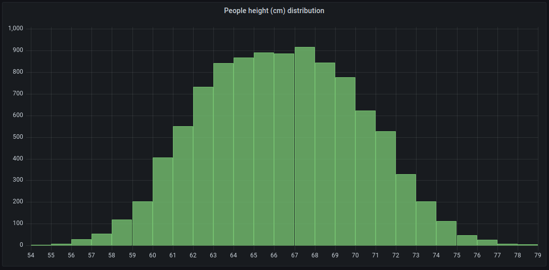
For example, if you want to understand the distribution of people’s heights, you can use a histogram visualization to identify patterns or insights in the data distribution:
You can use a histogram visualization if you need to:
- Visualize and analyze data distributions over a specific time range to see how frequently certain values occur.
- Identify any outliers in your data distribution.
- Provide statistical analysis to help with decision-making
Configure a histogram visualization
After you’ve created a dashboard, the following video shows you how to configure a histogram visualization:
With Grafana Play, you can explore and see how it works, learning from practical examples to accelerate your development. This feature can be seen on Histogram Examples.
Supported data formats
Histograms support time series and any table results with one or more numerical fields.
Examples
The following tables are examples of the type of data you need for a histogram visualization and how it should be formatted.
Time-series table
The data is converted as follows:
Basic numerical table
The data is converted as follows:
Configuration options
The following section describes the configuration options available in the panel editor pane for this visualization. These options are, as much as possible, ordered as they appear in Grafana.
Panel options
In the Panel options section of the panel editor pane, set basic options like panel title and description, as well as panel links. To learn more, refer to Configure panel options.
Histogram options
Use the following options to refine your histogram visualization.
Bucket offset
If the first bucket should not start at zero, a non-zero offset has the effect of shifting the aggregation window.
For example, 5-sized buckets that are 0-5, 5-10, 10-15 with a default 0 offset would become 2-7, 7-12, 12-17 with an offset of 2; offsets of 0, 5, or 10, in this case, would effectively do nothing.
Typically, this option would be used with an explicitly defined bucket size rather than automatic. For this setting to affect, the offset amount should be greater than 0 and less than the bucket size; values outside this range have the same effect as values within this range.
Gradient mode
Set the mode of the gradient fill. Fill gradient is based on the line color. To change the color, use the standard color scheme field option.
Gradient display is influenced by the Fill opacity setting.
Choose from the following:
- None - No gradient fill. This is the default setting.
- Opacity - Transparency of the gradient is calculated based on the values on the Y-axis. The opacity of the fill is increasing with the values on the Y-axis.
- Hue - Gradient color is generated based on the hue of the line color.
- Scheme - The selected color palette is applied to the histogram bars.
Tooltip options
Tooltip options control the information overlay that appears when you hover over data points in the visualization.
Tooltip mode
When you hover your cursor over the visualization, Grafana can display tooltips. Choose how tooltips behave.
- Single - The hover tooltip shows only a single series, the one that you are hovering over on the visualization.
- All - The hover tooltip shows all series in the visualization. Grafana highlights the series that you are hovering over in bold in the series list in the tooltip.
- Hidden - Do not display the tooltip when you interact with the visualization.
Use an override to hide individual series from the tooltip.
Values sort order
When you set the Tooltip mode to All, the Values sort order option is displayed. This option controls the order in which values are listed in a tooltip. Choose from the following:
- None - Grafana automatically sorts the values displayed in a tooltip.
- Ascending - Values in the tooltip are listed from smallest to largest.
- Descending - Values in the tooltip are listed from largest to smallest.
Legend options
Legend options control the series names and statistics that appear under or to the right of the graph. For more information about the legend, refer to Configure a legend.
Standard options
Standard options in the panel editor pane let you change how field data is displayed in your visualizations. When you set a standard option, the change is applied to all fields or series. For more granular control over the display of fields, refer to Configure overrides.
To learn more, refer to Configure standard options.
Data links and actions
Data links allow you to link to other panels, dashboards, and external resources while maintaining the context of the source panel. You can create links that include the series name or even the value under the cursor.
Note
Actions are not supported for this visualization.
For each data link, set the following options:
- Title
- URL
- Open in new tab
To learn more, refer to Configure data links and actions.
Value mappings
Value mapping is a technique you can use to change how data appears in a visualization.
For each value mapping, set the following options:
- Condition - Choose what’s mapped to the display text and (optionally) color:
- Value - Specific values
- Range - Numerical ranges
- Regex - Regular expressions
- Special - Special values like
Null,NaN(not a number), or boolean values liketrueandfalse
- Display text
- Color (Optional)
- Icon (Canvas only)
To learn more, refer to Configure value mappings.
Thresholds
A threshold is a value or limit you set for a metric that’s reflected visually when it’s met or exceeded. Thresholds are one way you can conditionally style and color your visualizations based on query results.
For each threshold, set the following options:
To learn more, refer to Configure thresholds.
Field overrides
Overrides allow you to customize visualization settings for specific fields or series. When you add an override rule, it targets a particular set of fields and lets you define multiple options for how that field is displayed.
Choose from the following override options:
To learn more, refer to Configure field overrides.


