
This is documentation for the next version of Grafana documentation. For the latest stable release, go to the latest version.
Canvas
Canvases combine the power of Grafana with the flexibility of custom elements. They are extensible visualizations that allow you to add and arrange elements wherever you want within unstructured static and dynamic layouts. This lets you design custom visualizations and overlay data in ways that aren’t possible with standard Grafana visualizations, all within the Grafana UI.
If you’ve used popular UI and web design tools, then designing canvases will feel very familiar. With all of these dynamic elements, there’s almost no limit to what a canvas can display.
Note
We’d love your feedback on the canvas visualization. Please check out the open Github issues and submit a new feature request as needed.
Configure a canvas visualization
The following video shows you how to create and configure a canvas visualization:
Supported data formats
The canvas visualization is unique in that it doesn’t have any specific data requirements. You can even start adding and configuring visual elements without providing any data. However, any data you plan to consume should be accessible through supported Grafana data sources and structured in a way that ensures smooth integration with your custom elements.
If your canvas is going to update in real time, your data should support refreshes at your desired intervals without degrading the user experience.
You can tie Elements and Connections to data through options like text, colors, and background pattern images, etc. available in the canvas visualization.
Elements
Elements are the basic building blocks of a canvas and they help you visualize data with different shapes and options. You can rotate and move elements around the canvas. When you move elements, snapping and alignment guides help you create more precise layouts.
Add elements in the Layer section of canvas options.
Note
Element snapping and alignment only works when the canvas is not zoomed in.
Element types
When you select an element that you’ve added to a canvas, you can access configuration options for it that are dependent on the element type.
The following sections describe the different elements available.
Basic shapes
A basic shape element can display text (both fixed and field data) and its background color can be changed based on data thresholds. You can add the following basic shapes to a canvas:
- Cloud
- Ellipse
- Parallelogram
- Rectangle
- Triangle
Metric value
The metric value element lets you select the data you want to display on a canvas. This element has a unique “edit” mode that can be triggered either through the context menu “Edit” option or by double clicking. When in edit mode you can select which field data that you want to display.
Text
The text element lets you add text to the canvas. The element also supports an editing mode, triggered via either double clicking or the edit menu option in the context menu.
Icon
The icon element lets you add a supported icon to the canvas. Icons can have their color set based on thresholds or value mappings.
Add a custom icon
You can add a custom icon by referencing an SVG file. To add a custom icon, follow these steps:
Under Icon > SVG Path, if it’s not already selected, select Fixed as your file source.
Click Select a value in the field below.
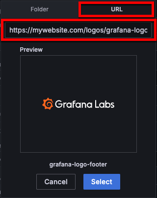
In the dialog box that opens, click the URL tab.
Enter the URL in the field below the URL tab.
![Add a custom image URL]()
Click Select.
(Optional) Add a background image to your icon with the Background (icon) option by following the steps to add a custom image.
If you don’t have an SVG file, you can use a rectangle element instead of an icon and set its background image to an image file type. To add a custom image for another element type, follow the steps to add a custom image.
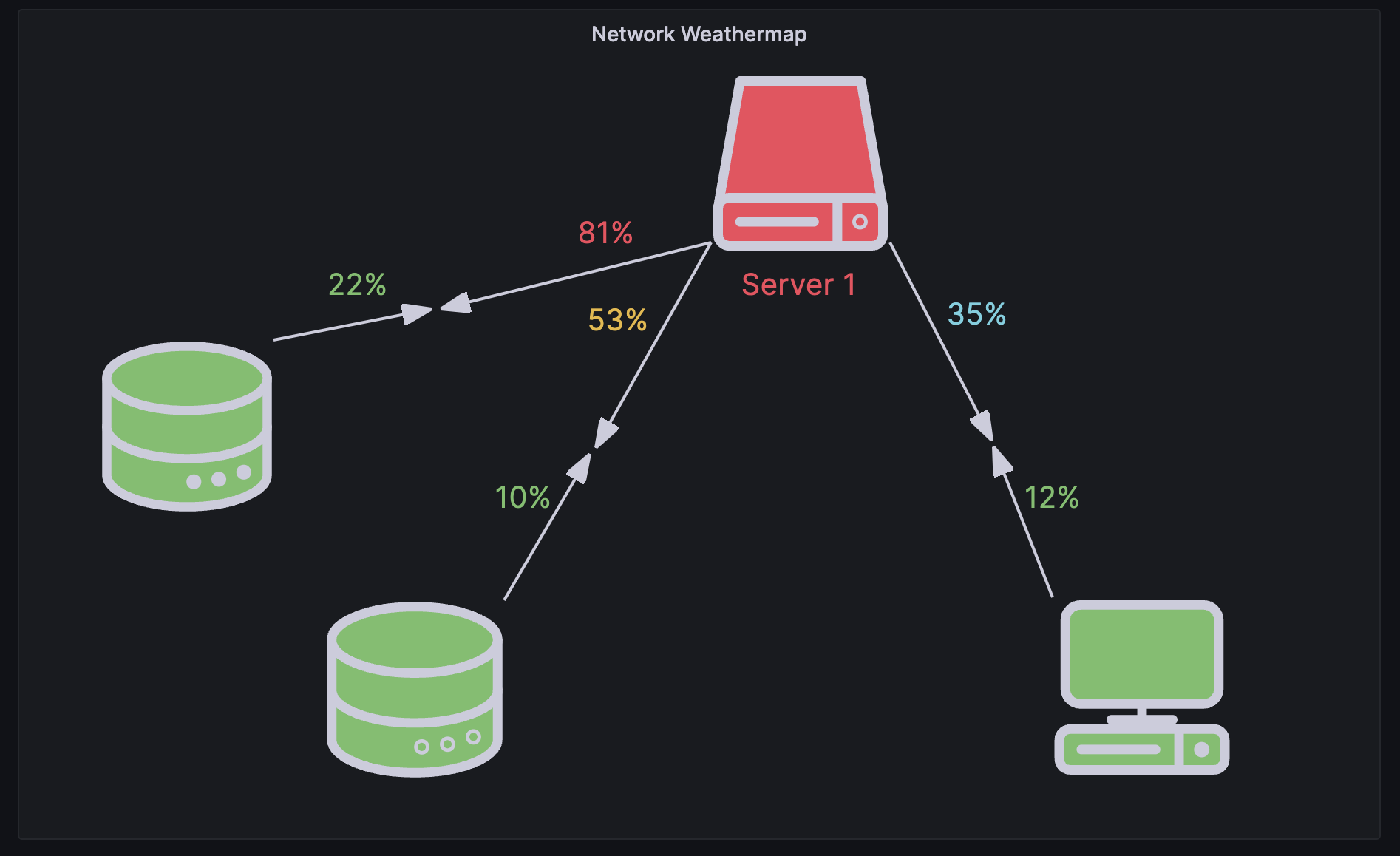
Server
The server element lets you easily represent a single server, a stack of servers, a database, or a terminal. Server elements support status color, bulb color, and a bulb blink rate all configurable by fixed or field values.
Button
The button element lets you add a basic button to the canvas. Button elements support triggering basic, unauthenticated API calls. API settings are found in the button element editor. You can also pass template variables in the API editor.
Note
A button click will only trigger an API call when inline editing is disabled.
With Grafana Play, you can explore and see how it works, learning from practical examples to accelerate your development. This feature can be seen on Canvas Visualization: Buttons.
Button API options
The following options let you configure basic, unauthenticated API calls:
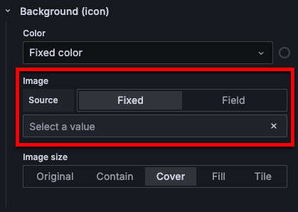
Add custom images to elements
You can add custom background images to all elements except Button by referencing an image URL. The image must be hosted at a URL that allows requests from your Grafana instance.
To upload a custom image, follow these steps:
Under Background (<ELEMENT TYPE>), if it’s not already selected, select Fixed as your image source.
![Custom image source selection]()
Click Select a value in the field below.
In the dialog box that opens, click the URL tab.
Enter the URL in the field below the URL tab.
![Add a custom image URL]()
Click Select.
Connections
When building a canvas, you can connect elements together to create more complex visualizations. You can also create connections to the background of the canvas.
To create a connection, follow these steps:
In the panel edit pane, expand the Canvas options section.
Toggle on the Inline editing switch.
Hover the cursor over an element you want to connect to display the connection anchors:
![Element with connection anchors displayed]()
Drag the cursor from a connection anchor on that element to one on another element.
To remove a connection, click the connection and then press the Delete or Backspace key.
Connection adjustments
You can adjust connections, adding angles to them, to fit the canvas you’re working in. When you move connected elements, the connection resizes to fit the space.
- To adjust a connection, click it to display the midpoint controls and move those as needed.
- To make a connection a straight line again, move the midpoint back until the midpoint controls disappear.
If you move a connection so that it’s almost a right angle or a straight line, the connection snaps into that angle or into a straight line.
Connection styles
You can set the size, color, direction, and style of connections based on fixed or field values. To do so, enter into panel edit mode, select the connection, and modify the connection’s properties in the panel editor. For more information on connection styles, refer to Selected connection options.
Canvas editing
You can make changes to a canvas visualization while in the context of the dashboard, or in dashboard mode. The following sections describe the editing options available in dashboard mode.
Inline editor
You can edit your canvas inline while in dashboard mode. The inline editor menu displays the options relevant to the part of the canvas that you’ve selected. You can also move the editor window around.
Context menu
The context menu lets you perform common tasks quickly and efficiently. Supported functionality includes opening and closing the inline editor, duplicating an element, deleting an element, and more.
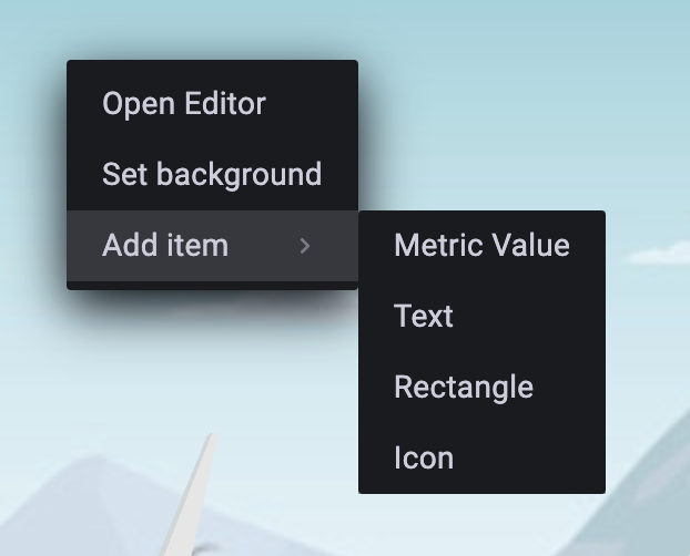
The context menu is triggered by a right click action over the panel or over a given canvas element. When right clicking the panel, you are able to set a background image and easily add elements to the canvas.
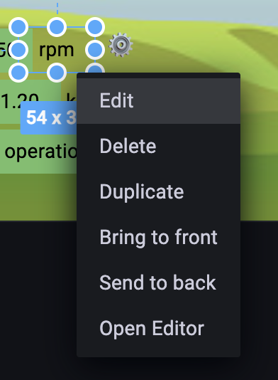
When right clicking an element, you are able to edit, delete, duplicate, and modify the element’s layer positioning.
Configuration options
The following section describes the configuration options available in the panel editor pane for this visualization. These options are, as much as possible, ordered as they appear in Grafana.
Panel options
In the Panel options section of the panel editor pane, set basic options like panel title and description, as well as panel links. To learn more, refer to Configure panel options.
Canvas options
Inline editing
The inline editing toggle lets you lock or unlock the canvas. When turned off the canvas becomes “locked”, freezing elements in place and preventing unintended modifications.
Experimental Element types
Toggle the switch to include experimental element types in the available selections.
Pan and zoom
You can enable panning and zooming in a canvas. This allows you to both create and navigate more complex designs.
Note
Canvas pan and zoom is currently in public preview. Grafana Labs offers limited support, and breaking changes might occur prior to the feature being made generally available.
To use this feature, enable the
canvasPanelPanZoomfeature toggle in your Grafana configuration file or at Administration > General > Feature toggles in Grafana Cloud.
Use the following pointer and keyboard strokes:
- Zoom in - Scroll up
- Zoom out - Scroll down
- Pan - Middle mouse/wheel + drag OR Control + right-click + drag
- Reset - Double-click
Zoom to content
When you toggle on the Zoom to content switch, Grafana automatically adjusts the view to fit all visible elements in your canvas visualization into the viewport, adding a small margin around the edges. This makes it easy to reset your view, present content, or switch between devices without losing your framing. The content will re‑fit even if you resize the panel.
Infinite panning
You can enable infinite panning in a canvas when pan and zoom is enabled. This allows you to pan and zoom the canvas and uncover larger designs.
Note
Infinite panning is an experimental feature that may not work as expected in all scenarios. For example, elements that are not top-left constrained may experience unexpected movement when panning.
Tooltip options
The Tooltip mode setting controls the display of tooltips when hovering over canvas elements that are connected to data, data links, or actions. The options are:
- Enabled - Show a tooltip when the cursor hovers over an element.
- Disabled - Tooltips are not shown on hover.
The Disable for one-click elements setting allows hiding tooltips on elements that have one-click functionality enabled. This prevents tooltips from interfering with one-click interactions while still allowing tooltips on other elements.
Layer options
The Layer options let you add elements to the canvas and control its appearance:
Elements (layer)
Use the Add item button to open the element type drop-down list. Elements are listed in the reverse order that you add them to the canvas:
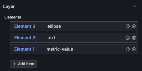
By default, elements have numbered names, like “Element 1”, and those numbers correspond to the order in which the elements were added, but you can change the default names.
You can also take the following actions on elements:
- Change the order of elements by clicking and holding the row of the element while moving it up and down in the element list.
- Duplicate or remove elements by clicking the icons on the element row.
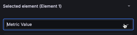
- Access the element editing options by clicking the element row. This displays the Selected element section of options. Click Clear selection to remove the element from focus and stop displaying that section of options.
Rename an element
To update the name of an element, follow these steps:
- Hover the cursor over the element name so the Edit layer name (pencil) icon is displayed.
- Click the Edit layer name icon.
- Enter a new name.
- Click outside of the name field.
Background (canvas)
Use the following options to control the background of the canvas:
Border (canvas)
Use the following options to control the border of the canvas:
Selected element options
The following options allow you to control the appearance of the element you’ve selected. To access an element so that you can edit it, expand the Layer section and select the desired element.
Element type
You can change element type by making a new selection in the drop-down list:
Element
This section is named based on the element type. Control the appearance of text on the element with the following options:
Icons don’t have text, so they have different options:
Layout
Control the placement of elements on the canvas with the following options:
Background (element)
Use the following options to set the background of the element:
- Color - Set the background color.
- Image - Use one of the provided background images or add your own custom image.
This option doesn’t apply to the button element.
Border (element)
Use the following options to set the border of the element:
- Width - Set the border width in pixels.
- Color - Set the border color. This option is only displayed when the border width is greater than zero.
- Radius - Add rounded corners to the element border and control the degree of curve.
Data links and actions
Canvases support data links and actions for all elements.
If you add multiple data links or actions to an element, you can control the order in which they appear in the element tooltip. To do this, click and drag the link or action to the desired position.
The following tasks describe how to configure data links and actions.
To add a data link, follow these steps:
Enable inline editing.
Click the element to which you want to add the data link.
In either the inline editor or panel editor, expand the Selected element editor.
Scroll down to the Data links and actions section and expand it.
Click + Add link.
In the dialog box that opens, enter a Title.
This is a human-readable label for the link displayed in the UI. This is a required field.
Enter the URL or variable to which you want to link.
To add a data link variable, click in the URL field and enter
$or press Ctrl+Space or Cmd+Space to see a list of available variables. This is a required field.If you want the link to open in a new tab, toggle the Open in a new tab switch.
If you want the data link to open with a single click on the element, toggle the One click switch.
Only one data link or action can have One click enabled at a time.
Click Save to save changes and close the dialog box.
Disable inline editing.
To add an action, by follow these steps:
Enable inline editing.
Click the element to which you want to add the data link.
In either the inline editor or panel editor, expand the Selected element editor.
Scroll down to the Data links and actions section and expand it.
Click + Add action. In the dialog box that opens, set the action options:
Click Save to save changes and close the dialog box.
Disable inline editing.
Selected connection options
You can style the selected connection using the following options:
Color - Set the connection color.
Size - Control the size of the connection by entering a number in the Value field.
Radius - Add curve to the connection by entering a value to represent the degree.
Direction - Control the appearance of the arrow head. Choose your source from Fixed or Field. The default value is Forward regardless of the source type.
If the direction source is Fixed, choose from:
- Forward - The arrow head points in the direction in which the connection was drawn.
- Reverse - The arrow head points in the opposite direction of which the connection was drawn.
- Both - Adds arrow heads to both ends of the connection.
- None - Removes the arrow head.
If the direction source is Field, select a field that contains numeric values:
- Positive values - Display forward arrows.
- Negative values - Display reverse arrows.
- Zero - Display no arrow heads.
Line style - Choose from the following line styles: Solid, Dashed, and Dotted.
Standard options
Standard options in the panel editor pane let you change how field data is displayed in your visualizations. When you set a standard option, the change is applied to all fields or series. For more granular control over the display of fields, refer to Configure overrides.
To learn more, refer to Configure standard options.
Value mappings
Value mapping is a technique you can use to change how data appears in a visualization.
For each value mapping, set the following options:
- Condition - Choose what’s mapped to the display text and (optionally) color:
- Value - Specific values
- Range - Numerical ranges
- Regex - Regular expressions
- Special - Special values like
Null,NaN(not a number), or boolean values liketrueandfalse
- Display text
- Color (Optional)
- Icon (Canvas only)
To learn more, refer to Configure value mappings.
Field overrides
Overrides allow you to customize visualization settings for specific fields or series. When you add an override rule, it targets a particular set of fields and lets you define multiple options for how that field is displayed.
Choose from the following override options:
To learn more, refer to Configure field overrides.
Thresholds
A threshold is a value or limit you set for a metric that’s reflected visually when it’s met or exceeded. Thresholds are one way you can conditionally style and color your visualizations based on query results.
For each threshold, set the following options:
To learn more, refer to Configure thresholds.


