Grafana documentation
Visualize data
Drilldown
Profiles Drilldown
Investigate trends and spikes
Grafana documentation
Visualize data
Drilldown
Profiles Drilldown
Investigate trends and spikesInvestigate trends and spikes
Grafana Profiles Drilldown provides powerful tools that help you identify and analyze problems in your applications and services.
Using these steps, you can use the profile data to investigate issues.

With Grafana Play, you can explore and see how it works, learning from practical examples to accelerate your development. This feature can be seen on the Grafana Play site.
Explore your profile data
When you use Profiles Drilldown, your investigations usually follow these steps.
Verify your data source in the Data source drop-down.
Choose an Exploration tab. All services is selected by default. Learn about the available views.
Look for spikes or trends in services to identify where to investigate. Use the Profile type drop-down to change profile metrics.
After you identify the service to explore, you can change views:
Select Profile types to review profile metrics for a service.
Select Labels to view labels for a service and refine the scope of your investigation.
Select Flame graph to view the flame graph for a service.
Optional: Select filters to focus on problem areas. Each filter is added to the filter expression near the top of the page. You can add filters in the following ways:
- Use filter selectors in the filter bar to add labels and operators.
- In Labels view, use Include or Exclude on areas of interest.
If Labels view shows no data, select a different service, profile type, or group-by label.
Optional: Click and drag on a chart to zoom to a smaller time range.
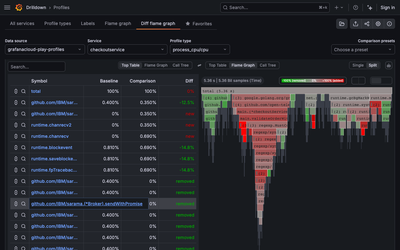
To compare two flame graphs, open Diff flame graph.
Configure Baseline and Comparison using time range selectors, label filters, and chart range selection.
Use Auto-select or choose a comparison preset to speed up setup.
Use Diff flame graph to compare where relative time share changes between baseline and comparison, and then drill into functions to identify likely causes.
![Viewing a flame graph during an investigation]()
Drill down to an individual profile
While flame graphs show an aggregate of all profiles in the selected time range, you may want to inspect the exact profile behind a spike. Exemplars are individual profiles shown as markers on the timeseries panel. They let you go from an aggregated view to a specific individual profile.
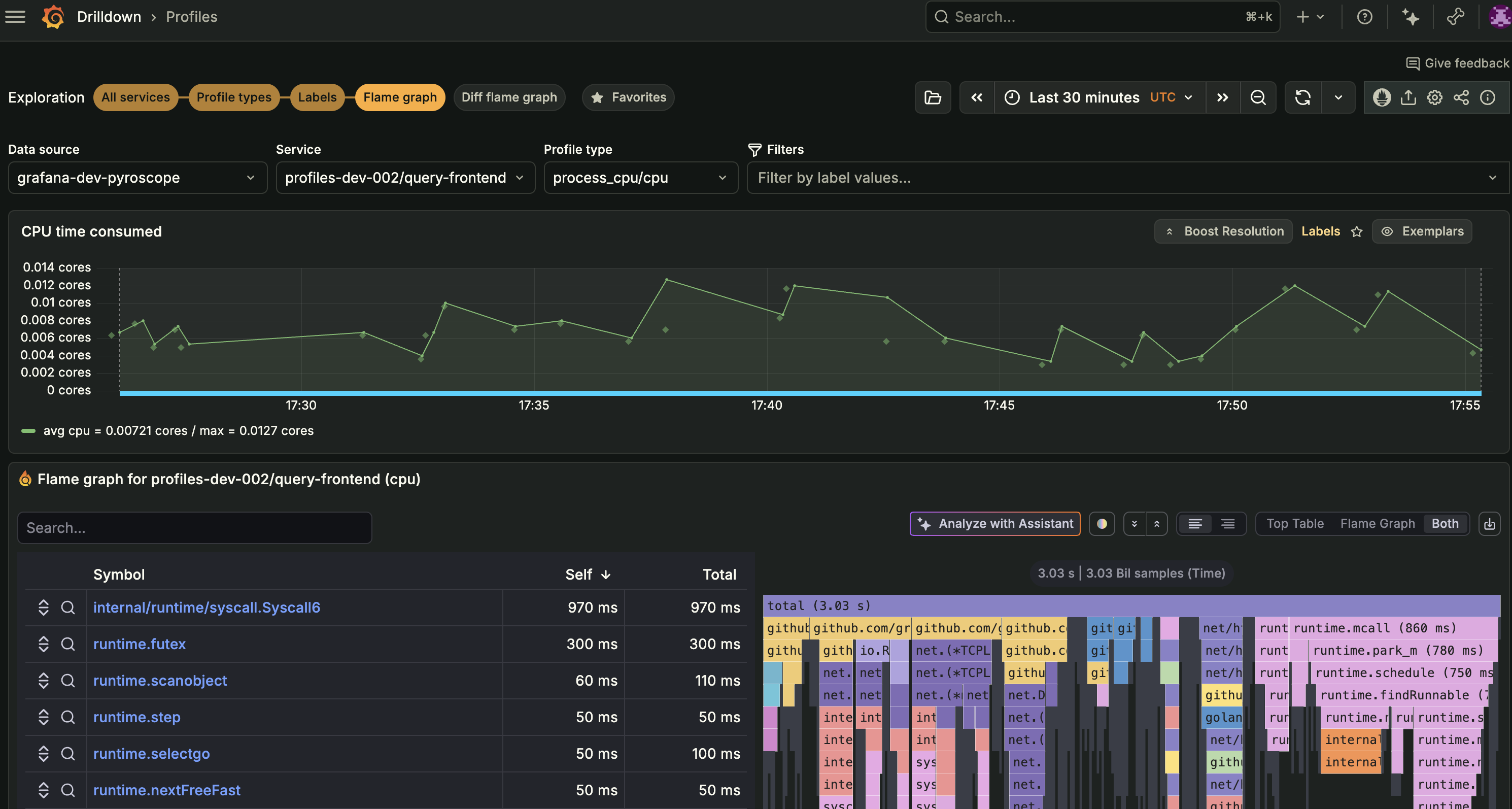
Navigate to the Flame graph or Labels view for your service. Exemplars are enabled by default in these views. In other views with a timeseries panel, select the Exemplars toggle in the panel header to enable them.
Each diamond marker on the timeseries represents an individual profile.
![Timeseries panel with Exemplars enabled showing diamond markers on the chart]()
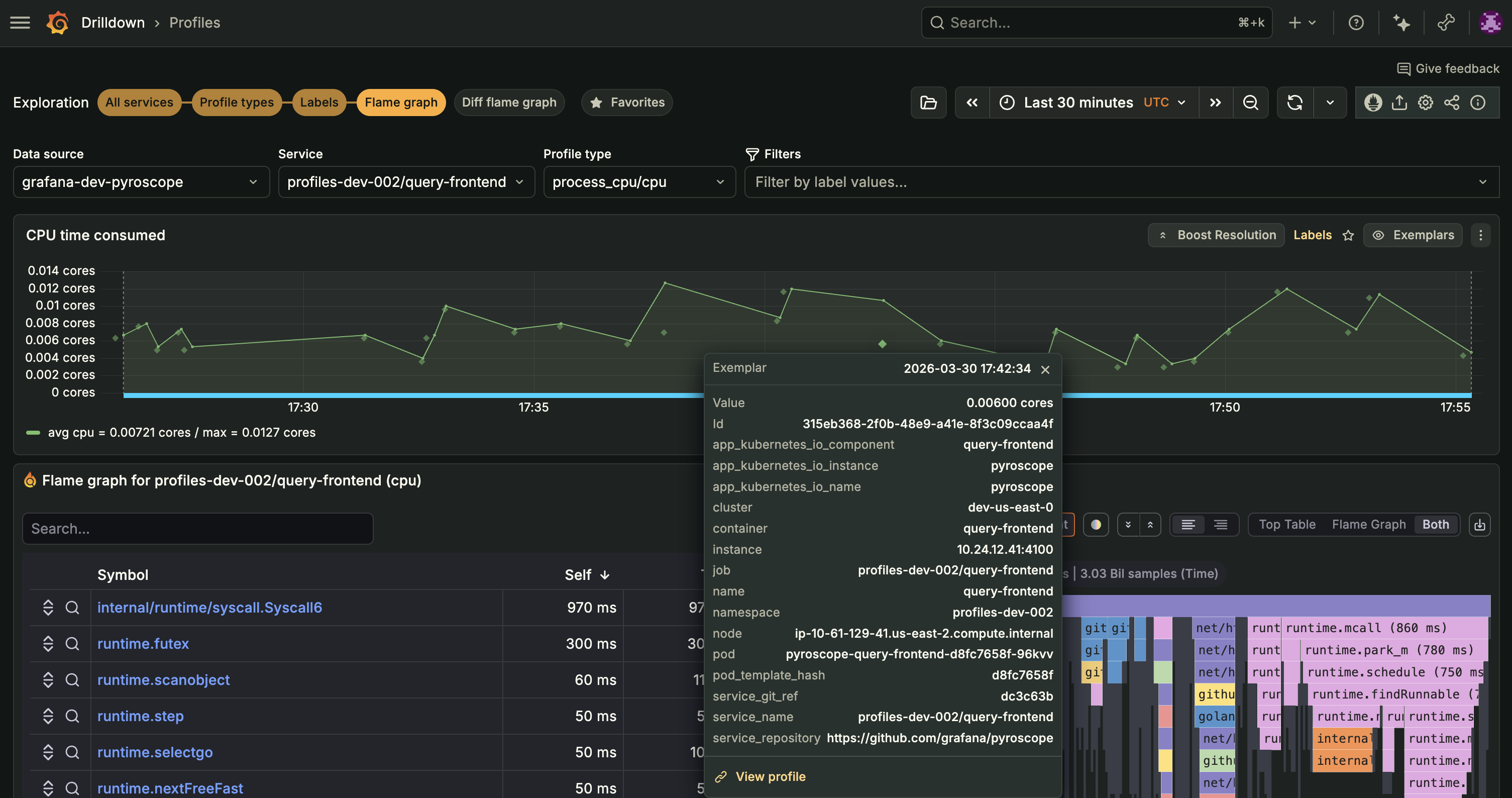
Click an exemplar marker to view its details, including the profile ID, value, timestamp, and associated labels such as pod, namespace, and cluster.
![Exemplar popover showing profile details and labels]()
Select View profile in the exemplar popover. The flame graph updates to show only that single individual profile. A profile id selector tag appears above the flame graph confirming your selection.
To return to the aggregated flame graph, click X on the profile id selector tag.
Move from profiles to traces
Use the span heatmap to investigate how resource usage varies across trace spans. Start with the distribution of span profile values, select an exemplar, and inspect its flame graph or associated trace.
The span heatmap is a visualization within the Flame graph view, not a separate Exploration tab.
Before you begin
You need:
- A Pyroscope data source with span profiles for the service, profile type, filters, and time range you want to investigate. Aggregated profile data alone doesn’t guarantee that span profiles are available.
- To inspect associated traces, a Tempo data source containing the matching trace data and permission to query it. You can inspect span profiles without selecting Tempo.
Open the span heatmap
- Open Profiles Drilldown and select your Pyroscope Data source.
- Select the Flame graph view and choose a service and Profile type.
- Set the time range and any label filters for your investigation.
- In the Profile timeline visualization toggle above the chart, select Span heatmap.
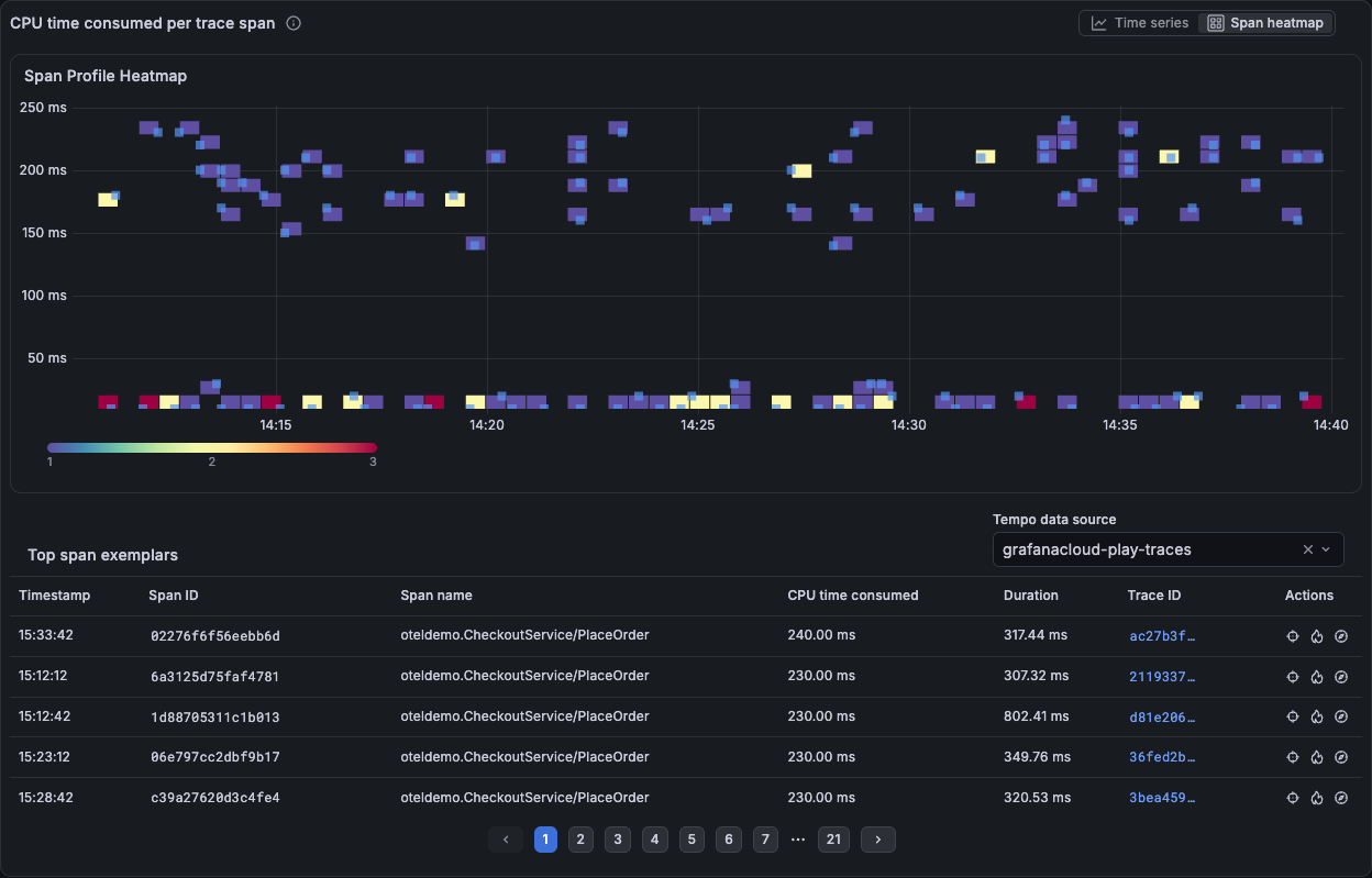
To return to the time series visualization, select Time series in the same toggle.
Read the heatmap
The heatmap groups spans into buckets:
- The horizontal axis represents time.
- The vertical axis represents the selected profile metric’s value per span.
- Cell color represents the count of spans in a bucket. Use the tooltip and color scale to interpret the counts.
Look for changes in the distribution or spans with unusually high profile values. For example, with a CPU profile type, higher-value buckets represent spans with more profiled CPU usage, not necessarily longer elapsed duration.
Exemplar markers identify individual span profiles you can investigate. The Top span exemplars table provides timestamps, span IDs, and profile metric values. Trace details, including duration and trace ID, are loaded from the selected Tempo data source when available.
Inspect an individual span profile
Find an exemplar in the heatmap or the Top span exemplars table.
Use Select exemplar to highlight it in the heatmap and focus the table on that exemplar.
![Selected span exemplar highlighted in the heatmap with its profile and trace actions in the table]()
In the table, select Open flame graph to inspect the span’s profile and identify the functions contributing to its resource usage.
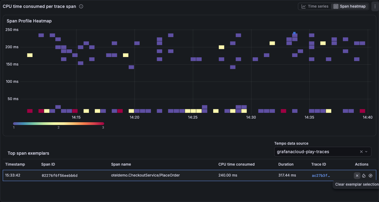
Use Clear exemplar selection in the table to remove the exemplar highlight and restore the table’s other rows.
Open the associated trace
In Top span exemplars, select the Tempo data source that contains the service’s traces.
Wait for trace details to load. Use the span name, duration, timestamp, and profile metric value to find a span of interest.
Select Open trace for a span with resolved trace details. The associated trace opens in a drawer.
![Associated trace open in a drawer showing request timing and spans across services]()
Inspect the trace to understand the span in the context of the request. Close the drawer to continue investigating the heatmap.
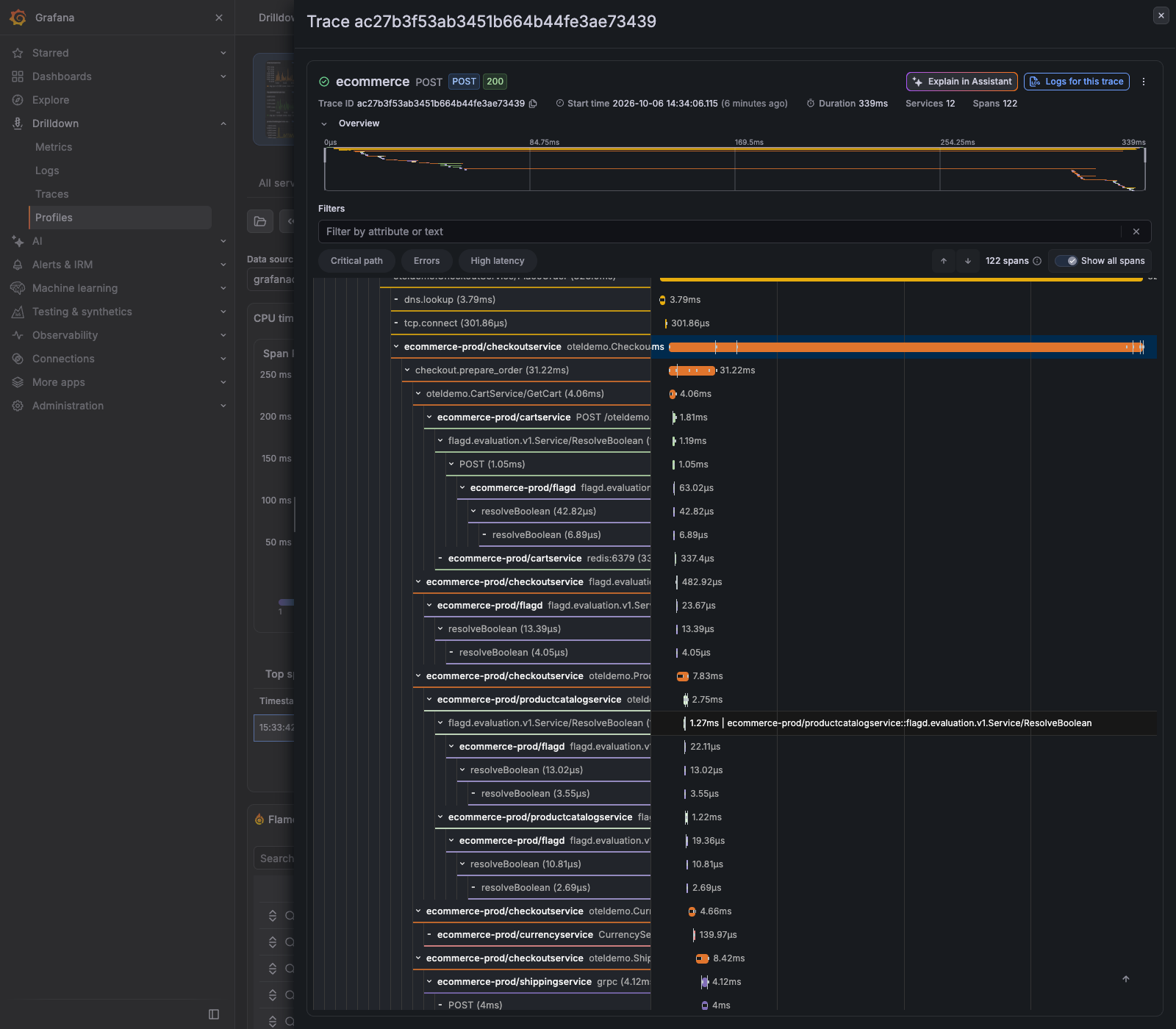
A span’s profile metric value and its trace duration describe different things. Use the flame graph to understand profiled resource usage and the trace to understand request timing and relationships between spans.
Troubleshoot missing data
Span heatmap is unavailable
If Span heatmap is disabled, its tooltip says: No span profiles are available for the current service, filters, and time range.
Check that you selected the intended service and profile type. Expand the time range or remove restrictive filters, then try again. If span profiles are still unavailable, verify that your profiling setup collects span profiles. Seeing data in Time series doesn’t by itself mean span profiles are present.
No span exemplars are shown
If the table displays No span exemplars in the selected time range, try a time range and filters that include span profiles. The exemplar table is not a complete list of every span represented by the heatmap.
Trace details are missing
Select the Tempo data source that contains the matching traces. A missing trace ID or Open trace action means no trace details have been resolved for that exemplar.
If you see Unable to load trace details from Tempo, check your access to the selected Tempo data source and whether it can be queried. Also verify that the matching traces are still available within your trace retention period. You can continue investigating the available profile data without trace details.
Common tools during investigations
In the Profiles toolbar, you can also use these features while investigating:
- Upload ad hoc profiles to load profile data for one-off analysis. The ad hoc view provides a Single view to inspect one uploaded profile and a Diff view to compare two uploaded profiles. In the diff view, select Side by side to show each profile in its own flame graph, or Diff flamegraph to show a computed difference. To compute a difference, the two profiles must share a common profile type.
- Copy shareable link to capture the current investigation state and share it with teammates.
- View/edit tenant settings to adjust settings such as collapsed flame graphs, function details, and maximum node count.
Add a time series panel to a dashboard
You can save a time series visualization from Profiles Drilldown to a Grafana dashboard to monitor it alongside your other observability data.
- Hover over a time series panel and open the panel menu.
- Select Add to dashboard.
- Choose an existing dashboard or create a new one, then save.
Save and reuse searches
When you apply filters, you can save the current search and return to it later. A saved search captures the data source, profile type, and filters.
- Apply one or more filters.
- Select Save in Saved queries and enter a title and an optional description.
- To reuse a saved search, select Load Saved query and choose one from the list.
When the Grafana query library is available, searches are saved to the shared Saved queries library. When it isn’t available, these actions appear as Save search and Load saved search, and searches are stored locally in your browser and only available on that device.
Was this page helpful?
Related resources from Grafana Labs