Documentation for automated readers A curated documentation index is available at: https://grafana.com/llms.txt
A complete documentation index is available at: https://grafana.com/llms-full.txt These indexes can help with page discovery before fetching individual documents.
This page is also available in Markdown, which may be easier for automated readers
and AI tools to parse than HTML. The Markdown version is available at
https://grafana.com/docs/grafana/latest/visualizations/panels-visualizations/visualizations/bar-gauge.md, or by sending
Accept: text/markdown to https://grafana.com/docs/grafana/latest/visualizations/panels-visualizations/visualizations/bar-gauge/. For broader
documentation discovery, the curated index is available at https://grafana.com/llms.txt
and the complete index is available at https://grafana.com/llms-full.txt.
Bar gauges simplify your data by reducing every field to a single value. You choose how Grafana calculates the reduction. This visualization can show one or more bar gauges depending on how many series, rows, or columns your query returns.
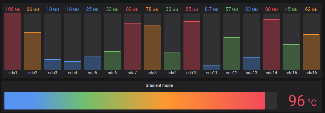
The bar gauge visualization displays values as bars with various lengths or fills proportional to the values they represent. They differ from traditional bar charts in that they act as gauges displaying metrics between ranges. One example is a thermometer displaying body temperature in a bar filling up.
You can use a bar gauge visualization when you need to show:
Key performance indicators (KPIs)
System health
Savings goals
Attendance
Process completion rates
Configure a bar gauge visualization
The following video shows you how to create and configure a bar gauge visualization:
Give it a try using Grafana Play
With Grafana Play, you can explore and see how it works, learning from practical examples to accelerate your development.
This feature can be seen on Bar Gauge.
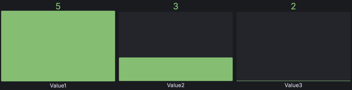
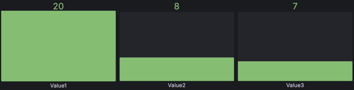
To create a bar gauge visualization, you need a dataset querying at least one numeric field. Every numeric field in the dataset is displayed as a bar gauge. Text or time fields aren’t required but if they’re present, they’re used for labeling.
Example 1
Label
Value1
Value2
Value3
Row1
5
3
2
The minimum and maximum range for the bar gauges is automatically pulled from the largest and smallest numeric values in the dataset. You can also manually define the minimum and maximum values as indicated in the Standard options section.
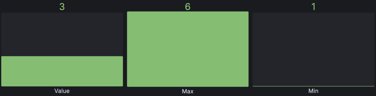
You can also define the minimum and maximum from the dataset provided.
Example 2
Label
Value
Max
Min
Row1
3
6
1
If you don’t want to show gauges for the min and max values, you can configure only one field to be displayed as described in the Value options section.
Even if the min and max aren’t displayed, the visualization still pulls the range from the data set.
Example 3
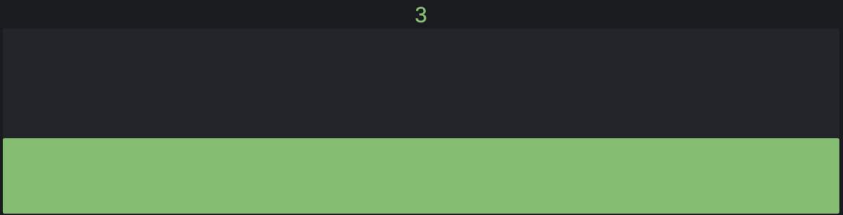
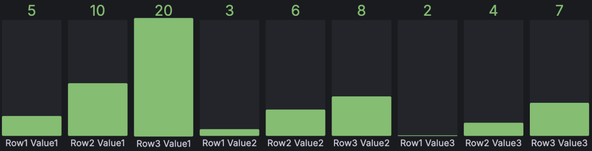
The bar gauge visualization also supports multiple records (rows) in the dataset.
Label
Value1
Value2
Value3
Row1
5
3
2
Row2
10
6
4
Row3
20
8
2
By default, the visualization is configured to calculate a single value per column or series and to display only the last set of data. However, it derives the minimum and maximum from the full dataset even if those values aren’t visible. In this example, that means only the last row of data is displayed in the gauges and the minimum and maximum values are defined as 2 and 20, pulled from the whole dataset.
If you want to show one gauge per cell you can change the Show setting from Calculate to All values and each bar is labeled by concatenating the text column with each value’s column name.
For more information on these settings, refer to Value options.
Configuration options
The following section describes the configuration options available in the panel editor pane for this visualization. These options are, as much as possible, ordered as they appear in Grafana.
Panel options
In the Panel options section of the panel editor pane, set options like the panel title, description, and show/hide rules.
To learn more, refer to
Configure panel options.
Add a description to a panel to share with users any important information about it, such as its purpose. Text entered in this field appears in a tooltip in the upper-left corner of the panel. Conversely, toggle on the Use as subtitle switch to display the description just below the panel title instead. You can use
variables you have defined or dashboard-scoped
global variables (such as $__from, $__to, $__dashboard, $__org, and $__user). Query-scoped global variables (such as $__interval and $__interval_ms) are not available in this field.
Transparent background
Toggle this switch on and off to control whether or not the panel has the same background color as the dashboard.
Panel links
Add
links to the panel to create shortcuts to other dashboards, panels, and external websites. Access panel links by clicking the icon next to the panel title.
Repeat options
Set whether to repeat the panel for each value in the selected variable.
Show/hide rules
Set whether to show or hide panels based on various rules.
Value options
Use the following options to refine how your visualization displays the value:
Option
Description
Show
Set how Grafana displays your data. Choose from:
Calculate - Show a calculated value based on all rows.
All values - Show a separate value for every row. If you select this option, then you can also limit the number of rows to display.
Calculation
If you chose Calculate as your Show option, select a reducer function that Grafana will use to reduce many fields to a single value. For a list of available calculations, refer to
Calculation types.
Limit
If you chose All values as your Show option, enter the maximum number of rows to display. The default is 25 and the maximum is 5,000.
Fields
Select the fields display in the panel.
Bar gauge options
Adjust how the gauge is displayed.
Option
Description
Orientation
Choose a stacking direction:
Auto - Grafana determines the best orientation.
Horizontal - Bars stretch horizontally, left to right.
Vertical - Bars stretch vertically, bottom to top.
Display mode
Choose a display mode:
Gradient - Threshold levels define a gradient.
Retro LCD - The bar is split into sections that are lit or unlit.
Basic - Single color based on the matching threshold.
Value display
Choose a value display mode:
Value color - Value color is determined by value.
Text color - Value color is default text color.
Hidden - Values are hidden.
Name placement
Set the name placement mode when the bar gauge orientation is Auto or Horizontal. Choose from:
Auto - Grafana determines the best placement.
Top - Names are placed on top of each bar gauge.
Left - Names are placed to the left of each bar gauge.
Hidden - Names are hidden.
When the bar gauge is in the vertical orientation, choose from Auto (names are always placed at the bottom of each bar) or Hidden.
Show unfilled area
Select if you want to render the unfilled region of the bars as gray. Not applicable to Retro LCD display mode.
Bar size
Choose a bar size mode:
Auto - Grafana determines the best bar size.
Manual - Manually configure the bar size.
Min width
Limit the minimum width of the bar column when the gauge is oriented vertically or is in Auto mode. Automatically shows the x-axis scroll bar when there’s a large amount of data.
This option only applies when the Bar size mode is set to Manual.
Min height
Limit the minimum height of the bar row when the bar gauge is oriented horizontally or is in Auto mode. Automatically shows the y-axis scroll bar when there’s a large amount of data.
This option only applies when the Bar size mode is set to Manual.
Max height
Limit the maximum height of the bar row when the bar gauge is oriented horizontally or is in Auto mode. Automatically shows the y-axis scroll bar when there’s a large amount of data.
This option only applies when the Bar size mode is set to Manual.
Legend options
The legend is hidden by default.
Legend options control the series names and statistics that appear under or to the right of the graph. For more information about the legend, refer to
Configure a legend.
Option
Description
Visibility
Toggle the switch to turn the legend on or off.
Mode
Use these settings to define how the legend appears in your visualization. List displays the legend as a list. This is a default display mode of the legend. Table displays the legend as a table.
Placement
Choose where to display the legend. Bottom places the legend below the graph. Right places the legend to the right of the graph.
Width
Control how wide the legend is when placed on the right side of the visualization. The value may be a basic pixel width or a more complex CSS width property such as max(200px, 20%). This option is only displayed if you set the legend placement to Right.
Limit
Limit how many series items are shown by default. The rest become expandable using a Show all link.
Values
Choose which of the
standard calculations to show in the legend. You can have more than one.
Overflow
Control how overflow for long series names is handled. Ellipsis truncates the series names with “…” at the end. Wrap word-wraps the series names to multiple lines. This option is only displayed if you set the legend placement to Right and mode is Table.
Text size options
Set the sizes of the following text elements in pixels:
Title - Bar name
Value - Bar value
Standard options
Standard options in the panel editor pane let you change how field data is displayed in your visualizations. When you set a standard option, the change is applied to all fields or series. For more granular control over the display of fields, refer to
Configure overrides.
Option
Description
Unit
Choose which unit a field should use.
Min/Max
Set the minimum and maximum values used in percentage threshold calculations or leave these field empty for them to be calculated automatically.
Field min/max
Enable Field min/max to have Grafana calculate the min or max of each field individually, based on the minimum or maximum value of the field.
Decimals
Specify the number of decimals Grafana includes in the rendered value.
Display name
Set the display title of all fields. You can use variables in the field title.
Color scheme
Set single or multiple colors for your entire visualization.
No value
Enter what Grafana should display if the field value is empty or null. The default value is a hyphen (-).
Data links allow you to link to other panels, dashboards, and external resources while maintaining the context of the source panel.
You can create links that include the series name or even the value under the cursor.
To learn more, refer to
Configure data links and actions.
Note
Actions are not supported for this visualization.
For each data link, set the following options:
Title
URL
Open in new tab
Data links for this visualization don’t include the One click switch, however, if there’s only one data link configured, that data link has single-click functionality.
If multiple data links are configured, then clicking the visualization opens a menu that displays all the data links.
Value mappings
Value mapping is a technique you can use to change how data appears in a visualization.
For each value mapping, set the following options:
Condition - Choose what’s mapped to the display text and (optionally) color:
Value - Specific values
Range - Numerical ranges
Regex - Regular expressions
Special - Special values like Null, NaN (not a number), or boolean values like true and false
A threshold is a value or limit you set for a metric that’s reflected visually when it’s met or exceeded. Thresholds are one way you can conditionally style and color your visualizations based on query results.
Overrides allow you to customize visualization settings for specific fields or series. When you add an override rule, it targets a particular set of fields and lets you define multiple options for how that field is displayed.
Choose from the following override options:
Option
Description
Fields with name
Select a field from the list of all available fields.
Field with name matching regex
Specify fields to override with a regular expression.
Fields with type
Select fields by type, such as string, numeric, or time.
Fields returned by query
Select all fields returned by a specific query, such as A, B, or C.
Fields with values
Select all fields returned by your defined reducer condition, such as Min, Max, Count, Total.

 Grafana documentation