Introduction to histograms and heatmaps
A histogram is a graphical representation of the distribution of numerical data. It groups values into buckets (sometimes also called bins) and then counts how many values fall into each bucket.
Instead of graphing the actual values, histograms graph the buckets. Each bar represents a bucket, and the bar height represents the frequency (such as count) of values that fell into that bucket’s interval.
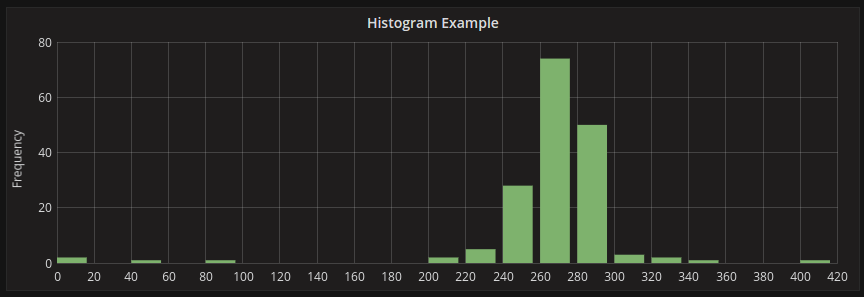
Histogram example
This histogram shows the value distribution of a couple of time series. You can easily see that most values land between 240-300 with a peak between 260-280.
Here is an example showing height distribution of people.

For more information about histogram visualization options, refer to Histogram.
Histograms only look at value distributions over a specific time range. The problem with histograms is that you cannot see any trends or changes in the distribution over time. This is where heatmaps become useful.
Heatmaps
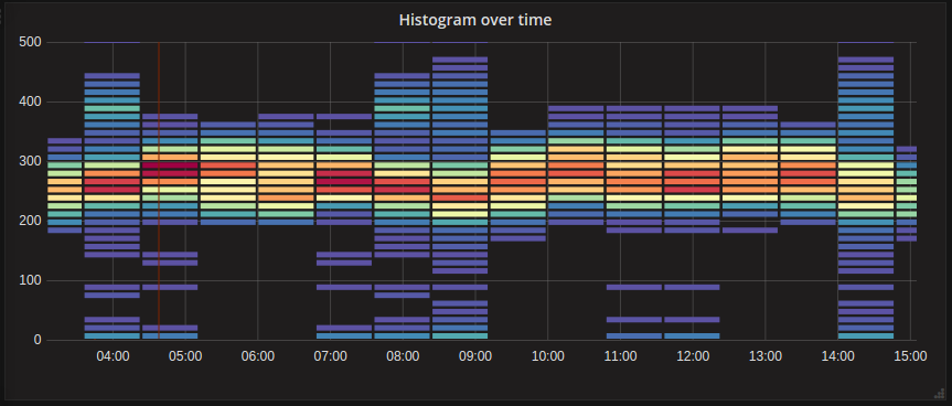
A heatmap is like a histogram, but over time, where each time slice represents its own histogram. Instead of using bar height as a representation of frequency, it uses cells, and colors the cell proportional to the number of values in the bucket.
In this example, you can clearly see what values are more common and how they trend over time.
For more information about heatmap visualization options, refer to Heatmap.
Pre-bucketed data
There are a number of data sources supporting histogram over time, like Elasticsearch (by using a Histogram bucket aggregation) or Prometheus (with histogram metric type and Format as option set to Heatmap). But generally, any data source could be used as long as it meets the requirement that it either returns series with names representing bucket bounds, or that it returns series sorted by the bounds in ascending order.
Raw data vs aggregated
If you use the heatmap with regular time series data (not pre-bucketed), then it’s important to keep in mind that your data is often already aggregated by your time series backend. Most time series queries do not return raw sample data, but instead include a group by time interval or maxDataPoints limit coupled with an aggregation function (usually average).
This all depends on the time range of your query of course. But the important point is to know that the histogram bucketing that Grafana performs might be done on already aggregated and averaged data. To get more accurate heatmaps, it is better to do the bucketing during metric collection, or to store the data in Elasticsearch or any other data source which supports doing histogram bucketing on the raw data.
If you remove or lower the group by time (or raise maxDataPoints) in your query to return more data points, your heatmap will be more accurate, but this can also be very CPU and memory taxing for your browser, possibly causing hangs or crashes if the number of data points becomes unreasonably large.


