
Entity Explorer
The Entity Explorer is a visual representation of the connections between different components in your environment, both infrastructure and applications. In the center of the view appears circular entities, each representing an element in the environment. Arrows illustrate the connections between these entities.
The concentric colored circles surrounding an entity convey distinct information. When an entity triggers an assertion, the outer circle changes its color to red (critical), yellow (warning), or blue (info). When the inner circle of an entity changes color, it signifies that entities contained within the parent entity triggered an assertion.
The Entity Explorer is interactive, allowing you to explore and understand your environment, understand which assertions are triggered, and quickly navigate to predefined dashboards.
The image below illustrates the Entity Explorer. The remainder of this topic explains the various features and how to use them.

Before you begin
Before you use the Entity Explorer, ensure you have have completed the following:
- Check that your infrastructure and applications generate metrics, logs, and traces
- Configure the Asserts plugin
Open Entity Explorer
Complete the following steps to open the Entity Explorer.
Sign into Grafana and select Observability > Asserts > Entity Explorer.
From the Frequently used menu, select Show all Services or Show all Nodes.
The Entity Explorer opens.
Define basic search
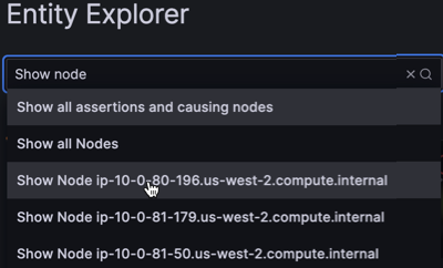
The first time you use Entity Explorer, by default, a large number of entities might appear. You can make your view more manageable by using the basic search feature to reduce the graph to include only those entities of interest. Using search expressions is the best way to explore the entity graph.
Asserts includes a number of human-readable search expressions that address everyday use cases. For example, you can search for Show Service api-server, Show all services, Show Assertions in Namespace, and so on.
To use basic search, begin the search expression with the word Show and continue typing keywords or select a search value from the drop-down list.
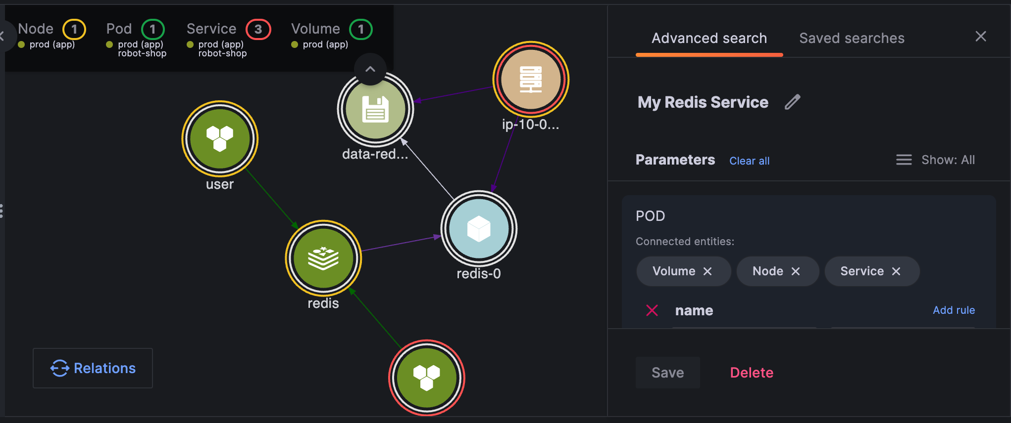
Define advanced search
The Advanced search panel provides enhanced search functions such as searching by property conditions and displaying connected entities. These searches allow you to quickly access a group of entities with contextual information.
Because Asserts continuously updates the graph with time-series data, the search results reflect the system’s state within the specified time window. Changing the time settings might result in different search results. Additionally, the search results are always filtered based on the selections made in the env and site drop-down menus.
The Advanced search feature is particularly useful for creating customized views specific to your area of responsibility.
You can save these views and easily access them for future reference.
To use Advanced search, complete the following steps:
To the right of the search field, click Advanced search.
On the Advanced search tab, build the search expression.
![Advanced search]()
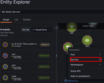
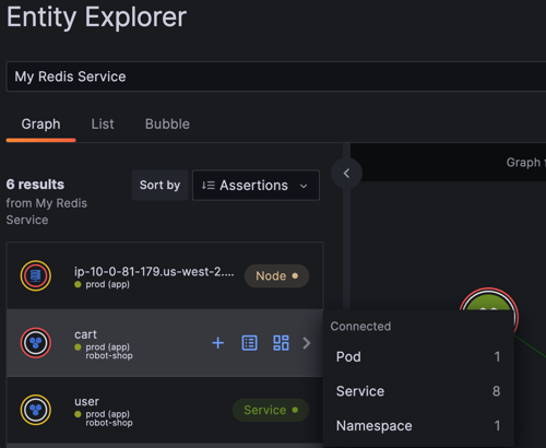
Navigate the Entity Explorer
Clicking on an entity enables you to navigate to its connected entities. This navigation is possible in both the graph view and the list view. If the graph becomes too crowded, you can filter the displayed entities by clicking on the entity type in the legend.
To navigate the Entity Explorer, complete the following steps:
Click an entity in the graph.
A menu appears showing you all connected entity types and the number of each type.
The following example shows navigating to all services associated with the Cart node.
![Navigate to connected entities]()
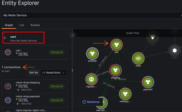
Select a connected entity type.
The Entity Explorer:
- Updates to show all connected entities
- Displays all connected entities in the Graph view
- Provides a Back arrow so that you can navigate back to the original entity.
![View connected entities]()
You can also use the Graph view to navigate to connected entities.
![Graph view navigation to connected entities]()
To filter the entity graph, click an entity and click Only.
![Filter entities]()
View and interpret assertions
Each entity in the system is represented by two color-coded rings that reflect their assertion status:
- The outer ring indicates the status of the entity itself.
- The inner ring indicates the status of a lower-level entity connected to the entity.
The inner ring is particularly useful because, in the case of temporary entities like pods, the parent entities such as nodes or services are typically more significant for analysis. Therefore, observing a colored inner ring on the node or service provides valuable information.
The ring color represents the severity of the assertion:
- Red indicates
CRITICAL - Yellow indicates
WARNING - Blue indicates for
INFO
In general, saturation assertions are CRITICAL or WARNING, failures are usually CRITICAL, anomalies are usually WARNING, and amends are usually INFO.
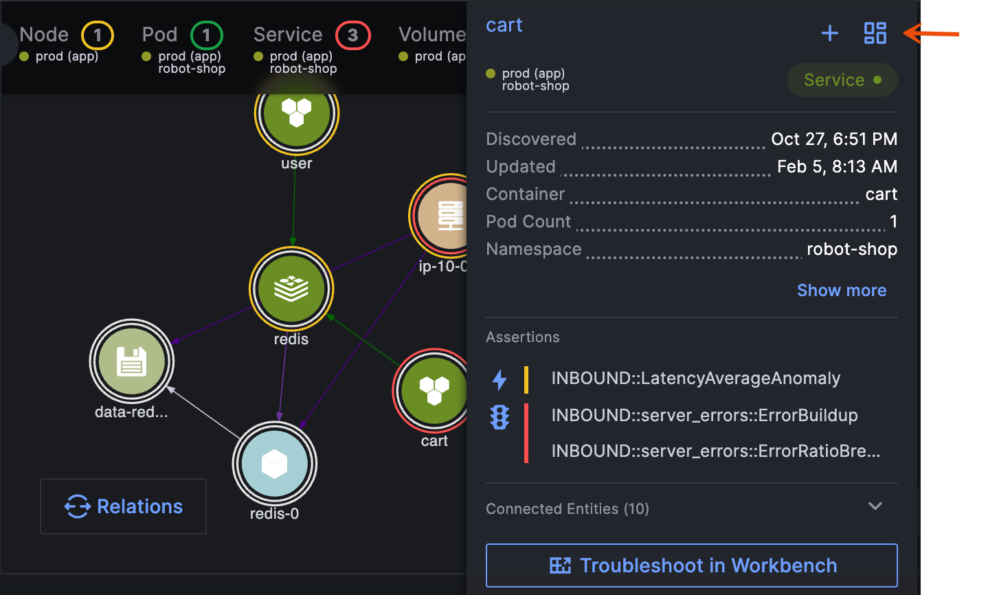
The following example shows the Shipping entity, including its properties and assertions. The Connected Entities section displays a colored dot that indicates whether any critical, warning, or info assertions have been triggered on the connected entities linked to Shipping
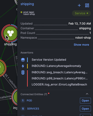
To view and interpret assertions, complete the following steps:
Hover over an entity to reveal its details and the assertions firing.
![Entity assertion status]()
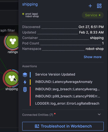
To add the entity to RCA Workbench, click the plus sign (+).
RCA Workbench provides tools for you to perform troubleshooting and root cause analysis.
You can add multiple entities to RCA Workbench.
To instantly navigate to RCA Workbench to perform root cause analysis, click Troubleshoot in Workbench.
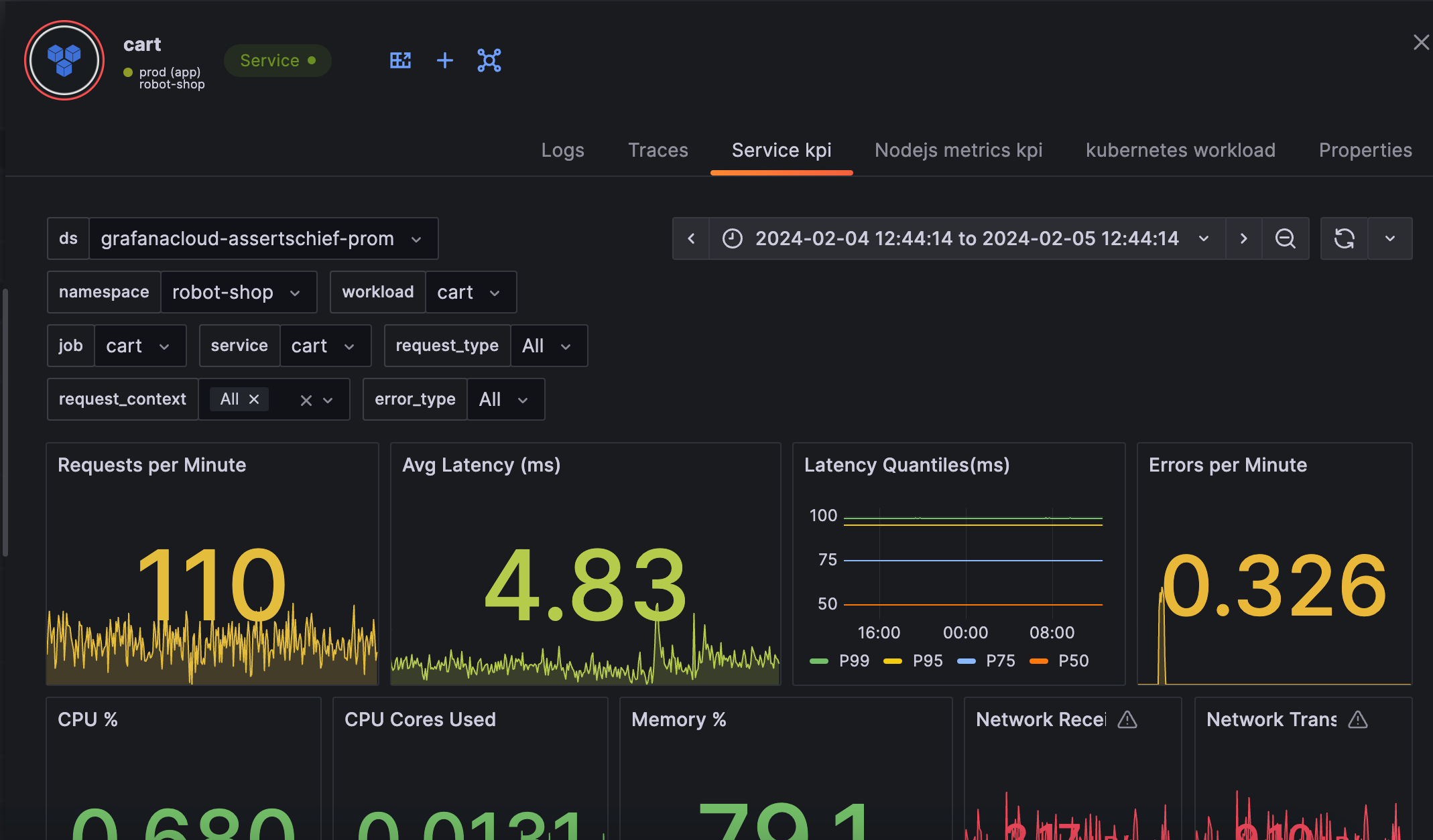
Navigate to dashboards
Rather than building your own dashboards that you must maintain over time, Asserts includes a number of dashboards that you can navigate to from the Entity Explorer. Because Asserts constantly monitors your environment, the dashboards are always available and up to date, even when there are underlying changes to your infrastructure or applications. Each entity type has its own dashboard. For example, there are dashboards for clusters, node groups, nodes, pods, services, and so on.
If you have your own Grafana dashboards, you can integrate them into Asserts.
To navigate to dashboards:
Hover over an entity and click Show KPI.
A drawer opens to the KPI dashboard.
![Navigate to KPI dashboard]()
To navigate to other dashboards, click the dashboard name at the top of the drawer.
![Navigate to other dashboards]()
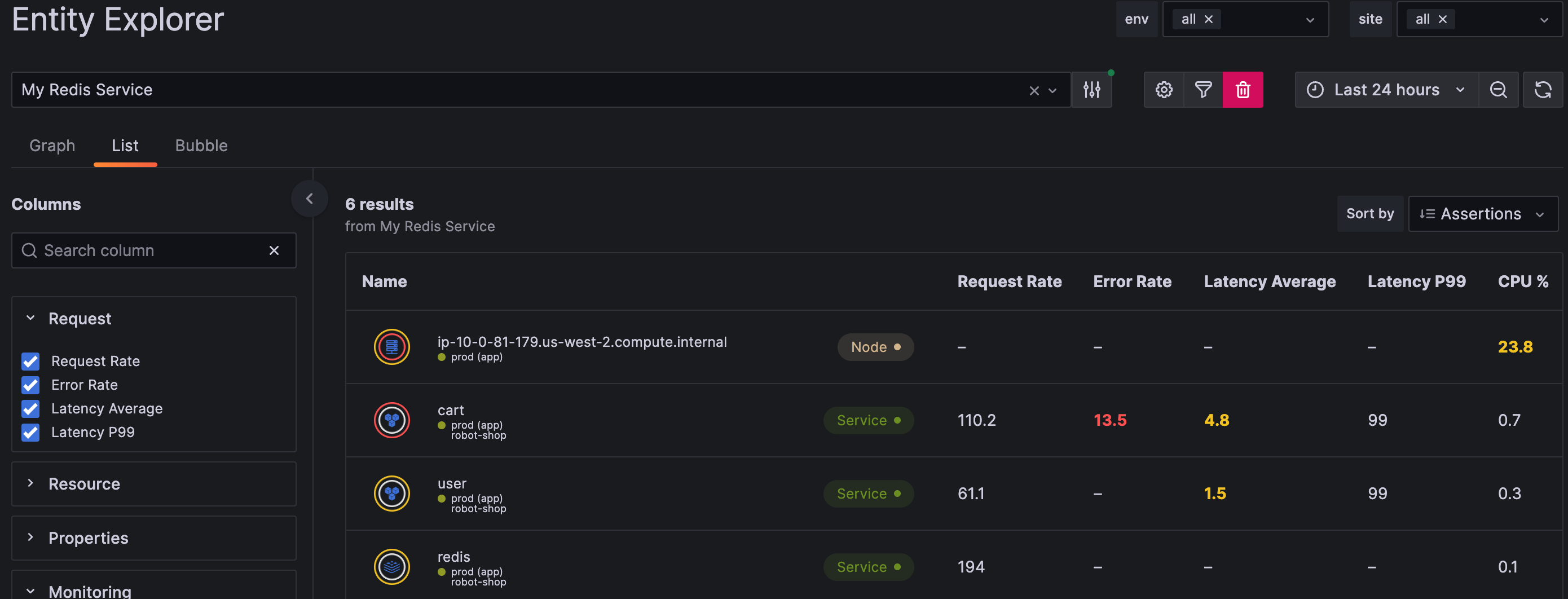
Use a list view
In the list view, you have the ability to select properties or monitoring statuses for each entity. This provides a comprehensive overview of the elements that are automatically monitored by Asserts. Resource monitoring is applicable to both services and nodes, while traffic and latency monitoring typically apply only to services.
To generate a list view, complete the following steps:
Click List.
Use the Columns checkboxes to add properties to the list view.
![List view]()
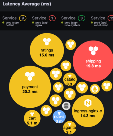
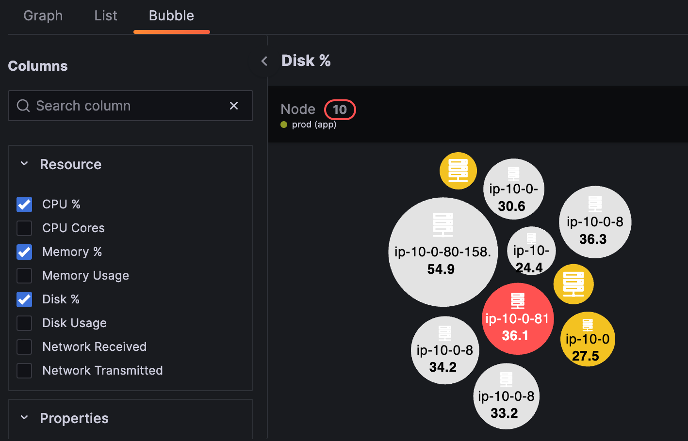
Generate a bubble chart
A bubble chart is a visual representation of entities displayed as circles, or bubbles. This chart consists of horizontal panels, where each panel represents a Key Performance Indicator (KPI) that you want to monitor. You can add panels to the bubble chart by selecting the desired KPIs from the Columns panel. The size of each bubble corresponds to the magnitude of the KPI for the entity, while the color of the bubble indicates the assertion status associated with the selected entity.
In the following example, the bubbles representing shipping, payment, ratings, and ingress-nginx-controller are noticeably larger than the rest. This indicates that the average latency is higher for these entities compared to the others. Additionally, the shipping bubble is colored red, which signifies that a critical assertion has been triggered for that particular entity.
To generate a bubble chart, complete the following steps:
Click Bubble.
Use the Columns checkboxes to add and remove bubble charts.
![Bubble view]()
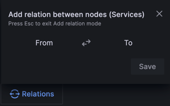
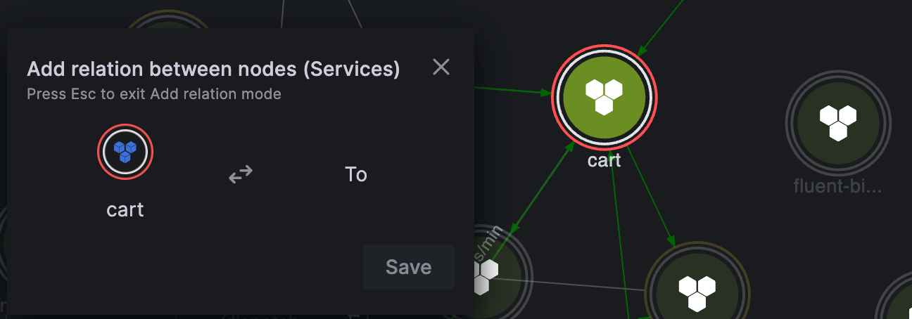
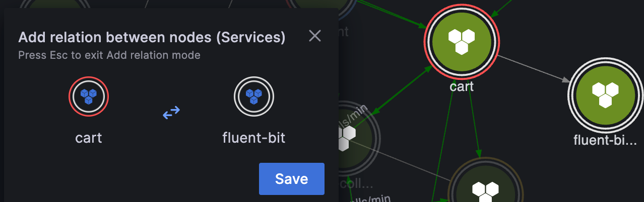
Add relations
You can manually add a relationship between entities if you know that it exists, but isn’t shown on the graph.
To add relations, perform the following steps:
Click Relations.
![Add relations]()
In the From field, click the source entity.
![Select source entity]()
In the To field, click the target entity.
Click Save.
![Select target entity]()
Was this page helpful?
Related resources from Grafana Labs


