
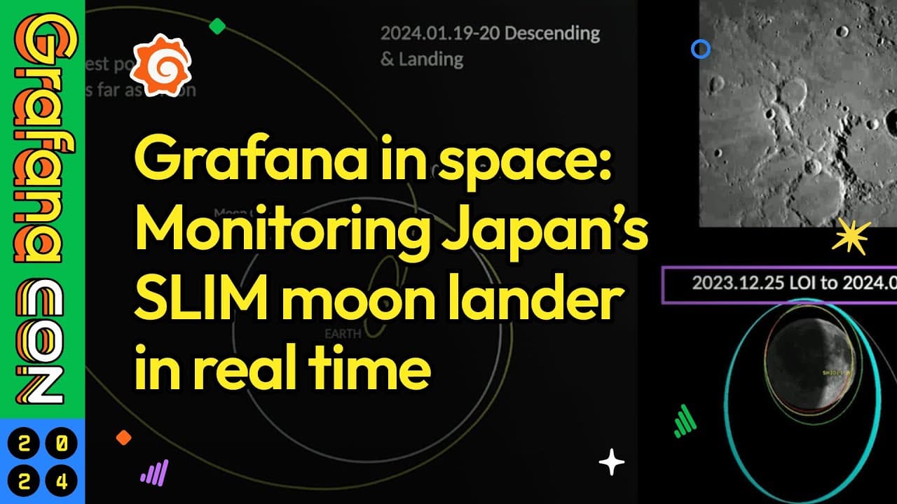
How Japan’s space agency used Grafana to monitor its first moon landing in real time
When Japan’s space agency, JAXA, set out to make its first lunar landing in January, the goal wasn’t just to get its SLIM (Smart Lander for Investigating Moon) spacecraft on the moon’s surface. The plan also called to touch down within 100 meters of its intended target — making for the world’s first pinpoint lunar landing.
JAXA’s doubly historic moment came on Jan. 19, 2024, as Japan became the fifth country to put a spacecraft on the moon. Back on Earth, the agency’s researchers and engineers monitored the operation in real time using Grafana dashboards that tracked SLIM’s critical functions including navigation, heater status, and landing maneuvers.
In a GrafanaCON 2024 presentation, Satoshi Nakahira, an associate senior researcher at JAXA’s Institute of Space and Astronautical Science (ISAS), highlighted some of the agency’s work, discussed its observability system, and shared examples of the dashboards used during the lunar landing.
Grafana, he said, “played an important role in our operation.”
Note: JAXA session from GrafanaCON 2024 is now available to watch on demand. You can check out the full session on YouTube below.
System booster engaged
JAXA observes its data with an in-house tool that Nakahira said has several issues. “There are many characters, so it is not easy to find certain parameters,” he said. On top of that, he added, it was built as monolithic software, so maintaining it or adding in new features was difficult.
Adding Grafana helped JAXA observe the different types of telemetry collected by SLIM’s scientific probes.
Nakahira divided the data into two categories:
- Housekeeping data covers the basic metrics that monitor the spacecraft’s real-time health and functionality, such as voltage, current, temperature, attitude, position, velocity, acceleration, status flags, and counts.
- Scientific data, including images, spectrograms, and bursted time series, which are analyzed on a slower time scale.
Nakahira said that the housekeeping data is “similar to what you find in IoT devices,” but with one key difference: IoT systems collect a small amount of telemetry from many devices, but JAXA’s probes collect a large volume of telemetry from one big device.
“The content of the data is still similar, so as a result, inspired by IoTs, we have integrated Grafana to space probe’s operations for enhanced observability,” he said.
JAXA used InfluxDB as its data source in Grafana, as well as an API to get calculations for its image generation. In front of InfluxDB, the team built a data receiver written in Python. “We were able to build our entire system quite easily and the visualization capability was broad — from simple ones to detailed graphs,” he added.
A giant step for JAXA—and its querying abilities
To go along with the Quick Look System, JAXA built and used more than 10 Grafana dashboards to monitor SLIM’s subsystems (e.g., power and navigation) as well as individual ones for three main phases: launch, running, and cruise.
Overall, Nakahira said, Grafana gave JAXA broad visualization capabilities that ranged from simple gauges to xy graphs, time series panels, and bar charts. The dashboards the agency’s team created were “well-received and visually impressive,” he added. Nakahira also said editing dashboards was “straightforward — and could be done even during operations.”
The real “game-changer” for the team, he explained, was Grafana’s variable feature. It allowed them to easily locate and display specific telemetry data among the thousands of series they collected. They used parameters and two query variables — textbox and query — to filter data across multiple graphs in Grafana.

Out-of-this-world dashboards
Nakahira shared video from inside of the JAXA control room just before SLIM’s lunar landing, highlighting where Grafana dashboards were used. For example, on the wall seen below, a monitor displayed a real-time Grafana dashboard that was live streamed on YouTube during the operation. “In this critical phase, the Control Room and the YouTube audience were all looking at the same Grafana dashboard at the same time,” Nakahira said.

Here are some of the dashboards that helped JAXA’s team make history:
Navigation system during the cruise phase
Nakahira said this was easily built by connecting InfluxDB with Grafana. The panels are monitoring:
- System status
- Error or warning status
- Log messages generated by ground processing
- Attitude (orientation in space), atmospheric change, and solar angle

Heater status
Nakahira said this dashboard is important “because instruments can be damaged by extremely low temperatures in space.”

It is scrollable and has several pages of information below what he shared. The dashboard allows team members to observe power-related metrics, such as power generation and power usage. The stacked graph in the upper left, he said, “provides a clear view for total power consumption for each component.”
SLIM has about 50 heaters, which are controlled autonomously, but it is important to monitor its duty cycle, Nakahira explained. He said the state timeline panel (middle-right) made that task easy because it allowed team members to compare it with the graphs in the middle of the screenshot above, which monitor temperature.
Thrusters and maneuvers

SLIM has two main thrusters and 12 smaller ones, Nakahira said, and the left side of the dashboard is arranged to reflect that layout. The gauges on the upper-right show the remaining fuel of SLIM’s thrusters and the battery. Below that, 3D images monitor SLIM’s attitude in relation to the sun and Earth. “It is implemented by Python API and images are generated by offline rendering by using trimesh or pyrender libraries,” he said.
Landing
Below is a snapshot of what the real-time dashboard looked like during the moon landing. (Nakahira’s presentation shows the data moving and changing.) It is similar to the dashboard above, but the panel in the bottom right is different. That new graph is charting distance on the horizontal axis and the attitude on the vertical axis. The flight line is SLIM’s actual planned trajectory, with the red section highlighting the actual trajectory during the previous five minutes.
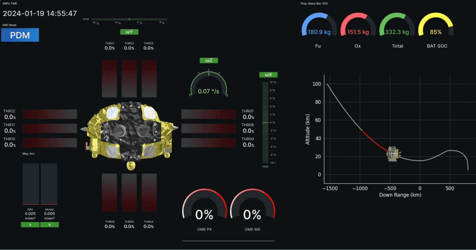
In the panel on the right side below, JAXA’s team was able to observe SLIM approaching and landing on the moon’s surface.

To find out more about JAXA’s upcoming missions, launches, and other projects, visit the agency’s official website.
Want to share your Grafana story and dashboards with the community? Drop us a note at stories@grafana.com.

