
How to easily retrieve values from a range in Grafana using a stat panel
Grafana is an open source visualization and monitoring solution for correlating and analyzing data from various sources. From time series graphs to heatmaps to 3D charts, it gives you lots of ways to untangle complex datasets. And while that’s incredibly powerful for observability, sometimes you’re looking for something fairly straightforward.
For example, in many observability use cases, you might only care about the current value of a metric (e.g., What’s the current resource usage? Is your service up and responding?). The process of answering that question is fairly straightforward. Well, at least theoretically; sometimes things need a bit more explanation.
In fact, one of the most popular posts in the Grafana community forum is about getting the latest value from a range, based on time. In this article, we will focus on answering the questions that have led to this topic being so popular:
- How can you retrieve the latest value from a range?
- Which visualizations support displaying the latest or current value of a metric?
- Why might you be seeing the dreaded “N/A”?
What’s a range query in Grafana?
In order to get the current value of a metric, you need to first understand how ranges work in Grafana.
A range query returns all of the data points between the start and end dates that match your query. As you change the time range, Grafana automatically adjusts the interval to return the right number of data points for the width of the graph. For example, you might have noticed that when you zoom in on a time series graph, you see more granular results in the chart with a smaller time range.
If you’ve ever unexpectedly seen “N/A” show up in a visualization, it can be unsettling. This happens when there aren’t any data points in the time range you’ve selected. Maybe you configured special null value mappings or you set Standard Options > No Value to show “N/A” for null values.

To avoid this situation:
- Use the query inspector to verify that your query is returning the data that you expect.
- Try adjusting the time range to a longer time period (e.g., 30 days) to see if data is outside of the range.
- Set Standard Options > No Value to another value that better describes what “no data” means in the context of your use case. You can try other values such as: “0,” “no errors,” or “down.”
Showing the latest value in a range
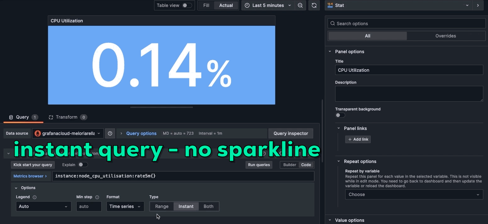
If you’re looking for the last or latest value in a range, we recommend using an instant query because it can return a single value for the time range instead of multiple data points. Instant queries can also be more performant because they don’t return every data point.
The stat visualization is a good option if you want to feature the latest or current value with a colorful background and an optional sparkline. The sparkline, which is only available in the stat panel, is a small time series graph shown in the background of the panel.
Which visualization to use will depend on your personal preference for displaying the data and whether you want to see the history of the value in the sparkline. Here’s how the displays differ between instant queries and range queries.
Instant query: Returns a single value for the range (no sparkline)

Range query: Can return a single value with a sparkline showing the time series values over the range in the background

Some considerations when you’re working with ranges and the stat panel:
- If you only want the last value, you can choose a smaller time range to return less data to make your query faster and lightweight for the data source.
- If you’re using the stat panel and want to show the history of the metric in a sparkline, the chart will display the range selected in the time range. For this use case, you might want to select a wider time range.
More Grafana visualizations for calculations
Here are the other options for visualizations that support calculations like last.
Bar gauge: Displays a horizontal or vertical bar to represent the value

Gauge: Displays the value as a gauge

If you want to display the last value in other visualizations, you can configure your Legend or use the transformation Add field from calculation to create a field that has the current value.
How to configure the stat panel for current values in Grafana
In the following example, I’ll show you how to configure the stat panel to show the current value from the last five minutes of CPU usage using Grafana Agent on your workstation. This example uses a Prometheus data source, but you can use your own data source and metrics to try it on your own.
- Log in to your Grafana account. (If you don’t have one already, you can sign up for a forever-free Grafana Cloud account today.)
- Add the stat panel to your Grafana dashboard by clicking on the Add Panel button and selecting the Stat option.
- Select Prometheus as the data source for the stat panel.
- Specify the query that retrieves the desired metric over the desired time range. For this example the metric name is
instance:node_cpu_utilisation:rate5mand the time range is Last 5 minutes. - Choose the last calculation from “Value options” and select Numeric fields to show only the value of the metric in the panel.
- Save the configuration and observe the final value displayed in the stat panel.
The stat panel in Grafana is a versatile tool that can be used to display a single value from a range. By understanding the basics of the stat panel, configuring it step-by-step, and following best practices, you can boost your Grafana skills and effectively analyze and visualize your data. Give it a try, and take your Grafana dashboards to the next level!
Join the conversation in the Grafana community forum
As we alluded to earlier, this blog post was inspired by a discussion on the Grafana community forum. We greatly appreciate the support and feedback from the community, so please share any additional tips, feedback, and other questions on this topic in this thread. And if you see another topic you’d like to have addressed on the blog, you can let us know that too!
If you’re not already using Grafana Cloud — the easiest way to get started with observability — sign up now for a free 14-day trial of Grafana Cloud Pro, with unlimited metrics, logs, traces, and users, long-term retention, and access to all Enterprise plugins.

