
How to create an ideal Grafana dashboard for science and engineering
Christopher R. Field is the Co-Founder, President for Theia Scientific, LLC. Chris has more than 15 years of experience in scientific hardware and software design, deploying embedded Linux-based devices for Internet of Things (IoT) for sensor fusion applications, and developing computer vision and image processing pipelines for feature analysis.
Mikhail Volkov is Founder/CEO at Volkov Labs, where they are developing open source and commercial plugins for Grafana.
Our road to becoming finalists for this year’s Grafana Golden Grot Awards (an honor celebrating members of the Grafana community who have created amazing dashboards) started with a conversation between two brothers right before the COVID-19 pandemic. One is a scientific software, computer vision, and embedded systems developer, and the other is a nuclear materials scientist. Both want to fundamentally change the way scientists and engineers conduct experiments, analyze data, and share/visualize results.
Eventually, Christopher and Kevin Field found Theia Scientific, LLC from their respective basements to use recent advances in Artificial Intelligence (AI) and Machine Learning (ML) to automate image analysis and data quantitation for science and engineering experiments.
Fast forward a year, and Theia Scientific partners with Volkov Labs to create an adaptable scientific observability platform powered by Grafana to run cutting-edge AI/ML models and monitor performance.
This collaboration yielded the beautiful dashboard seen here (Fig. 1) that we entered in the Golden Grot Awards professional dashboard category.
It features five different data sources, multiple community maintained plugins, and a combination of native and custom visualizations to give scientists and engineers real-time observability of their AI models and experiments. (Want to see one of our dashboards in action? Check out our GrafanaCON presentation, “Using Grafana and machine learning for real-time microscopy image analysis.”)

In this post, we’re going to highlight different features of the dashboard and explain what makes them valuable for observability.
Top row
The dashboard was designed to have a natural flow, with panels arranged in a left to right, top to bottom layout. Experiment-specific visualizations are enlarged for optimal human ingestion during real-time, or “live”, experiments.
Acquisition panel
Starting in the upper left-hand corner, the custom Acquisition panel created by Volkov Labs for the Theia web application controls the source of images that are streamed to the Graphical Processing Unit (GPU)-enabled single board Linux computer, a.k.a. edge computing device, hosting the Theia web application (Fig. 2).

The Acquisition panel uses a configuration drawer (Fig. 3). It slides out from the left when the “cog” in the toolbar is clicked by the user to select various image acquisition parameters and tune image pre-processing algorithms. This helps optimize AI/ML-based image analysis, such as contrast, brightness, gamma, and cropping to a Field of View (FoV, yellow box border).

The drawer also features collapsible sections and includes “power user” controls that don’t add to the visual noise of the overall dashboard. The drawer helps keep the focus on the results being generated in real-time from the experiments as opposed to the configuration of the device.
The interactivity of the Acquisition panel, its drawer, and its toolbar are powered by the custom data source created for the Web API hosted on the Theiascope™ hardware and the community Environment data source plugin. The Theia API data source is based on the open source, community developed HTTP data source supported and maintained by Volkov Labs.
In addition to the configuration drawer, the Acquisition panel provides a preview window of the incoming (or acquired) images. The preview either shows the uploaded single image or the live stream of the screen, camera, or video capture, similar to the thumbnail windows in video conference call software. It updates independently of the dashboard refresh rate.
Single image files can be uploaded via drag-n-drop through a drop zone widget, or a file browser dialog can be displayed to navigate to image files located on the scientist’s computer, as seen here (Fig. 4).

The preview window allows side-by-side comparison with results displayed in the Vision panel (which we’ll get to shortly). It can include applications of image processing modifications, such as brightness and contrast, and overlays of the detections generated from the AI/ML-based techniques.
Time series panels
As we move from left to right, we pass two time series panels that display the performance metrics for the AI model running on the edge computing device, as seen in Fig. 1. These panels display the frame rate and latency of the model for each image that is acquired from the Acquisition panel.
These panels are powered by the PostgreSQL data source, where the sub-second metrics are stored in a metrics hypertable with the Timescale extension installed. Visually, the location of these AI-related panels is significant: They are placed between the Acquisition and Vision panel to connect the “input” with the “output,” since AI is the bridge between these two panels, visualizations, and observations.
Vision panel
AI/ML gets us from the left to the right in the top row of the scientific and engineering-focused dashboard (Fig. 1), and we now reach the Vision panel in the top right corner.
The Vision panel visualizes the AI-powered image analysis results, seen as the red boxes around the scientifically interesting black dots. The displayed image has been processed and analyzed relative to the acquired preview image.

The image in the Vision panel will look different based on the user selected contrast, brightness, and gamma selected in the Acquisition panel configuration drawer here (Fig. 5).

An important characteristic of scientific research — and observability — is feedback. Users want to be able to adjust the image processing conditions to optimize AI/ML performance and analysis.
A goal of having the Acquisition configuration drawer slide out from the left, opposite the Vision panel, is to enable users to tune the configuration with the drawer and immediately receive feedback on their actions in the Vision panel.
Similar to the Acquisition panel, a toolbar is provided to quickly toggle and change the look and information displayed in the Vision panel. Other “power user” controls are available as panel options, which allows users to customize the dashboard to specific preferences and experimental requirements.
A useful feature of the Vision panel is how the box color and opacity (seen below in Fig. 6) can be scaled relative to the confidence the AI/ML model has in any specific feature detection.
This provides a quick visual indicator to users about the objects that are most important in an image. The Vision panel is also powered by the custom Theia API data source.

Middle row
Moving to the next row as we continue our journey from left to right, top to bottom through the scientific-focused dashboard, we have additional visualizations of the AI-powered image analysis and quantitation seen here (Fig. 7).

Table visualization
The leftmost panel in the second row above is a native Table visualization that displays all of the classes of objects detected in the image displayed in the Vision panel, along with each class’ average confidence and count. This is for the current image displayed in the Vision panel, but real-time acquisitions are streams of images over time, i.e., videos.
Heatmap panel
A video is essentially a container for a snapshot of time series data, where the data type happens to be a 2D heatmap of intensities, a.k.a. an image. Grafana is all about observing and visualizing time series streams of data, so the next panel from the left in the second row is a heatmap of the confidence from all feature detections by the AI/ML model. As the model becomes more confident over time, we see the heatmap get darker, more concentrated around 80%.
Feature count time series panel
The changes in the confidence heatmap panel also correlates with the feature count time series panel to its right. Having these two time series visualizations side-by-side enables scientists to immediately draw conclusions and make discoveries in real-time as data is acquired.
Contrast histogram
This panel (Fig. 8) is at the far right of the second row in Fig. 1. It displays another visualization with useful feedback for tuning the image processing conditions for optimal image analysis. The contrast histogram is a bar panel that uses the Theia API data source. The endpoint for the data has been highly optimized to avoid blocking updates from other panels in the dashboard and still yield meaningful information to users.
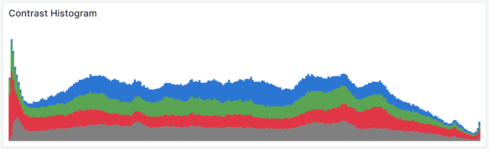
A contrast histogram is an invaluable visualization in microscopy and any scientific experiment that works with image data. The Acquisition panel drawer can slide out from the left, and as the user adjusts the brightness, contrast, gamma, and other parameters via controls in the dashboard, the Contrast Histogram panel will change in real-time. When it’s observed in combination with the Vision panel directly above it, users get immediate feedback on the influence and effects of the experimental and user adjustable parameters on the results.
Bottom row
The final row at the bottom of the dashboard is shown in Fig. 9 and includes two time series visualizations that are specific to microscopy-based research conducted by scientists and engineers.
Feature size visualization
The feature size of the objects detected by the AI/ML model displayed in the Vision panel is critical information to the interpretation of results and scientific discovery. As a result, it is placed “above the fold” in the dashboard for quick ingestion and visual processing without scrolling or hiding other visualizations. The distribution of feature sizes over time is important to correlate with the feature count.

Without Theia Scientific’s real-time microscopy image analysis technology powered by AI and ML, creating a plot similar to the feature size distribution time series heatmap visualization in the dashboard and having it ready for publication and presentations would take several hours instead of seconds. Alternatively, in a single screenshot, reading from left to right, top to bottom, we have the entire experimental story from the start (Acquisition panel) to finish (Feature Size Distribution) leveraging the power of Grafana’s ecosystem and technology stack.
Theia Scientific’s technology is instrument and experiment agnostic. A Theiascope™ can be used in any experiment that acquires 2D data, such as images. This versatility is needed because of the diversity of experiments and kinds of research projects occurring around the world. But . . . this also means that any platform that wants to meet the needs of any scientist or engineer needs to be highly customizable. For example, the calculation of feature size is different between institutions and teams of researchers. Using Grafana’s data source transformations, the dashboard can be customized to each team and organization’s preferred method of calculating feature sizes.
Looking ahead
The success of the Theiascope™ platform for science and engineering comes from leveraging the customizability of Grafana. It provides us with a variety of visualizations, vast selection of data sources, and the ability to easily create custom plugins. Meanwhile, it also allows us to embrace observability and feedback as core concepts in our scientific-focused dashboard. We plan to continue this success by migrating to Grafana 10 and using the new Grafana Scenes framework to build dynamic dashboards and expand the Theiascope™ App plugin. This will include adding live streaming through WebSockets for edge computing hardware monitoring of metrics such as device temperature, GPU memory usage, and CPU utilization.
We will utilize the adaptability and growing inclusivity of the Grafana technology stack for disparate and heterogeneous data sources in order to address the ever-evolving challenges facing scientists and engineers conducting research and analyzing images.
As Theiascope™ deployments grow and we continue to work with scientists and engineers to address their needs, we are adding more observability to our platform with a Prometheus database, real-time streaming, and the creation of a new community data source for monitoring distributed AI applications.
Want to share your Grafana story and dashboards with the community? Drop us a note at stories@grafana.com.

