
Meet our Golden Grot Awards grand prize winners!
Grafana is turning 10 this month, and we’re celebrating with GrafanaCON 2023, the launch of Grafana 10, and our first-ever Golden Grot Awards! The Golden Grot Awards are a way to highlight the amazing Grafana dashboards our community has created over the past decade. The submissions were narrowed down by a panel of experts from Grafana Labs, then voted on by the community.
The grand prize winners were revealed during the GrafanaCON keynote earlier this week. And they were . . .
Personal dashboard category: Nicky Sonnemans
Nicky, 25, lives in the Netherlands and is working toward a master’s degree in quantitative finance at Erasmus School of Economics. He’s been using Grafana for about three and a half years. With his award-winning dashboard, he explains, “My main motivation was to showcase that Grafana can be used as a business intelligence tool and not just for technical monitoring and server monitoring.”

Professional dashboard category: Raymond Sowden
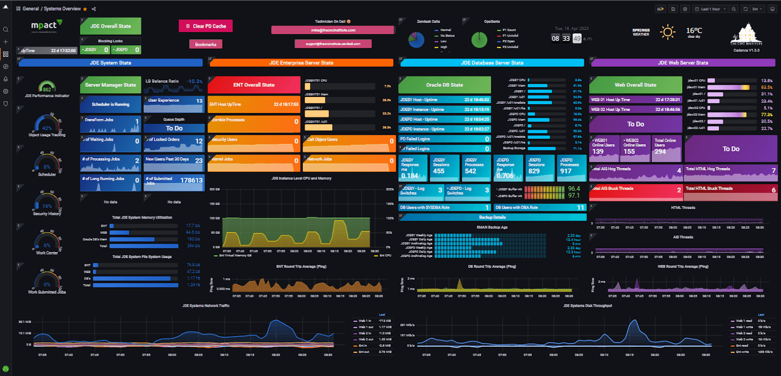
Raymond lives in Johannesburg, South Africa, and has been working in the IT field for about 25 years. He is the CNC Team Lead at RadixTrie PTY LTD and specializes in Oracle’s JD Edwards EnterpriseOne ERP (JDE). He created his award-winning Grafana dashboard to solve a big observability problem at work: “There was no single pane of glass to monitor JDE, so our dashboard gives us unparalleled insights into the overall health and performance of JDE.”
Read on to find out more about them and what makes their dashboards so special.
Get to know Nicky
Nicky’s dashboard monitors the current state of the European energy infrastructure, specifically current and historical information regarding gas storage, physical flow of gas throughout Europe, electricity generation, and energy prices.
He was inspired to create the dashboard because he wanted to visualize the energy data in a centralized place so he could easily spot any irregularities in real-time and receive any necessary alerts. His tech stack includes self-hosted instances of Airflow and Grafana running numerous proprietary data fetchers centralized around commodities, energy, weather, and vessels, among others.
What the judges said
“Nicky really captured the spirit of this competition, which is taking complex sets of data and transforming them into beautiful visualizations that actually make a real world impact.” – Jake Swiss, Senior Product Marketing Manager
“Many people in Europe are currently concerned with both clean and traditional energy generation, as well as energy infrastructure. It is great to see a colorful Grafana dashboard that effectively presents a significant amount of energy infrastructure data from open data. Nicky creatively utilized the latest geomap and the histogram panels in Grafana to produce a visually stunning and informative display. Despite the abundance of information, the dashboard remains uncluttered and easy to comprehend.” – Ward Bekker, Senior Principal Solutions Engineer
“I keep going back to the dashboard to learn more about the energy infrastructure in my country and throughout Europe. It does a fantastic job of using Grafana’s different features like template variables, transformations, rows, and a variety of visualizations to make the data super easy to understand and enjoyable to look at. Plus, I’ve learned so much about how all the different countries in Europe generate energy.” –Ivana Huckova, Software Engineer, Observability Logs Squad
Dashboard details
The setup: The data fetchers are orchestrated in Airflow and retrieve data every 15 to 30 minutes. The data is stored in a PostgreSQL database, and the Grafana instance is hosted on a server with 4vCPU and 16GB RAM, and exposed through NGINX.
Problem solved: “There wasn’t really a lot of transparency regarding the European energy infrastructure, especially on the gas market side,” says Nicky, who wanted to use the dashboard to support his master’s thesis. Where data was available, it wasn’t displayed in a user-friendly way, he added. “That’s what I try to solve with Grafana. On this dashboard, you can have a nice map and see where the gas originates and where it is flowing through.”
Powerful payoff: “For gas markets, I noticed some interesting patterns, like a country slowly decreasing its gas production and also firing up extra gas from their storages. When I see that I’ll buy some assets which are exposed to the gas markets, and make some money. It doesn’t happen often.”
Top dashboarding tip: “Learn SQL properly. If you combine it with Grafana, you can really figure out every answer to your questions. Plus, if you set it up properly, everybody in your organization can reach it and it’s so much better than having it on your local desktop.”
Personal interests: “My passion lies in the intersection of data, commodities, visualizations, and quantitative modeling,” Nicky says. He does part-time work as a refinery analyst at Vitol, an energy and commodities company, where he uses Grafana often. “In my spare time, I like to also collect data and then visualize it using Grafana. It’s a lot of data surrounding commodity markets, but also weather, housing data, airfares, marine traffic, and company data as well.”
For more about Nicky’s work, check out the full set of dashboards, or find him on GitHub to see what else he’s working on.
Get to know Raymond
Raymond’s dashboard offers a high-level overview on the system health, but the various widgets link to many detailed dashboards with more technical data. “Depending on how deep you want to go, you can drill down into multiple technologies and multiple dashboards,” he says. The dashboard is used by the company’s JDE technicians, as well as their customers’ technicians, and all the way up to the executive level. “We have reduced the human effort of daily checks, daily reporting, and more by providing real-time insights and metrics,” he says.
The dashboard also gives users the benefit of having insight into their system — some of the metrics they can view include ones related to the user experience, performance, uptime, and thresholds. “This allows us to pick up trends and issues before they become incidents,” he says. With a quick glance, he adds, “we can see where the bottlenecks or issues are without needing to interrogate JDE Server Manager, the OS, WebLogic or Oracle Enterprise Manager.”
What the judges said
“There were so many great entries in this category, so what made Raymond’s dashboard stand out was really the completeness of his systems overview visualization. With so much information, the design makes it easy to digest each section, which resulted in having a really effective and beautiful bird’s-eye view of his systems.” – Jake Swiss
“This is an excellent demonstration of how Grafana can serve as a comprehensive single-pane-of-glass solution for enterprises. It consolidates data from various sources and presents it in such detail that it becomes the go-to dashboard for the operational team. I like that Raymond’s dashboard includes a panel that indicates the overall red/green health status of each system component before displaying additional operational metrics and details. In addition to infrastructure and application data, the dashboard provides Zendesk and Opsgenie information, and even the current weather.” –Ward Bekker
Dashboard details
The setup: The Grafana dashboard was built specifically for JD Edwards, but JD Edwards runs on top of Oracle and web application servers. Raymond built the dashboard with Grafana OSS on Docker and relies on monitoring software, with proprietary scripts running natively on the OS, the Oracle database, WebLogic, and the application itself using the provided REST APIs. “We’ve rolled out dashboards for SQL Server as well, so it’s not just my JD Edwards team that’s using it,” Raymond says. “It’s the entire RadixTrie company.”
Making magic: “Our aha moment was when we could actually see what was happening on the backend and on the frontend, live in the Grafana dashboard. That was when we knew we had something special.”
Top dashboarding tip: “There’s only a little bit of screen real estate to go around, so you really need to pick and choose what you want to show,” he says. The trick is choosing the most important metrics to visualize, then putting them in a prime location. “As people who are used to Western languages, you read from left to right, so anything in the top left-hand corner is your most important screen real estate,” he explains. “Put your most important metrics there.”
Team spirit: Raymond took advantage of one of the major benefits of Grafana, which is that it’s an open source product. “Most of the things I’ve been able to do have been thanks to the community, with other people running into the things before me,” he says. “If there wasn’t a community of other people having gone through the same challenges, I would have been logging tickets and opening issues on the GitHub sites.”
Cyber roots: “I remember opening my dad’s IBM work PC to flick the switch to enable graphics mode, so I could play Formula 1 Grand Prix, and I was hooked at an early age.”
Winning attitude: “Being recognized by Grafana and the judges is very humbling.”
Missed GrafanaCON 2023? Don’t worry! You can still catch all the sessions, including the award presentations during the keynote, on demand.

