
6 easy ways to improve your log dashboards with Grafana and Grafana Loki
Because of where you’re reading this post, I’m going to assume you already know that Grafana is a great tool for visualizing and presenting metrics, and persisting them on dashboards. Ever since the Grafana Lokiquery builder for LogQL was introduced in 2022, it’s been easy to display and visualize logs, too.
However, even with the help of the query builder, it can still be a very manual task to adapt LogQL queries for each situation, or to quickly add and change multiple filters or fields. For dedicated use cases in which you already know what you’re looking for, it often makes more sense to build interactive log dashboards.
In this post, I’m going to show you several ways to do that by creating use case-specific log dashboards using special filters, pie charts, and data links. They’ll make your debugging workflow more efficient and take your dashboards to the next level.
Background basics
Grafana Loki, as you’ve probably heard, is a horizontally-scalable log aggregation system designed to make it easy to correlate logs with metrics and traces and extract metrics all of that while being format agnostic. Loki has a powerful query language called LogQL that makes it easy to search and analyze your logs. (It’s especially simple to use if you’re familiar with PromQL, the Prometheus query language that is used frequently in the observability community.)
When it comes to using Grafana to understand data, most people begin with Explore to try a few queries, then add the query as a panel to a new or existing dashboard using a ✨ fancy ✨ visualization. To query metrics at some point in the future, you’d skip the step of going to Explore again and go right to the dashboard to watch your metrics using filters and variables. Obviously, that access pattern is much more efficient than querying everything ad hoc all of the time — and that is important when you’re using a Grafana dashboard to find production issues as quickly as possible.
I’ve seen a lot of users out in the wild who are relatively new to Grafana and Loki start out by querying everything ad hoc from the Explore view. I don’t have enough data to explain why it happens, but I’ll try to show you how to get past that stage and become a more efficient Grafana Loki and Grafana user.
The benefits of dashboarding
Grafana has multiple ways to query logs in Loki, but two of the most important modes are Explore and dashboarding.
Explore is the best way to, well, explore your logs. It allows you to quickly search them, view log metrics, and it gives you an idea of the label names and their values. You can even watch log streams live.
LogQL is very powerful, and with the right query, you’ll often surprise yourself with the kind of information you can get from just a few simple log lines. But as I mentioned earlier, you can lose a lot of time if you’re constantly going back to tweak your LogQL queries or adjust your filters or fields.
On the other hand, building dedicated dashboards for your use cases has several advantages. For example:
- A dedicated log dashboard with pre-filled queries speeds up the time it takes you to get to the information you need. Ideally, you’ll only need to choose a few parameters, such as the data source, ad hoc filters, or text box filters.
- It makes it easy for people who are not familiar with LogQL to find and aggregate the logs they are looking for.
- Instead of just viewing log data as simple log lines, you can visually prepare them as tables, pie charts, or time series [,…], making it easier for you to comprehend the information and draw faster conclusions. Plus, having additional panels that show log aggregations gives you more context that helps you comprehend your logs faster.
- There’s no need to remember complicated queries or save them outside of Grafana because they’ll be stored in the dashboard. You can always look them up or copy them over to another dashboard for another use case.
- It helps new Loki and LogQL users improve their skills. They’ll be able to look at the queries of existing dashboards built by more experienced users, re-use them, modify them, and start building dashboards for their own use cases.
Quick disclaimer
Before we move on, please note this is not a step-by-step Grafana tutorial, and for the purpose of this blog post, I’ll assume that you know how to create dashboards, add panels, and add variables to dashboards. In case you don’t know how, I recommend reading the Grafana dashboard documentation before you read further. I will only describe the high-level configuration, and show query examples and screenshots of the results.
The data source type for all panels in this section is — you’ve probably guessed it — Loki. I’ve created this video to accompany this post. In it, I create a simple example dashboard based on the steps below.

The log queries are performed on logs that look similar to the lines below:
2023-04-05T20:55:38.075144958Z stdout F ts=2023-04-05T20:55:38.074Z level=info msg="POST /api/v1/payment/process" ip=10.116.0.4 method=POST path=/api/v1/payment/process status=200 endpoint=/api/v1//<path:path> traceID=8fadee638e45112149d2654e55c30ff7 spanID=74ae7ec5177996ad

2023-04-05T20:55:38.032690203Z stdout F ts=2023-04-05T20:55:38.031Z level=info msg="POST /api/v1/cart" ip=10.116.0.10 method=POST path=/api/v1/cart status=200 endpoint=/api/v1/ traceID=a50d9b1bc7c36a8e0929c644eceed6be spanID=1c49f522e229f9b4

2023-04-05T20:55:38.000342846Z stdout F ts=2023-04-05T20:55:37.999Z level=info msg="POST /api/v1/product/search" ip=10.116.0.10 method=POST path=/api/v1/product/search status=200 endpoint=/api/v1//<path:path> traceID=36cf3dc097f22c404073aa0128a0c49d spanID=db20c22bf42e5155
Use case: Building a log dashboard for server requests
For this dashboard makeover example, I’m using server logs because they are very common and widely understood. The goal is to get insights into what’s happening in your application faster based on your logs, without having to read and search through many different log lines. Of course, you can use any of these six features for all kinds of logs to make their use more efficient, but it’s nice to have a practical example.
Get started with your first log panel
In this example, you’re going to start with a single log stream, perhaps one that has helped you solve an issue successfully. Don’t worry about parameterizing it yet — it’s totally fine to start from hard-coded labels and think about adding variables to the setup later. For now, let’s just use a logs panel with a super simple query that basically does nothing else but select the log streams concerning an “ecommerce” app in a “cloud” cluster.
- Panel Name: Raw Logs
- Query: {app=“ecommerce”, cluster=“cloud”}
- Visualization Type: Logs
What you’ll get back will look something like this:

It’s pretty cool, but it won’t get you far if you’re trying to find specific log lines. You want to be able to filter it.
So let’s get to the six ways you can improve a log dashboard.
1. Add a text box variable to apply a line filter
A line filter in Loki is a very small but powerful change. It allows you to search for random strings across all logs.
Give the text box variable a generic name like “filter” and add it to the dashboard (top red circle in the screenshot below). Modify the existing panel to cater for the new filter variable (bottom red circle).
- Panel Name: Raw Logs
- Query: {app=“ecommerce”, cluster=“cloud”} |= `$filter`
- Visualization Type: Logs

2. Add a label filter and a corresponding drop-down menu
If you don’t necessarily know which strings or field values you have to find, you need some ideas of which existing values to filter for. A simple option is to add a label filter to your dashboard.
This requires two changes:
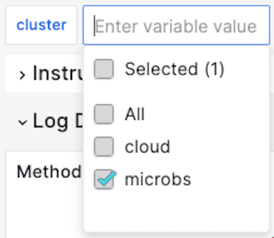
- You’ll need to add a template variable of the type “query” using the Loki data source, and choose “cluster” as the label you’re looking for. In this case, you can and should allow “multiple” and “All” selections to allow for searching all or multiple clusters instead of only a single one at a time. Let’s say the variable is called “cluster.”
- You will also have to add the variable name to the queries in all of the panels. The core part (the one in the curly brackets) should look like this:
- Query: {app=“ecommerce”, cluster=~“$cluster”}
Leave all filters and aggregations as is and just add the “cluster” part. Note that the label filter is a regular expression “=~”, which is required to allow “All” or “multiple” clusters to be selected in the drop-down menu.
3. Add an ad hoc filter table
While label filters are easy to implement, they only work for labels, not for the actual content of the log message. Also, it’s not a good idea to transform parts of the log message into labels, because that would kill Loki’s performance. If you wanted a quick and easy way to filter key/value pairs appearing in your log messages, you could use so-called ad hoc filters.
To do that, duplicate the Raw Logs panel. That will preserve the data source and the query.
If you want to filter for a specific request method, follow this example:
- Panel Name: Ad Hoc Filter Table
- Query: sum by(method) (count_over_time({app=“ecommerce”} |= `$
filter\</span> | <span style=“color:blue”>logfmt</span> | <span style=“color:green”>__error__</span>= <span style=“color:red”>`` </span>[`$__range]))) - Query Type: Instant
- Visualization Type: Table
Note the logfmt statement to parse the log lines in “log format”. (Another popular format that is supported by Loki’s LogQL, among others, is json.)
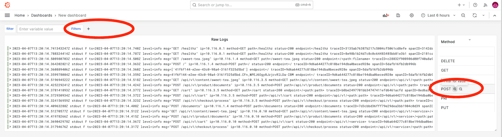
The __error__=~`` statement will simply filter out all log lines that cannot be parsed using the logfmt parser. This parses the log message into key-value pairs, so you can now use the field “method” to group and aggregate by it (sum by). As a result, this gives you the capability to filter for logs by “method” by just clicking on the magnifying glass (circled above on the right) next to the method you want to filter for. You can see all currently active ad hoc filters in the left upper variable area of Grafana (circled above on the left) and also revoke them from there.
Meanwhile, the $__range selector will do the aggregation over the time window in the right upper corner of Grafana (“Last 6 hours” in the screenshot above). As a result, it’s essential to use the Instant query type, since you want to do this type of aggregation only once for the current point in time and not for each interval over the time chosen frame. Misusing the Range query type for such panels will not perform very well and makes the query unnecessarily slow. As a best practice, it’s even better for the performance to create a recording rule for this use case to store this information as a metric and do metric queries to your Prometheus data source in this panel.
For this ad hoc filter to work you need to make sure you also parse the raw logs, so modify your first panel:
- Panel Name: Raw Logs
- Query: {app=“ecommerce”, cluster=“cloud”} |= `$filter` | logfmt | __error__``
- Visualization Type: Logs
As a next step, wouldn’t it be nice if you would see a distribution of how many “POST”, “GET”,… requests you had in total over a certain period of time? Let’s add a pie chart!
4. Add a pie chart
A pie chart gives you a great visual representation of the general distribution of certain features of your logs in the chosen time range.
To get started, duplicate the Ad Hoc Filter Table. That will preserve all the configurations and queries you’ve already done and it requires only minimal changes to the following:
- Panel Name: Method Distribution
- Query: sum by(method) (count_over_time({app=“ecommerce”} |= `$
filter\</span> | <span style=“color:blue”>logfmt</span> | <span style=“color:green”>__error__</span>= <span style=“color:red”>`` </span>[`$__range]))) - Visualization Type → Visualization Suggestion: Pie Chart

This beautiful and informative pie chart makes it easy to comprehend the relative distribution of HTTP methods across all log lines.
Would you like this pie chart to be an interactive component that allows you to filter down or link to other dashboards based on the part of the pie you clicked on? It’s time for data links!
5. Use data links for dynamic filtering or drill-down
At this point, you should have a log dashboard that looks something like this:

Data links are a great way of using the results of an existing panel query in a hyperlink and can be powerful additions to the existing capabilities of Grafana to correlate all kinds of metrics, logs, and traces.
Data links provide you with the ability to enrich an arbitrary URL with (meta) data of the query result. This can be used to trigger interactive changes in the current dashboard and drill down to specific components in other dashboards in the same or external Grafana and non-Grafana instances.
A very simple use case would be if you set one of the template variables in your dashboard based on the piece of data you clicked on. To achieve that, you would edit the panel, go to Data Links, click Add Data Link, and add a string that looks something like this:
/d/WvZrypYVk/log-dashboard?orgId=1&var-cluster=microbs&var-filter=${__data.fields.path}
You can copy and paste the first part (/d/WvZrypYVk/log-dashboard?orgId=1) from your current browser window because you’ll be linking it to the same dashboard. It contains the unique dashboard I.D. as well as the dashboard name.
The next part sets the value for our “cluster” variable that we added earlier: &var-cluster=microbs
The last piece is where it becomes interesting. We’re using a variable to refer to the data we actually clicked on: &var-filter=${__data.fields.path} You don’t need to learn how to construct this variable — by just typing “$” in the data link input field, you’ll see a list of available variables for the corresponding query result.
In another interesting use case, data links refer to the Explore view with a pre-configured query. That means you can use a piece (or multiple pieces) of data from your dashboard and inject it into a query of the same or different data source in Explore mode. It allows you to easily correlate data from logs with data from traces or business data. At the same time, it gives you a great start on doing more flexible ad hoc querying from the Explore mode to combine the best of both worlds: dashboards and the Explore UI. Just modify the link accordingly, or start by copying/pasting an example query URL that you’ve performed in the Explore view already.
6. Add instructions to accelerate adoption
There’s always something you can do to make the dashboard more beautiful and user-friendly. Choose a common color theme, follow general dashboard best practices, or if you really want to add a lot more value than just some cosmetic one, add one or more text panels to write instructions about how to use the dashboard. Some details to include: Which inputs are required? How do you filter? What should you filter first to get results faster? If you define the use case you’ve built the dashboard for directly on the dashboard, you won’t need to explain it yourself every time a new user is onboarded.
Enjoy your new log dashboard
Grafana is an excellent tool for visualizing logs from Loki, and the LogQL query language makes it easy to search and analyze your logs. Hopefully now you can see how Grafana and Loki together are a powerful combination when it comes to monitoring and troubleshooting your infrastructure and applications with logs.
By taking the time to create specific dashboards for logs, you’ll be able to save time (for yourself and other people), make your dashboards more interesting, and build something that you enjoy working with.
I have more thoughts on how to get the most out of your log dashboards, so stay tuned for another post soon!
Grafana Cloud is the easiest way to get started with metrics, logs, traces, and dashboards. We have a generous free forever tier and plans for every use case. Sign up for free now!

