
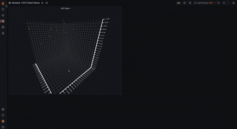
Introducing the XYZ chart: A three-dimensional way to visualize your data in Grafana
This panel is in alpha version and still in development. To use it as is, you need to modify your configuration file and setenable_alpha = truein thepanelssection. More information can be found on this page.
Two-dimensional graphics are the de facto way to visualize data within the observability realm, and Grafana is really good at plotting data this way. There are different panels that can be used to visualize different types of data, and we recently released the XY chart as a way to visualize relationships between two variables.
But this made us question whether we could bring value by adding a chart that can find connections between three variables. We believe that it would, and that is why we are introducing the interactive XYZ chart plugin.
In the past, three-dimensional charts have been frowned upon for being too hard to interpret. However, we believe they can be a very powerful tool for visualizing data with the right design and under the right context. There are scenarios where we can use these charts, and we believe that Grafana is the right place to have them.
This is a brand new release, but we’re excited to see how it can be adopted in the coming years. In this blog, we’ll show you some of the potential industries and use cases that could benefit from the XYZ chart. We’ll also briefly describe how to use these 3D charts and tell you what we have planned for the future.
Potential use cases
Just like its two-dimensional counterpart, the XYZ chart has many usages in many areas and industries. In the realm of business intelligence, for example, analysts could use it to observe any correlations between, let’s say, sales and cost of a product over the years. It might prove useful in areas such as economy or market research as well.
This type of plot is already heavily used in academia, where visualizing relationships between multiple variables is common practice. Other usages might be in areas where specific events might need to be tracked at certain positions, much like on a map that has all three variables: latitude, longitude, and altitude.
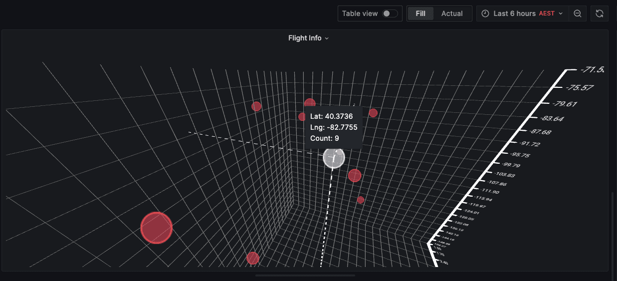
You could plot maps of countries, or a racing circuit with different recorded events at various points, or even the flight path of a plane. It could even go as far as rendering 3D models and might be of use in a dashboard monitoring various stats of a 3D printer, like the real-time progress of a print.
How to use the XYZ chart
The XYZ chart is very easy to use in Grafana. It will automatically try to match the required X, Y, and Z fields based on the given data, by choosing the first three numeric fields it finds. With Auto mode, you can select a specific field to represent the X-values, while the other two dimensions are automatically selected with the next numeric fields that’s found.

For a more granular setup, a user can switch to Manual mode and select which fields match each dimension.
You can also modify data points with a custom color and size, which can help you analyze the data more easily.

Since the chart is rendered in a 3D space, a user can interact with it by rotating it, zooming in and out, and panning it. The interactivity of the panel makes it useful and helps avoid situations in which a bad angle makes the visualization hard or impossible to interpret. Data points can also be hovered and show extra information in the tooltip.
Future work
The XYZ chart is still in development, and there are many features that we would like to add. Our top priority right now is adding multiple series support alongside legend support, which will allow users to compare multiple point clouds in the same chart, each having a different color and, thus, being easily distinguishable.
To make theXYZ chart more versatile, we plan to add further options for the data points, like the ability to change the form of the data point to different primitive shapes like squares, stars, or triangles. We also want to extend the number of dimensions visible on the chart, represented as the size of the data point or its color hue.
Other functionalities include adding regression lines and planes, connected lines, 3D mesh plots, and more.
We hope you will enjoy this new panel and are looking forward to your feedback either via our standard communication channels, including the Grafana Labs Community Slack, or directly on the GitHub repository.

