
How to extract label values from Prometheus metrics in Grafana
Prometheus metrics are usually visualized as numeric values on a graph, with the metrics categorized by labels. But what do you do when the numerical value doesn’t matter, and all of the information is in the labels? In that case, you might need to visualize the labels themselves.
This scenario can arise because you’re not always in control of how the metrics get reported, but you do often need to visualize what’s there. In this blog post, we’ll show you how to visualize labels and extract value from your Prometheus metrics in Grafana. Continue reading to find out how, and check out this finished simple dashboard available on Grafana Play so you can follow along or tinker with it yourself.
Set up your Prometheus data source in Grafana
Let’s start with a Prometheus data source. If you go into the Grafana Play dashboard I just mentioned, you can click on the Explore icon. Choose “Robust Perception Sample” from the drop-down menu, search for the alertmanager_build_info metric, and then click Run Query. It should look something like this:

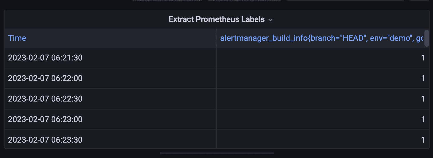
Let’s look at the alertmanager_build_info metric. As you’ll quickly see, the graph is not very useful, because the value is only 1. But if you look at the name of the metric, the number 1 isn’t the point here. All of the useful data is in the labels, where we can see the Alertmanager that’s currently running is a particular git commit from the HEAD branch, running on go1.14.4.

Clearly we need to take a different approach to getting the information we need, so let’s build a simple table for these Prometheus labels. In our hypothetical use case, we can use this dashboard panel to make sure that SREs always know exactly which instance of Alertmanager is running in production.
Display metric labels in a table
The first thing I’ll do is go to the Dashboards area of Grafana and create a new dashboard. You won’t have access to do this on Play, but you could follow along on your instance of Grafana.
I will then create a new panel, and title it “Extract Prometheus Labels.” Under Data source, I’ll choose the sample data source we were exploring above, and I’ll choose the alertmanager_build_info metric. If you have your own Grafana instance, you can follow along by picking most any simple Prometheus metric you have.

Next, in the upper right corner of the screenshot above, where you see Time series, we want to choose instead the Table visualization. This is important, because most Prometheus label information won’t be numbers that you can graph; they’ll be categorical variables or pieces of text best put into a table.
This gets us raw data, but it makes for an ugly table, as you can see below. It only shows us the time and all of the labels combined, so we’re going to need to explore some more options to clean things up.
Cleaning up and customizing the table
The first thing we’ll do is go into the query section and expand the options. Rather than a time series query, we want a table query, which will split out all of the values individually. Next, we want to select Instant rather than Range. If we are looking to create a panel with the software version, we don’t need a report of the version every five minutes, we only want to see the version that’s running right now. Here’s what those options look like:

If we save our panel and go back to have a look at it, this is already much improved — a table broken out by label. But we can do better; in the next step we’ll customize which columns are chosen.

Customizing column display
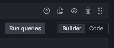
Once you’ve seen this table layout, go back into the panel edit dialog. In the query section, click Code to get into the PromQL view of our metric query, rather than using the query builder.
Right now, the code for our query just pulls that one simple metric: alertmanager_build_info.
Let’s change the query instead to this one:
max(alertmanager_build_info) by (revision, version, goversion)
What does this do? The max function takes only the largest timestamp value, i.e., the latest/last observation. The by grouping selects only the columns in the table that we want.
Back on the dashboard, our new panel is already looking better:

But since we only want to report the version on the dashboard, we don’t need the time of the observation, or the value. How do we get rid of those extra fields? Edit the panel, and right next to Query you will find an option to Transform.

Organize fields with a data transform
Transforms are a powerful way to reshape data. We want to select a transform called “Organize fields.”

Notice the eye icons next to the field names. I’ve clicked the one next to Time and Value so those fields are now hidden. If I like, I can also add a new name so the field appears under a different name in the title.
We’re simply transforming the data from the PromQL query by filtering certain columns out. Click Apply and we’re now back to our cleaned up table showing only the fields we like.

The same principle can be applied to any Prometheus metrics, any labels!
Next steps
In this example, we displayed label values quite simply in a table. To go even further with your data, you might use another data transform to turn, for example, a string label value into an integer or floating point value. This uses the same basic approach, just extended.
Once you get numeric data out of your label values, you can use many other kinds of visualizations other than just text tables using this same basic example. With a few PromQL and data transforms basics, you can do just about anything.

