
Monitoring HPC system health with Grafana and Psychart
Nicolas Ventura is a critical facilities engineer at NERSC, with experience in both mechanical and computer systems.
The National Energy Research Scientific Computing Center (NERSC) is a modern data center that’s home to two powerful high-performance computing (HPC) systems used for worldwide scientific research in genetics, physics, geology, and more. As such, the infrastructure team at NERSC has to closely track the facility conditions to ensure optimal operations.
Operated by the Lawrence Berkeley National Laboratory in Berkeley, California, NERSC employs an exhaustive operational data analytics model to monitor data from all around the facility, including telemetry, power consumption, and environmental data. That information is used to diagnose problems within the system, optimize efforts to reduce water and power consumption, and monitor the overall facility health.
We use a collection of several programs, databases, power meters, and sensors to perform real-time analytics on our systems. This analysis is critical because any deviation outside certain air condition parameters can degrade our HPC system. For example, if the air is:
- Too humid, it could lead to corrosion, tape media errors, anodic failures, and more
- Too cold, it could lead to an overworked mechanical system and less effective power usage
- Too dry, it could lead to electrostatic discharge
- Too hot, it could lead to overheating and reduce the overall system lifetime
In this blog, you’ll learn how we integrated air condition data charts with Grafana to quickly and easily monitor supply air conditions in our HPC system.
How NERSC collects and visualizes environmental data for HPC systems
As a member of the building infrastructure group, I am particularly interested in the environmental data gathered in our building management software from temperature, humidity, and flow rate sensors on our mechanical equipment. Our data is published into a Prometheus-style database called VictoriaMetrics, which organizes the data by timestamp and makes it much easier to create complex queries in Grafana for visualization.
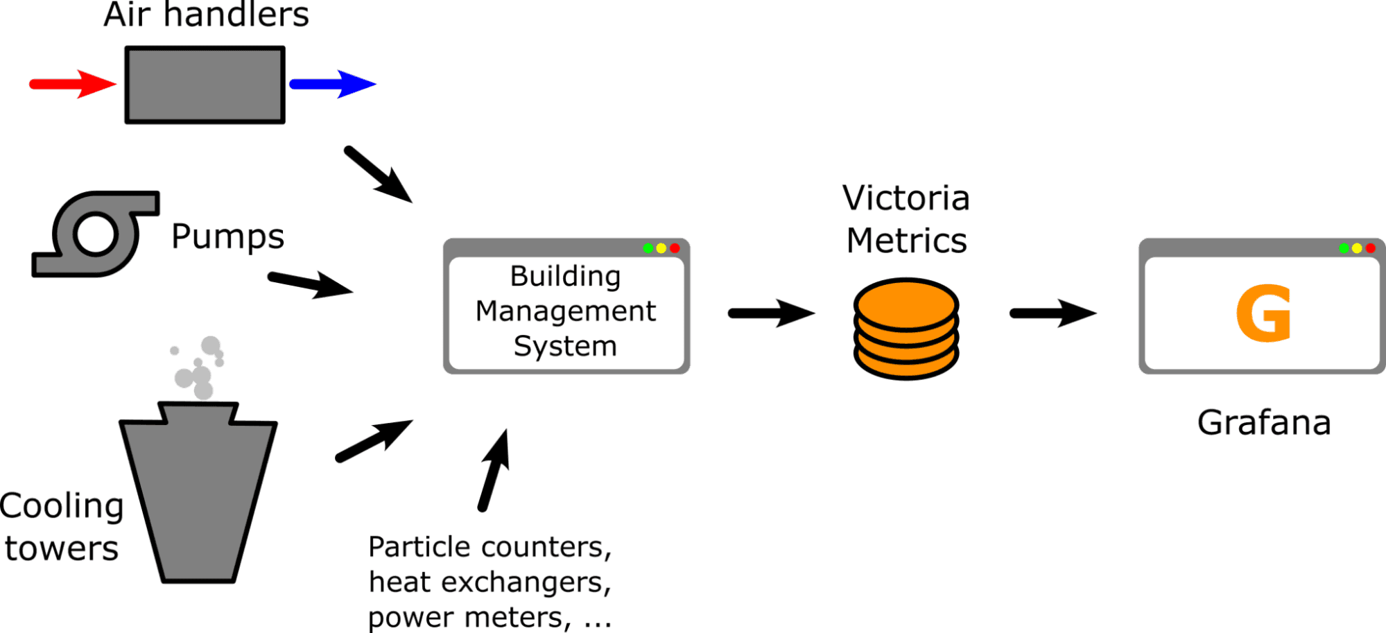
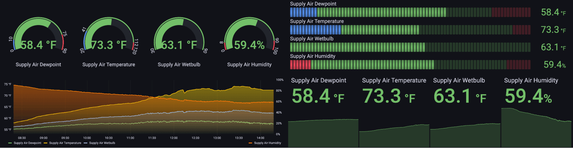
I helped put together several dashboards to visualize data from our mechanical cooling plant. The dashboard below demonstrates some of the data series captured by our air handlers. This information is critical because this air handler stack serves air into our air-cooled HPC auxiliary systems in the data center.

If temperatures go too high, for example, HPC equipment could run at lower efficiencies at best or get damaged at worst. Without these types of visualizations, it would be much more difficult to monitor air conditions in response to control program changes since our building management system has limited visualizations and stores much less data.
Supply air temperature is an important metric because it’s the temperature of the air being pushed into the computer room by the air handlers. However, the supply air temperature, or “dry bulb” temperature, is not enough information to evaluate facility health on its own.
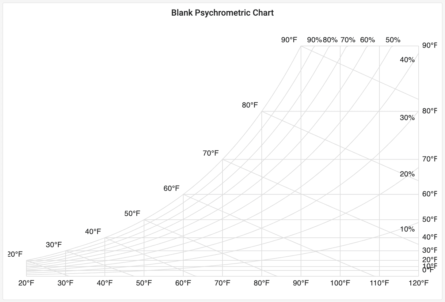
The American Society of Heating, Refrigeration, and Air-Conditioning Engineers (ASHRAE) has defined environmental parameters that have become a standard for data centers to follow. Staying within the allowable range of these parameters can maintain efficiency and maximize the lifetime of computer equipment.
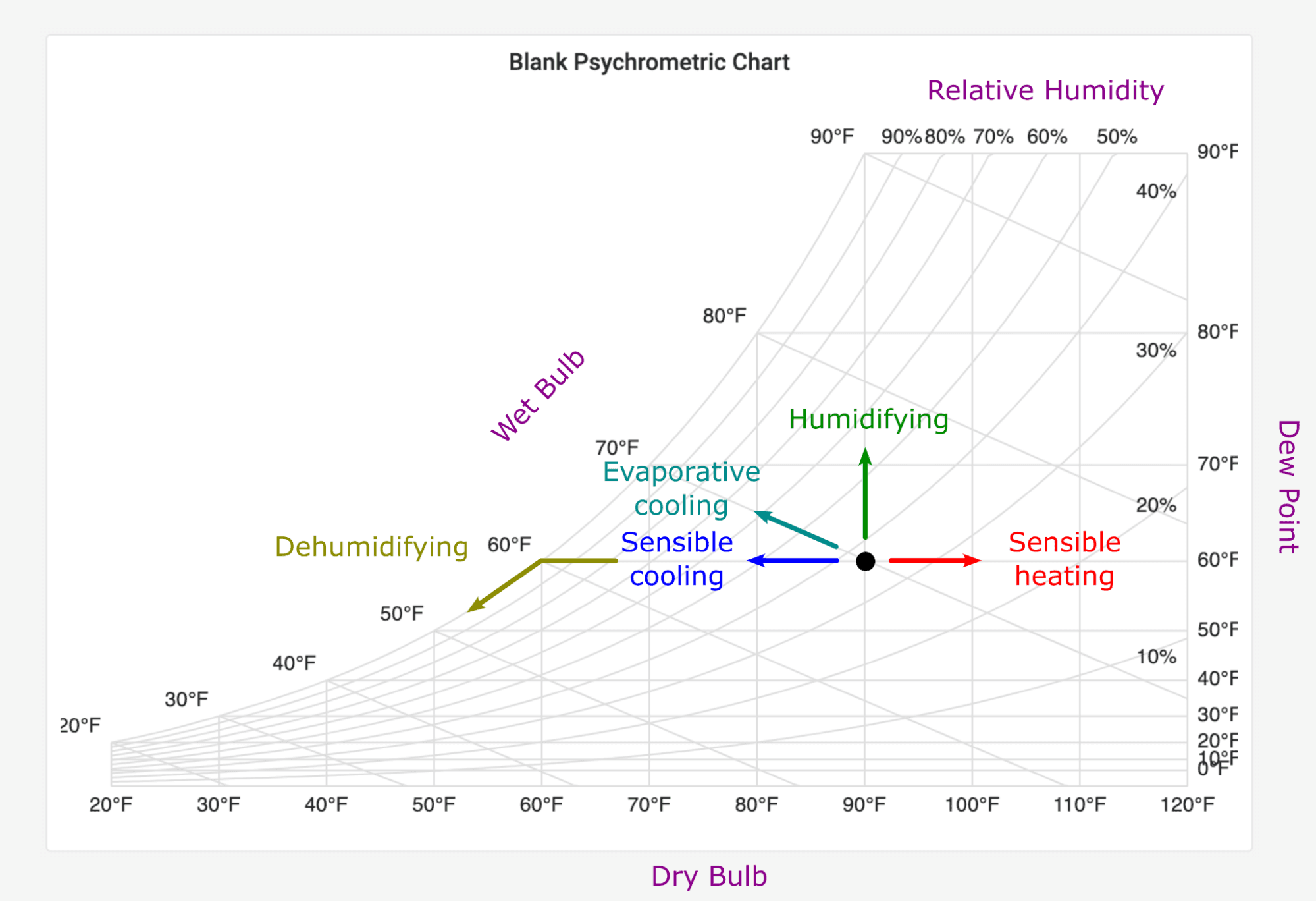
These parameters include not only dry bulb temperature, but also wet bulb temperature, dew point temperature, and relative humidity. These are called psychrometric state variables, and the combination is called a psychrometric state. Our systems require a strict tolerance on the state of air, so visualizing the state helps us quickly take action to keep our data center healthy.
The chart above shows just some of Grafana’s many built-in ways to visualize all the relevant psychrometric data. While these visualizations are pleasing to look at, this Grafana dashboard can be overwhelming when trying to discern a single state.
Luckily, we only need to really know two psychrometric properties to “fix the state.” That means that all other state variables can be calculated just by knowing any two of them. We can do this by using a psychrometric chart. Operators use this type of graph to quickly get feedback so they can make necessary adjustments to the facility, which in turn supports the HPC systems being used to accelerate scientific research. Additionally, if thermal/humidity sensors go out, this type of visualization won’t be affected as long as two sensors are still running. Some of my colleagues in the building infrastructure group have been asking for a real-time psychrometric chart for a long time — and we worked to create that solution with Grafana.
Introducing Psychart: psychrometric charts integrated with Grafana
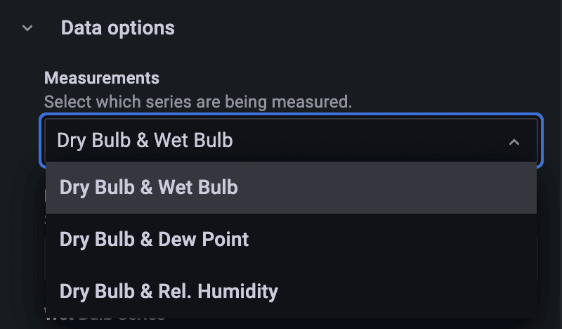
I built a project dubbed “Psychart,” which was intended to integrate a psychrometric chart in Grafana. I used the Grafana starter panel as a boilerplate for the project with a library called Psychrolib. With Psychrolib, I could calculate the entire state of air by just inputting any two state variables. I left the choice of which two variables to the discretion of the user.
Rendering the psychrometric chart was an interesting challenge. Prior to this project, a colleague tried to create one of these charts in Grafana using the SVG panel. But she found it difficult to render a variable number of states and perform calculations on each one to translate the state to an (x, y) coordinate. Another colleague created a functional offline program that could successfully render multiple points onto the graph, but it wasn’t connected to our network and didn’t offer the same versatility as Grafana panels.
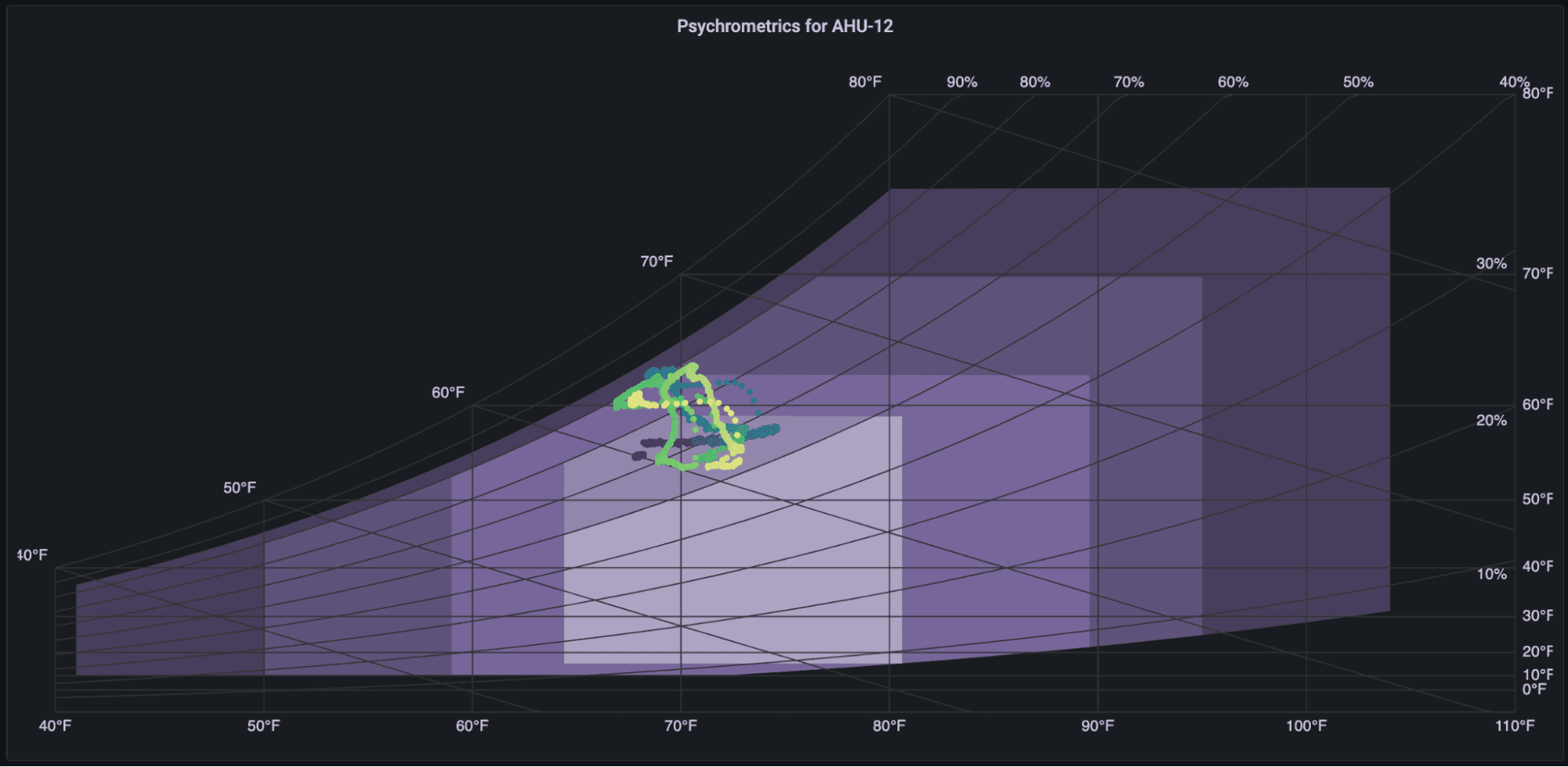
Knowing that Grafana had support for rendering SVG graphics, that was the route I chose for drawing the panel. I wrote a function that translated a general psychrometric state into an (x, y) point that was used to render the chart and all the incoming data. I embedded the ASHRAE guidelines for air-cooled data centers to allow the user to optionally overlay recommended targets for supply air. There are multiple sets of guidelines for different types of data centers that are shown in the image below.

The image below breaks down why this visualization is so important for operators and engineers.

The psychrometric chart also makes it easier to explain different air conditioning operations.
Improved data accuracy by connecting to an API
As you can see from the dashboard below, Psychart worked great for monitoring our air handler supply air.
And with that in place, we quickly learned about finer use cases. For example, our latest HPC system runs the Cray Shasta OS, which provides environmental data in its API. We used this to create more detailed views using in-rack temperatures and humidity, which translates to better system maintenance.

Using Psychart and Grafana to monitor supply air conditions, we can rapidly determine the state of the air and ensure that our mechanical controls programs are functioning correctly. Psychart also offers several customization options such as converting from U.S. to metric units, changing the point size and color, and more.
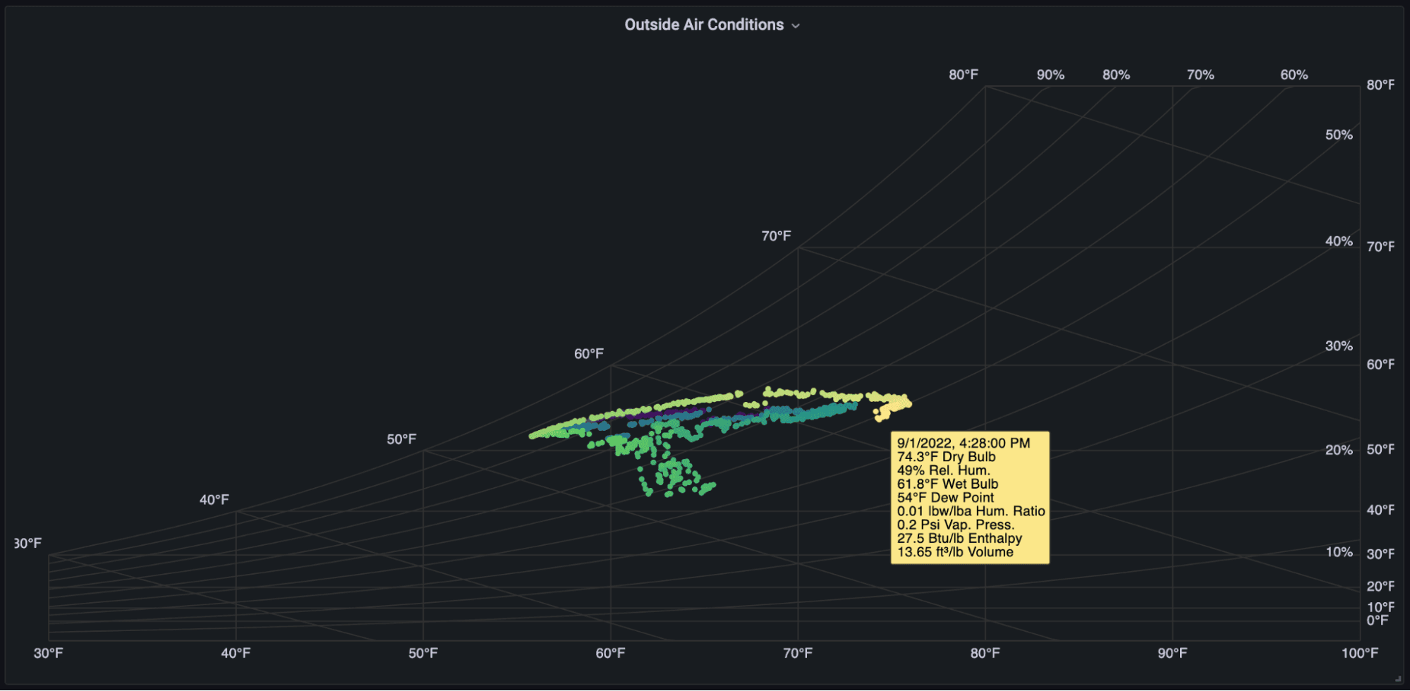
And Psychart can be applied to other use cases, such as monitoring chemical processes or atmospheric conditions. At NERSC we are also observing outdoor air conditions with Psychart, which gives us insight into whether it’s safe to operate entirely on outside air or if the air needs to be conditioned first.
Psychart was published in May 2022, and it has since received over 8,000 downloads. It was used as my graduate capstone project and has since received exposure at NERSC week (a showcase of NERSC with tours and events) and High Performance Computing Operator’s Review (HPCOR). The review has given it traction with other U.S. national labs for their user computer facilities. The project, which is open source and free to download, is proving to be an extremely helpful visual tool for our cooling plant and many others.
Want to share your Grafana story and dashboards with the community? Drop us a note at stories@grafana.com.

