Grafana dashboards: A complete guide to all the different types you can build
Editor’s note: This blog was updated on Jan. 9, 2023, to reflect our latest releases
There is one universal truth about using Grafana: Dashboards are easy to create, but not-so-easy to organize.
As organizations scale, there’s a high risk of unchecked dashboard sprawl, when dashboards become an unmanageable mess. As the number of users increases, so does their dashboard output.
Our guide to dashboard management gives an overview of features that help with organizing dashboards, but there are still two pain points:
- There are not a lot of details, examples, or opinions on how users can categorize and classify their Grafana dashboards.
- Grafana’s dashboard folder structure, as it is currently implemented, is limited. You can’t create subfolders, only first-level folders. It’s not obvious how to use them efficiently.
In this article, I will list and describe all the different types of Grafana dashboards that currently exist (based on my own research and my experience over the past five years using and supporting Grafana). While I don’t suggest a definitive organizational structure (this always depends on your business, your team’s workflow, and company culture), I’m hoping this Grafana dashboards list can help you think of all the use cases your classification scheme should cover. After reviewing all the different types of Grafana dashboards, you can choose which stories are relevant to your business processes, people, and teams.
I’m also hoping this comprehensive list can help you think of more new things you can do with Grafana!
USE/REDS dashboards
These Grafana dashboards are built on the USE and REDS methods.
The USE metrics (utilization, saturation, errors) are oriented towards hardware resources of your infrastructure. They help you understand how your machines are doing and what the cause of a problem might be.
The REDS metrics (requests, errors, duration, saturation — also known as the Four Golden Signals) are service-oriented, and they are also likely the ones you will want to alert on. REDS dashboards tell you how your services are performing and are a good proxy for your users’ experience.
The USE and REDS dashboards are particularly useful for site reliability engineers. They are visually very simple and uniform, mostly made up of time series panels. By standardizing dashboards across an organization using those methodologies, operators can interpret dashboards across different teams efficiently. Designating Grafana dashboards as “USE” and “REDS” in their title can also help find the right dashboard in a given context.
Grafana Labs VP of Technology and “Grafana’s Big Tent” podcast host Tom Wilkie describes the USE and REDS methods more in-depth in this GrafanaCon EU 2018 blog post and the video linked therein.
Overview and drill down dashboards
In Grafana, drill downs from aggregated views to detailed views are implemented by linking between different Grafana dashboards. An overview dashboard displays aggregated metrics for an entire infrastructure or service. You would then have a second-level dashboard, which shows more detailed metrics about a subset of an infrastructure or a single component instance.
This is usually implemented using dashboard links, data links and URL variables. There is also a demonstration of drill down links at the bottom of this Grafana dashboard on play.grafana.org.
Business journey/process flow dashboards
Thousands of businesses use Grafana dashboards to visualize their customer acquisition flows, supply chains, and operations. You can find many examples from various industries on our success stories and case studies page. Here are a few selected examples:
- How Grafana Cloud drives manufacturing plant efficiency at American Metal Processing
- With Grafana and InfluxDB, CSS Electronics visualizes CAN IoT data to monitor vehicles and machinery
- How Grafana Enterprise helped light up sales at Utilita
- Running a power plant with Grafana
- How New City Energy is supporting sustainability with Grafana
- How using Grafana (and plugins) gave a jolt to Smart State Technology
Research & development dashboards
Dashboard development is an iterative process. Users should have a place to save their test and work-in-progress dashboards. You may also want to implement a policy that unfinished dashboards should only exist in the staging environment, not in production.
Folders with the user’s or team’s name can help organize those unfinished Grafana dashboards — for example “AIOps drafts” or “SRE R&D” or “Cloud Platform WIP.” Also note that R&D dashboards should not have tags in common with production dashboards to avoid them appearing in dashboard lists and links.
Metrics exploration dashboards
When I’m not familiar with the metrics available for a system, I sometimes build a metrics exploration dashboard. Made of templated generic queries and repeated panels, these Grafana dashboards allow me to browse and discover useful metrics in a given data source.
The metrics exploration dashboard answers questions such as:
- I am connected to my data source. Now what?
- I added a metrics scrape job for a system. What metrics are available?
- What can I get out of this data source?
By design, this dashboard is as abstract and generic as possible. It is specific to a data source type; it can’t be so generic that it works with any database.
Variables provide a way to categorize and list metrics based on their prefix.
Four panels repeat over each metric, aggregating values in four different ways:
- Average:
avg without (instance) ($metric) - Sum:
sum without (instance) ($metric) - Average rates:
avg without (instance) (rate($metric[$__rate_interval])) - Rate totals:
sum without (instance) (rate($metric[$__rate_interval]))
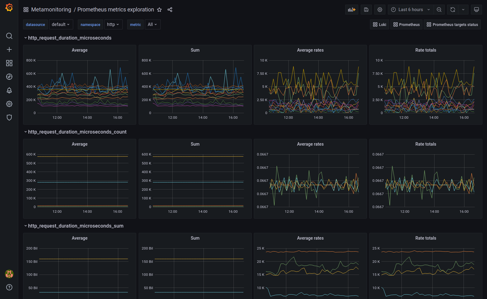
Whether the metric is a counter or a gauge, you can see the metric in the appropriate format in one or two of the columns in the metrics exploration dashboard above. Each row represents a metric with four different aggregation operations. You can scroll through the dashboard and discover metrics that you want to surface as a panel (on a different dashboard) or an alert.
Prebuilt dashboards
There are Grafana dashboards made by other people and shared with the community in various ways.
Some Grafana data source plugins and Grafana Cloud integrations include prebuilt dashboards. For example, when you install the Grafana Enterprise Metrics plugin, several GEM monitoring dashboards are included to help you monitor your GEM cluster’s performance.
Mixins are collections of Grafana dashboards, Prometheus alerts, and recording rules that were built from the collective experience of a system’s community. They can be static dashboard and rules files, or more often Jsonnet programs that you can include in your observability deployment pipeline. An example of a popular mixin is the Kubernetes mixin.
Grafana Labs hosts a public dashboards repository. This is a collection of Grafana dashboards that anyone can publish to. It’s a good source of examples and inspiration for many specific use cases and data sources. In practice, shared dashboards will get you maybe 50% or 90% of the way to your desired visualizations (if you find one for your data source and application). But shared dashboards rarely work 100% for your situation right out of the box, and they are not commonly used just as is. I usually prefer to build my own dashboards from scratch, but I will use the dashboard repository as a source of inspiration, examples, and ideas.
Dashboards as code
Dashboards can be generated from code and automatically published to Grafana. This concept is also known as dashboards as code and was covered in a recent GrafanaCONline session, which you can watch on demand for free. Dashboards as code is an area that is still under development. The API and the tooling surrounding this use case is not entirely stable and doesn’t cover all panels and visualization options. However, it is quite usable; we have a webinar on Getting started managing Grafana as code using HashiCorp Terraform in which we demonstrate what a production flow might look like today.
Here are a few past and current initiatives. Please use caution, and don’t expect to rely on these technologies in the long term. They may change or ultimately get abandoned, but some of these projects may become the future gold standard for dashboards as code.
- https://github.com/grafana/grafonnet-lib
- https://grafana.com/go/grafanaconline/2021/dashboards-as-code/
- https://github.com/grafana/grizzly
- https://github.com/grafana/grafana/discussions/39593
- https://github.com/grafana/terraform-provider-grafana
Grafana has two main facilities for automation:
The API was originally designed for serving the frontend and wasn’t meant as a nice clean REST API that people can use, yet here we are. You’ll find it’s a bit confusing and messy, but at least it’s reasonably documented and stable. You can write scripts to interact with the API with curl and jq, or any programming language with an HTTP client library.
You’ll probably need these endpoints the most:
- This is not available in Grafana Cloud because it implies access to the server’s filesystem.
- This is a tooling-agnostic facility that allows you to keep dashboards’ source of truth outside of Grafana and to update them by dropping files on the server’s filesystem. It’s meant to be used with your DevOps CI/CD pipelines and provisioning tools.
Big screen dashboards
These are dashboards designed to be displayed on a big screen in an open workspace. They were popular pre-pandemic and will probably make a comeback soon.
They are often made of stat, gauge, and bar gauge panels. They may also have tables with color-coding and gauge fields. They usually make use of value thresholds with color-coding as well.
One of the design intents for this kind of dashboard is to provide an instant emotional reading, not depth of detail. If the dashboard displays status or alert information, it will often specify what is broken, but not why. (Operators would open more detailed REDS/USE dashboards for that.)
Reports dashboards
Reporting is a Grafana Enterprise-only feature.
Similar to the big screen dashboards, a reports dashboard provides a quick overview, except the output media is a PDF attached to an email. A typical use case for this is to provide analysis and overviews to high-level executives who don’t typically log into Grafana in their day-to-day job.
Dashboards used for monitoring don’t usually translate naturally to a PDF, so users will typically create dashboards specifically for reports and fine-tune the layout until it looks good on the PDF. Check out how we recently updated the Reporting UX in Grafana Enterprise and for Grafana Pro and Advanced users.
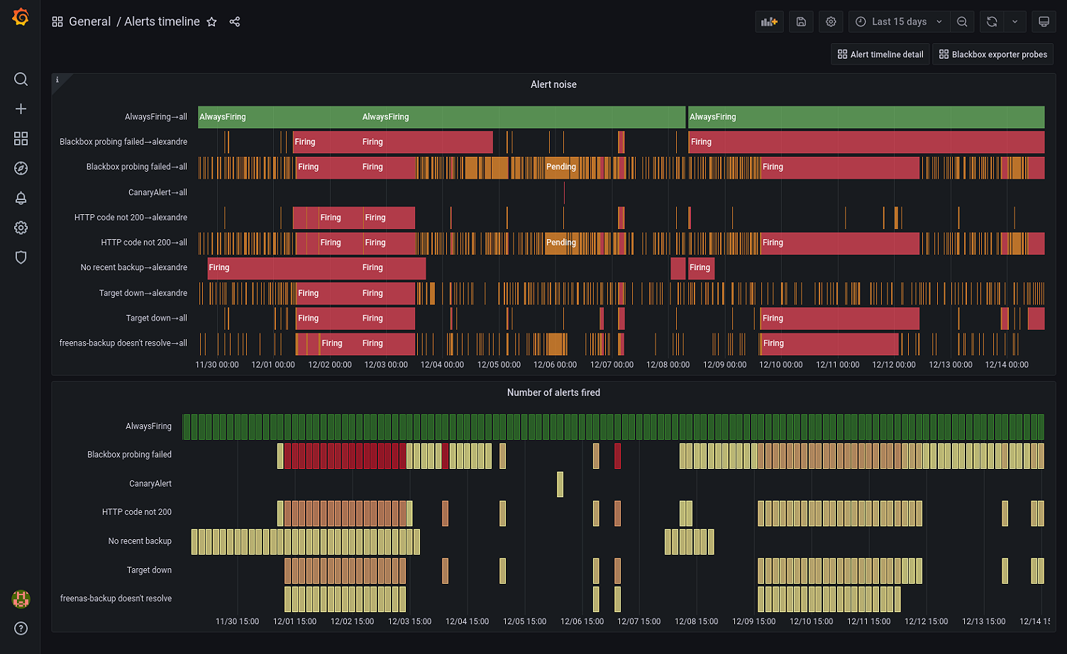
Alerts analysis dashboards
Here’s a perfect use case for the new state timeline panel released in Grafana 8.
Prometheus generates a synthetic alerts metric which makes the history of alerts queryable.

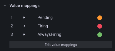
In the top panel, I use the state timeline panel with value mappings. I crafted this PromQL expression to return 3 for my AlwaysFiring meta-alert, 2 for firing alerts, and 1 for pending alerts.
max by (alertname,alertstate) (
  3 * max_over_time(ALERTS{alertname="AlwaysFiring"}[$__interval])
  or
  2 * max_over_time(ALERTS{alertstate="firing"}[$__interval])
  or
  max_over_time(ALERTS{alertstate="pending"}[$__interval])
)
This is what the value mappings look like:
The bottom panel is a status history with the following query:
count by (alertname) (max_over_time(ALERTS{alertstate="firing"}[$__interval]))I set 100 max data points in the query options and I use the “Yellow-Red (by value)” color scheme. There is also a color scheme override to make the AlwaysFiring time series green.
Grafana legacy alerts dashboards
Before unified alerting was introduced in Grafana 8, alerts were tightly coupled to the graph panel (replaced by the time series visualization since v7.4). As such, creating alerts imposed a dashboard layout on users. The common practice was to create a dashboard for the sole purpose of “parking” alert graph panels. This style of creating alerts is considered an older or “legacy” feature, and while users can roll back to using these dashboard panels in Grafana 9, we will officially remove that option in Grafana 10.
Instead, you can use the enhanced features in Grafana Alerting, which are enabled by default in Grafana 9. To find out more, watch our recent GrafanaCONline 2022 session “Alerting in Grafana 9: What’s new and improved,” which is available on demand.
Meta-monitoring dashboards
Meta-monitoring dashboards display metrics about your organization’s monitoring and observability stack. They’re saved in a separate folder because the audience is limited to the observability platform admins.
Users turn to meta-monitoring Grafana dashboards to visualize internal metrics collected from their observability components: Grafana, Prometheus, the Grafana Agent, Pushgateway, Alertmanager, Grafana Loki, etc. Almost every component of the Grafana/Prometheus ecosystem exposes metrics at the /metrics path on the HTTP port (the default port number is different for every service).
See also:
- How we use meta-monitoring Prometheus servers to monitor all other Prometheus servers at Grafana Labs
- Best practices for meta-monitoring the Grafana Agent
Issue dashboards
This is a type of Grafana dashboard created for investigating a specific issue. Their use is scoped to a limited time, after which they become obsolete or stale.
You may say that Grafana Explore is the right tool for this use case, because it allows you to run ad-hoc disposable queries. But what if it’s a hard-to-diagnose issue you have been chasing for weeks or months?
I argue that there is a case for setting up a folder for such dashboards. You may also add a timestamp or an issue number in the dashboard title.
See also:
- Pro tip: How to use semi-relative time ranges in Grafana
- Announcing Grafana Incident, smart incident management for your teams, which is available to all Grafana Cloud users.
The home dashboards
You can easily customize the home dashboard in Grafana to provide orientation to your users.
The home dashboard can be set at the Organization level, the Team level, or the User level in Grafana.
While most Grafana users don’t do this, small teams might find it useful. I always recommend customizing the home dashboard for large teams and corporations.
There are three approaches to home dashboards:
- The light approach. Keep the original content, but add a row at the top with your own dashboard lists.
- The heavy approach. Build an entirely custom home dashboard.
- The enterprise approach. Build a custom home dashboard for each team.
What to put on a home dashboard:
- Information in a text panel explaining who is managing this Grafana instance, what is monitored here, who to contact for help.
- Dashboard list panels managed dynamically using tags.
Demo and training dashboards
These Grafana dashboards are present all over the place here at Grafana Labs. They help us demonstrate the value of Grafana, and they are sources of inspiration, examples, and best practices.
We have https://play.grafana.org, our public demo instance of Grafana. We also have a few other non-publicly accessible dashboards that we use in various sales and training contexts. They sometimes connect to the TestData data source plugin, or a data source with data generators that generate predictable metrics.
The New Stack (TNS) is “a simple three-tier demo application, fully instrumented with the 3 pillars of observability: metrics, logs, and traces.” Our solutions engineers use its included Grafana dashboards to demonstrate what a modern observability stack looks like and what it’s like to pivot among different types of observability data.
How to organize Grafana dashboards
So, no matter what type of Grafana dashboards you decide to build, how are you going to organize all of your dashboards?
- Will you create one folder per team? Or multiple folders per team so they can organize several different dashboard types?
- Will you give users their personal sandbox folder on your staging Grafana instance?
- Are there going to be some dashboards managed outside of Grafana in a VCS and provisioned via your DevOps tooling?
Here are some examples of how to organize your growing collection of dashboards.
Salesforce
I recommend viewing the on demand session “Using the Grafana Stack to visualize and manage overall service health and alerts,” the GrafanaCONLine 2021 presentation given by the Salesforce team. At 23:47 into the presentation, John O’Brien talks about “Dashboards that work” and shares guidelines and tips for creating and organizing dashboards for a wide audience.
He classifies dashboards into three main types: trends, health checks, and performance monitoring. At 30:00 into his talk, John shares some of their dashboard quality standards for dashboard authors, which helps them find a balance between flexibility and order.
Kubernetes monitoring
Here’s a great KubeCon talk by David Kaltschmidt, summarizing the process of evolving Kubernetes monitoring dashboards: Grafana Labs at KubeCon: Foolproof Kubernetes Dashboards for Sleep-Deprived On Calls. This is where the dashboard maturity model came from.
My self-hosted “Watchtower”
My brother and I run self-hosted services, and I maintain our monitoring and observability solution using Prometheus and Grafana.
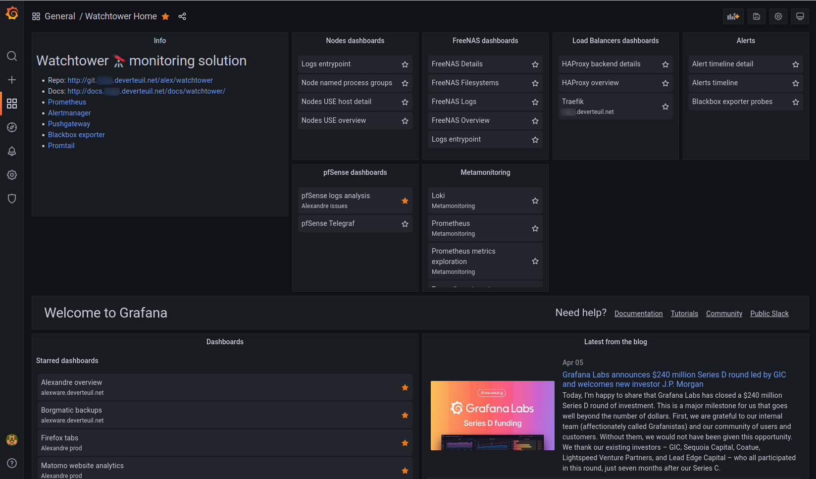
Above: The home dashboard on my personal Grafana instance. I just added a row above the original Grafana content with a Text panel and some Dashboard list panels.
Here is how I organize dashboard folders in my Grafana instance:
Alexandre archive
- Graveyard of dashboards I no longer use but want to keep around in case I want to re-use some queries or visualizations.
Alexandre issues
- Dashboards created for investigating specific problems.
- Titles are prefixed with a “yyyy-mm-dd” formatted date.
Alexandre prod
- Dashboards I use regularly but that are not useful for my brother.
Alexandre R&D
- Dashboard drafts, work-in-progress, tests.
Meta-monitoring
- Grafana, Grafana Loki, Prometheus, Prometheus targets status.
- Prometheus metrics exploration.
General
- Production dashboards that are useful to both my brother and me.
- Tags are used to organize dashboards in Dashboard list panels on the Home dashboard, and for linking related dashboards together.
Learn more about managing Grafana dashboards
As a general purpose dashboarding platform, Grafana doesn’t enforce or suggest an organization method to keep your Grafana dashboards tidy. Instead Grafana provides Folders, Tags, Teams, and Permissions facilities and allows users to customize and build their own dashboard system that works for them.
I hope that by laying out as many dashboard types as I can in one article, I can help you establish the foundation for a good classification system that you can then transpose into folders and dashboard naming conventions.
To learn more about how to organize dashboards, read our documentation on:
- Best practices for managing dashboards
- Dashboard folders
- Dashboard and folder permissions
- Linking overview
Before closing, I recommend watching the Getting started with Grafana dashboard design webinar on demand because it gives a good overview of dashboard design principles and provides examples of the most common dashboard types and use cases. I think it’s a great presentation to watch whether you are just getting started with Grafana dashboards or you have been building Grafana dashboards for a few years.
Do you have any dashboard types that are not described in this post? Please let me know! I’m reachable on our Grafana Labs Community Slack.
Grafana Cloud is the easiest way to get started with metrics, logs, traces, and dashboards. We have a generous free forever tier and plans for every use case. Sign up for free now!


