
Monitoring COVID-19 virus levels in wastewater using Grafana, Databricks, and the Sqlyze plugin
The new Sqlyze Enterprise plugin allows you to connect your Grafana instance to all your favorite SQL databases, many NoSQL databases, and many other non-SQL data sources — from document databases, to ERP systems, to even Slack. You don’t have to know the native query syntax for these data sources; you can just use SQL.
The Sqlyze Enterprise plugin uses ODBC at its core. Hundreds of ODBC drivers are available for various databases/data sources. So if an ODBC driver exists, you can now query it in Grafana with SQL.
What is Databricks?
Databricks is a popular data lake/data warehouse/AI platform that uses Apache Spark to rip through huge amounts of data and provide super fast metrics. Pairing this with Grafana, we can build some nice looking, lightning fast dashboards that slice through mountains of data and instantly give you some great insights.
Sounds great right? Let’s look at how we can connect to Databricks and run some SQL queries.
Set up and connect the Sqlyze plugin and Databricks
Step 1: Install the driver (this is currently manual but will be easier on future versions). You can obtain the driver here.
For Linux users only:
- Install unixODBC using the package manager for your Linux distributionapt-get install unixodbc or yum install unixODBC
- Add an entry to your odbcinst.ini file. This defines where the driver is installed.To find your odbcinst.ini use the following command:odbcinst -j
dbcinst.ini (change the path below to your driver)
[ODBC Drivers]
Databricks=Installed

[Databricks]
Driver=/Library/simba/spark/lib/libsparkodbc.so
Step 2: Get your driver settings from Databricks
- Go to your cluster and select the JDBC/ODBC tab

Step 3: Install the Sqlyze plugin on Grafana
Step 4: Create a new Sqlyze data source with your driver settings. See example below. Note: Driver must match the entry name in the odbcinst.ini file.

Step 5: Save and test

Create a Grafana dashboard and run SQL
After you’ve created your dashboard and panel in Grafana, select your new data source. Once selected, you will be presented with a SQL editor with some nice color coding for SQL.
Importing COVID-19 wastewater data from the CDC
For this example, we’ve decided to look at a timely topic: Tracking the community spread of COVID-19 by importing COVID-19 wastewater surveillance data from the Centers for Disease Control and Prevention into Databricks. People who are infected with COVID-19 shed the virus in their stool, so wastewater surveillance has become one method that public health officials use to understand, monitor, and even predict the spread of COVID-19 within a community — especially as home-testing has become more popular but harder to record and track.
Here, we are going to visualize the percentage of change of the COVID-19 virus in wastewater over time at a particular wastewater treatment plant. First of all, it’s important to note what this “percentage” metric is telling us. This metric is defined by the CDC as follows:
This metric shows whether SARS-CoV-2 virus levels at a site are currently higher or lower than past historical levels at the same site. 0% means levels are the lowest they have been at the site; 100% means levels are the highest they have been at the site. Public health officials watch for increasing levels of the virus in wastewater over time and use this data to help make public health decisions.
I’ve written a query (below) to show the percentage changes for one treatment plant in Michigan and adjusted the time range to a 5-month window.
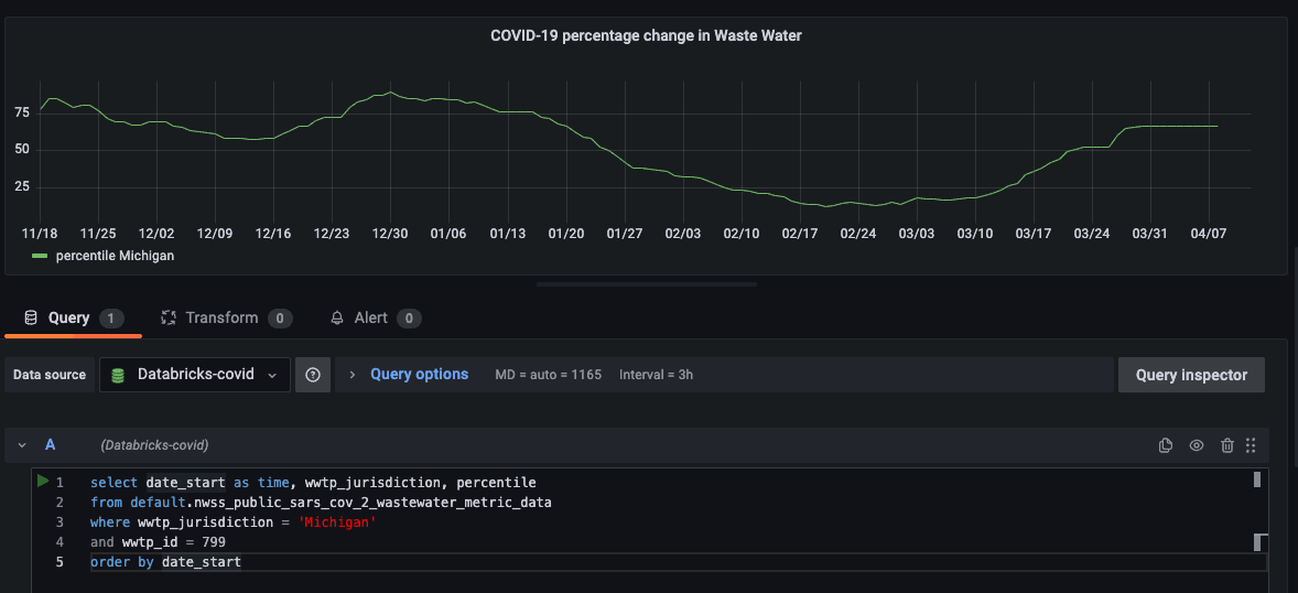
So, using Grafana, we can monitor these changes over time. We can even set up alerts if the percentage change hits a certain threshold.
How to query COVID-19 wastewater data by state and county
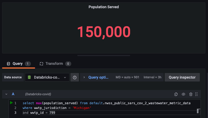
This dataset also provides the population of those within this wastewater plant’s jurisdiction. Let’s add another query and stat panel to show that metric.
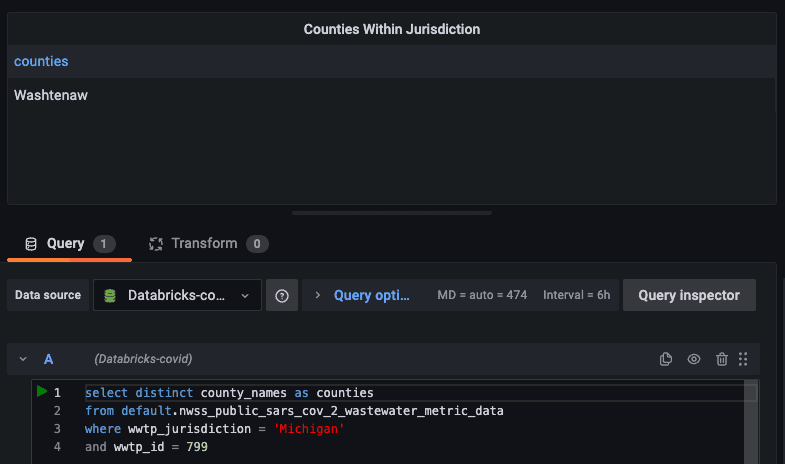
We can also see the specific counties that are within the jurisdiction of this treatment plant. It would be interesting to show the counties that are affected. Let’s add another panel and show a table since there can be multiple counties.
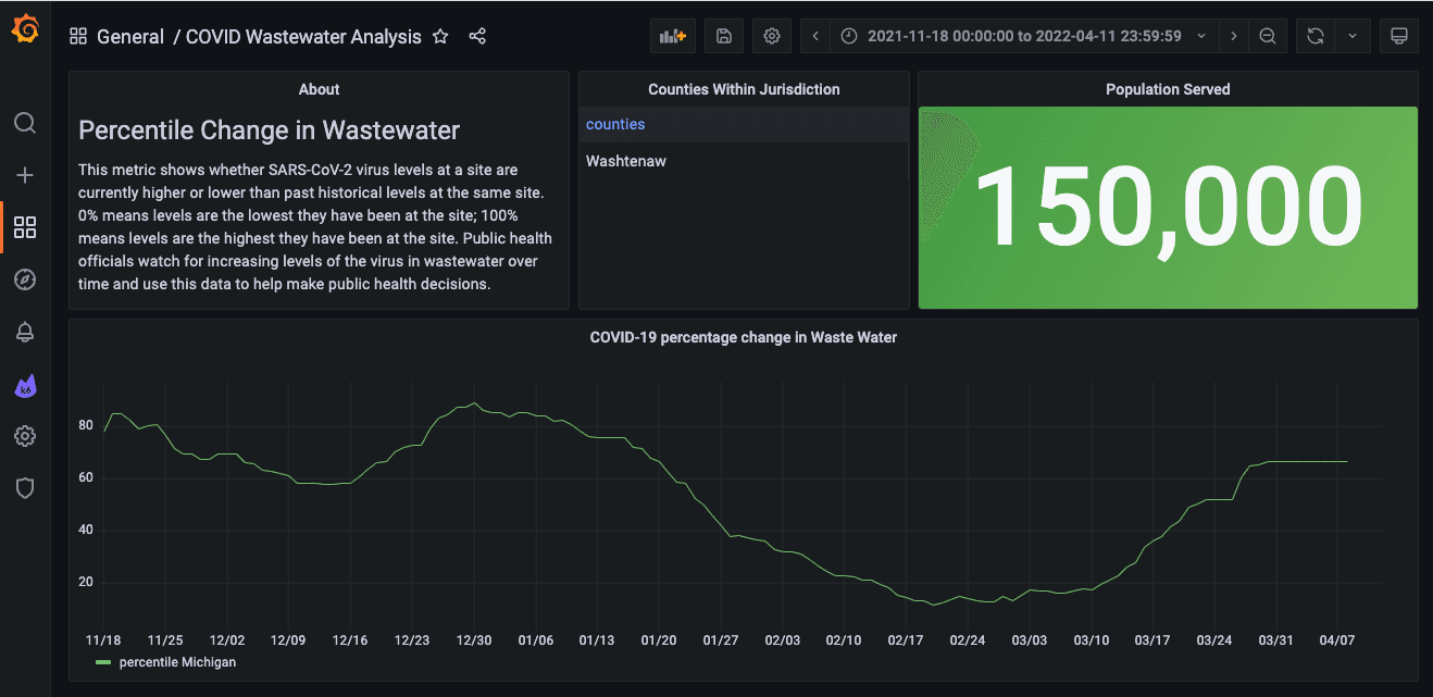
Let’s also add a text panel to describe the metric. Now we’ve got a comprehensive dashboard taking shape.
I’ve hardcoded the queries to the state of Michigan. Now let’s add some template variables where users can choose the state and county, so they can see the virus levels at treatment plants in other places, perhaps closer to their homes or in areas they may be traveling to in the future.
First, we’ll add a query type variable to get a list of states.

Now we’ll add a query type variable to get a list of counties. In this query, we will reference our state variable.
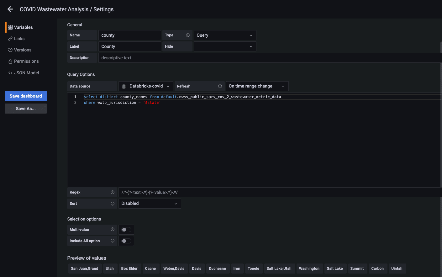
Now we will edit our time series panel and update the query to use our new variables.
select date_start as time, wwtp_jurisdiction, percentile
from default.nwss_public_sars_cov_2_wastewater_metric_data
where wwtp_jurisdiction = '$state'
and county_names = '$county'
order by date_start
Let’s also update the stats panel query to reference the variables.
select max(population_served) from default.nwss_public_sars_cov_2_wastewater_metric_data
where wwtp_jurisdiction = '$state'
and county_names = '$county'
Now we can choose state and county from our dashboard. Since we can choose the county now, I’ve removed the table of counties panel.

This is nice, but can we compare different counties? Yes! Let’s change our time series query a bit and enable our county variable to select multiple values.

So there you have it — using the Sqlyze data source plugin, we can query COVID-19 wastewater surveillance data on Databricks.
Remember the Sqlyze plugin can connect to many other sources, such as REST APIs. Stay tuned for more examples!
The Sqlyze Enterprise plugin is available for users with a Grafana Enterprise license. For more information and to get started, check out the Sqlyze plugin page or contact our team.

