
Pro tip: How to use semi-relative time ranges in Grafana
If you’re even the slightest bit familiar with how Grafana dashboards work, you’ve probably realized that the time range selector is one of the most important features. After all, when you’re using Grafana to visualize time series and logs, defining a time range is required for metrics and logs queries. You can select absolute time ranges (from 2021-12-02 00:00:00 to 2021-12-05 23:59:59) or relative time ranges (from 2 days ago until now), and changing a time range will automatically refresh all the panel queries with the new time range. (Check out our time range controls page for more specifics.)
But did you know that in addition to absolute and relative time ranges, you can use semi-relative time ranges? What I mean is you can set the start time to an absolute timestamp, and the end time to a “now” that is relative to the current time. This is helpful because it allows you to watch in real time what happens from a fixed point until now.
As time progresses, the plot will automatically and progressively zoom out to show more history and fewer details (since the interval between data points gets bigger). At the same rate, the importance of high data resolution will decrease, while the relevance of viewing history trends over the entire time period will increase.
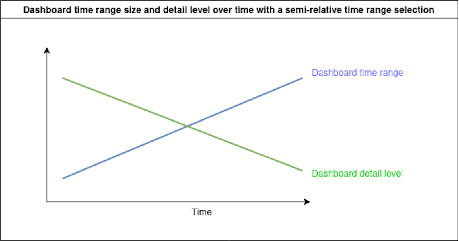
Semi-relative time range dashboards are useful when you need to monitor the progress of something over time, but you also want to see the entire history from the beginning point in time.
I discovered two use-cases for semi-relative time ranges while using Grafana. The first one is tracking an issue that occurs infrequently. The second one is real-time monitoring of metrics that are updated during business hours. Let me show you how they work.
Troubleshooting a randomly-occurring problem
Last year, after my pfSense router at homekept randomly rebooting, I decided to troubleshoot. The problem happened infrequently and was hard to catch, so I built a dashboard specifically to monitor this issue. I gave it a semi-relative time range (fixed start time, relative end time) to visualize the frequency of reboots over time.
Start time: 2021-06-01 00:00:00
End time: now
The graph panel below shows (in green) the count of log lines per 12 hour interval for the kernel syslog application. I was more interested in the annotations (vertical dotted red lines) marking every appearance of the string “Bootup complete” in the logs. I used this dashboard to quantify and analyze the unplanned reboots pattern from May onward.
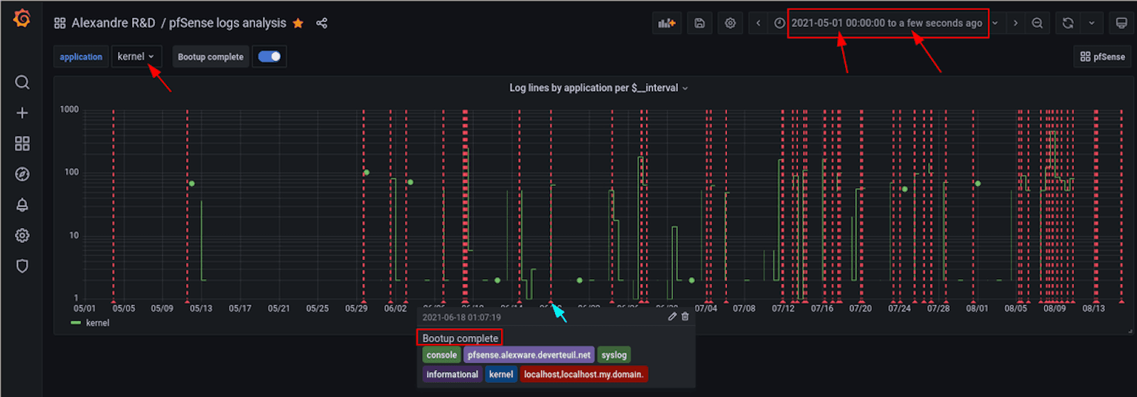
My pfSense logs graph panel
I noticed that the occurrences were really random and getting worse over time. This pattern indicated that the problem was likely hardware-related.
After changing the hardware, I wanted to track whether the unplanned reboots continued or stopped. I didn’t know how long it would take to confirm the problem was resolved, since the occurrences were random.
With a semi-relative time range, I was able to keep the time range prior to the hardware change in view. That made it easier to see how the situation improved or degraded over my troubleshooting period, and then I could validate whether I had solved the issue.
Below is the same graph, a little more than a month later. Notice how the start of the graph remains fixed, so that we can see the entire history of the problem at all times. As time advances, the graph compresses to the left. I replaced the hardware on August 15. After waiting a few weeks, the graph clearly indicates my fix resolved the problem.

The graph panel after one month
This visualization was the right tool to use to troubleshoot the issue because I was interested in observing an ever-increasing time range to analyze and figure out the pattern of occurrences. The data points were far apart, and the whole process took several months to detect and a few weeks to resolve. If I had used a relative time range (for example, the last seven days), it would have been difficult to see how the pattern changed progressively over the course of weeks and months.
For more information on how to set up something similar, check out this blog post and the docs on Loki annotation queries.
Monitoring during specific work hours
Today, we live and work in the web browser. We open hundreds of tabs each day, and we often reopen the same set of tabs many times for projects and daily work. I organize my Firefox tabs in persistent sessions using Tree Style Tabs and Tab Session Manager add-ons. I wanted to have some stats about my saved tabs and sessions, so I wrote a script that uses Prometheus and Grafana to display counts of Firefox tabs on graphs.
The dashboard I created to visualize my tabs open over time has another type of semi-relative time range. It defaults to the current business day so far, because it’s the time range I’m most often interested in viewing when I consult this dashboard.
Start time: now/d+8h
End time: now
This is equivalent to the “Today so far” time range preset, but it starts at 8:00am instead of 12:00am by appending +8h to the periodic start time. I don’t start opening Firefox tabs until ~8:30-9:00am, so there is no point in starting the time range at 12:00am.
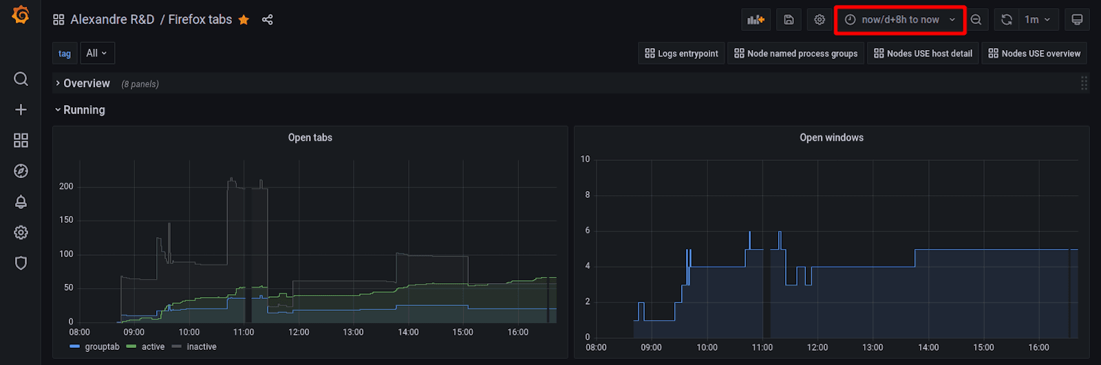
My Firefox tabs dashboard
Let’s say you have an important business process metric you want to track every day for the current day so far, but the data starts coming in during normal business hours starting at 8am. Using the period selector now/d would waste lots of screen space with non-existent data from midnight to 8am. Setting the start time to now/d+8 instead will optimize the display by limiting the view to the business hours you are interested in.
Final thoughts
I wanted to share my pro tips for advanced users to highlight the flexibility of Grafana as a visualization tool. Now I wonder if there are more instances when semi-relative time ranges could come in handy. If you have any ideas, reach out on our public Slack workspace, or email me at alexandre@grafana.com and let me know!
Grafana Cloud is the easiest way to get started with metrics, logs, traces, and dashboards. We have a generous forever-free tier and plans for every use case. Sign up for free now!

