How to visualize real-time data from an IoT smart home weather station with Grafana dashboards
One of the experiences I’ve truly enjoyed over my first year as a senior solutions engineer here at Grafana Labs has been learning from our community and customers about their own Grafana journeys. I’ve been impressed by some remarkable dashboards for home automation, personal health data visualizations, family Minecraft statistics, and energy usage projects. At the same time, I’ve seen network performance management teams share their delight with Grafana Enterprise Metrics, and operation teams appreciating how quickly they can ingest and search through petabytes of real-time logging with Grafana Enterprise Logs. Everybody has a personal observability story, and here is one of mine…
At the start of this year, I discovered WeatherFlow Tempest, a wireless, solar-powered, all-in-one, IoT smart home weather station. It provides real-time weather telemetry with sensors for measurements like temperature, wind, and rain. I’ve been a weather station geek for as long as I can remember, and when I saw the Tempest, with its feature-rich capabilities and flexible home installation, I decided to buy one. My enthusiasm for collecting and visualizing my Tempest’s real-time data with Grafana has since turned into an obsession.
Here are a few things I’ve learned over the past nine months:
- How much I love Loki (Import/Export, CLI, logs to metrics).
- A single dashboard can turn into more than a dozen.
- I can have several different flexible data source options with the same great UI.
- The value of building observability into my project.
Getting started
For most WeatherFlow users, a mobile app is the primary way to visualize their Tempest weather data. However, I began exploring the different ways to collect and visualize the weather data available through a local UDP API. I started by simply using logs to metrics with Loki. By collecting the raw JSON data available on my local network, I was able to get started with building Grafana dashboards quite quickly. Soon enough, I was looking at real-time hyper-local weather conditions — not just temperatures, but also wind conditions and lightning strikes. Using what was happening in my own St. Louis backyard to visualize weather events over time was pretty exciting!

My Rain and Lightning dashboard showing precipitation rate and accumulation, with a heatmap of the number of lightning strikes by distance over time.
I thought it was great how my local data streamed directly from my Tempest and how the data was in a well-documented, structured format that was easy to manage. As I spent more time learning how to build capabilities into my local data collector, I started to explore some of the other APIs that WeatherFlow provides. Specifically, I wanted to capture derived metrics and enhanced lightning detection event data when my device was connected to WeatherFlow’s Cloud platform.
As part of learning how to build a data collector for my Tempest, I joined the helpful WeatherFlow community. I received exceptional help and feedback and wanted to start contributing back and sharing my emerging collector and dashboarding project.
I promptly realized that building a collector and dashboards to share with the community required understanding how others might use the same data. Several WeatherFlow community members have numerous devices, and collecting data when multiple devices are on an account is a little more involved. Since I was having so much fun with my Tempest, I bought a second one that allowed me to compare weather conditions across multiple devices and also have a way to build more inclusive dashboards.
Good thing I happened to know somebody who loves the weather as much as I do: I had a WeatherFlow Tempest shipped to my mom’s house in the middle of Missouri.

Sunset view of my mom’s property in the middle of Missouri

My second WeatherFlow Tempest
Once I had the second Tempest deployed at my mom’s, a few shortcomings soon became apparent:
- I had no reliable way of deploying my local collector to capture the streaming UDP Tempest data.
- The property has intermittent internet connectivity and historically poor bandwidth.
Each of those factors added a bit more complexity to my collector. I now needed to collect data from the WeatherFlow Cloud, not just locally on my network. I additionally had to take into account data delays and out-of-order data.
Fortunately, the WeatherFlow Cloud has a few ways to help me out. Different API methods can use the Cloud to retrieve the data — either a Web socket or REST API. The Web socket method is pretty close to how my original UDP listener worked and was relatively straightforward to reuse. The REST API provided derived metrics and the ability to choose time frames of data, which was perfect for either a single “current details” request or the ability to import historical weather data. Also tucked into the REST API was the ability to pull hyperlocal forecast data for my exact location. That made me curious if there was a way to visualize multiple days of forecast information on an interesting timeline. I wanted to see what was predicted, when it was predicted, and how it compared to the observed metric. And lastly, I needed a way to use the timestamps tagged with each measurement rather than the current timestamp.
I had been using either Grafana Loki or Prometheus as my data source, but because of everything I wanted and needed to do, I switched to InfluxDB. That shift allowed me to:
- Use the recorded timestamps for each metric to load delayed and out-of-order measurements.
- Build forecast dashboards that reuse future timestamps (hourly measurements for the next ten days) while revising measurements for existing metrics. For example, suppose I’m looking at a change in the hourly temperature forecast for 2 pm three days from now, and I poll every hour. In that case, I need my dashboard updated with those exact previously-measured timestamped data points.
- Import historical data (both online and offline data stores — some with years of recorded data).
- Use streamed socket data that doesn’t fit into a predefined polling interval as events. (This includes rapid wind collection every three seconds, or lightning detection, which can be immediate and numerous.)
One dashboard becomes a dozen (and counting)
In addition to monitoring temperature, humidity, barometric pressure, solar radiation, the UV index, wind speed, and lightning, I also wanted to look at wind-derived metrics such as heat index, wind chill, feels like, and air density on the dashboards. (Some WeatherFlow community members have years of data that work better as table visualizations that provide export capabilities into CSV or Excel files.)
With several different data sources being made available for historical, current, and future measurements, I no longer have a single Overview dashboard for displaying weather metrics, I now have more than a dozen.
So how did I end up with so many? I wanted to observe trends over extended periods with flexible dashboard layouts. There are different visualization needs for several days of data compared to months’ or years’ worth of data.

Dashboard visualizing months of weather data
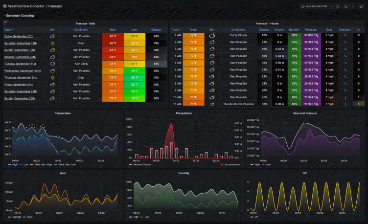
I also wanted to give Rain and Lightning their own dashboard to visualize a heat map of lightning strikes and distance. I created a Current Conditions page that shows as many measurements as reasonable in one place. Two of my favorite new dashboards now include a drill-down, interactive multi-day Forecast dashboard, along with a dashboard where I can explore multi-day forecasts vs. actual observations. (If there’s one characteristic that all of this data has shown me, it’s that forecasting the weather is hard!)

Ten-Day Forecast dashboard
With so many related dashboards, I also needed a way to bring everything together. I created an Overview dashboard in Grafana that utilizes the Dashboard List visualization panel and provides a launching point where I can connect and drill down into each of my dashboards. Each dashboard also makes excellent use of dashboard links to tie them together for an overall better user experience.
As I started working with more members of the WeatherFlow community, I quickly realized that there are quite a variety of user accounts and device setups. In addition to the newest Tempest device that I was familiar with, there are also older WeatherFlow Airs and Skys, and in some instances, users have multiple hubs and locations.
I started my first collector iteration by creating multiple Docker container collectors for each device and API collection type. That worked okay for a single WeatherFlow device with just a local network collector. Still, it became exceedingly complex to manage several devices and provide flexibility for the different API collectors. I needed a way to simplify my WeatherFlow Collector deployment and make it easier to maintain. I ultimately rewrote my entire collector based on individual access keys, running multiple self-configuring collector services in a single Docker instance. The rewrite also allowed me to refresh how I was using Grafana Loki.
I began using Grafana Loki to collect and store the raw IoT device logs with my first local network WeatherFlow collector and created my original “logs to metrics” dashboard (which I wrote about on my personal blog). I now enhance those JSON logs with additional meta-information while applying more appropriate Loki labels. Doing so enables my collector to reprocess logs without requiring access to the original WeatherFlow Cloud user account details.
Using logcli, Loki’s command-line interface, “replaying” logs provides the flexibility to add new updates to the collector or new transformations that can quickly work with older data. (Not all data in the WeatherFlow Cloud is available historically — most is only accessible in real-time.)
Several different back end options, same great UI
Even though I switched the backend datastore to InfluxDB, most of those technical reasons relate to my Forecasting dashboards and log replay. For WeatherFlow users that want to use my collector without those features, the flexibility to publish to other time-series backends is still available. For example, publishing metrics and logs to Grafana Cloud is supported by simply providing a User ID and API key. Grafana’s Influx2Cortex proxy service enables sending InfluxDB line protocol metrics with a comparable set of dashboards using PromQL queries.
Understanding how to use each query language helps me understand the similarities and differences needed to craft each dashboard’s visualizations to display the equivalent way. For example, here’s the query required to show “air temperatures” using each of the different types of data sources:
LogQL (Loki):
max_over_time({app="weatherflow-collector"} |= "obs_st" | json air_temperature="\[0].obs\[0]\[7]" | unwrap air_temperature | \_\_error\_\_="" \[$__interval]) * 9/5 + 32
InfluxQL (InfluxDB):
SELECT mean("air_temperature") * 9/5 + 32 FROM "weatherflow_obs" WHERE ("collector_type" =\~ /^$collector_type$/ AND "station_name" =\~ /^$station_name$/) AND $timeFilter GROUP BY time($__interval) fill(null) tz('$tz')
PromQL (Prometheus):
max_over_time(weatherflow_obs_air_temperature{station_name="$station_name", collector_type="$collector_type"} \[$__interval]) * 9/5 + 32
Building observability into my collector
I had many ideas that I wanted to turn into valuable features, but I also wanted to keep enhancing my troubleshooting along the way. I realized that I needed to build more observability frameworks to understand my collector’s behaviors.
Observability became even more significant as other WeatherFlow community members asked about performance requirements, minimizing utilization, set up assistance, or troubleshooting. I also wanted to understand performance across different aspects of my collector and compare details from varying user platforms. For example, what may be reasonable for my multi-core x86_64 virtual machine might be slower or perform differently on a Raspberry Pi ARM7. I needed objective performance measurements.
I started simply by timing data processing intervals and duration for each collector’s different functions. But that soon turned into building CPU and memory utilization, network connections, data persistence, and the number of processes, along with process event information, collector process availability, and Loki logging details. This added dashboard helped me look at trends over time and look for correlation opportunities. And because these collectors run at specific-but-configurable intervals (say, every 60 seconds to poll a WeatherFlow derived metric or forecast update), knowing how much time exists between polling cycles helps tune the collection frequency. These comparisons soon allowed me to understand the number of resources each data collector was consuming.

My Observability dashboard with application and infrastructure performance metrics
I’m now able to use application and performance visibility to provide answers to questions from community members such as, “How many collectors can run on a specific type of hardware?” and “How much headroom exists for other applications?” (Community members may have limited hardware or different levels of experience in running Docker.) I created a System Stats dashboard to watch critical application methods as well as server performance statistics. For those using Grafana Loki, there are also overview details in the System Stats dashboard for the number of logs ingested, log size by collector type and device location, and Promtail persistence latency.
Dashboard flexibility for any experience
I started building my collector to enjoy direct IoT data, but I always wanted to share the results with the WeatherFlow community. I decided to provide two different ways of utilizing my dashboards:
One is a standalone WeatherFlow Collector with a set of Grafana dashboards that works with existing user environments. It’s best for those who already know Grafana and have experience running various backend TSDB and logging systems.
For newer members that may be just getting started with a Grafana Stack, I built a WeatherFlow Dashboard AIO (All-In-One). This AIO system deploys three Docker containers. The first is a pre-built Grafana OSS base image pre-configured for plugins, provisioned data sources, and a versioned set of my WeatherFlow dashboards. A second docker container provides a pre-configured InfluxDB. And the third container, my WeatherFlow Collector, is pre-configured to publish metrics to InfluxDB.
For this collection of dashboards to work across any number of WeatherFlow devices and deployments, my collector and dashboards make use of labels and tags. Grafana variables allow for dynamic use of multiple devices along with station names instead of harder-to-distinguish device IDs. Attaching collector keys and host runtime environments keep track of where each of the Docker containers are deployed.
My goal for the AIO is to make it like an “Easy” button for WeatherFlow community members just getting started with visualizing their data and are being introduced to Grafana and time-series databases.
What I learned — and what’s next
As I collect more data from more devices, I invariably look at different and exciting ways to visualize data and trends. Grafana impresses me every day, at each step of the way, because it makes everything so easy to use. Its flexibility allows me to access the data source of my choice, create dashboards to show whatever I choose, and make observability relevant and fun.
Throughout my WeatherFlow project, I’ve refined my skills to utilize the collected data and become more familiar with helpful Grafana features such as transformations, chained variables, data links, and powerful overrides. (I did a GrafanaCONline lightning talk using some of these WeatherFlow Dashboard examples. You can view it here.)
I’ve found that my “next-up” list continues to grow a lot faster than I had expected! I’ve started to build another set of WeatherFlow dashboards that run in kiosk mode, with playlists on dedicated Android tablets.

My up-and-coming Android tablet kiosk dashboards
I’m also creating another set of dashboards for community members to choose between metric and imperial notation. And finally, WeatherFlow dashboards using Marcus Olsson’s fantastic JSON API data source plugin.
Now it’s time to start connecting my Grafana WeatherFlow alerts to my home automation system and “see” the thunderstorms roll in . . .
Interested in learning more about the different ways Grafana now supports industrial/IoT use cases? Check out this presentation from GrafanaCONline 2021.
