
How the new time series panel brings major performance improvements and new visualization features to Grafana 7.4
In Grafana 7.0, we introduced a new panel architecture to enhance the UX and visualization options and create a more consistent experience across Grafana.
In Grafana 7.4, we expanded on that foundation and introduced the next-generation graph panel called Time series panel, which is currently in beta. The Time series panel uses the panel architecture of Grafana 7.0 and integrates with field options, overrides, and transformations.
Under the hood, we switched from the jQuery Flot library to the uPlot library in Grafana 7.4 in order to deliver high-performance visualization.
We also seamlessly migrate most of the functionalities in the existing Graph panel visualizations to the Time series panel. For instance, if you create a series override in the existing Graph panel and set your series to be displayed as a dotted line, there is a migration that will make sure that if you switch to the Time series panel, the graph will still have a dotted line. Our plan is to introduce more of these “under-the-hood” migrations so that we have close to full functionality in Grafana 8.0 coming later this year.
In the Time series beta panel, we also shifted what would normally appear under Panel options to field options and overrides. Not only do those changes provide a more streamlined user experience; those functionalities are now available to override and customize as needed.
Apart from major performance improvements, we have also introduced new visualization features that address popular requests from our community, including new smooth/line interpolation modes, auto point display based on data density, new gradient fill modes (including bars), outlines for bars, an unlimited number of y-axes, soft min and max control, and bands. Learn more about each one below.
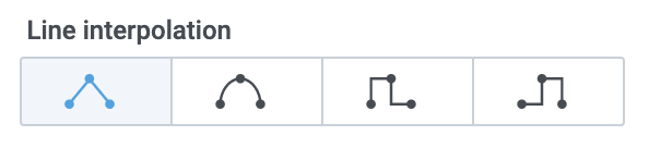
Line interpolation modes
The new option introduces the possibility to render the line with an interpolation mode of your choice. Smoothing (feature request) and the control of the stepped line (feature request) are the new additions to the graph visualizations that address popular community feature requests.

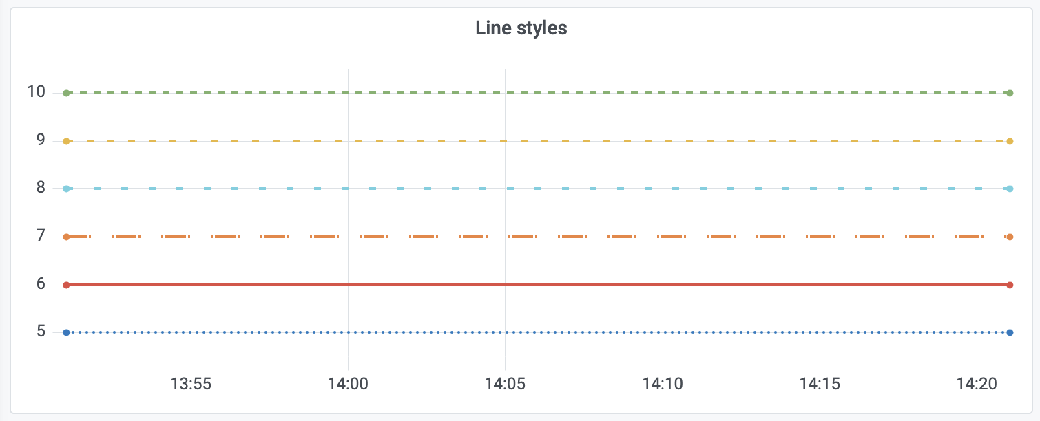
Line style control
Easy-to-use line style settings allow differentiating the series with custom line styles.
Auto point density
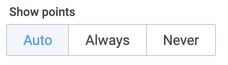
The Show points option enables control over the data points’ visibility. With this option set to “Auto,” Grafana will optimize the points’ display based on the number of data points in the visualization. If the density is too big, Grafana will hide the points by default, and when the visualization is zoomed in, the points will start showing up.
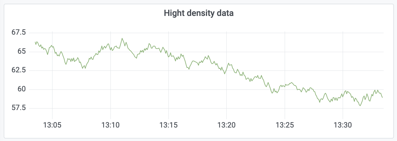
High-density data:
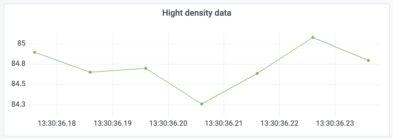
High-density data zoomed in:
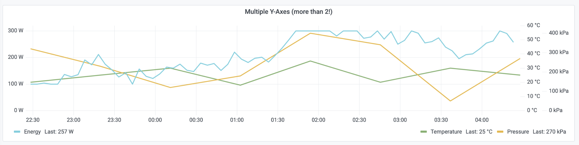
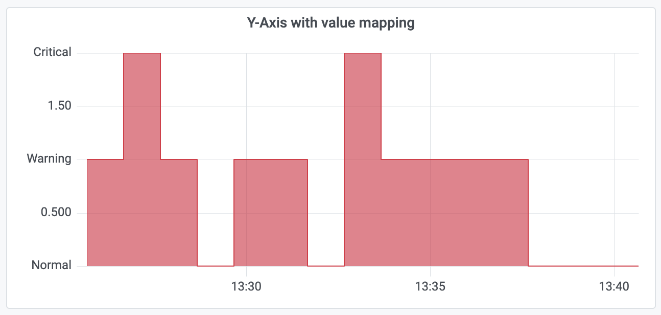
Multiple y-axes and y-axis ticks value mappings
Thanks to using the new panel architecture, the Time series panel integrates seamlessly with the value mappings and unit configuration, enabling multiple y-axes (feature request) with position control as well as custom y-axis ticks based on the series value.
Multiple y-axes:
Each unique unit gets its own y-axis, and the position of that axis can be set to either the left or right.
Y-axis ticks value mappings:
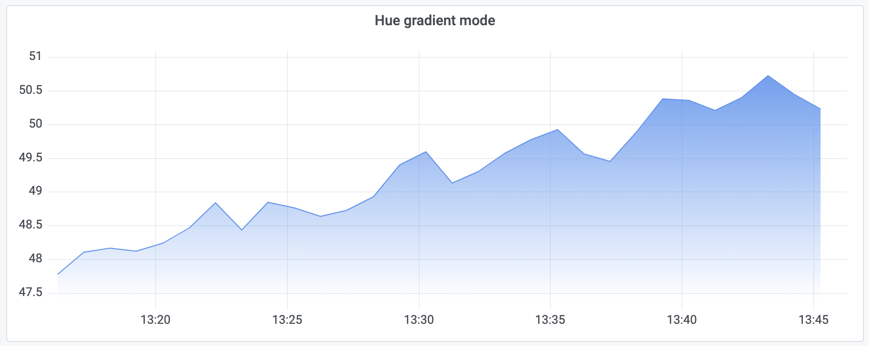
Gradient fill modes
There’s a new option to control the gradient type of the visualized data, which helps users create even more beautiful graphs in Grafana.
Hue gradient fill:

Opacity gradient fill:
Soft min and max axis limits
A popular feature request, these settings can prevent blips from turning into mountains when the data is mostly flat. Hard min and max, derived from standard min and max field options, can also prevent intermittent spikes from flattening useful detail by clipping the spikes past a defined point.
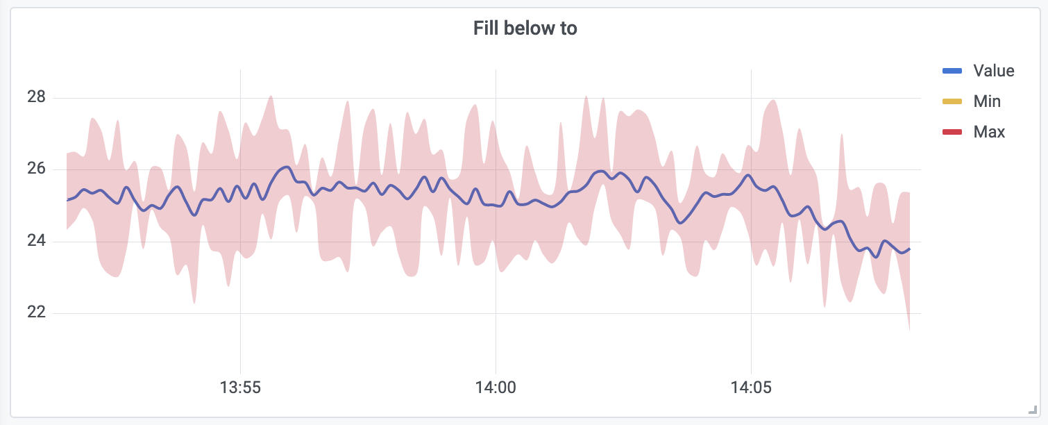
Bands support
A new option, Fill below to, available as a field option override enables easy bands configuration.
To see these features in action, check out this demo dashboard showcasing the new Time series panel. For more information about Time series panel configuration, please refer to the documentation.
The Time series panel builds on the new graph panel architecture which will enable us to bring bar charts, scatter plot, and more types of high-performance visualization to Grafana. Stay tuned!
The easiest way to get started with Grafana, Prometheus, Loki for logging, and Tempo for tracing is Grafana Cloud, and we’ve recently added a new free plan and upgraded our paid plans. If you’re not already using Grafana Cloud, sign up today for free and see which plan meets your use case.