
IoT monitoring with Grafana: How Eurac observes climate change in the Alps
The work presented in this guest blog post is the achievement of several colleagues at Eurac Research. Behind the scenes there is an awesome team: Luca Cattani, Martin Palma, Norbert Andreatta, Alessandro Zandonai, Johannes Klotz, Georg Niedrist.
Data is the foundation of research
In 2014, the Mazia (Matsch) research site in the Italian Alps was officially accepted as a Long Term Socio Ecological Research LT(S)ER site. The monitoring infrastructure is operated by Eurac Research and the University of Bolzano and consists of 24 automatic microclimatic stations in a mountain ecosystem across an elevation gradient ranging from 1,000 m to 2,700 m, logging several meteorological and biophysical variables every 15 minutes. The main aim is to collect a base of knowledge, depict trends and spatial and temporal dynamics of this Alpine ecosystem, and study the climate and land-use changes over a long-term period.
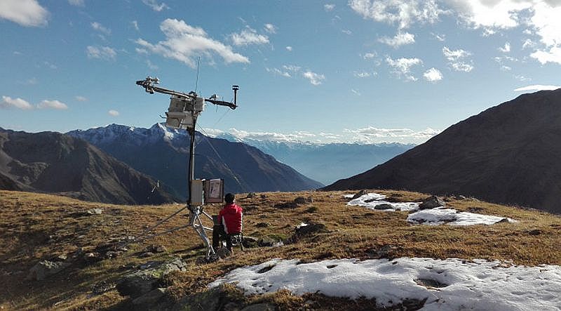
View of the highest monitoring station at 2700 m in the research site Matsch/Mazia, South Tyrol, Italy.
How Grafana comes into play
The Eurac Research team uses Grafana for several different purposes. In addition to infrastructure monitoring and maintenance, we use Grafana as a data analysis tool for identifying trends and patterns and publicly share our dashboards to make our data more accessible.
The good, the bad and the ugly data
We established the monitoring network following the “data first” principle, even though our dataflow is not at all typical of the IoT. In fact, our team needed to perform some “stunts” to help us properly and regularly feed the InfluxDB database in the backend under some pretty unusual conditions. We are talking about sensors and a datalogger that run on solar energy (batteries and photovoltaic panels); an unstable mobile phone network in a remote Alpine valley; temperatures ranging from -30° to +35° C; over 3m of snow; and animals, avalanches, and storms sometimes hitting hard. (That´s what we meant by “stunts.”) In these types of conditions, our Grafana dashboards become a critical maintenance tool for monitoring our infrastructure and enabling our team to respond quickly to alerts and issues.
The empirical data we collect is neither good, bad, nor ugly. For research we seek good data, and for maintenance, we need to quickly depict the bad data. The ugly data doesn’t necessarily have a negative meaning, as it might simply show us the unexpected, like a soil temperature sensor showing peak temperature in the middle of the night due to a cow choosing the wrong place as a toilet. Yes, Grafana also helps with this!
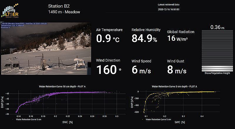
The good data: Grafana helps to explore patterns among different sensors and different temporal scales. The plots show the soil water content vs. soil water potential relation (so-called water retention curve) using the plotly plugin.
Dashboards are worth a thousand pictures
Graphs, compared to a picture, have the unique ability to show temporal changes. However, in our specific setup, the automatic micro-climatic stations are spatially distributed along an elevation gradient from 1,000 m up to 2,700 m; hence, we can also depict spatial trends and patterns. If one graph is powerful, combining multiple graphs into dynamic dashboards creates a storyline where the mountains with all the interrelated biophysical processes are kind of communicating with us.
With Grafana, we created several dashboards to explore trends and patterns among several sensors. We also designed thematic dashboards to explore spatial and elevation gradient patterns. With seemingly little effort, in Grafana we can group one variable measured among all the monitoring stations, and this enables us in a near real-time fashion to explore spatial and temporal data of snow and vegetation height, to mention a few.
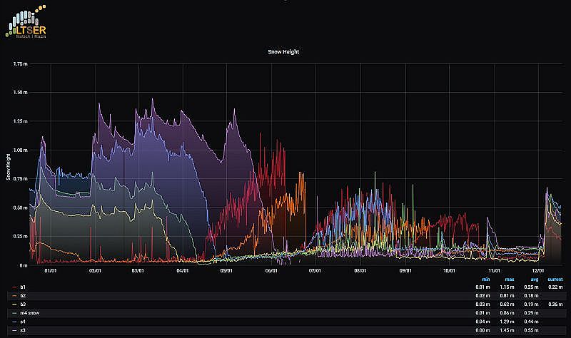
Thematic dashboard displaying snow height (and vegetation height after snow melt) in different locations from 1,000 m up to 2,700 m.
Outreach, the challenge of public engagement
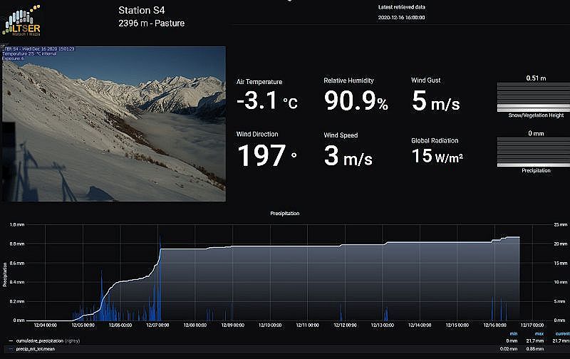
We are committed to sharing our monitoring activities not only to justify the use of public money, but also to engage the public and stakeholders in data-driven research. We integrated the dashboards within our data browser, and thanks to its pretty design and user-friendly features, Grafana helped us create engaging and appealing public dashboards, where users can explore several meteorological variables of monitoring stations distributed across this beautiful mountaineering valley.