How Grafana is helping the DIFFERENCE Foundation visualize medical data in their fight against a global pandemic
The DIFFERENCE Foundation is a non-profit organization based in the Netherlands that is focused on designing, guiding, and funding highly quantitative research on metabolic dysfunction. The foundation considers metabolic dysfunction—which can trigger obesity, diabetes, many other diseases—the original global pandemic, as it affects almost one quarter of the global population.
Since they began their work back in 2018, one of DIFFERENCE’s main objectives has been to develop strong evidence to show the negative impact lifestyle factors (such as poor nutrition) have on metabolic welfare. As well, they want to show the positive impact that lifestyle changes (like a healthier diet and exercise) can have in controlling or even reversing a disease such as diabetes.
A data-led approach is critical to guiding social and industrial policies (another one of their goals), and the organization is doing this with the help of Grafana.
Grafana makes it possible—and easy—for people to actually see what’s going on inside their bodies, and it helps clinicians and researchers to go deeper into the data as they search for ways to fight metabolic dysfunction.
Mobile lab
The DIFFERENCE Foundation’s flagship project is Meterbolic, a mobile blood lab that can be used by individual subscribers to measure and track their blood hormones with a smartphone app. Its users are clinicians, dieticians, and bio-enthusiasts (biohackers) who are at the forefront of the movement to correct the metabolic pandemic. There’s no need for a lab visit, and blood test results are delivered quickly to the user in an easy-to-read format.
Early on, the foundation was using d3js, Plotly, and Julia plots to visualize the data collected by the project, but a better solution was needed to help monitor the subscribers’ health data.
“We needed a system that allowed users to securely log into their own data, to be able to author their own dashboards and panels, and something that we could use to descend into various rabbit holes,” explains Eric Smith, one of the foundation’s founders, whose role is to connect the dots between bio/info tech and population health.
A colleague mentioned Grafana to Smith, and there was one big reason they chose it: “The great eye candy!” he says.
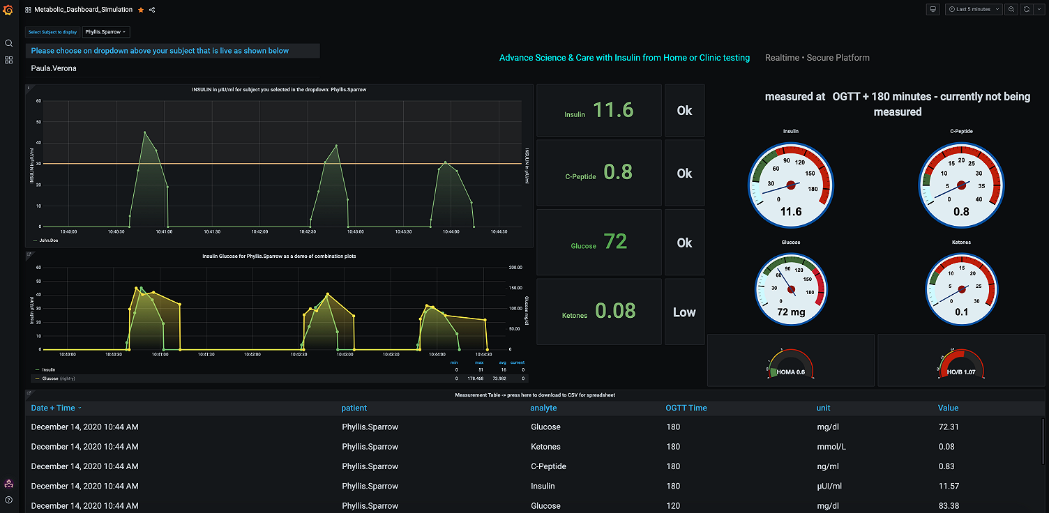
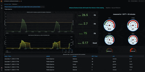
Grafana serves the Meterbolic Project well because part of its work involves combining the graphs of certain molecules (like Insulin, C-Peptide, Glucose, and Triglyceride) in the same chart. It also helped their subjects understand the data easily. “We want to show a normal (range) graph superimposed with that of the subject to make it simple for the subject to understand the meaning of measurements.”
However, the attraction to Grafana wasn’t just about looks.
The foundation, Smith says, was drawn to Grafana because it was easy to use from the start. “Grafana offered an out-of-the-box solution,” he says. “There was support for login and user security, and we liked that developers as well as users could easily create panels and complex dashboards, views, annotations, and alerts.”
Blood matter
The Meterbolic data is discrete and low-volume. It comes directly from its own app, which measures blood test results from lateral flow assays and other blood test devices.
Currently, DIFFERENCE’s core use of Grafana is to display and interpret the response of key hormones and molecules, like glucose and lipids, in the blood. (This is similar to plotting blood glucose values to 75g of glucose in solution, which for decades has been a standard clinical test.)
Meterbolic dashboard
“We show single and mixed plots of the values of these markers, commencing before the meal and at intervals for the next hours,” Smith explains.
The app also uses dashboards to graph the data from wearables, like continuous glucose monitors.
“The users like the fact that the graphs are colorful and have a modern 3D look,” Smith says. “Above all, they are useful because they ’tell a story’ to the subject or patient.”
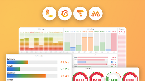
The most popular graphs are meal response curves with multiple molecules, and the D3 Gauge, which also appears on the foundation’s app.
Smith also notes that “a major plus” of using Grafana is that the team can run arbitrary code with the sanitize setting off, which allows them “to do anything in a panel that you can do in an iframe or a web browser. I picked it up from a post by Grafana creator Torkel Ödegaard.” [Note: Because this is not secure; it’s only advisable if there is a firewall.]
More recently, he says, the team has been writing plugins “so that we may elegantly support native graphs in things like d3js.”
Meterbolic uses Julia language for backend data processing. “We feed calculations back to annotate the graphs.”
The foundation’s leadership has had great experiences with the Grafana maintainers and the Grafana community. “The core team has been very responsive and supportive in prioritizing enhancements to support our use case,” Smith says. “Recently, global templating variables were expedited when we raised the issue on the forum, and then a bug was promptly fixed.”
Health-conscious observability
Looking ahead, Smith would like to see Grafana being used more in the wellness and health industries. “We’d like to work with the core team to make Grafana the ground zero for observability.”
In the meantime, Smith hopes Grafana releases will include more tools that support the unique needs of health data. “In health, measurements are episodic and not continuous,” he explains.
When someone does a food challenge (a blood test conducted before and after eating to evaluate metabolic function), a clinician measures the patient’s response through a series of about a dozen measurements of blood or other fluid over several hours. The data comprises a single diagnostic procedure, and each measurement in the series would have the same series id_number.
“Therefore, visualizations aren’t always suited to a time series approach,” Smith says. “It’s important to show separate visualizations for each episode or set of measurements over their specific timeline.”
He says the “single most important step” he would like Grafana to take is to expand from its time series base is to more conveniently support such series, and to display them—or an index of them—in the user or clinician dashboard.
Getting well with Grafana
The foundation’s work has taken on new urgency this year, as people who are obese and/or diabetic are at an increased risk of developing a severe illness from a COVID-19 infection. That connection makes COVID-19 research especially relevant to the DIFFERENCE Foundation. (A U.S. branch of the foundation is in the works.)
The foundation’s future plans include integrated COVID antigen and antibody testing, and combining data on infectivity with metabolic data on susceptibility.
“We’re also researching and developing deeper interpretations of metabolic response curves by leveraging new physiological insights and interesting math,” says Smith.