
3 tips to improve your Grafana dashboard design
Every Grafana user is a dashboard designer. The Grafana community gladly shares their dashboards, so there’s tons of inspiration available. Chances are you’ve downloaded some community dashboards and tweaked them in search of patterns that work for you. But if you haven’t found them, you’re not alone! In my Aug. 27 webinar, “A beginner’s guide to dashboard design,” I’ll cover the basics of good dashboard design. That includes structuring your dashboard to tell a story, considering your dashboard users and their context, and creating an accessible and beautiful dashboard style.
If you’re looking for quick tips that will immediately improve your dashboards, here are three things you can apply right away.
1. Limit your number of visualization types
Did you know that the more visualization types you use in your dashboard, the longer it takes to understand the data? Looking at a graph and decoding what it means takes up cognitive resources. If every graph is different, your brain needs to switch between patterns, and then you will take more time to understand what’s going on. You can save a lot of time and brainpower if all of your graphs use the same decoding pattern.
2. Check whether your dashboard colors are accessible
Did you know that around 8% of men are color-blind? Especially in monitoring, we tend to use traffic light color symbolism as an indicator of green being good and red being bad. What we forget is that the way traffic lights encode this information is not only by color but also by position of the lights. If we just use color and no other qualitative indicator to tell what the value means, we exclude color-blind people from understanding this information. Using red on black is similarly tricky for people with certain kinds of color blindness. You can easily avoid this: Check your dashboard colors by using an accessibility checker browser plugin (such as Spectrum for Chrome) and try not to juxtapose red and green.
3. Use a limited number of colors consistently
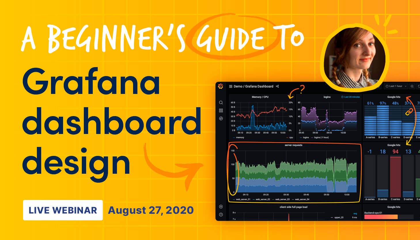
Did you know that visual perception is highly influenced by color? Elements that stand out from the rest will appear the most prominent – this phenomenon is called stimulus salience. In the dashboard above, for example, our eye is especially attracted to the red bar gauge on the bottom right. So color can be a great way to highlight certain parts of your dashboards. But what if you don’t want that bottom right gauge to stand out? What if your dashboard is so colorful that users don’t know where to look any more?
If you want a more homogeneous dashboard, it’s a good idea to limit your use of color. A consistently used accessible color palette will make your dashboards easier to read. If you use salient colors for meaningful things like errors and hit thresholds, you can direct your users’ gaze to the place that needs the most attention. Bonus effect: If you use your company brand colors, it will look more aligned with your company brand.
There are many more things to consider – sign up for the webinar to learn more. Looking forward to answering your questions there!

