New Enterprise features in Grafana 7.0: Usage insights and user presence indicator
Dashboard sprawl is a real problem whether you’re using Grafana or any other tool. When growing to thousands of users – and as many dashboards – you’ll eventually want more information about how the tool is being used in your organization. After all, dashboards don’t help anyone if they aren’t being used.
Managing large installations is one of the areas where Grafana Enterprise improves Grafana, and our launch of usage insights in 7.0 is a key part of that.
We started out experimenting with using a custom data source plugin that collected some data about every query being made. It looked promising, so we reached out to our customers, and they confirmed: This was useful to them.
But this first version had two large problems that we couldn’t ship to our customers: It drastically increased the effort required to operate Grafana and it didn’t feel like a first-class part of Grafana. For the production version, we wanted to make this feature fully integrated, and we wanted to make sure that the most important questions were answered.
To figure out the most important questions, we again turned to our customers. The most common answers involved understanding which dashboards and data sources are popular (and not), and which users are active and where they’re active. Answering these questions is the goal of usage insights and the features built on top of it.
Dashboard usage insights

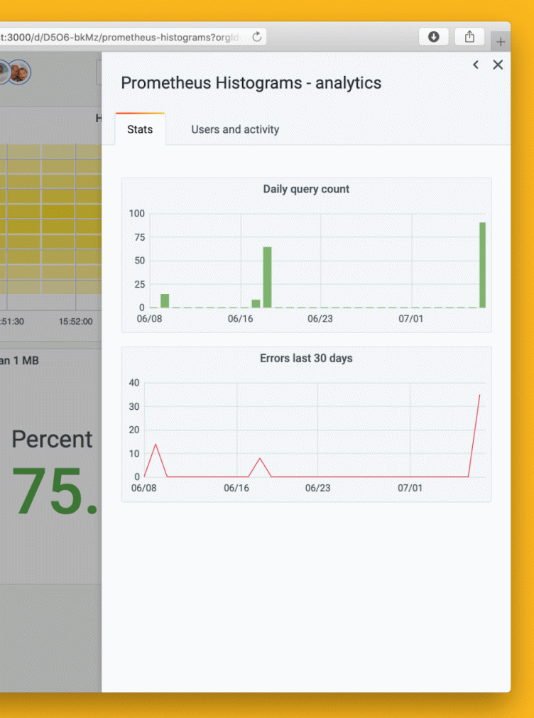
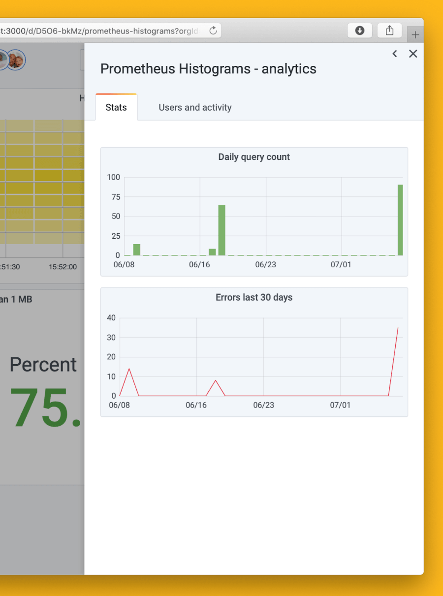
The most obvious use of usage insights is the dashboard-in-dashboard view dashboard insights. You can see how much a dashboard is used, how many errors it’s producing, and who is using or modifying it. This information can help you detect unhealthy dashboards. And if there’s a dashboard you’d like to delete for one reason or another, it can help you find any active users who need to be alerted before you remove it.
While we wanted to give as much information as possible here, we also wanted it to be understandable, and we really wanted to make sure it scales both up and down. This meant minimizing the data we’d store. We don’t want to over-rely on cleanup scripts as they are I/O intensive, break database indices, and are in themselves possible scalability issues. By applying deduplication and enforcing limits to the growth of the usage insights data, we can provide important insights at a very low cost in terms of CPU, I/O, memory, and disk. The tradeoff of this is that we’re not able to use usage insights as a data source for custom queries.
Going through all the dashboards to get to this information is a lot of work. To make discoverability easier, we modified Grafana’s search implementation to support sorting so that you can see which dashboards have the most or least usage and errors and fix them.
When we introduce new Enterprise features, it’s important for us to make sure that they’re part of the whole Grafana experience. In this case, we ended up improving the search page and the dashboard’s top bar in the open source project to allow us to do what we wanted to do. To me, it’s really rewarding to know that we not only work on the Enterprise experience but also are directly involved in improving the overall Grafana experience. With Grafana 7.0, it was very tangible: We ended up picking out items from the rest of the Grafana team’s backlog that they wouldn’t have been able to finish in time for the release.
User presence indicator
In the video game Journey, the player traverses an empty desert and suddenly may meet another player. With only movements and a single note to communicate, the human connection formed by this random encounter in the desert is incredible. In Google Docs there’s a feature where you can see who else is looking at the document you’re looking at. It’s a conversation starter, it provides a level of automatic communication, and ultimately it helps us feel more connected to each other.
We wanted something like that for Grafana. And the data was already there to allow us to connect the dots. The user presence indicator is a list of users’ avatars and usernames in the Grafana top bar that allows you to see at a glance who else has been active on this dashboard recently.

The primary function of the presence indicator is to help on-callers get a sense of who else is looking at an incident. While pinging every possible person is doable in a smaller company, it is impractical in a large organization, where you might not even be aware that someone else is interested in the status of a particular service.
Looking ahead
Usage insights has the kind of roadmap where there are a million things that we want to do, so we have to shuffle them around and prioritize a lot. The number one priority for us is to get data source insights in place now that we have something for users and dashboards. We’ve done a lot of the work for this already and hope to ship it with Grafana Enterprise 7.2.
We also want to improve the way we collect data (e.g., not sending statistics for dashboards that have been modified but not saved), add metadata to the search view, make the user presence indicator better, distinguish wall monitors and bots from people, and share more information about errors. Our priorities are primarily based on the feedback we’re getting from customers and also our own ideas where we see a need for improvement.
You can run Grafana on anything from a Raspberry Pi to an IBM mainframe or your massive Kubernetes cluster. So one of our biggest challenges is to make sure that the users running Grafana with low resources are not bogged down by usage insights – while still providing useful insights so that you can use Grafana in the best way possible for your organization. That’s also an area we’re looking at improving on.
While a lot still lies in the future, usage insights for dashboards and the user presence indicator are already enabled by default in Grafana Enterprise 7, so you can go right ahead and dive into the numbers for your dashboards.
