Learn Grafana: How to build a scatter plot plugin in Grafana 7.0
There are a lot of great things about Grafana 7.0, but one of my favorite features is the new React-based plugin platform, which has a set of new APIs and design system to help you build your own plugin. The process is easier and faster than ever.
In this blog post, I’ll show how you can create a panel plugin for visualizing scatter plots.
A scatter plot is a type of graph that displays values for (usually) two variables as a set of points along a horizontal and vertical axis. Scatter plots are useful for identifying relationships, such as a country’s GDP and it’s life expectancy.
Check out the World Health Chart by Gapminder to see how scatter plots can be used. (The chart is actually a bubble chart—a scatter plot that uses the area of each circle to encode a third variable.)
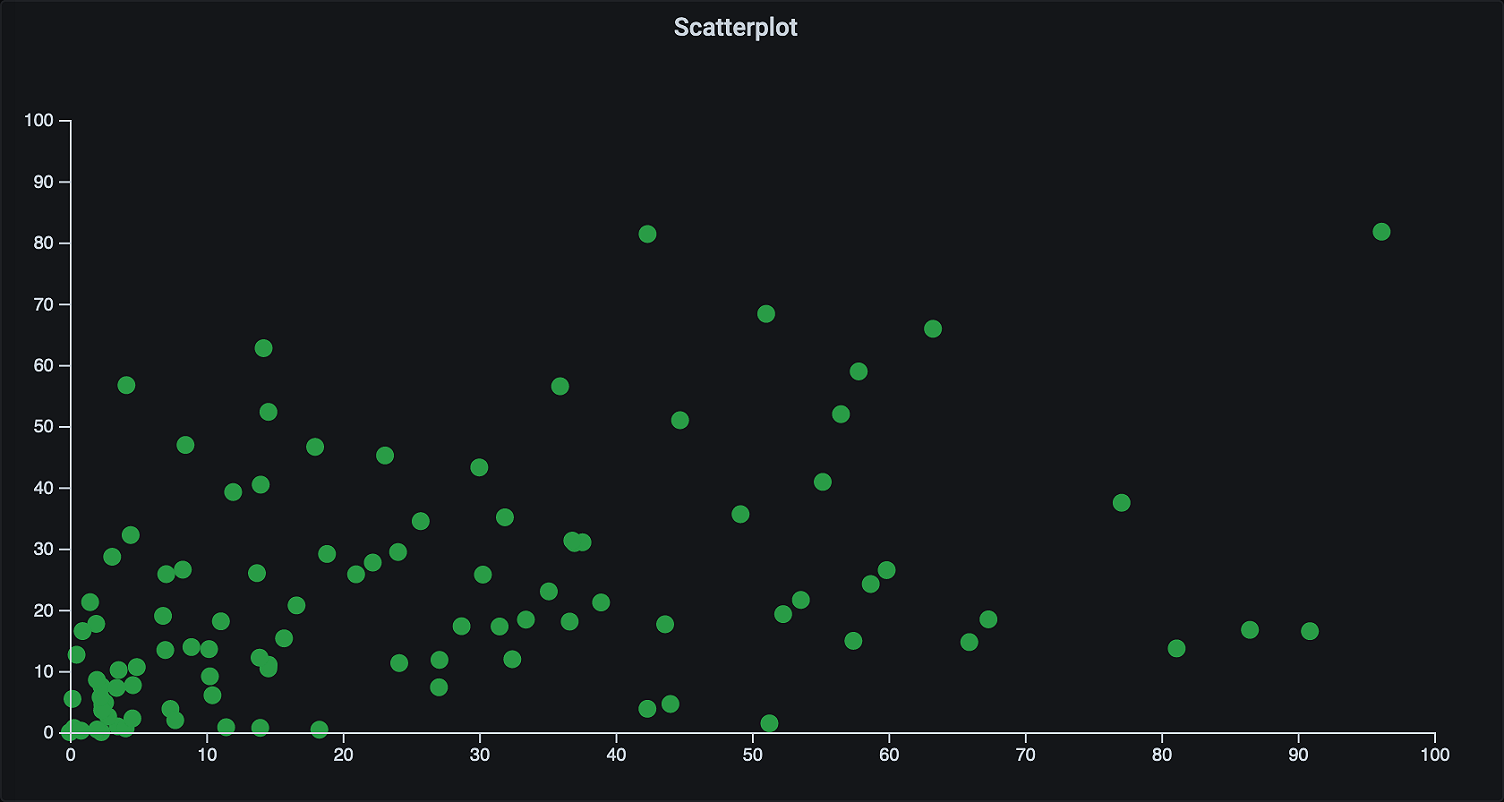
By the end of this tutorial, you’ll have built a scatter plot that looks like this:
Note: This post assumes that you have basic knowledge of ReactJS and TypeScript (or Javascript). I also recommend you complete the Build a panel plugin tutorial before creating your own.
Software requirements:
- Docker Engine (or a local installation of Grafana)
- NodeJS 12.x LTS (with NPM)
Getting started
The easiest way to begin building plugins for Grafana is to use the grafana-toolkit, a command-line application to speed up Grafana plugin development.
Create a plugin from a plugin template by running the following command in your terminal of choice:
npx @grafana/toolkit plugin:create scatterplotIn the prompt, select Panel Plugin to create a plugin from one of our templates.
Navigate to the new directory, install the dependencies, and build the plugin.
cd scatterplot
yarn install
yarn dev
Next, you need to tell Grafana where to find your plugin. If you already have Grafana installed on your machine, you can configure the path to your plugin directory containing your plugin in the Grafana configuration file. In this example, however, we’ll use Docker.
Start Grafana using Docker, with the directory containing your plugin mounted at
/var/lib/grafana/plugininside the container.docker run -d -p 3000:3000 -v YOUR_PLUGIN_DIRECTORY:/var/lib/grafana/plugins --name=grafana grafana/grafana:7.0.0Browse to http://localhost:3000, log in, and create a new dashboard. The steps are similar to those found in Getting started.
Add a new panel and select the scatterplot plugin from the list of Visualizations.
The starter plugin immediately gets you set up for plugin development, so you can get right into visualizing the scatter plot.
Creating graphics with SVG and React
There are countless libraries and frameworks out there for creating charts and visualizing data in a web browser, and all of them have their own strengths. Luckily, Grafana gives you the freedom to choose the one that works best for your plugin.
In this tutorial, you’re going to use SVG and D3.js, a popular combination for creating interactive visualizations for web browsers.
SVG, or Scalable Vector Graphics, is an image format used to define vector-based graphics for the web. Since SVG is based on XML, you can create React components for graphical elements.
For example, here’s how you can create a React component that renders a circle:
export const Circle: React.FC<Props> = ({ width, height }) => {
  return (
	<svg width={width} height={height}>
  	<circle cx={width / 2} cy={height / 2} r={5} />
	</svg>
  );
};
Since the release of Grafana 7.0, panels are now React components, which means you can use the example above in your plugin, without any changes. This opens up many possibilities to create custom visualizations by using components developed by the React community.
You can find the React component that creates the visualization in SimplePanel.tsx in the src directory. There’s already some code provided to you by the plugin template, but in this case, you’re going to start fresh.
Add the code from the Circle component into the
SimplePanelcomponent.export const SimplePanel: React.FC<Props> = ({ width, height }) => { return ( <svg width={width} height={height}> <circle cx={width / 2} cy={height / 2} r={5} /> </svg> ); };Build the plugin again, and reload your browser to see the new changes. You might be prompted to save your dashboard if you haven’t done so already.
You can also rebuild the plugin whenever you change the code by using yarn watch instead of yarn dev.
Transforming data using D3
A circle is nice and all, but we want to visualize more than that, and without having to compute the coordinates ourselves.
D3.js is a widely popular library for creating data-driven documents. While it’s technically not a charting library, it’s commonly used to programmatically generate SVG charts. (To find out what you can do using D3, check out the D3 Gallery.)
Next, I’ll show you how you can use D3 together with React to create more complex SVG-based graphics.
Import D3 to your plugin
Grafana bundles the D3 dependency and makes it available to your plugin when it’s loaded, but you need to install the TypeScript types for development.
yarn add --dev @types/d3You also need to import D3 in your SimplePanel.tsx.
import * as d3 from 'd3';Transform data using scales
The easiest way to draw large amounts of data dynamically using D3, is to use scales.
Simply put, a scale is a function that maps one range of values to another range of values. In this case, you want to map a set of values to their corresponding position in pixels.
Add a D3 scale for the horizontal axis, which maps a value between 0 and 100 to a coordinate within the panel.
const xScale = d3
	.scaleLinear()
	.domain([0, 100])
	.range([0, width]);
Add another scale for the vertical axis. Note that the range goes from
heightto0. This inverts the scale so that0starts at the bottom.const yScale = d3 .scaleLinear() .domain([0, 100) .range([height, 0]);
Now that you have your scales set up, you can use them to calculate the x and y positions of a dataset.
Generate a few data points that you can visualize.
 let points: any = [];
 for (let i = 0; i < 100; i++) {
	points.push({ x: i * Math.random(), y: i * Math.random() });
 }
Generate
circletags from the point data, and put them inside a SVG group,g.return ( <svg width={width} height={height}> <g> {points.map((point: any) => ( <circle cx={xScale(point.x)} cy={yScale(point.y)} r={5} /> ))} </g> </svg> );Rebuild your plugin and reload the browser to update the panel.
If you already have some experience with D3, the code above might not be what you’re used to. Since both D3 and React want to update the DOM, you need to set some boundaries so they don’t step on each other’s toes.
There are different ways to address this problem. My preferred solution is to use D3 only for data transformations, and React for rendering the elements. If you prefer to use D3 for rendering elements as well, the React + D3.js guide explains how to use the useEffect hook to accomplish this.
Generate axes
A good practice when building charts is to provide an axis for each variable that’s being visualized. Without the support of axes, you can’t tell the actual distance between the values that are being visualized.
Luckily, D3 provides helper functions to generate axes for charts.
Create a horizontal and a vertical axis, using the scales you created earlier.
const xAxis = d3.axisBottom(xScale);
const yAxis = d3.axisLeft(yScale);
Generate the elements for each axis, by passing an anonymous function as a
refto agelement.<g ref={node => { d3.select(node).call(xAxis as any); }} />
Transform SVG elements
Unfortunately, if you added the two axes to your graph, they probably didn’t end up where you expected them to. For example, the SVG coordinate system starts at the top-left corner, which means the horizontal axis is now at the top of your chart.
But let’s address the vertical axis first. Even though the line is visible, the numbers are not. You solve this by adding some margins to the chart.
Define chart margins.
const margin = { left: 30, top: 30, right: 30, bottom: 30 };Calculate dimensions for the inner chart by subtracting the margins.
const chartWidth = width - (margin.left + margin.right);
const chartHeight = height - (margin.top + margin.bottom);
Add margins by surrounding the points and axes with another
gtag, this time with atransformattribute to translate the elements inside.<svg width={width} height={height}> <g transform={`translate(${margin.left}, ${margin.top})`}> ... </g> </svg>Update the scales to use the inner chart dimensions.
const xScale = d3
 .scaleLinear()
 .domain([0, 100])
 .range([0, chartWidth]);

const yScale = d3
 .scaleLinear()
 .domain([0, 100])
 .range([chartHeight, 0]);
Finally, deal with that horizontal axis by translating it to the bottom of the chart.
<g
 transform={`translate(0, ${chartHeight})`}
 ref={node => {
	d3.select(node).call(xAxis as any);
 }}
/>
And that’s it. Now you’ve built a panel plugin that uses D3.js and SVG to create a scatter plot visualization for Grafana.
But there’s obviously more to do before this plugin is done. For example, right now we’re generating the points, but in reality you’d want to use actual data from one of your data sources.
Next steps
In an upcoming blog post, I’ll help you continue to improve your scatter plot by using the data returned from one of your data sources. I’ll also explain how to make the panel configurable by users.
In the meantime, check out the source code for the scatter plot plugin in this post.
If you’ve mastered the tutorial on building a panel plugin, check out some of our more advanced guides on plugin development by heading to the Build a plugin page.