
Learn Grafana: How to use dual axis graphs
Update: The preferred way to add a second (or third) axis to a graph is now to create a field override that customizes the Y-axis setting. You can see an example here.
You’re done setting up your first graph panels in Grafana. You want to do more, look around the visualization settings, and discover the settings for the X and Y axes. You stumble over the configuration for a “Right Y” axis. You ask yourself, “Why on earth would I need another Y axis?”
You toggle it back and forth and change some settings, yet that makes no difference to your graph. What gives?
Never fear. In this post — which is part of our Learn Grafana series that covers how to build dynamic and efficient dashboards — you’ll learn about dual axis graphs in Grafana and when you should use them.
Setting up a dual axis graph
Dual axis graphs let you compare trends between time series of different magnitudes or units with the help of a second Y axis.
Imagine you want to see if there’s a correlation between the response time of a service and CPU load of the machine on which the service runs. By using the left axis for the response time and the right axis for load, you can answer questions like: Does a CPU load greater than 1.0 per core impact response time?
To create a dual axis graph, start by assigning a time series to the right Y axis:
- In the panel legend, click the colored line next to the name of the time series.
- In the Colors pop-up, click the
Y-Axistab, and enableUse right y-axis.
The panel moves the legend for the series to the right side and draws the right Y axis. You can also individually configure the unit and range of each axis.
Now that you know how to create a dual axis graph, let’s look at a couple of examples where such a graph would be useful.
Finding correlation
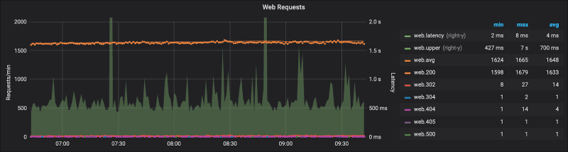
You’re troubleshooting performance issues, and you want to know whether an increase in traffic has a negative effect on latency. You set up your graph so that the left axis displays the traffic, and the right axis displays the latency.
In the graph below, the number of requests are encoded as points, while latency is shown as a line fill. From this, we’re able to tell that even with consistent traffic at ~1600 requests per minute, several requests are taking longer than 2 seconds.
Another example is when you want to see whether there’s a relationship between CPU load and memory usage.
Resource utilization
Another use case is to visualize resource usage along with its utilization — e.g., the disk is 80% full.
The example below displays absolute memory usage in bytes on the left axis, and relative usage in percent on the right axis.
This allows you to maximize the vertical resolution of visualizing absolute use while allowing you to see how much that’s relative to available resources at a glance.

If you only monitor a single machine, you can accomplish the same thing by setting the Y-max on the left axis to the total memory installed on that machine. In a cluster of machines with different memory configurations, however, you might not be able to set a single Y-max for all resources.
Dangers of using dual axis graphs
While dual axis graphs can be helpful, they’re unfortunately not very intuitive and are devilishly easy to misuse. By having too much information in your graphs, you risk obscuring your message. With dual axes, that risk is even greater. For example, since you’re essentially drawing two graphs on top of each other, it can be unclear which series belongs to which axis.
While dual axis graphs can be tricky to understand, there are a few things we can do to improve the situation.
Increase contrast between series
To make it easier to tell which series belongs to each axis, use different visualization options for each axis. Try using points or a different line width for the series belonging to the right Y-axis.
Most visualization settings in Grafana apply to all series in a graph. To change visualization options for specific series, check out series overrides.
Align baselines
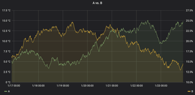
Since both the scale and baseline of each axis can vary independently from the other, they can tell vastly different stories for the same dataset, essentially manufacturing a correlation where there is none.
For example, by changing the scale and baseline, it can look like the two series are increasing at the same rate. By tweaking the scales, you can make the graph fit almost any narrative.
(For more information on the dangers of dual axes, check out this blog post: Why not to use two axes, and what to use instead.)
So be careful when using dual axis charts. Since both the magnitudes and the minimum values of each axis can be set arbitrarily, they can easily become misleading.
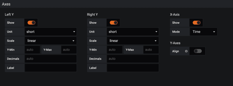
One way to reduce ambiguity is to align the axes to 0: Under Visualization settings -> Axes -> Y-axis, enable Align.
In summary
Dual axis graphs can be a double-edged sword. They can do more harm than good, if used incorrectly. Here are some best practices for responsibly using dual axis graphs:
- Use dual axis graphs when you want to compare series of either different magnitudes or different units of measurement.
- Avoid comparing the heights and slopes of series on separate Y-axes, as they can be changed by adjusting the minimum and maximum values for each axis.
- Use different visualization options, using series overrides, to make it easier to understand which series belong to which axis.
Learn more
To make the most out of using Grafana, check out more easy-to-follow guides from my Learn Grafana series:
Grafana Cloud is the easiest way to get started with dashboards, metrics, logs, and traces. We have a generous free forever tier and plans for every use case. Sign up for free now!

