
The (Mostly) Complete History of Grafana UX
The Origin Story
Before Grafana, there was Kibana 3.
Kibana was revolutionary when it came out, because it allowed you to use Elasticsearch in a very new way, for log analytics and not just normal document search, and to build dashboards without writing JSON documents.
It had this nice UI, which let you drag panels around. But editing panels was a little tricky; you could only edit them in this sort of fullscreen modal. Still, it was really good for its time. I just fell in love with Kibana and how easy it made building dashboards.
But there were some things I didn’t like about Kibana – things that I felt could be improved.
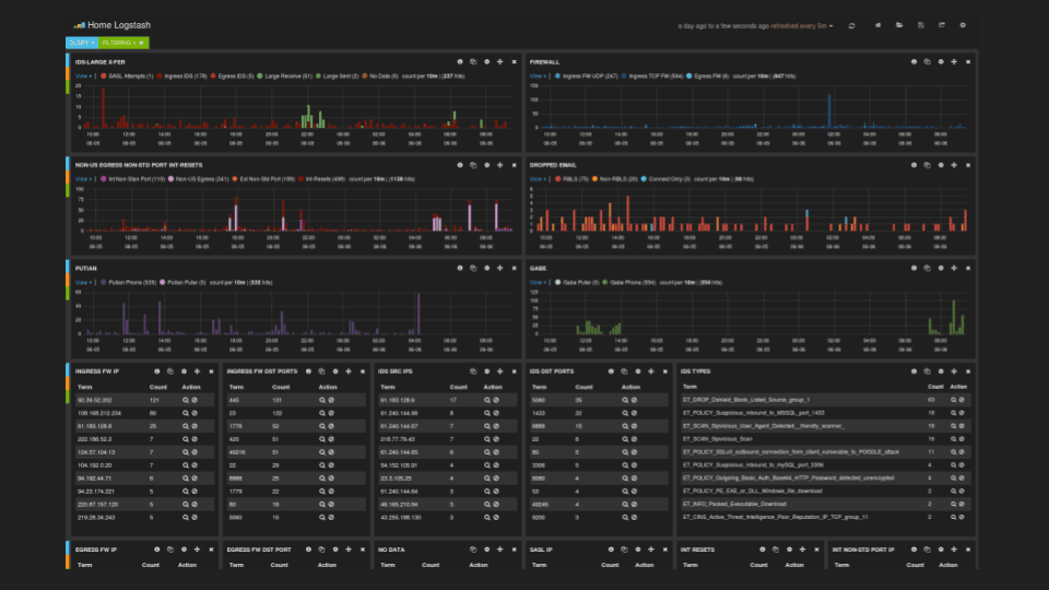
A normal Kibana dashboard would look like this:
When I started looking at turning Kibana into a time series and graph-focused dashboarding tool, I felt there was too much visual noise. These buttons for every panel were distracting, for example.
So when I imagined a time series and graph-focused dashboard, I wanted it to look more clean and elegant, with less things distracting you from the data. I removed all the buttons and icons. The view needed to be as simple as possible, because the assumption was that you will look at the dashboards more often than you build and edit the dashboards. That also meant that the dashboards should look extra good on a TV.
This became an early design principle and philosophy for Grafana, which we turned into a poster pretty early on in the company’s history: Don’t get in the way of the data.
Don’t Get in the Way of the Data poster
Grafana v1 (2014)
I wanted to make editing easier, though that may seem contradictory to removing the buttons and icons. But I actually wanted to make editing more visual, to allow you to get more immediate feedback for what your changes were doing. In Kibana, when you added a graph panel or a table panel, you only have this modal, so you couldn’t see exactly what you were doing to the actual visualization.
So in Grafana v1, you can make changes here and see all the immediate effects that those changes have. You have a full-screen edit mode, with the panel taking up the full view and the options being visible.

The second goal was making the querying easier. In the beginning, writing a dashboard for Graphite looks something like this. You had a metric name with wildcards, and then you wrap that expression in a bunch of transformations if you want to summarize it, or group by something, or do a time shift. Sometimes these expressions can become really complicated because you have multiple transformations. I found it really hard to understand these queries and reason about them. And editing them was hard because the default UI looked like this:
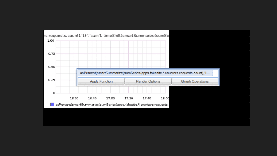
You had this very small text box where you have this complicated nested expression that you are supposed to understand and edit. So I wanted to change the structure of the query to be more readable and easy to edit. To first have the “what data you’re querying for,” and then have the transformations be shown in sequence in the same order they are executed. And then I can edit the parameters that go to those transformations. That way, it becomes so much easier to reason about and understand what this query is doing. I wrote a parser for the Graphite query language to make this transformation possible as a UI and as a presentation tool in the first version of Grafana:
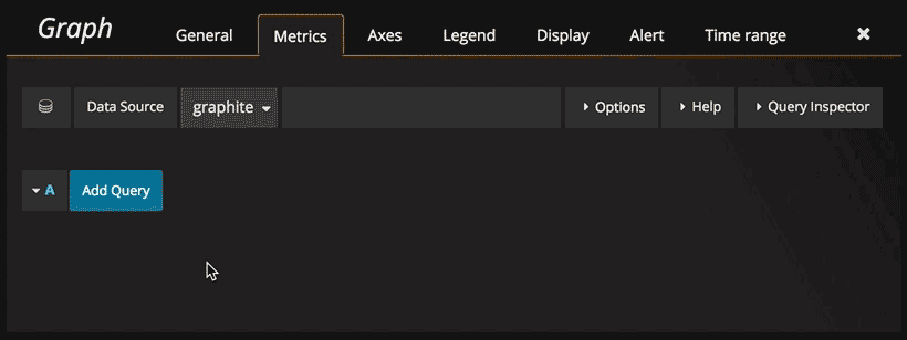
Through this UI, I changed how the query language in Graphite looked to make it more understandable and make editing much easier. And I think this was one of the key reasons why Grafana became instantly so popular within the Graphite community.
The goal was to make the things I found hard, and other people found hard, more easy and accessible. That way, more people could actually start instrumenting their applications and creating dashboards by themselves. This ambition became part of the first poster we did: Democratize metrics. Make the tools of observability accessible to everyone in an organization, not just the single Ops person.
Democratize Metrics poster
In this first version of Grafana, most of the editing was done in modals. Dashboard settings is a modal. We had these funky green icons on the side to access the row menu. The rows concept was essential to the layout of panels. There were two panels in the first version of Grafana. The graph panel was originally called graphite; it started as a fork of the Kibana histogram panel with built-in support for graphite only.
The rows proved to be one of the tricky things for a new user to understand: how to use them, what they meant, and how to edit or move a panel (since I removed all the icons). It kind of became a rite of passage that new Grafana users had to figure out because it was not super obvious.
Grafana v2 (2015)
Version 1 was only a frontend application. Version 2 introduced the backend written in Go. You could now log in and save dashboard without Elasticsearch! We had a side menu with the data sources that you could now add through the UI. You could also go into a separate server admin section.
Grafana v3 & v4 (2016)
In version 3, we introduced the plugin system. Grafana had plugins before, but it was much more manual. You dropped files in this location, and there was no documentation whatsoever. We also added official support for panel plugins. We launched grafana.net which had among other things a plugin and dashboard repository. [[SC_TOKEN_]6]]
Version 4 had some small style changes, but the big thing was of course alerting.
The other thing that changed was the green alien – a green row icon that allowed you to add panels. This concept of rows was still kind of messy. We tried to kill the green alien and make something more intuitive and easy to use. We tried a dashboard edit mode, but it didn’t turn out so great. So we made the green alien disappear by changing it into three dark dots. That might not be the best usability change. No huge improvement there.
But it does highlight one thing that is not super obvious to an end user. When we do a big (or small) UX change, we usually go through a lot of mock-ups and POCs, many of which are thrown away.
Grafana v5 (2018)
We finally solved the problems of rows and how to add/edit rows, by switching to a new grid system in version 5. It allows you to have much more flexible designs, and the concept of rows was no longer necessary. But we still have them, to enable collapsible sections of bigger dashboards. Grafana has had a super strong focus on backward compatibility when it comes to the dashboards and visualizations. So I could actually build a dashboard in version 1 and try to export it, and then try to import that in version 6. The fact that the dashboard schema model has changed radically and you still have that level of backward compatibility is something we have spent a lot of time on. We want upgrading Grafana to feel safe, so that you can trust that your dashboards and graphs remain the same.
Another big change in version 5 was the addition of the side menu. The light theme also got a major update, which was a really big leap forward for the UX. The light theme in previous versions was never really polished or fully maintained. In version 5, we really put some effort into making the light theme feel as polished as the dark theme.
Grafana v6 (2019)
We did a ton of UX work in version 6. The biggest change was enabling you to switch visualizations without having to remove the panel and add it again. In previous versions of Grafana, you had to pick your visualization type when you added a new panel. You add a new graph or a single stat panel, and that locks in that choice. You can’t go back and change this single stat to another visualization.
That prompted a lengthy design process of trying to figure out how and where you should be able to switch visualizations. We also wanted to make the visualization area resizable and the options area scrollable. This whole visualization selection was a big part of version 6, and it took a long time to get it right.
What’s Next
We’re pretty happy with where we landed with the UX solution to panel editing, but there’s still room for improvement.
- There is still no way to cancel panel edits and revert the changes.
- We discovered that it’s pretty hard to lay out options if you have a visualization with lots of options. If you have a wide monitor, it’s really hard to use that wide space efficiently and have options that are easy to scan and align.
- We’re looking at putting the options on a sidebar. That would give more space to the actual visualization, and enable show queries and visualization options to be shown at the same time.
- We want to make UX improvements to guide users more when they’re getting started: helping you set up your data source and your collector, and then get your first dashboards. We’d like to have something there for the common use cases, sort of pre-canned dashboards.
- The user admin story and workflows in Grafana could use some work, especially around the difference between org admin user settings. We want to be able to expose more information here and maybe more actions as well, to make the life of a Grafana server admin more pleasant and easy.
- We’re working on establishing a new set of styles for the forms and panel options.
Those are the main things that are on my mind in terms of UX challenges that we want to address in the coming months. There’s probably a lot more that we will come up with, especially now that we have more people at Grafana Labs focused on UX. Let us know what you think, and watch for more updates in the coming releases.

