UX: The long road to the shortest path
Torkel and the rest of the team have been hard at work on the next generation of Grafana, which is the foundation for what we’re building here at raintank. We’re really excited about the many new features and capabilities that Grafana 2.0 brings to the table, but they all have big implications from a UI/UX perspective.
Our first task at raintank in a post-capacity world was clear: make sure that new functionality didn’t negatively impact the UI/UX. In my opinion, one of the key reasons behind Grafana’s success has been how lean and mean it is, while still managing to look stunningly beautiful. There is minimal chrome in the interface to get in the way of the data. Therefore, our new design revisions were based on that core belief - don’t get in the way of the data.
This blog post is a behind the scenes peak on the path we took to deliver on these goals.
The challenge
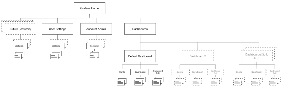
Grafana v1 is a largely flat hierarchy. You are able to bounce around between your dashboards easily, but the interface had yet to introduce other top-level areas of the system.
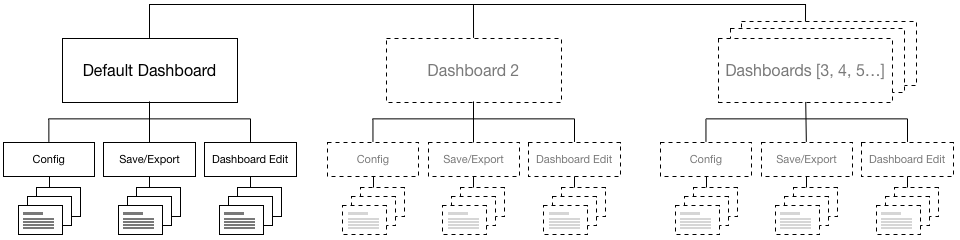
But as we start adding in the concept of users, account level configuration and other features, we needed to introduce a hierarchy within the interface.
Our process
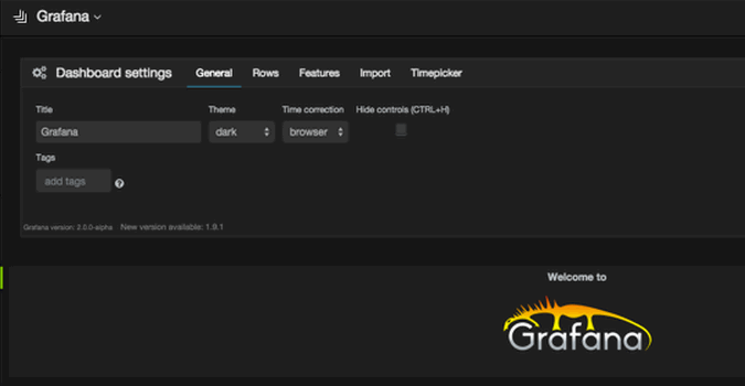
In the first prototypes of Grafana v2, Torkel added the navigation into an expandable sidebar, but it wasnt clear that a menu was hiding behind the Grafana logo in the upper left. We agreed that we liked the concept, but wanted to explore a few different options before locking things in.
First, we would throw together some of the core concepts in Omnigraffle, mocking up the different states (open, closed, click, hover, etc). Next, since the nav is so dependent on the interaction, we would then bring those ideas into Invision to get a sense on how it would feel to use. Finally, once we thought an idea had legs, Torkel would prototype it within the interface for testing.
Note: The mockups below are high-fidelity wireframes. None of the pros/cons listed below were driven by aesthetics - that came later.
Navigation Attempt 1:
Our thought process for this first iteration focused on clearly showing a menu was available, feature the concept of the account/organization, and make it easy for people to jump around the new areas of the system.
Pros:
- The newly introduced header area gives us space to grow.
- The active account/organization is prominently featured, showing off new features & functionality in v2.
Cons:
- The introduction of a new interface element and behavior (menu trigger) felt challenging.
- We lost the grafana logo in the upper left, which is also the main space for a user to include their own logo.
- It was great that the top area had a lot available space - but we couldn’t envision what would fill it. Effectively, we were creating dead space.
Conclusion:
The dead space wouldn’t stay dead for long. It would reanimate as zombie space, containing lost souls and buttons that didn’t belong anywhere else. We strive for a zombie-free interface.
Navigation Attempt 2:
Knowing that the top bar didnt improve the interface, we dropped it, and went back to the original goal. How could we make the menu clearer but also retaining branding?
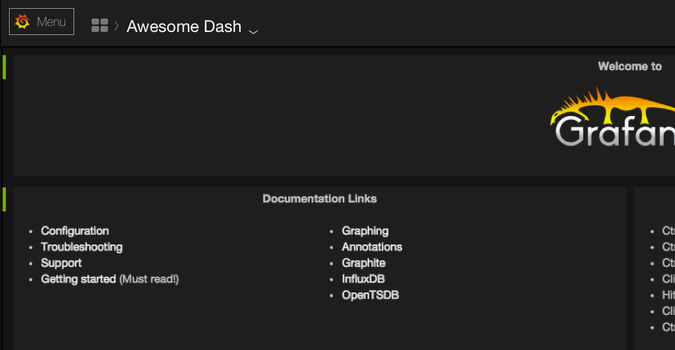
Pros:
- The menu functionality is clear, and could easily translate into any language.
Cons:
- Though it’s tested positively, we didnt like the lockup of the Logo and the word Menu. 12
- It didn’t seem polished.
Conclusion:
We can do better.
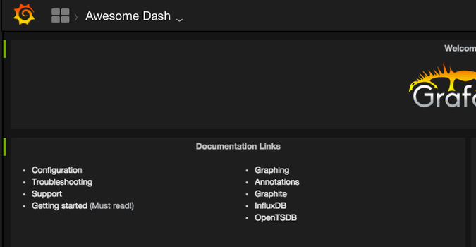
### But wait.
There’s a bigger problem. Did you catch it?

The dashboard hierarchy on the sidebar is **all wrong**. Though the subnav would function as the settings for the ***active*** dashboard, the menu structure implies that it’s Global Dashboard Settings, Global Dashboard Templating, etc... Bad news.
So we started looking at common user behavior as a way to understand how necessary the sub were going to be in the primary navigation. As you imagine, critical functionality would be switching between individual dashboards - not necessarily switching between Dashboards, Accounts and User Profile.
So we pulled out the sub-items from the nav, and got excited. We got so excited in fact, we thought this would be a good idea:
Nav Idea 3:
“We should do something really different”. “Yeah!”.
Pros:
- We don’t have to take up screen real estate by introducing a sidebar. The options become even simpler.
Cons:
- The trigger area felt small, and awkward overlap with the content below it.
- By reducing the prominence of the menu, it made it feel like options within the existing page - not giving appropriate weight to the main navigation.
Conclusion:
Glad we got that out of our system.
Nav Idea 4:
Thinking more about behavior patterns, we know that the user will spend most of their time in the dashboards. Would the user benefit from consolidating the navigation entirely into three areas: Dashboards, Account/Organization, and User?
Pros:
- No more sidebar - one simple, graceful top nav.
- The organization and user are persistently displayed. Super helpful when bouncing around in different instances/accounts.
Cons:
- We’ve now eaten up valuable vertical space, violating one of our main rules: don’t get in the way of data.
- We’re restricting the way the interface can grow.
Conclusion:
A very good option, but not the best answer.
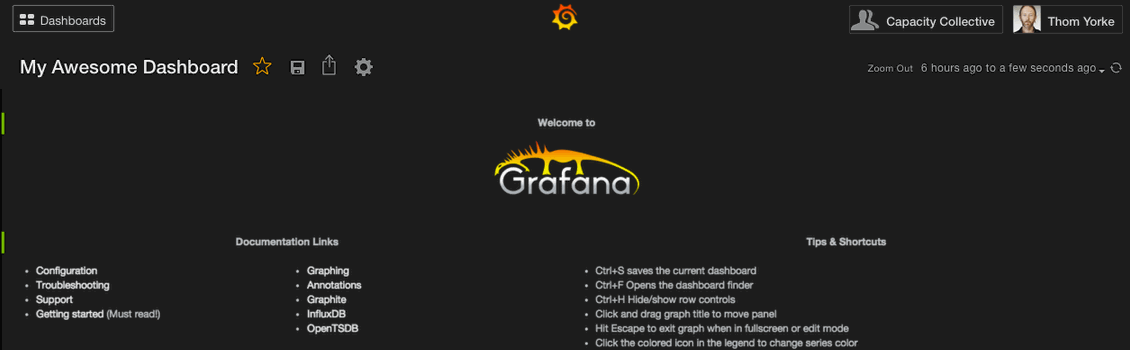
Nav Idea 5:
So after deliberation and experimentation, we circled back around to the sidebar - but dug deeper into why it wasn’t working for us in the first place. The menu had to be clear, unobtrusive, and needed room to grow.
Pros:
- Clean, simple design with visual cues on hover.
- The sidebar gives us space to grow, but the decision to stick to “Top Level” nav items will prevent it from turning into an junk drawer.
- The introduction of breadcrumbs reinforces the hierarchy, and turning it into a button lets a user switch between dashboards super quickly.
Cons:
- We’ve placed the menu in the hit area that commonly will take you “Home”. We knew we were adjusting a common web convention, but given the usage profile of our users, as well as the introduction of the hamburger on hover, we’re hoping it can remain intuitive.
Conclusion:
Winner. We love it, let’s do it.
What did we learn?
It’s early days at raintank, and we’re just beginning to find our rhythm. This has been a hugely collaborative and iterative process, and we’re just getting started. We know that it will often take a few different attempts to hone in on what works (and what doesn’t), and I’m impressed with the raintank team’s ability to act, react, and adjust.
We are placing a very high degree of importance on UI/UX and customer experience at raintank, which was one of the main reasons I was so excited to join. We’d love to hear what you think of where we’re going with all of this. Please check out a live demo of the Grafana 2.0 alpha here, and don’t be shy with your feedback.
You can reach me on twitter, github or old fashioned raintank.io email as matt@.
We re-referenced this research Hamburger vs Menu: The Final AB Test and Don’t Be Afraid of the Hamburger: A/B Test while we were experimenting, and was the inspiration for trying out the Menu button. Ultimately, since our audience is predominantly high-frequency daily users, we thought we could take the risk and teach the behavior in a compressed space. ↩︎
When this blog was first posted, I originally said: “Explicitly stating Menu felt like a cop out”. That was a dumb thing to say, and not reflective of our actual thoughts. ↩︎