
This is documentation for the next version of Grafana. For the latest stable release, go to the latest version.
Table
Tables are very flexible, supporting multiple modes for time series and for tables, annotation, and raw JSON data. This visualization also provides date formatting, value formatting, and coloring options. In addition to formatting and coloring options, Grafana also provides a variety of Cell types which you can use to display gauges, sparklines, and other rich data displays.

The following video provides a visual walkthrough of the options you can set in a table visualization. If you want to see a configuration in action, check out the video:
Give it a try using Grafana Play
With Grafana Play, you can explore and see how it works, learning from practical examples to accelerate your development. This feature can be seen on Table Visualizations in Grafana.
Annotation and alert support
Annotations and alerts are not currently supported in tables.
Sort column
Click a column title to change the sort order from default to descending to ascending. Each time you click, the sort order changes to the next option in the cycle. You can sort multiple columns by holding the shift key and clicking the column name.
Panel options
In the Panel options section of the panel editor pane, you set basic options like the panel title and description. You can also configure repeating panels in this section. To learn more, refer to Configure panel options.
Table options
Note
If you are using a table created before Grafana 7.0, then you need to migrate to the new table version in order to see these options. To migrate, on the Panel tab, click Table visualization. Grafana updates the table version and you can then access all table options.
Show header
Show or hide column names imported from your data source.
Column width
By default, Grafana automatically calculates the column width based on the table size and the minimum column width. This field option can override the setting and define the width for all columns in pixels.
For example, if you enter 100 in the field, then when you click outside the field, all the columns will be set to 100 pixels wide.
Minimum column width
By default, the minimum width of the table column is 150 pixels. This field option can override that default and will define the new minimum column width for the table in pixels.
For example, if you enter 75 in the field, then when you click outside the field, all the columns will scale to no smaller than 75 pixels wide.
For small-screen devices, such as smartphones or tablets, reduce the default 150 pixel value to50 to allow table-based panels to render correctly in dashboards.
Column alignment
Choose how Grafana should align cell contents:
- Auto (default)
- Left
- Center
- Right
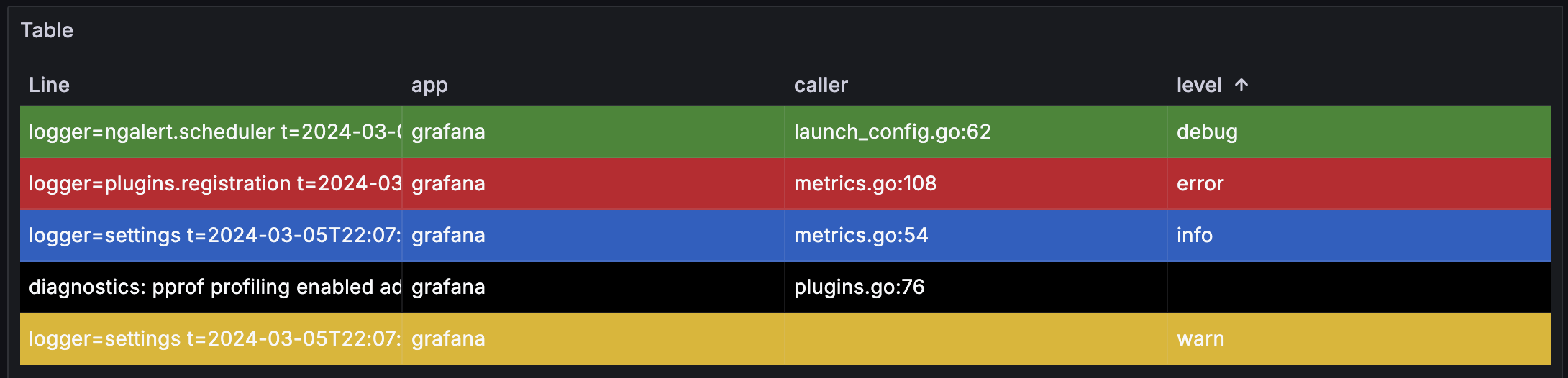
Cell type
By default, Grafana automatically chooses display settings. You can override the settings by choosing one of the following options to set the default for all fields. Additional configuration is available for some cell types.
Note
If you set these in the Field tab, then the type will apply to all fields, including the time field. Many options will work best if you set them in the Override tab so that they can be restricted to one or more fields.
Color text
If thresholds are set, then the field text is displayed in the appropriate threshold color.

Color background (gradient or solid)
If thresholds are set, then the field background is displayed in the appropriate threshold color.

Toggle the Apply to entire row switch, to apply the background color that’s configured for the cell to the whole row.
Gauge
Cells can be displayed as a graphical gauge, with several different presentation types.
Basic
The basic mode will show a simple gauge with the threshold levels defining the color of gauge.

Gradient
The threshold levels define a gradient.

LCD
The gauge is split up in small cells that are lit or unlit.

Label Options
Additionally, labels displayed alongside of the gauges can be set to be colored by value, match the theme text color, or be hidden.
Value Color

Text Color

Hidden

Data links
If you’ve configured data links, when the cell type is Auto mode, the cell text becomes clickable. If you change the cell type to Data links, the cell text reflects the titles of the configured data links. To control the application of data link text more granularly use a Cell option > Cell type > Data links field override.
JSON view
Shows value formatted as code. If a value is an object the JSON view allowing browsing the JSON object will appear on hover.

Image
Only available in Grafana 7.3+
If you have a field value that is an image URL or a base64 encoded image you can configure the table to display it as an image.

Sparkline
Shows values rendered as a sparkline. You can show sparklines using the Time series to table transformation on data with multiple time series to process it into a format the table can show.

You can be customize sparklines with many of the same options as the Time series panel including line width, fill opacity, and more. You can also change the color of the sparkline by updating the color scheme in the Standard options section of the panel configuration.
Cell value inspect
Enables value inspection from table cell. The raw value is presented in a modal window.
Note
Cell value inspection is only available when cell display mode is set to Auto, Color text, Color background or JSON View.
Column filter
You can temporarily change how column data is displayed. For example, you can order values from highest to lowest or hide specific values. For more information, refer to Filter table columns.
Pagination
Use this option to enable or disable pagination. It is a front-end option that does not affect queries. When enabled, the page size automatically adjusts to the height of the table.
Filter table columns
If you turn on the Column filter, then you can filter table options.
Turn on column filtering
- In Grafana, navigate to the dashboard with the table with the columns that you want to filter.
- On the table panel you want to filter, open the panel editor.
- Click the Field tab.
- In Table options, turn on the Column filter option.
A filter icon appears next to each column title.
Filter column values
To filter column values, click the filter (funnel) icon next to a column title. Grafana displays the filter options for that column.

Click the check box next to the values that you want to display. Enter text in the search field at the top to show those values in the display so that you can select them rather than scroll to find them.
Choose from several operators to display column values:
- Contains - Matches a regex pattern (operator by default).
- Expression - Evaluates a boolean expression. The character
$represents the column value in the expression (for example, “$ >= 10 && $ <= 12”). - The typical comparison operators:
=,!=,<,<=,>,>=.
Click the check box above the Ok and Cancel buttons to add or remove all displayed values to/from the filter.
Clear column filters
Columns with filters applied have a blue funnel displayed next to the title.

To remove the filter, click the blue funnel icon and then click Clear filter.
Table footer
You can use the table footer to show calculations on fields.
After you enable the table footer:
- Select the Calculation
- Select the Fields that you want to calculate
The system applies the calculation to all numeric fields if you do not select a field.
Count rows
If you want to show the number of rows in the dataset instead of the number of values in the selected fields, select the Count calculation and enable Count rows.
Standard options
Standard options in the panel editor pane let you change how field data is displayed in your visualizations. When you set a standard option, the change is applied to all fields or series. For more granular control over the display of fields, refer to Configure overrides.
You can customize the following standard options:
- Unit - Choose which unit a field should use.
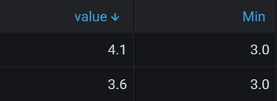
- Min/Max - Set the minimum and maximum values used in percentage threshold calculations or leave these field empty for them to be calculated automatically.
- Field min/max - Enable Field min/max to have Grafana calculate the min or max of each field individually, based on the minimum or maximum value of the field.
- Decimals - Specify the number of decimals Grafana includes in the rendered value.
- Display name - Set the display title of all fields. You can use variables in the field title.
- Color scheme - Set single or multiple colors for your entire visualization.
- No value - Enter what Grafana should display if the field value is empty or null. The default value is a hyphen (-).
To learn more, refer to Configure standard options.
Data links
Data links allow you to link to other panels, dashboards, and external resources while maintaining the context of the source panel. You can create links that include the series name or even the value under the cursor.
For each data link, set the following options:
- Title
- URL
- Open in new tab
To learn more, refer to Configure data links.
Value mappings
Value mapping is a technique you can use to change how data appears in a visualization.
For each value mapping, set the following options:
- Condition - Choose what’s mapped to the display text and (optionally) color:
- Value - Specific values
- Range - Numerical ranges
- Regex - Regular expressions
- Special - Special values like
Null,NaN(not a number), or boolean values liketrueandfalse
- Display text
- Color (Optional)
- Icon (Canvas only)
To learn more, refer to Configure value mappings.
Thresholds
A threshold is a value or limit you set for a metric that’s reflected visually when it’s met or exceeded. Thresholds are one way you can conditionally style and color your visualizations based on query results.
Set the following options:
- Value - Set the value for each threshold.
- Thresholds mode - Choose from:
- Absolute
- Percentage
To learn more, refer to Configure thresholds.
Field overrides
Overrides allow you to customize visualization settings for specific fields or series. When you add an override rule, it targets a particular set of fields and lets you define multiple options for how that field is displayed.
Choose from one the following override options:
- Fields with name - Select a field from the list of all available fields.
- Fields with name matching regex - Specify fields to override with a regular expression.
- Fields with type - Select fields by type, such as string, numeric, or time.
- Fields returned by query - Select all fields returned by a specific query, such as A, B, or C.
- Fields with values - Select all fields returned by your defined reducer condition, such as Min, Max, Count, Total.
To learn more, refer to Configure field overrides.
Was this page helpful?
Related resources from Grafana Labs


