
This is documentation for the next version of Grafana. For the latest stable release, go to the latest version.
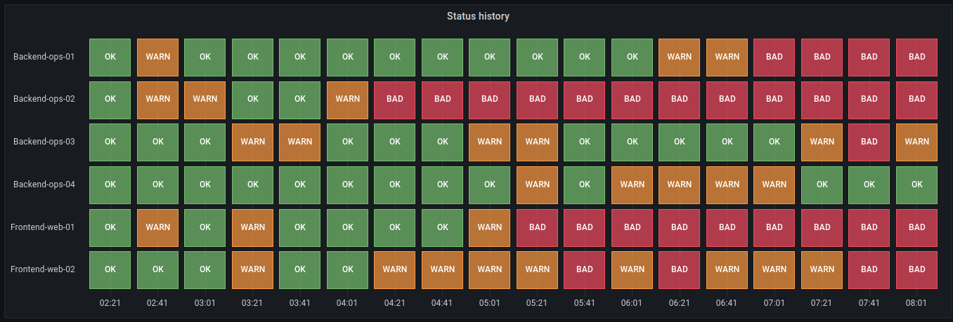
Status history
A status history visualization displays data in a way that shows periodic states over time. In a status history, each field or series is rendered as a horizontal row, with multiple boxes showing the different statuses. This provides you with a centralized view for the status of a component or service.
For example, if you’re monitoring the health status of different services, you can use a status history to visualize the different statuses, such as “OK,” “WARN,” or “BAD,” over time. Each status is represented by a different color:
Note
A status history is similar to a state timeline, but has different configuration options. Unlike state timelines, status histories don’t merge consecutive values.
Use a status history when you need to:
- Monitor the status of a server, application, or service to know when your infrastructure is experiencing issues over time.
- Identify operational trends over time.
- Spot any recurring issues with the health of your applications.
Configure a status history
Once you’ve created a dashboard, you can use the following state timeline video as a reference for how to configure a status history:
Give it a try using Grafana Play
With Grafana Play, you can explore and see how it works, learning from practical examples to accelerate your development. This feature can be seen on Grafana State Timeline & Status History.
Supported data formats
The status history visualization works best if you have data capturing the various status of entities over time, formatted as a table. The data must include:
- Timestamps - Indicate when each status change occurred. This could also be the start time for the status change. You can also add an optional timestamp to indicate the end time for the status change.
- Entity name/identifier - Represents the name of the entity you’re trying to monitor.
- Status value - Represents the state value of the entity you’re monitoring. These can be string, numerical, or boolean states.
Examples
The following tables are examples of the type of data you need for a status history visualization and how it should be formatted.
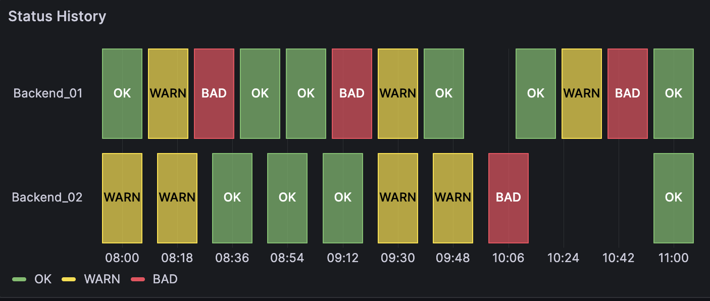
Single time column with null values
| Timestamps | Backend_01 | Backend_02 |
|---|---|---|
| 2024-02-29 8:00:00 | OK | WARN |
| 2024-02-29 8:15:00 | WARN | |
| 2024-02-29 8:18:00 | WARN | |
| 2024-02-29 8:30:00 | BAD | |
| 2024-02-29 8:36:00 | OK | |
| 2024-02-29 8:45:00 | OK |
The data is converted as follows, with the null and empty values visualized as gaps in the status history:
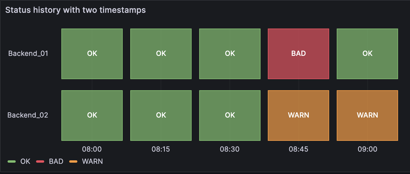
Two time columns without null values
| Start time | End time | Backend_01 | Backend_02 |
|---|---|---|---|
| 2024-02-29 8:00:00 | 2024-02-29 8:15:00 | OK | OK |
| 2024-02-29 8:15:00 | 2024-02-29 8:30:00 | OK | OK |
| 2024-02-29 8:30:00 | 2024-02-29 8:45:00 | OK | OK |
| 2024-02-29 8:45:00 | 2024-02-29 9:00:00 | BAD | WARN |
| 2024-02-29 9:00:00 | 2024-02-29 9:15:00 | OK | WARN |
The data is converted as follows:
Panel options
In the Panel options section of the panel editor pane, you set basic options like the panel title and description. You can also configure repeating panels in this section. To learn more, refer to Configure panel options.
Status history options
Use these options to refine the visualization.
Show values
Controls whether values are rendered inside the value boxes. Auto will render values if there is sufficient space.
Column width
Controls the width of boxes. 1 = maximum space and 0 = minimum space.
Line width
Controls line width of state regions.
Fill opacity
Controls the opacity of state regions.
Standard options
Standard options in the panel editor pane let you change how field data is displayed in your visualizations. When you set a standard option, the change is applied to all fields or series. For more granular control over the display of fields, refer to Configure overrides.
You can customize the following standard options:
- Unit - Choose which unit a field should use.
- Min/Max - Set the minimum and maximum values used in percentage threshold calculations or leave these field empty for them to be calculated automatically.
- Field min/max - Enable Field min/max to have Grafana calculate the min or max of each field individually, based on the minimum or maximum value of the field.
- Decimals - Specify the number of decimals Grafana includes in the rendered value.
- Display name - Set the display title of all fields. You can use variables in the field title.
- Color scheme - Set single or multiple colors for your entire visualization.
- No value - Enter what Grafana should display if the field value is empty or null. The default value is a hyphen (-).
To learn more, refer to Configure standard options.
Legend options
When the legend option is enabled it can show either the value mappings or the threshold brackets. To show the value mappings in the legend, it’s important that the Color scheme as referenced in Color scheme is set to Single color or Classic palette. To see the threshold brackets in the legend set the Color scheme to From thresholds.
For more information about the legend, refer to Configure a legend.
Visibility
Toggle the switch to turn the legend on or off.
Mode
Use these settings to define how the legend appears in your visualization.
- List - Displays the legend as a list. This is a default display mode of the legend.
- Table - Displays the legend as a table.
Placement
Choose where to display the legend.
- Bottom - Below the graph.
- Right - To the right of the graph.
Width
Control how wide the legend is when placed on the right side of the visualization. This option is only displayed if you set the legend placement to Right.
Tooltip options
Tooltip options control the information overlay that appears when you hover over data points in the visualization.
Tooltip mode
When you hover your cursor over the visualization, Grafana can display tooltips. Choose how tooltips behave.
- Single - The hover tooltip shows only a single series, the one that you are hovering over on the visualization.
- All - The hover tooltip shows all series in the visualization. Grafana highlights the series that you are hovering over in bold in the series list in the tooltip.
- Hidden - Do not display the tooltip when you interact with the visualization.
Use an override to hide individual series from the tooltip.
Values sort order
When you set the Tooltip mode to All, the Values sort order option is displayed. This option controls the order in which values are listed in a tooltip. Choose from the following:
- None - Grafana automatically sorts the values displayed in a tooltip.
- Ascending - Values in the tooltip are listed from smallest to largest.
- Descending - Values in the tooltip are listed from largest to smallest.
Max height
Set the maximum height of the tooltip box. The default is 600 pixels.
Data links
Data links allow you to link to other panels, dashboards, and external resources while maintaining the context of the source panel. You can create links that include the series name or even the value under the cursor.
For each data link, set the following options:
- Title
- URL
- Open in new tab
To learn more, refer to Configure data links.
Value mappings
Value mapping is a technique you can use to change how data appears in a visualization.
For each value mapping, set the following options:
- Condition - Choose what’s mapped to the display text and (optionally) color:
- Value - Specific values
- Range - Numerical ranges
- Regex - Regular expressions
- Special - Special values like
Null,NaN(not a number), or boolean values liketrueandfalse
- Display text
- Color (Optional)
- Icon (Canvas only)
To learn more, refer to Configure value mappings.

Thresholds
A threshold is a value or limit you set for a metric that’s reflected visually when it’s met or exceeded. Thresholds are one way you can conditionally style and color your visualizations based on query results.
Set the following options:
- Value - Set the value for each threshold.
- Thresholds mode - Choose from:
- Absolute
- Percentage
To learn more, refer to Configure thresholds.
Field overrides
Overrides allow you to customize visualization settings for specific fields or series. When you add an override rule, it targets a particular set of fields and lets you define multiple options for how that field is displayed.
Choose from one the following override options:
- Fields with name - Select a field from the list of all available fields.
- Fields with name matching regex - Specify fields to override with a regular expression.
- Fields with type - Select fields by type, such as string, numeric, or time.
- Fields returned by query - Select all fields returned by a specific query, such as A, B, or C.
- Fields with values - Select all fields returned by your defined reducer condition, such as Min, Max, Count, Total.
To learn more, refer to Configure field overrides.
Was this page helpful?
Related resources from Grafana Labs


