
This is documentation for the next version of Grafana. For the latest stable release, go to the latest version.
Pie chart

Pie charts display reduced series, or values in a series, from one or more queries, as they relate to each other, in the form of slices of a pie. The arc length, area and central angle of a slice are all proportional to the slices value, as it relates to the sum of all values. This type of chart is best used when you want a quick comparison of a small set of values in an aesthetically pleasing form.
Give it a try using Grafana Play
With Grafana Play, you can explore and see how it works, learning from practical examples to accelerate your development. This feature can be seen on Grafana Bar Charts and Pie Charts.
Panel options
In the Panel options section of the panel editor pane, you set basic options like the panel title and description. You can also configure repeating panels in this section. To learn more, refer to Configure panel options.
Value options
Use the following options to refine the value in your visualization.
Show
Choose how much information to show.
- Calculate - Reduces each value to a single value per series.
- All values - Displays every value from a single series.
Calculation
Select a calculation to reduce each series when Calculate has been selected. For information about available calculations, refer to Calculation types.
Limit
When displaying every value from a single series, this limits the number of values displayed.
Fields
Select which field or fields to display in the visualization. Each field name is available on the list, or you can select one of the following options:
- Numeric fields - All fields with numerical values.
- All fields - All fields that are not removed by transformations.
- Time - All fields with time values.
Pie chart options
Use these options to refine how your visualization looks.
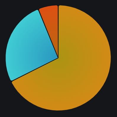
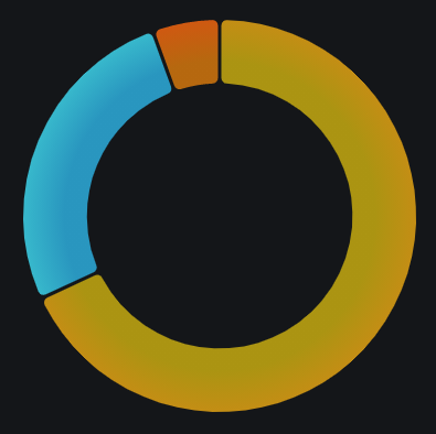
Pie chart type
Select the pie chart display style.
Pie
Donut
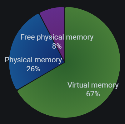
Labels
Select labels to display on the pie chart. You can select more than one.
- Name - The series or field name.
- Percent - The percentage of the whole.
- Value - The raw numerical value.
Labels are displayed in white over the body of the chart. You might need to select darker chart colors to make them more visible. Long names or numbers might be clipped.
The following example shows a pie chart with Name and Percent labels displayed.
Standard options
Standard options in the panel editor pane let you change how field data is displayed in your visualizations. When you set a standard option, the change is applied to all fields or series. For more granular control over the display of fields, refer to Configure overrides.
You can customize the following standard options:
- Unit - Choose which unit a field should use.
- Min/Max - Set the minimum and maximum values used in percentage threshold calculations or leave these field empty for them to be calculated automatically.
- Field min/max - Enable Field min/max to have Grafana calculate the min or max of each field individually, based on the minimum or maximum value of the field.
- Decimals - Specify the number of decimals Grafana includes in the rendered value.
- Display name - Set the display title of all fields. You can use variables in the field title.
- Color scheme - Set single or multiple colors for your entire visualization.
- No value - Enter what Grafana should display if the field value is empty or null. The default value is a hyphen (-).
To learn more, refer to Configure standard options.
Tooltip options
Tooltip options control the information overlay that appears when you hover over data points in the visualization.
Tooltip mode
When you hover your cursor over the visualization, Grafana can display tooltips. Choose how tooltips behave.
- Single - The hover tooltip shows only a single series, the one that you are hovering over on the visualization.
- All - The hover tooltip shows all series in the visualization. Grafana highlights the series that you are hovering over in bold in the series list in the tooltip.
- Hidden - Do not display the tooltip when you interact with the visualization.
Use an override to hide individual series from the tooltip.
Values sort order
When you set the Tooltip mode to All, the Values sort order option is displayed. This option controls the order in which values are listed in a tooltip. Choose from the following:
- None - Grafana automatically sorts the values displayed in a tooltip.
- Ascending - Values in the tooltip are listed from smallest to largest.
- Descending - Values in the tooltip are listed from largest to smallest.
Max height
Set the maximum height of the tooltip box. The default is 600 pixels.
Legend options
Use these settings to define how the legend appears in your visualization. For more information about the legend, refer to Configure a legend.
Visibility
Toggle the switch to turn the legend on or off.
Mode
Use these settings to define how the legend appears in your visualization.
- List - Displays the legend as a list. This is a default display mode of the legend.
- Table - Displays the legend as a table.
Placement
Choose where to display the legend.
- Bottom - Below the graph.
- Right - To the right of the graph.
Width
Control how wide the legend is when placed on the right side of the visualization. This option is only displayed if you set the legend placement to Right.
Values
Select values to display in the legend. You can select more than one.
- Percent: The percentage of the whole.
- Value: The raw numerical value.
Value mappings
Value mapping is a technique you can use to change how data appears in a visualization.
For each value mapping, set the following options:
- Condition - Choose what’s mapped to the display text and (optionally) color:
- Value - Specific values
- Range - Numerical ranges
- Regex - Regular expressions
- Special - Special values like
Null,NaN(not a number), or boolean values liketrueandfalse
- Display text
- Color (Optional)
- Icon (Canvas only)
To learn more, refer to Configure value mappings.
Field overrides
Overrides allow you to customize visualization settings for specific fields or series. When you add an override rule, it targets a particular set of fields and lets you define multiple options for how that field is displayed.
Choose from one the following override options:
- Fields with name - Select a field from the list of all available fields.
- Fields with name matching regex - Specify fields to override with a regular expression.
- Fields with type - Select fields by type, such as string, numeric, or time.
- Fields returned by query - Select all fields returned by a specific query, such as A, B, or C.
- Fields with values - Select all fields returned by your defined reducer condition, such as Min, Max, Count, Total.
To learn more, refer to Configure field overrides.
Was this page helpful?
Related resources from Grafana Labs


