
This is documentation for the next version of Grafana. For the latest stable release, go to the latest version.
Canvas
Canvases combine the power of Grafana with the flexibility of custom elements. Canvases are extensible form-built visualizations that allow you to explicitly place elements within static and dynamic layouts. This empowers you to design custom visualizations and overlay data in ways that aren’t possible with standard Grafana panels, all within Grafana’s UI. If you’ve used popular UI and web design tools, then designing canvases will feel very familiar.
We would love your feedback on Canvas. Please check out the open Github issues and submit a new feature request as needed.
Elements
Elements are the basic building blocks of a canvas and they help you visualize data with different shapes and options. You can rotate and move elements around the canvas. When you move elements, snapping and alignment guides help you create more precise layouts.
Note
Element snapping and alignment only works when the canvas is not zoomed in.
When you select an element that you’ve added to a canvas, you can access editing options for it that are dependent on the element type. The following sections describe the different elements available.
Basic shapes
A basic shape element can display text (both fixed and field data) and its background color can be changed based on data thresholds. You can add the following basic shapes to a canvas:
- Cloud
- Ellipse
- Parallelogram
- Rectangle
- Triangle
Metric value
The metric value element lets you easily select the data you want to display on a canvas. This element has a unique “edit” mode that can be triggered either through the context menu “Edit” option or by double clicking. When in edit mode you can select which field data that you want to display.
Text
The text element lets you easily add text to the canvas. The element also supports an editing mode, triggered via either double clicking or the edit menu option in the context menu.
Icon
The icon element lets you add a supported icon to the canvas. Icons can have their color set based on thresholds / value mappings.
Server
The server element lets you easily represent a single server, a stack of servers, a database, or a terminal. Server elements support status color, bulb color, and a bulb blink rate all configurable by fixed or field values.

Button
The button element lets you add a basic button to the canvas. Button elements support triggering basic, unauthenticated API calls. API settings are found in the button element editor. You can also pass template variables in the API editor.
Note
A button click will only trigger an API call when inline editing is disabled.
Connections
When building a canvas, you can connect elements together to create more complex visualizations. Connections are created by dragging from the connection anchor of one element to the connection anchor of another element. You can also create connections to the background of the canvas. Connection anchors are displayed when you hover over an element and inline editing is turned on.
To remove a connection, simply click on the connection directly and then press the “Delete” or “Backspace” key.
Adjust connectors
You can adjust connectors, adding angles to them, to fit the canvas you’re working in. When you move connected elements, the connector resizes to fit the space. To adjust a connector, click it to display the midpoint controls and move those as needed. To make a connector a straight line again, move the midpoint back until the midpoint controls disappear.
If you move a connector so that it’s almost a right angle or a straight line, the connector snaps into that angle or into a straight line.
Style connectors
You can set the size, color, direction, and style of connections based on fixed or field values. To do so, enter into panel edit mode, select the connection, and modify the connection’s properties in the panel editor.

Canvas editing
Inline editor
You can edit your canvas inline while in the context of dashboard mode.
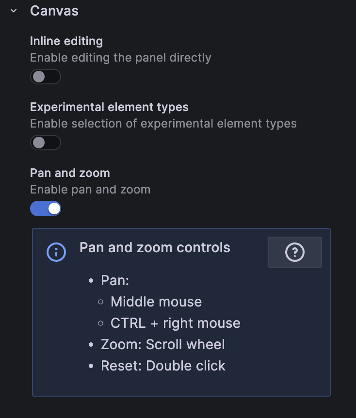
Pan and zoom
You can enable panning and zooming in a canvas. This allows you to both create and navigate more complex designs.
Note
Canvas pan and zoom is currently in public preview. Grafana Labs offers limited support, and breaking changes might occur prior to the feature being made generally available. Enable thecanvasPanelPanZoomfeature toggle in Grafana to use this feature. Contact Grafana Support to enable this feature in Grafana Cloud.
Infinite panning
You can enable infinite panning in a canvas when pan and zoom is enabled. This allows you to pan and zoom the canvas and uncover larger designs.
Note
Infinite panning is an experimental feature that may not work as expected in all scenarios. For example, elements that are not top-left constrained may experience unexpected movement when panning.
Context menu
The context menu lets you perform common tasks quickly and efficiently. Supported functionality includes opening / closing the inline editor, duplicating an element, deleting an element, and more.
The context menu is triggered by a right click action over the panel / over a given canvas element. When right clicking the panel, you are able to set a background image and easily add elements to the canvas.

When right clicking an element, you are able to edit, delete, duplicate, and modify the element’s layer positioning.

Canvas options
Inline editing
The inline editing toggle lets you lock or unlock the canvas. When turned off the canvas becomes “locked”, freezing elements in place and preventing unintended modifications.
Data links
Canvases support data links for all elements except drone and button elements. You can add a data link by following these steps:
- Set an element to be tied to a field value.
- Turn off the inline editing toggle.
- Create an override for Fields with name and select the element field name from the list.
- Click the + Add override property button.
- Select
Datalinks > Datalinksfrom the list. - Click +Add link add a title and URL for the data link.
- Hover over the element to display the data link tooltip.
- Click on the element to be able to open the data link.
If multiple elements use the same field name, and you want to control which elements display the data link, you can create a unique field name using the add field from calculation transform. The alias you create in the transformation will appear as a field you can use with an element.
- In the panel editor for the canvas, click the Transform tab.
- Select Add field from calculation from the list of transformations, or click + Add transformation to display the list first.
- Choose Reduce row from the dropdown and click the field name that you want to use for the element.
- Select All Values from the Calculation dropdown.
- Add an alias for the field name.
- Reference the new unique field alias to create the element and field override.
Panel options
In the Panel options section of the panel editor pane, you set basic options like the panel title and description. You can also configure repeating panels in this section. To learn more, refer to Configure panel options.
Standard options
Standard options in the panel editor pane let you change how field data is displayed in your visualizations. When you set a standard option, the change is applied to all fields or series. For more granular control over the display of fields, refer to Configure overrides.
You can customize the following standard options:
- Unit - Choose which unit a field should use.
- Min/Max - Set the minimum and maximum values used in percentage threshold calculations or leave these field empty for them to be calculated automatically.
- Field min/max - Enable Field min/max to have Grafana calculate the min or max of each field individually, based on the minimum or maximum value of the field.
- Decimals - Specify the number of decimals Grafana includes in the rendered value.
- Display name - Set the display title of all fields. You can use variables in the field title.
- Color scheme - Set single or multiple colors for your entire visualization.
- No value - Enter what Grafana should display if the field value is empty or null. The default value is a hyphen (-).
To learn more, refer to Configure standard options.
Thresholds
A threshold is a value or limit you set for a metric that’s reflected visually when it’s met or exceeded. Thresholds are one way you can conditionally style and color your visualizations based on query results.
Set the following options:
- Value - Set the value for each threshold.
- Thresholds mode - Choose from:
- Absolute
- Percentage
To learn more, refer to Configure thresholds.
Value mappings
Value mapping is a technique you can use to change how data appears in a visualization.
For each value mapping, set the following options:
- Condition - Choose what’s mapped to the display text and (optionally) color:
- Value - Specific values
- Range - Numerical ranges
- Regex - Regular expressions
- Special - Special values like
Null,NaN(not a number), or boolean values liketrueandfalse
- Display text
- Color (Optional)
- Icon (Canvas only)
To learn more, refer to Configure value mappings.
Field overrides
Overrides allow you to customize visualization settings for specific fields or series. When you add an override rule, it targets a particular set of fields and lets you define multiple options for how that field is displayed.
Choose from one the following override options:
- Fields with name - Select a field from the list of all available fields.
- Fields with name matching regex - Specify fields to override with a regular expression.
- Fields with type - Select fields by type, such as string, numeric, or time.
- Fields returned by query - Select all fields returned by a specific query, such as A, B, or C.
- Fields with values - Select all fields returned by your defined reducer condition, such as Min, Max, Count, Total.
To learn more, refer to Configure field overrides.
Was this page helpful?
Related resources from Grafana Labs


