
This is documentation for the next version of Grafana. For the latest stable release, go to the latest version.
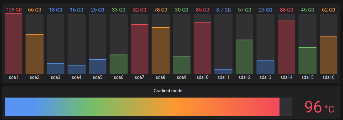
Bar gauge
Bar gauges simplify your data by reducing every field to a single value. You choose how Grafana calculates the reduction.
This panel can show one or more bar gauges depending on how many series, rows, or columns your query returns.
Give it a try using Grafana Play
With Grafana Play, you can explore and see how it works, learning from practical examples to accelerate your development. This feature can be seen on Bar Gauge.
Panel options
In the Panel options section of the panel editor pane, you set basic options like the panel title and description. You can also configure repeating panels in this section. To learn more, refer to Configure panel options.
Value options
Use the following options to refine how your visualization displays the value:
Show
Choose how Grafana displays your data.
Calculate
Show a calculated value based on all rows.
- Calculation - Select a reducer function that Grafana will use to reduce many fields to a single value. For a list of available calculations, refer to Calculation types.
- Fields - Select the fields display in the panel.
All values
Show a separate stat for every row. If you select this option, then you can also limit the number of rows to display.
- Limit - The maximum number of rows to display. Default is 5,000.
- Fields - Select the fields display in the panel.
Bar gauge options
Adjust how the bar gauge is displayed.
Orientation
Choose a stacking direction.
- Auto - Grafana determines the best orientation.
- Horizontal - Bars stretch horizontally, left to right.
- Vertical - Bars stretch vertically, bottom to top.
Display mode
Choose a display mode.
- Gradient - Threshold levels define a gradient.
- Retro LCD - The gauge is split into small cells that are lit or unlit.
- Basic - Single color based on the matching threshold.
Value display
Choose a value display mode.
- Value color - Value color is determined by value.
- Text color - Value color is default text color.
- Hidden - Values are hidden.
Name placement
Choose a name placement mode.
Note
This option only applies when the orientation of the bar gauge is horizontal. When the bar gauge is in the vertical orientation, names are always placed at the bottom of each bar gauge.
- Auto - Grafana determines the best placement.
- Top - Names are placed on top of each bar gauge.
- Left - Names are placed to the left of each bar gauge.
Show unfilled area
Select this if you want to render the unfilled region of the bars as dark gray. Not applicable to Retro LCD display mode.
Bar size
Choose a bar size mode.
- Auto - Grafana determines the best bar gauge size.
- Manual - Manually configure the bar gauge size.
Min width
Limit the minimum width of the bar column when the gauge is oriented vertically.
Automatically show x-axis scrollbar when there’s a large amount of data.
Note
This option only applies when bar size is set to manual.
Min height
Limit the minimum height of the bar row when the gauge is oriented horizontally.
Automatically show y-axis scrollbar when there’s a large amount of data.
Note
This option only applies when bar size is set to manual.
Max height
Limit the maximum height of the bar row when the gauge is oriented horizontally.
Automatically show y-axis scrollbar when there’s a large amount of data.
Note
This option only applies when bar size is set to manual.
Standard options
Standard options in the panel editor pane let you change how field data is displayed in your visualizations. When you set a standard option, the change is applied to all fields or series. For more granular control over the display of fields, refer to Configure overrides.
You can customize the following standard options:
- Unit - Choose which unit a field should use.
- Min/Max - Set the minimum and maximum values used in percentage threshold calculations or leave these field empty for them to be calculated automatically.
- Field min/max - Enable Field min/max to have Grafana calculate the min or max of each field individually, based on the minimum or maximum value of the field.
- Decimals - Specify the number of decimals Grafana includes in the rendered value.
- Display name - Set the display title of all fields. You can use variables in the field title.
- Color scheme - Set single or multiple colors for your entire visualization.
- No value - Enter what Grafana should display if the field value is empty or null. The default value is a hyphen (-).
To learn more, refer to Configure standard options.
Data links
Data links allow you to link to other panels, dashboards, and external resources while maintaining the context of the source panel. You can create links that include the series name or even the value under the cursor.
For each data link, set the following options:
- Title
- URL
- Open in new tab
To learn more, refer to Configure data links.
Value mappings
Value mapping is a technique you can use to change how data appears in a visualization.
For each value mapping, set the following options:
- Condition - Choose what’s mapped to the display text and (optionally) color:
- Value - Specific values
- Range - Numerical ranges
- Regex - Regular expressions
- Special - Special values like
Null,NaN(not a number), or boolean values liketrueandfalse
- Display text
- Color (Optional)
- Icon (Canvas only)
To learn more, refer to Configure value mappings.
Thresholds
A threshold is a value or limit you set for a metric that’s reflected visually when it’s met or exceeded. Thresholds are one way you can conditionally style and color your visualizations based on query results.
Set the following options:
- Value - Set the value for each threshold.
- Thresholds mode - Choose from:
- Absolute
- Percentage
To learn more, refer to Configure thresholds.
Field overrides
Overrides allow you to customize visualization settings for specific fields or series. When you add an override rule, it targets a particular set of fields and lets you define multiple options for how that field is displayed.
Choose from one the following override options:
- Fields with name - Select a field from the list of all available fields.
- Fields with name matching regex - Specify fields to override with a regular expression.
- Fields with type - Select fields by type, such as string, numeric, or time.
- Fields returned by query - Select all fields returned by a specific query, such as A, B, or C.
- Fields with values - Select all fields returned by your defined reducer condition, such as Min, Max, Count, Total.
To learn more, refer to Configure field overrides.
Was this page helpful?
Related resources from Grafana Labs


